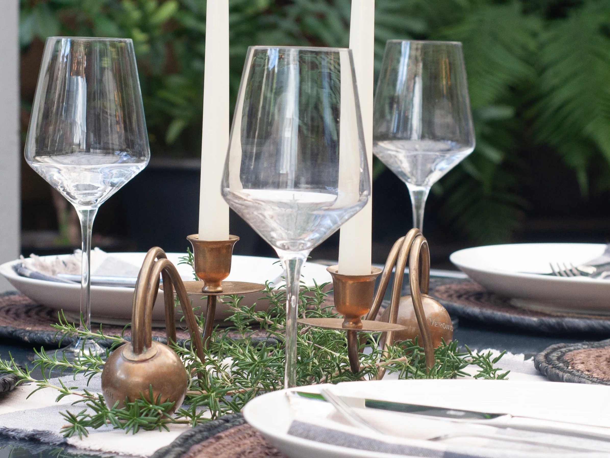
The Collection
I choose pieces not simply because they’re vintage, but because they have that ‘something’. They spark a feeling, make you smile and your heart sing. I do my best so you can find the extraordinary. Please have fun exploring.
I choose pieces not simply because they’re vintage, but because they have that ‘something’. They spark a feeling, make you smile and your heart sing. I do my best so you can find the extraordinary. Please have fun exploring.
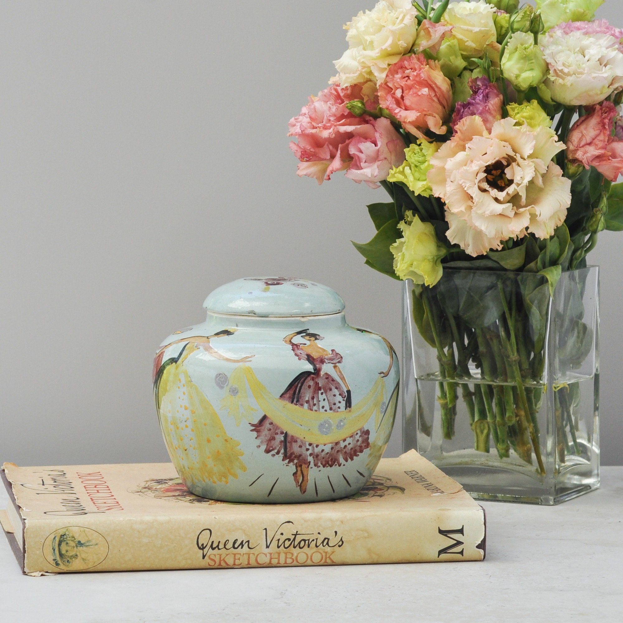
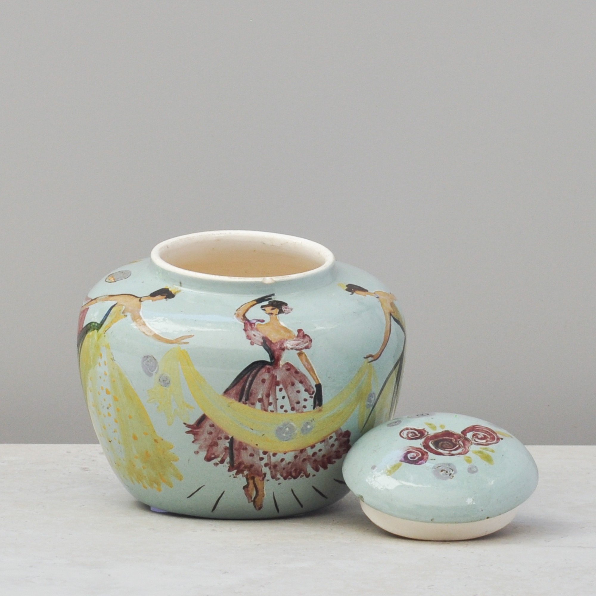
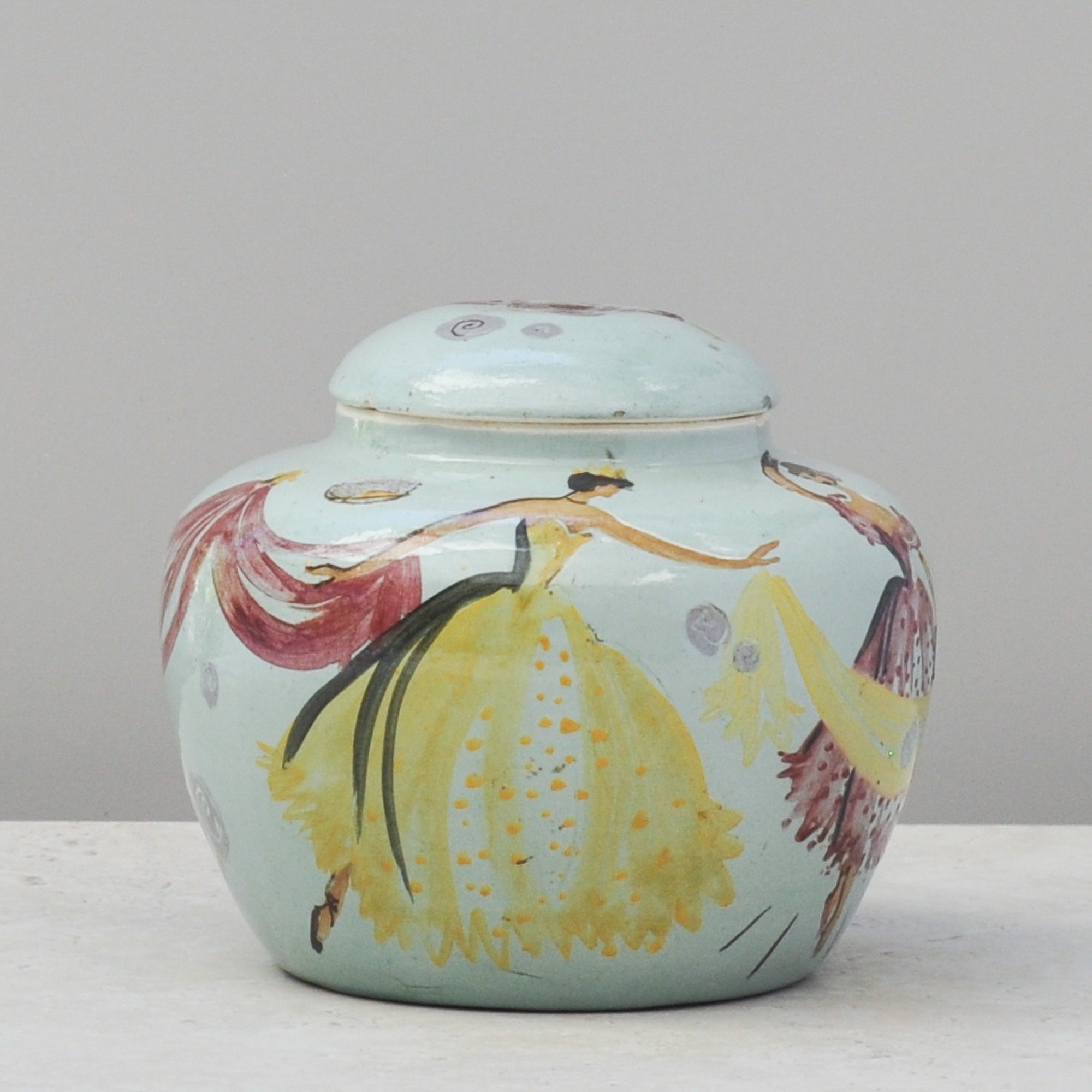
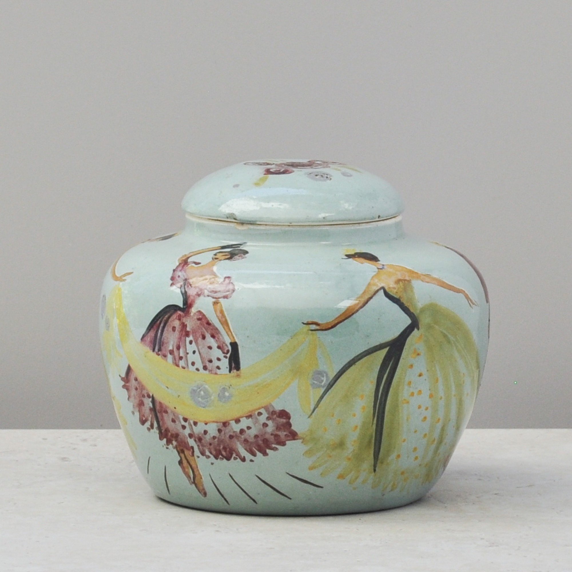
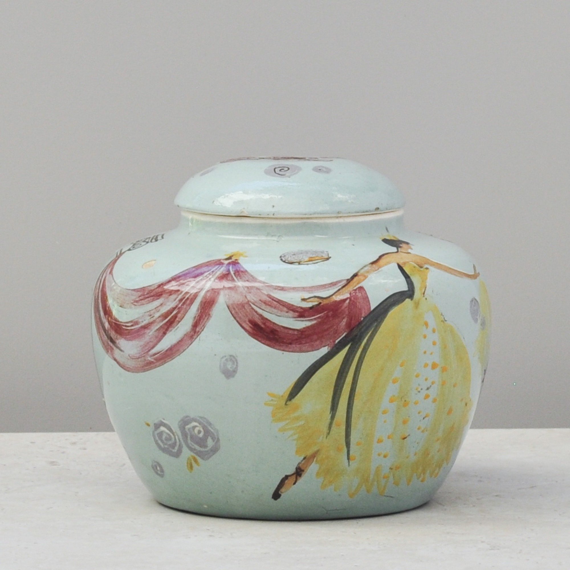
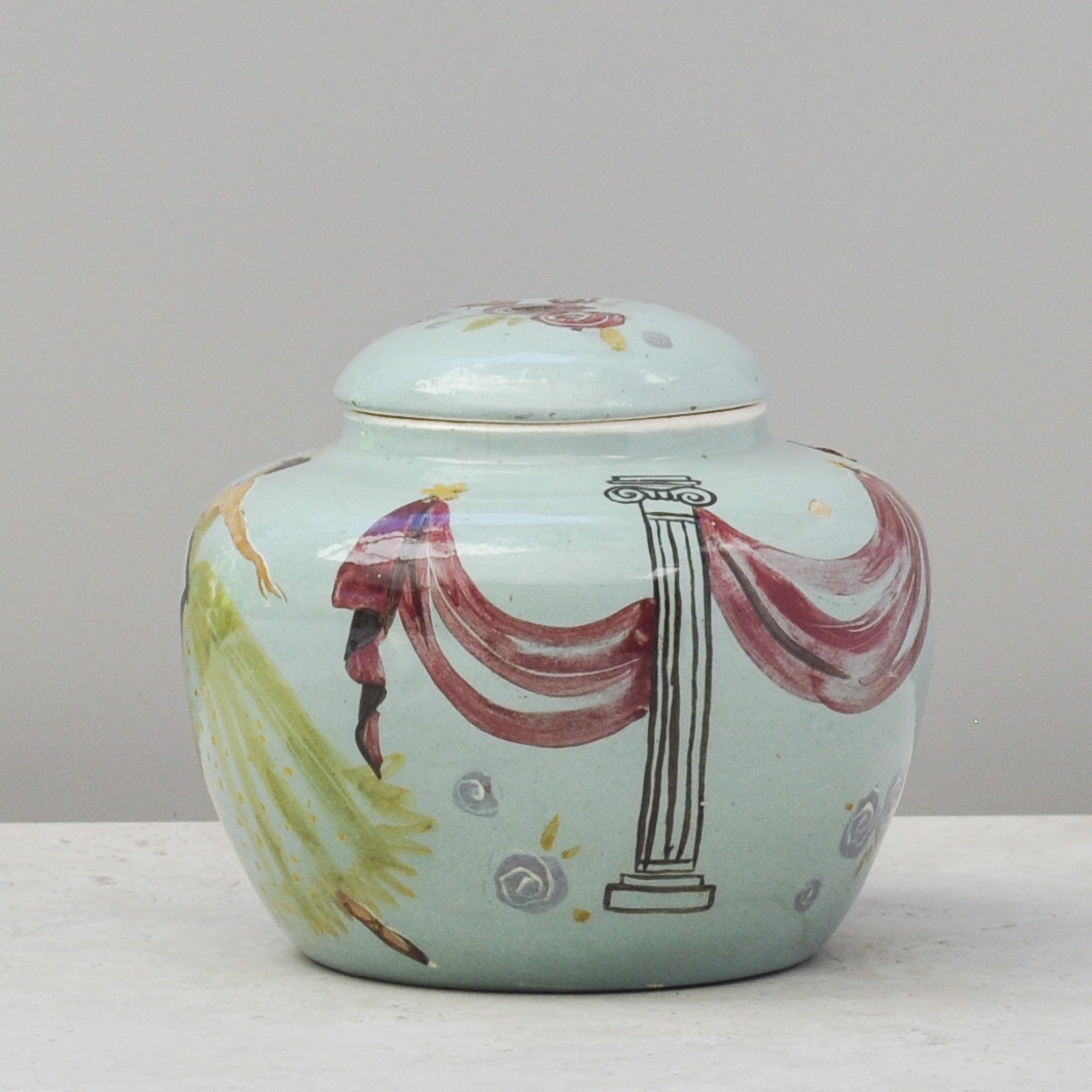
This was an unexpected “I have to have it” piece. When I first saw it I felt it and I knew it was special.
It’s a scene of free-spirited dancers painted in soft pastels of pinks and yellows. They have life, movement and a sense of wonder. You can sense the movement of their fabric and the breeze that surrounds them.
Signed and dated 1949, it is a piece by the famous Australian potter Martin Boyd, created during the early years of his studio practice. The Boyd family were a remarkable artistic family, with Martin no exception.
The other unique element to this piece is that it is a lidded jar. In my research I have seen plates from the series, but nothing as rounded and softly formed as this.
This is Australian art history in its finest form.
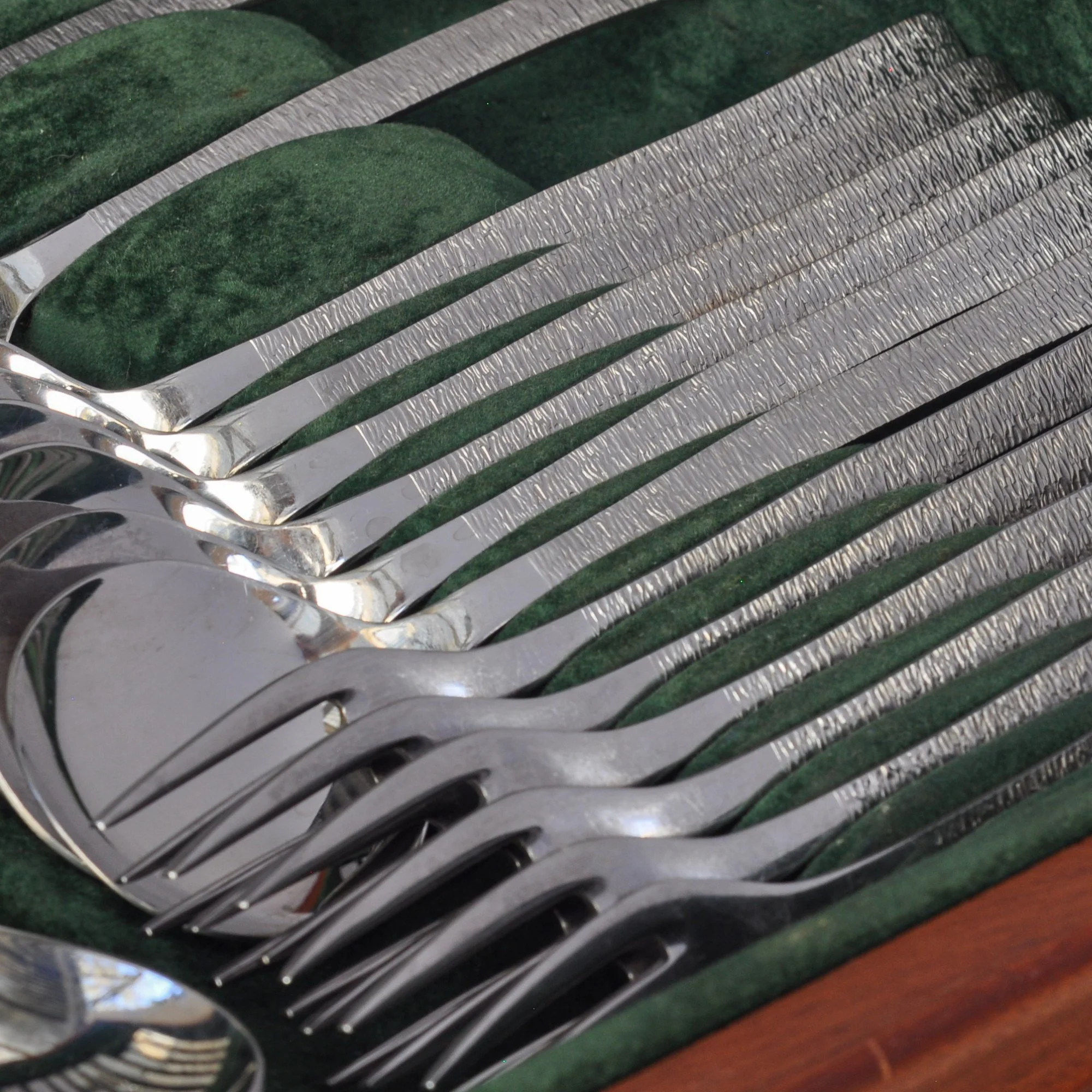
I was introduced to this set by a friend and colleague, a mid-century expert who is a true source of knowledge. We admired it, considered it and sighed when it appeared to be sold.
Then it came back. This time there was no hesitation. That never happens.
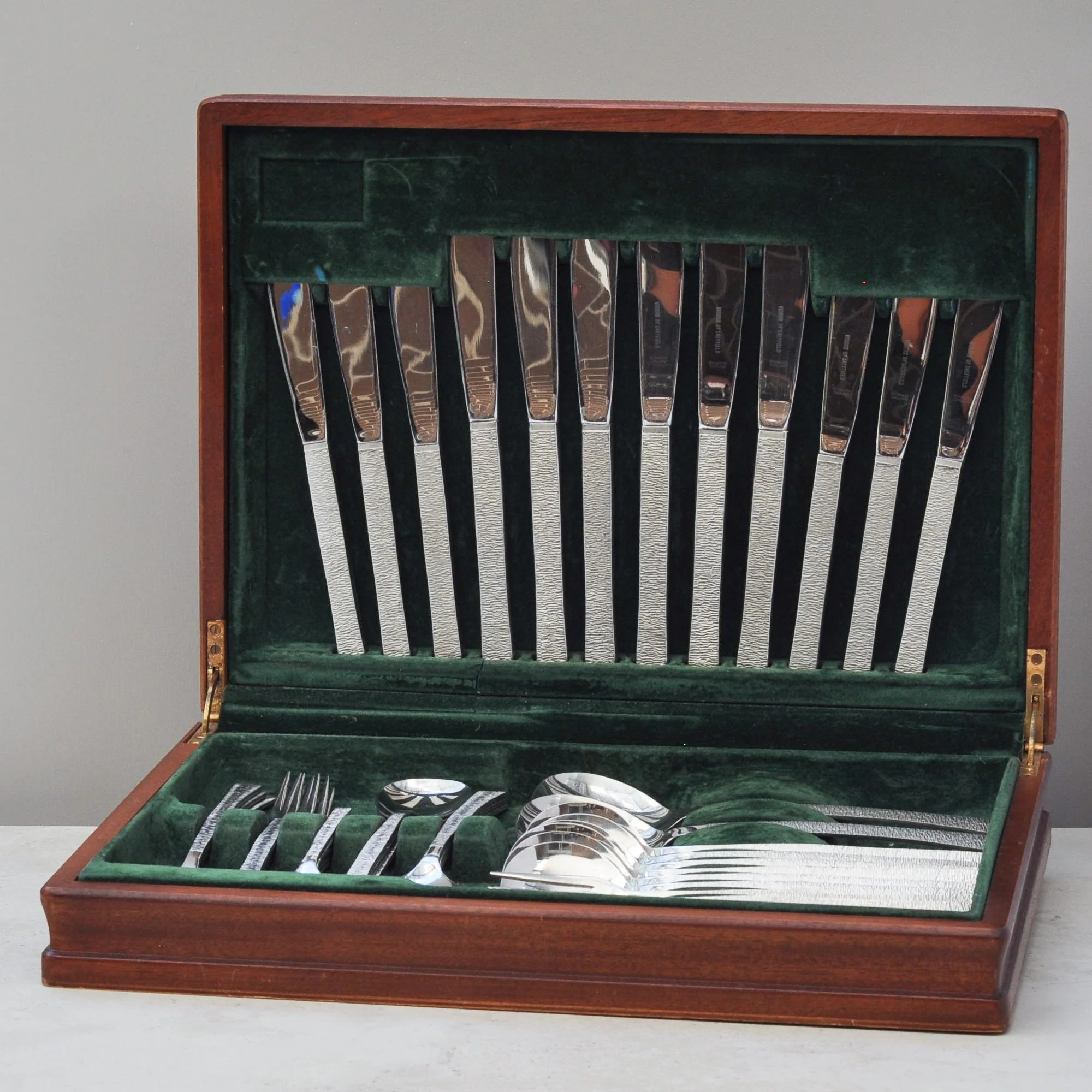
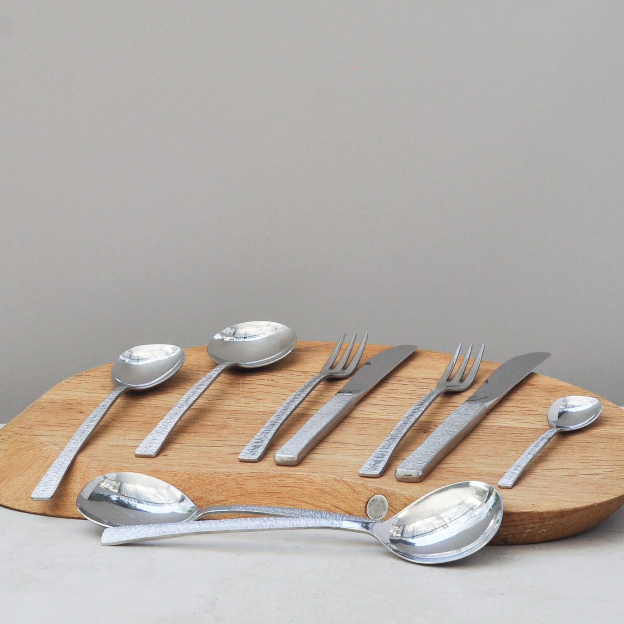
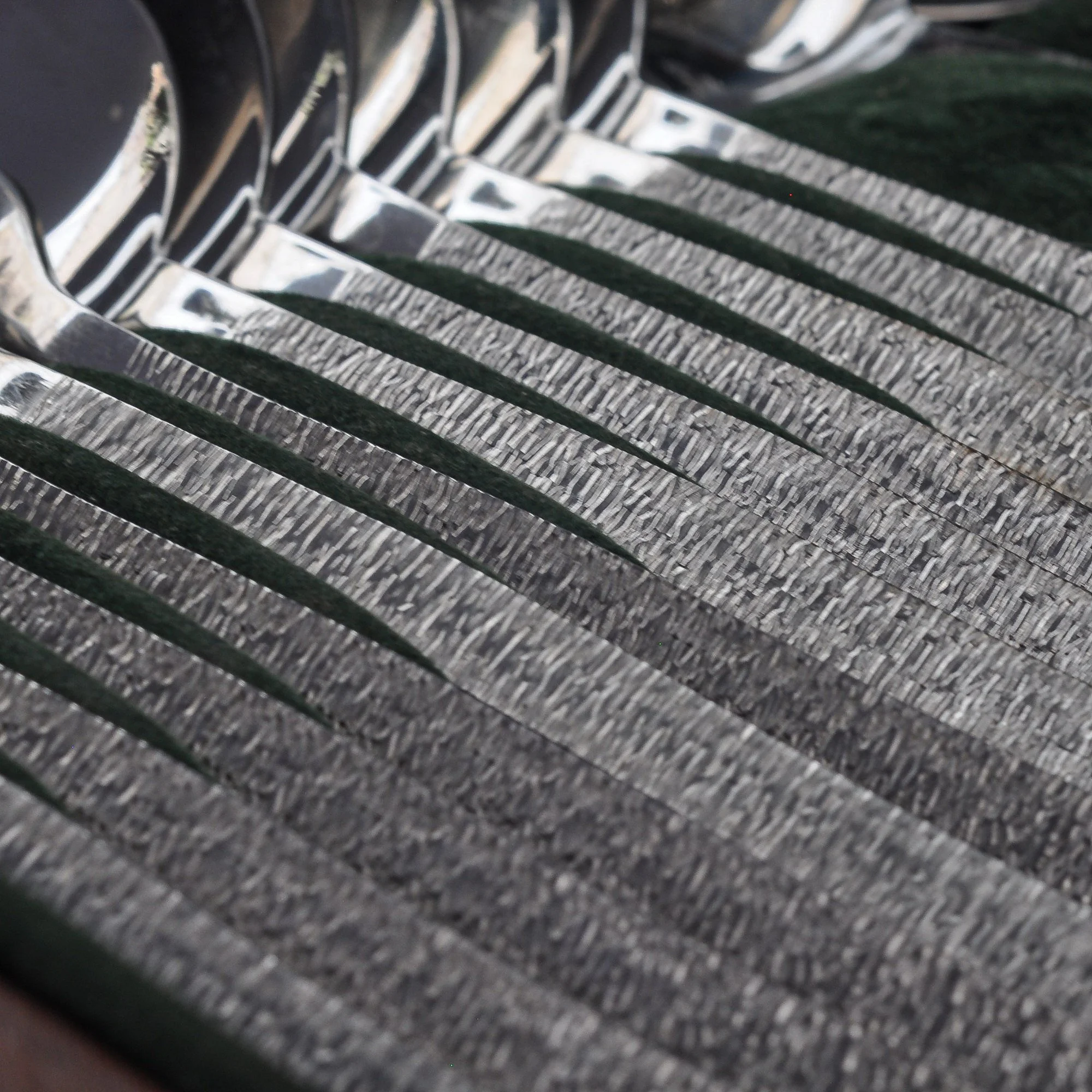
It is a striking 44-piece cutlery set is from the Viners Studio range, designed in the 1960s by renowned British silversmith Gerald Benney.
The distinctive bark-textured handles give it a strong mid-century presence – tactile, design-led and beautiful. Made in Sheffield from stainless steel and presented in its original wooden box with deep green lining.
This set really does wow.
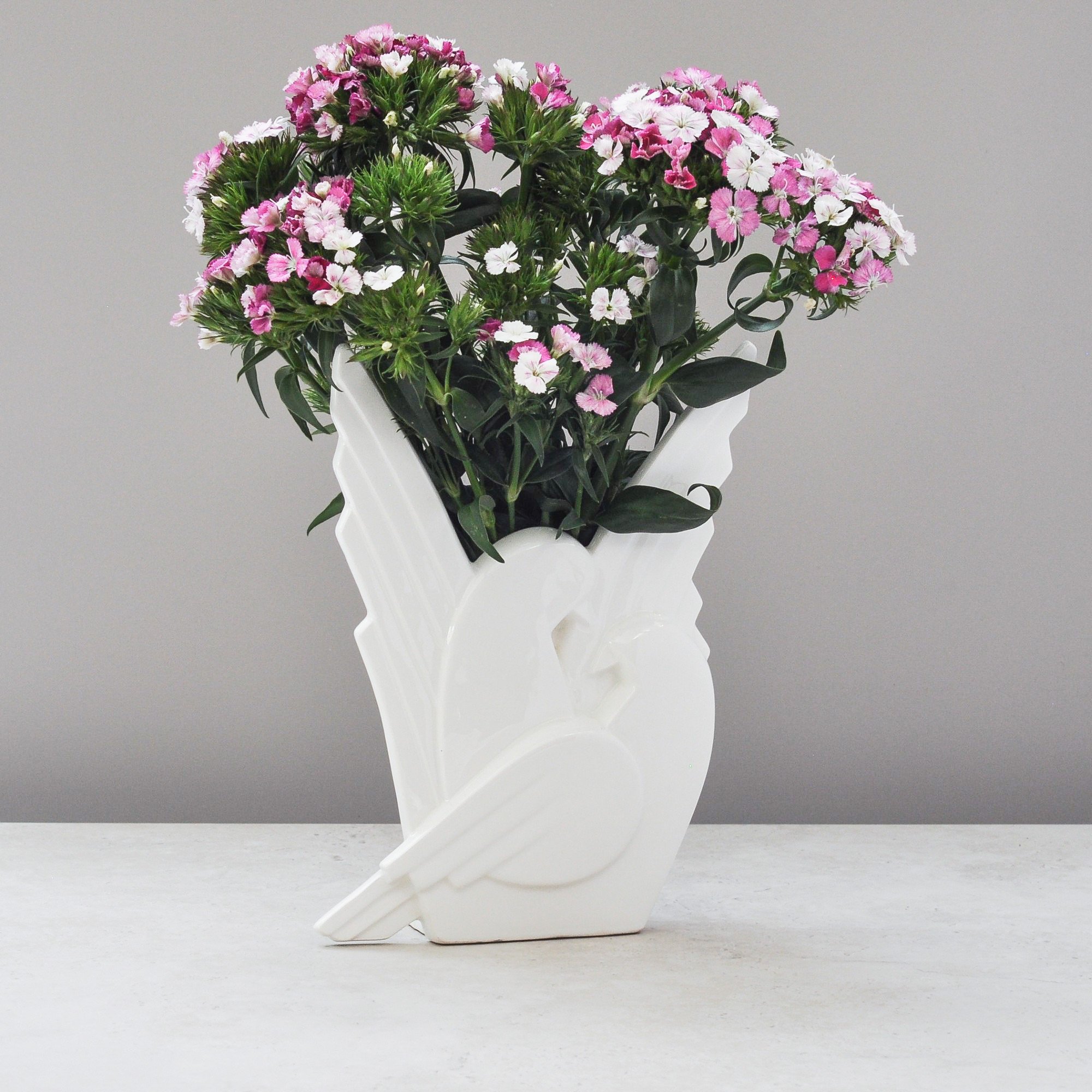
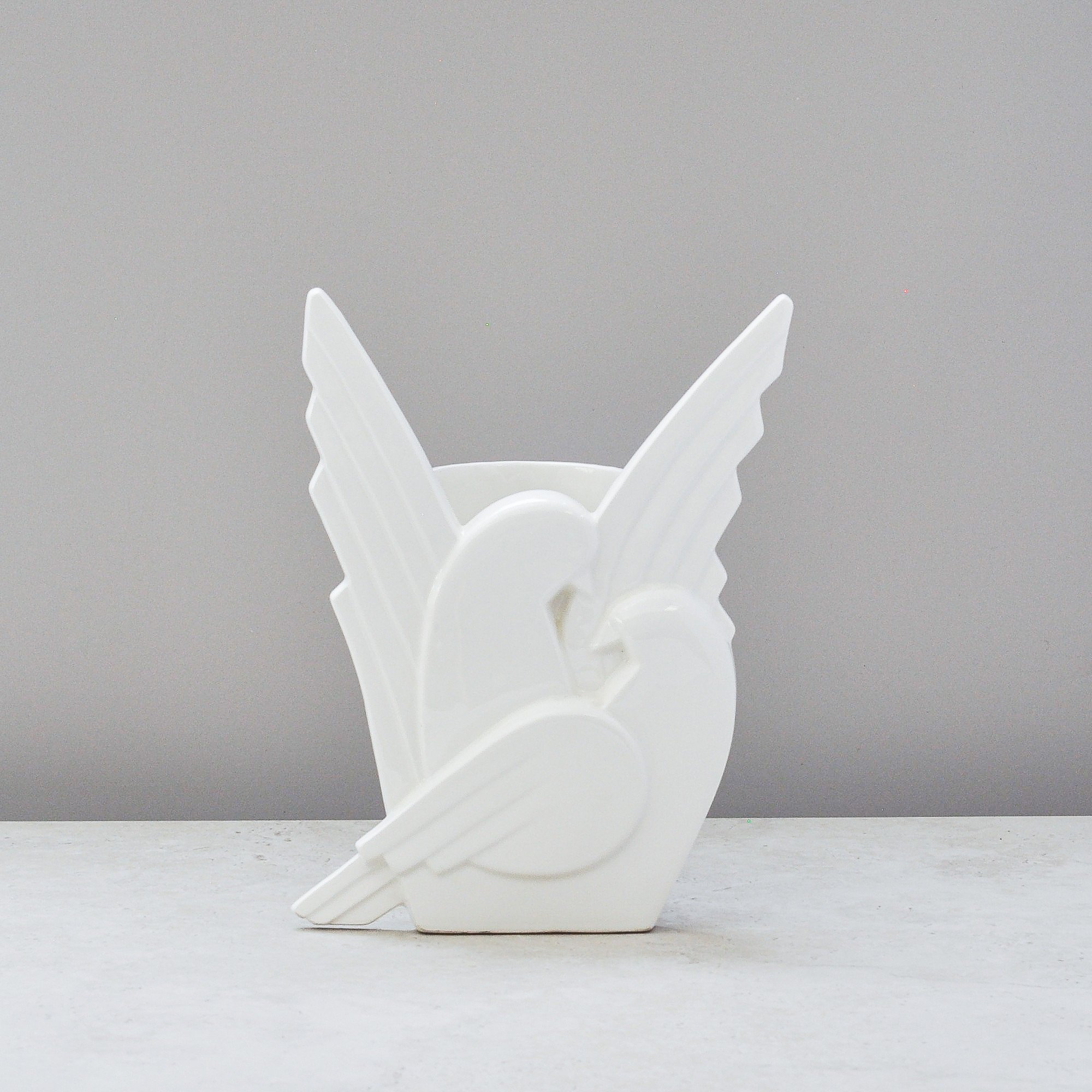
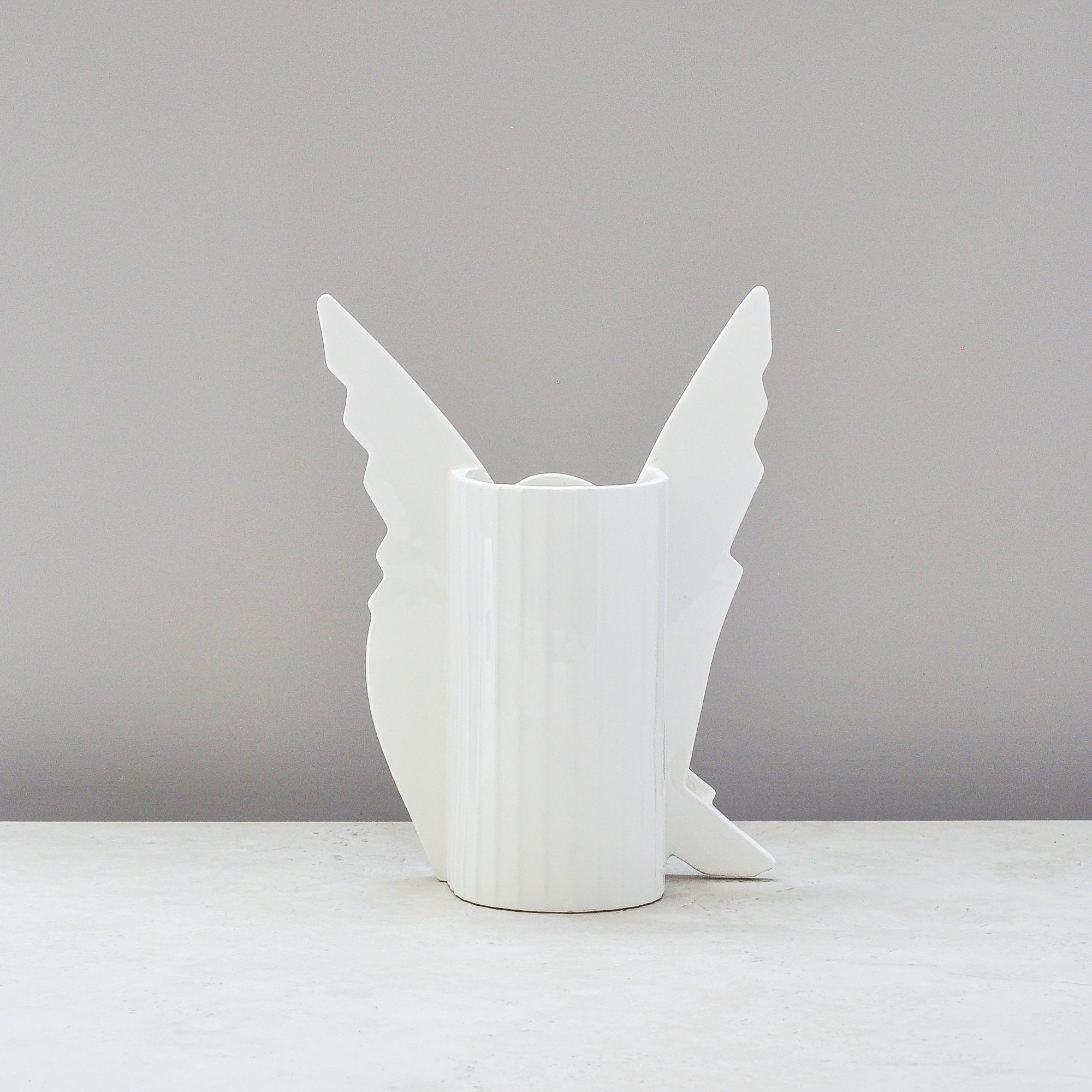
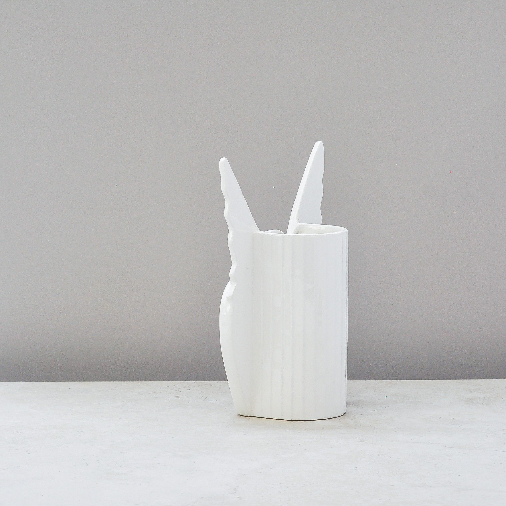
This vase is special and one I am delighted to welcome into The Collection. It has all the style of the Art Deco era, the quality of high grade porcelain and a prestigious brand name to support it. It is, quite simply, a stunner.
From the American company Fitz and Floyd, a brand celebrated for its aesthetic, elegance and whimsical charm (no wonder I love it), the label confirms it was made in Japan, likely in the 1970s or early 1980s as part of their Skylark Dove series.
I know this piece will fly away quickly, it’s a beauty. Here’s hoping it flys to you!
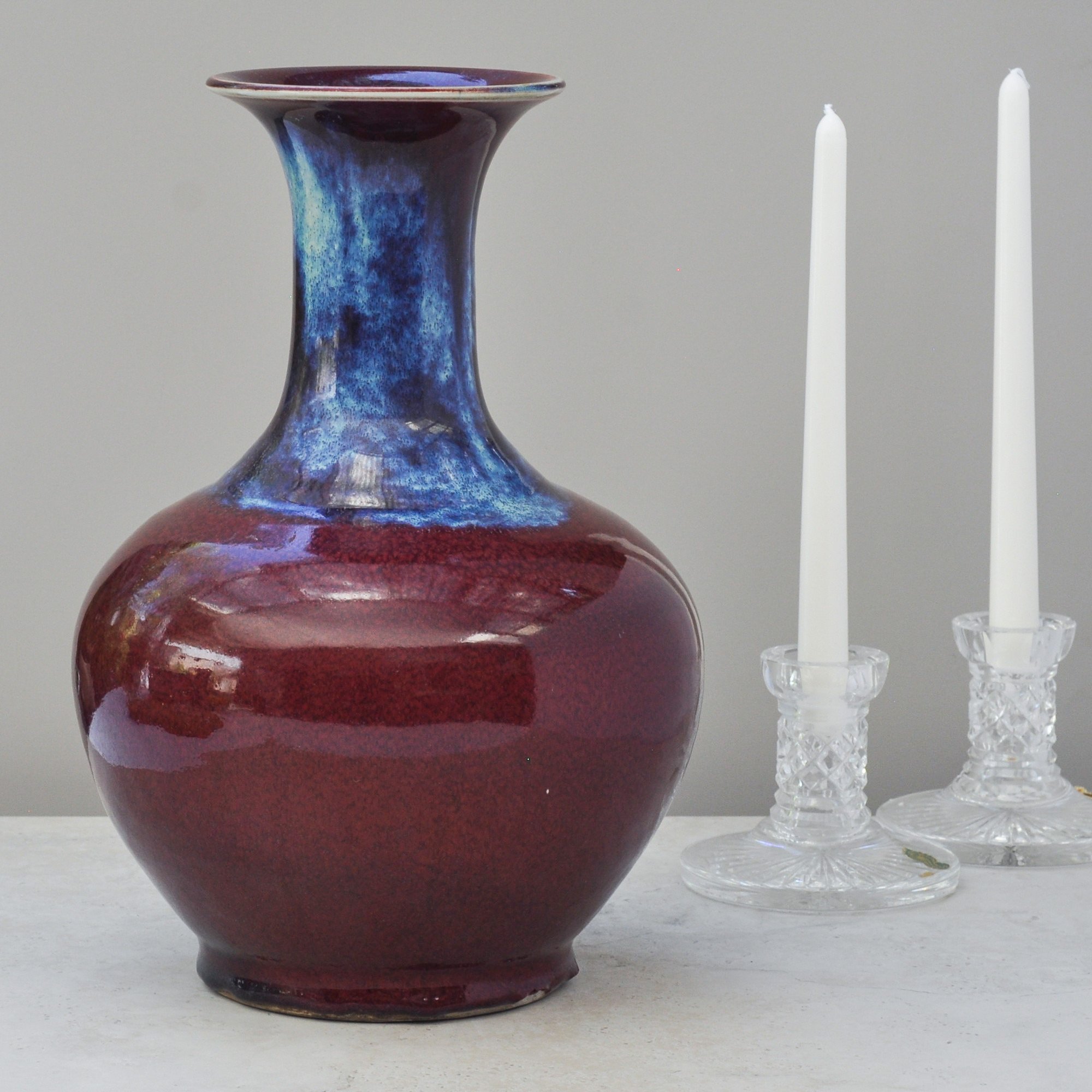
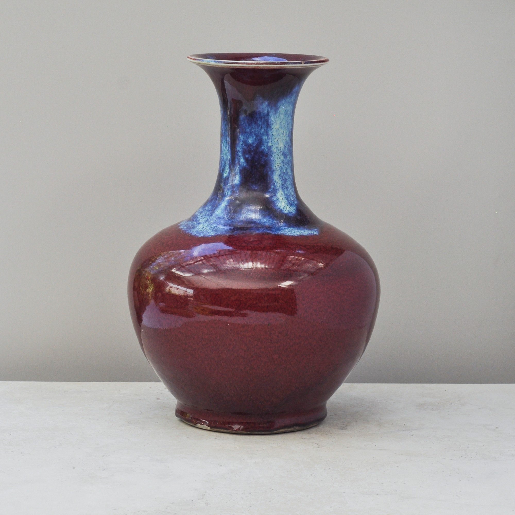
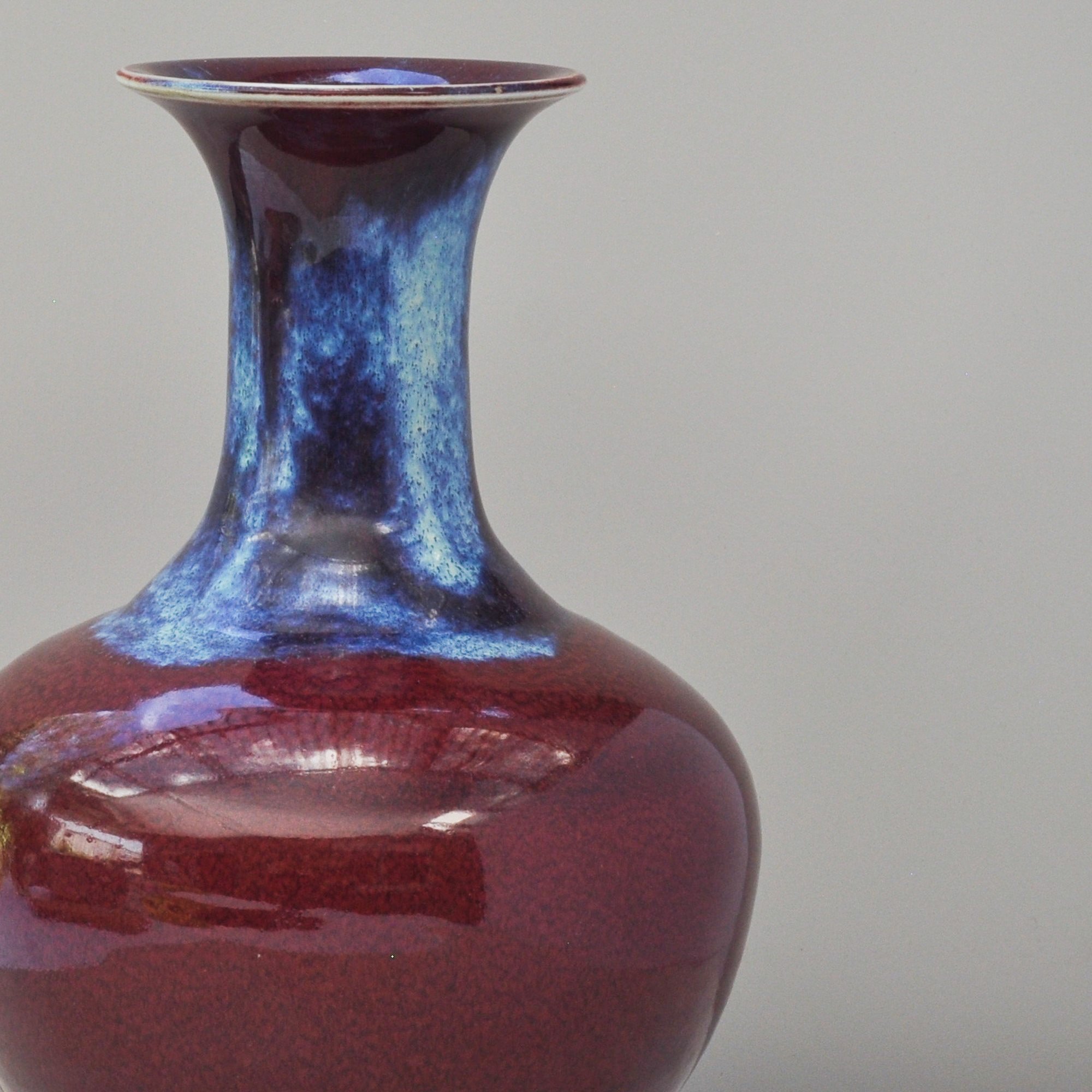
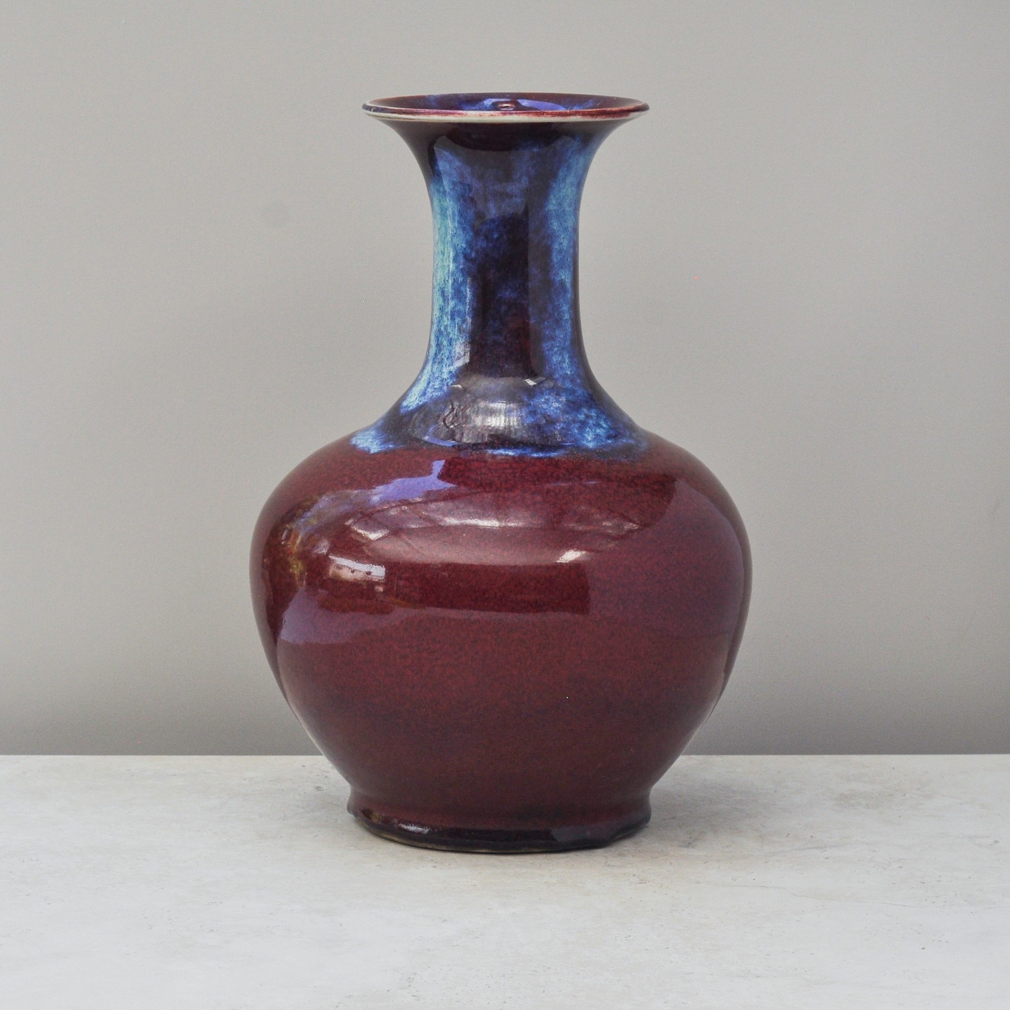
There is nothing timid about this large Chinese porcelain vase. It features the beautiful and vivid sang-de-boeuf (oxblood) flambé glaze, where rich blues and soft purples around the neck flow into deep red tones across the body.
This vibrant glaze is created using copper oxides and high-temperature kiln firing in a carefully controlled atmosphere. The colours develop and move naturally during the firing process, meaning no two pieces ever the same. It is this unpredictability that gives sang-de-boeuf ware its depth, variation and noteworthy appeal.
Substantial in both scale and weight, this piece stands 34cm high and has a reassuring solidity that reflects its quality and presence. What an incredible statement piece.
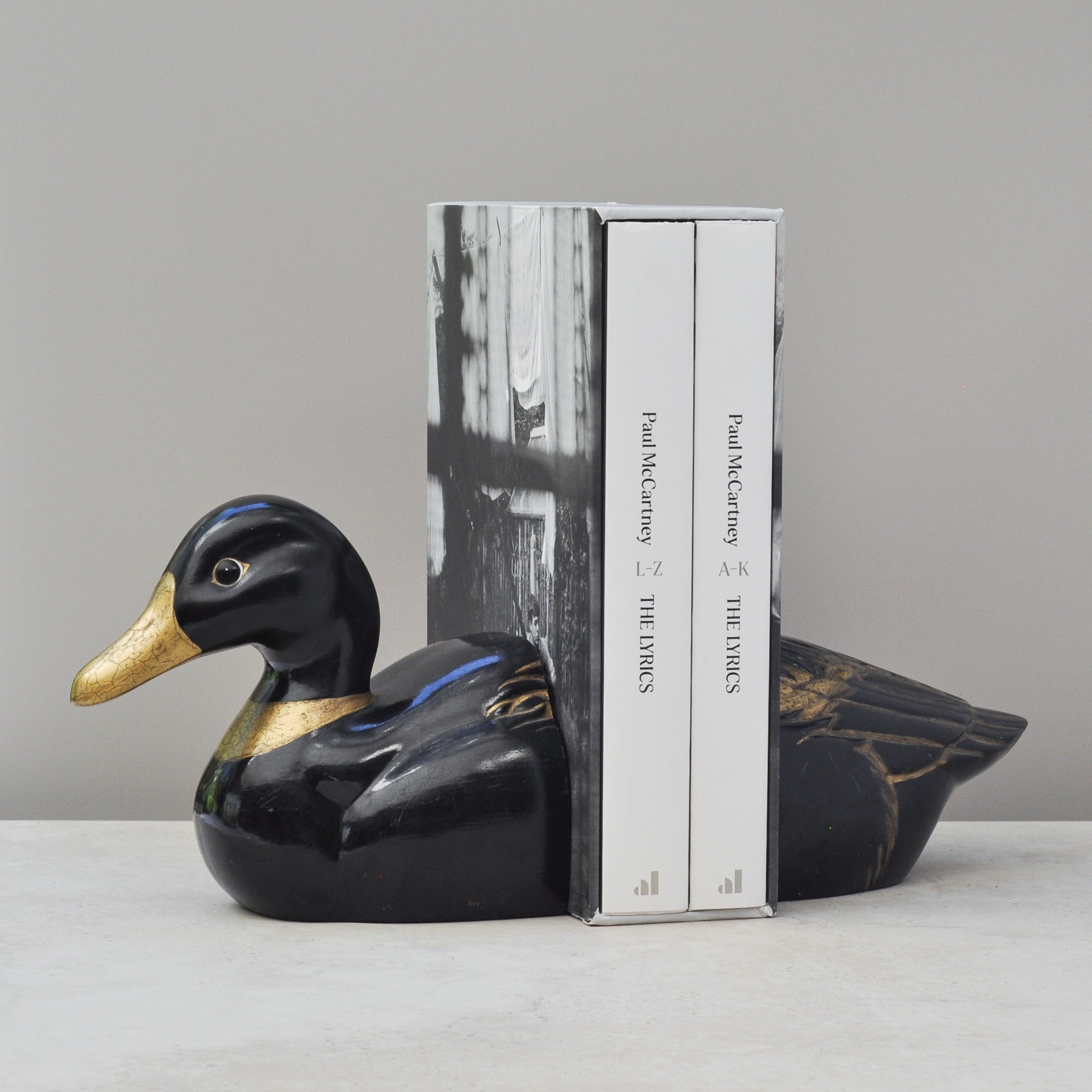
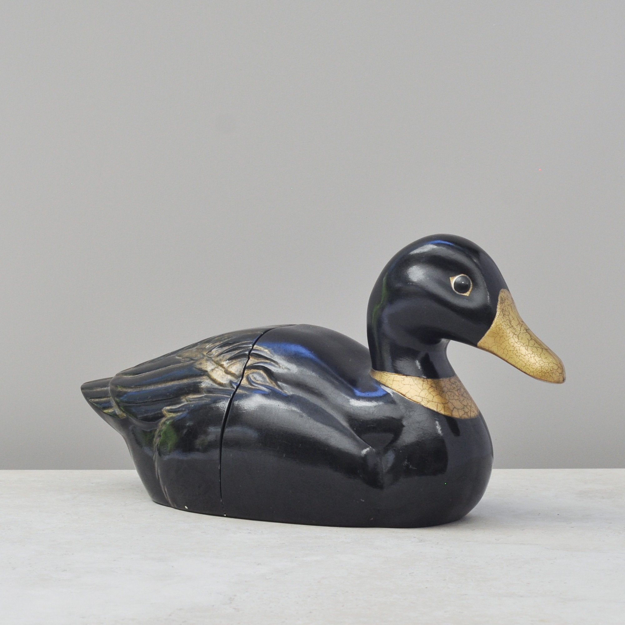
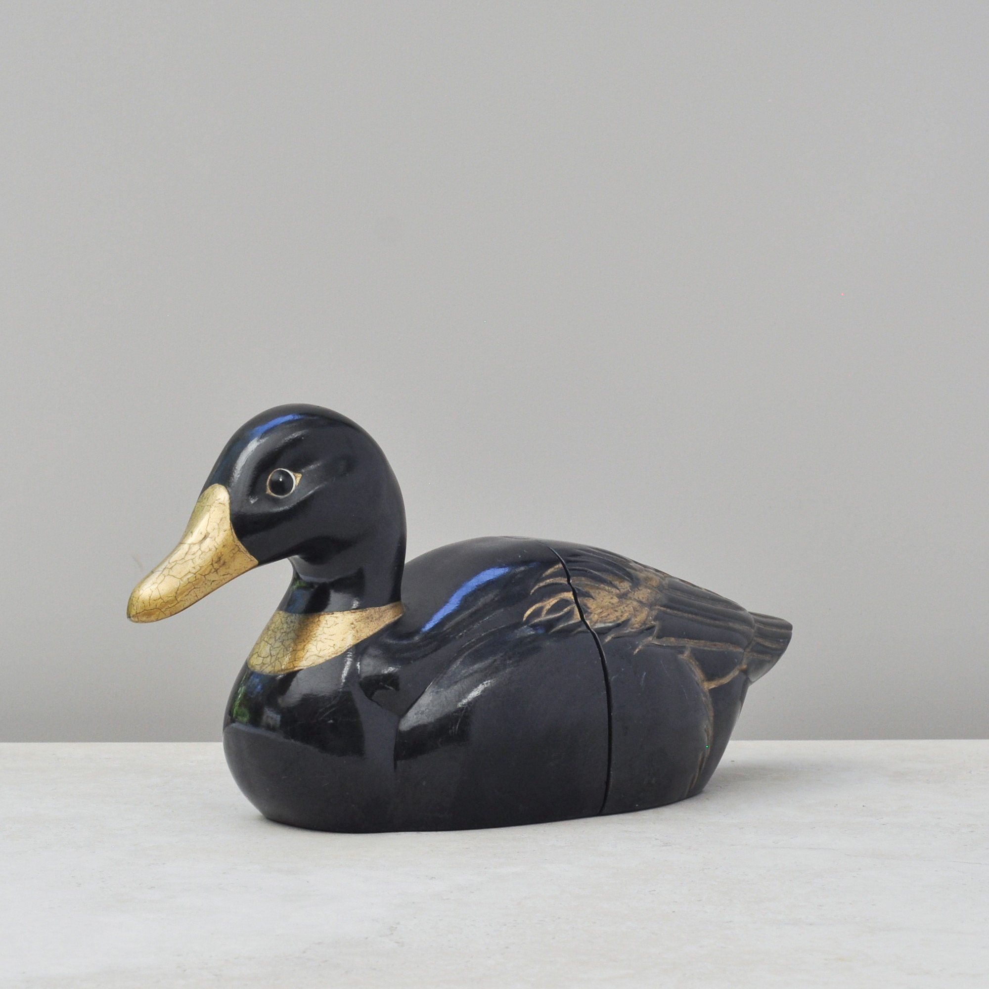
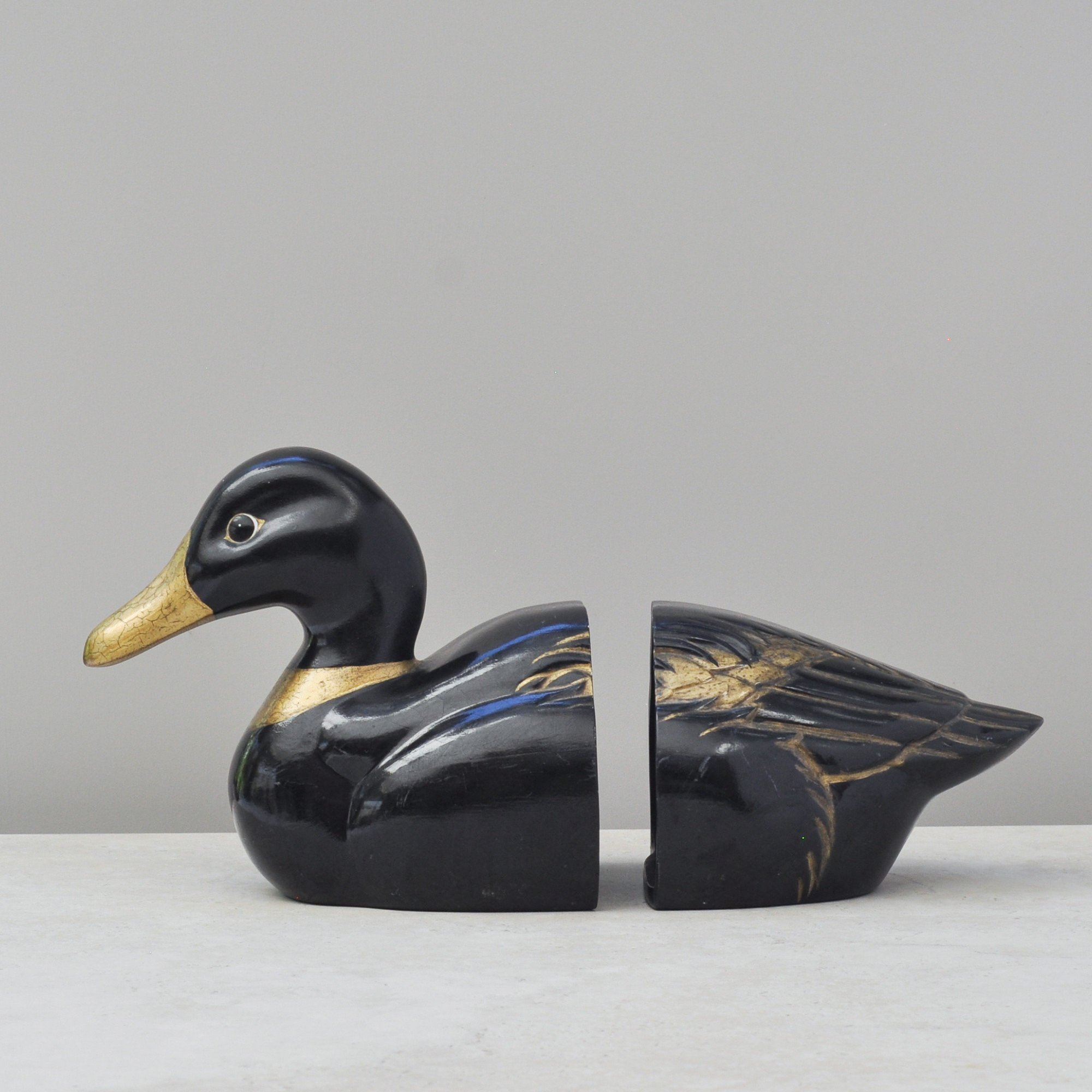
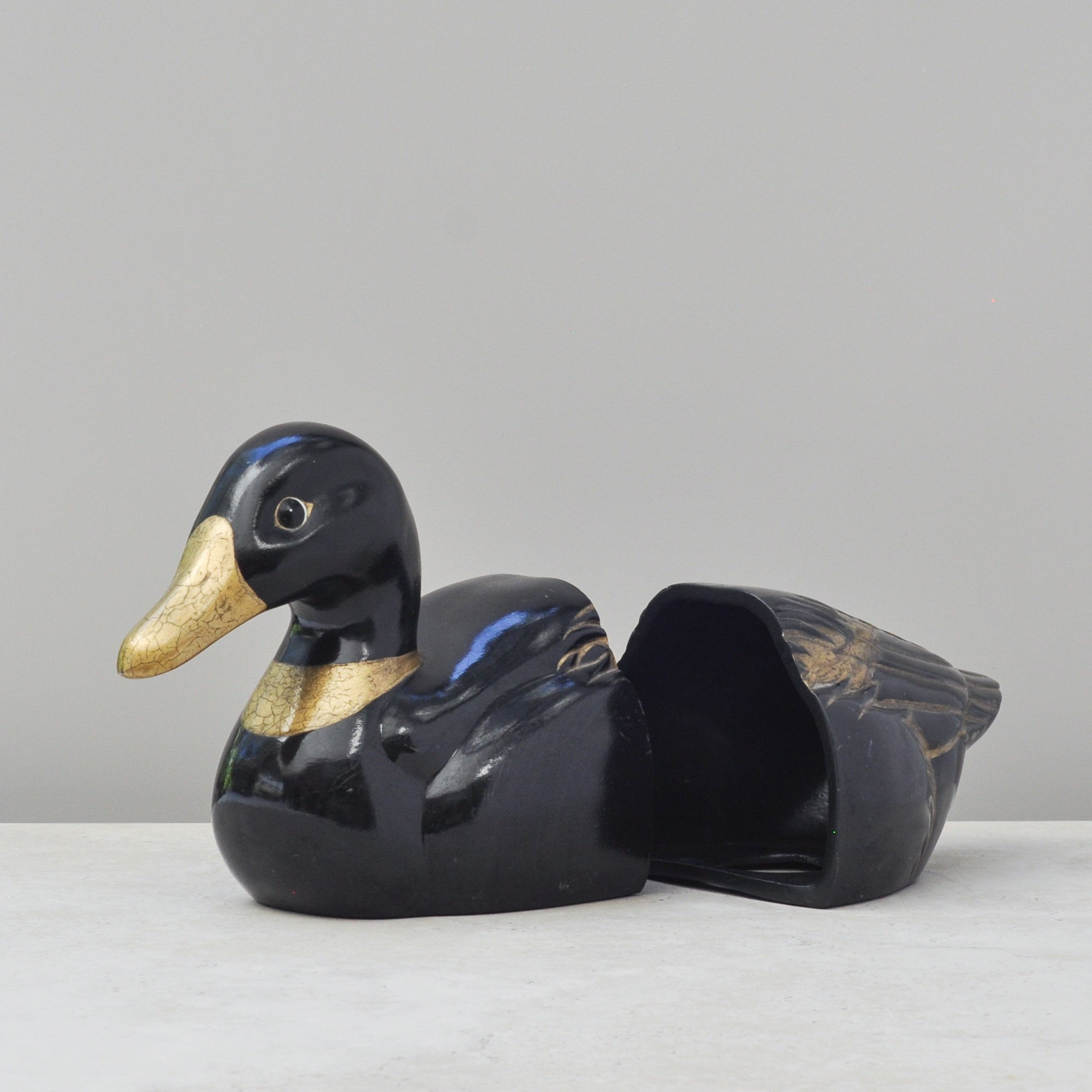
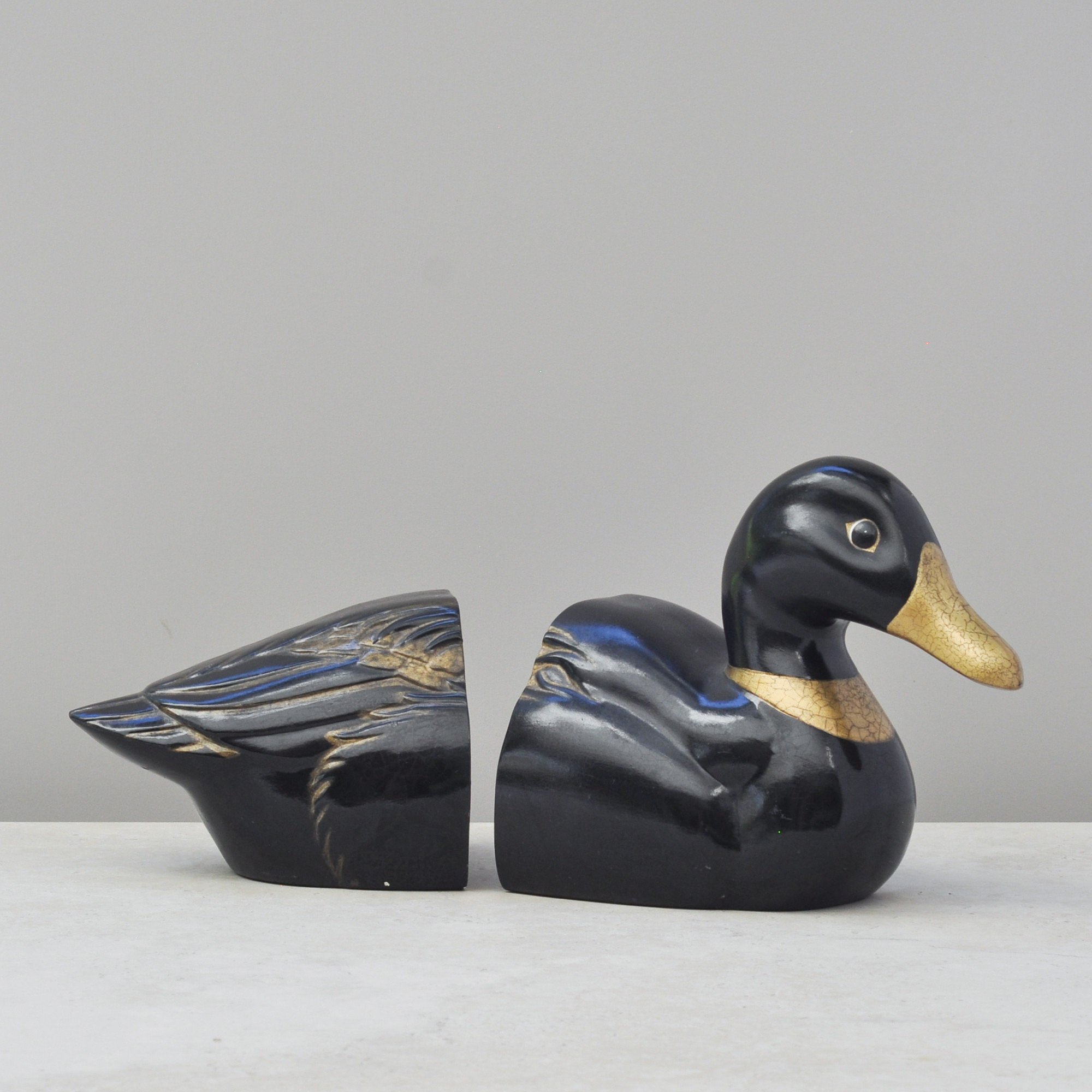
Who would think a duck could stop you in your tracks? Trust me, this one does. He’s handsome.
The striking black and gold finish on this ceramic duck bookend is both sculptural, with a strong, confident form and a rich deep glaze, and refined with just the right amount of gold highlights to define his look.
Solid and weighty, he works perfectly as a functional bookend but is equally as beautiful as a decorative object in his own right.
Handmade and signed to the base (Helena Austin, 1996) he is a distinctive and one-of-a-kind find for collectors of sculptural ceramics and, of course, lovers of ducks.
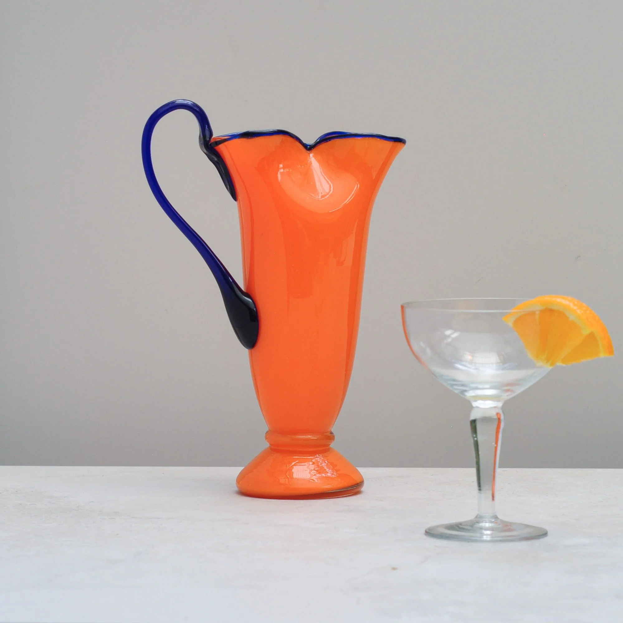
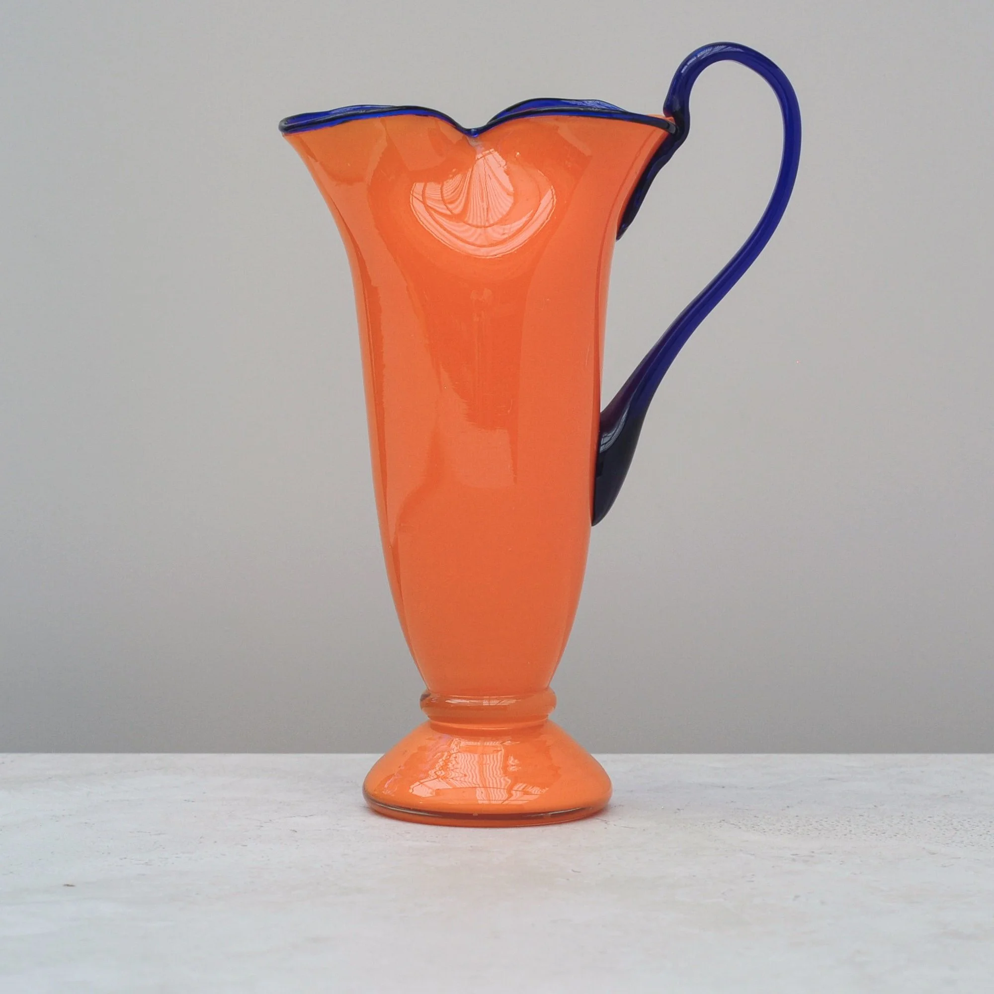
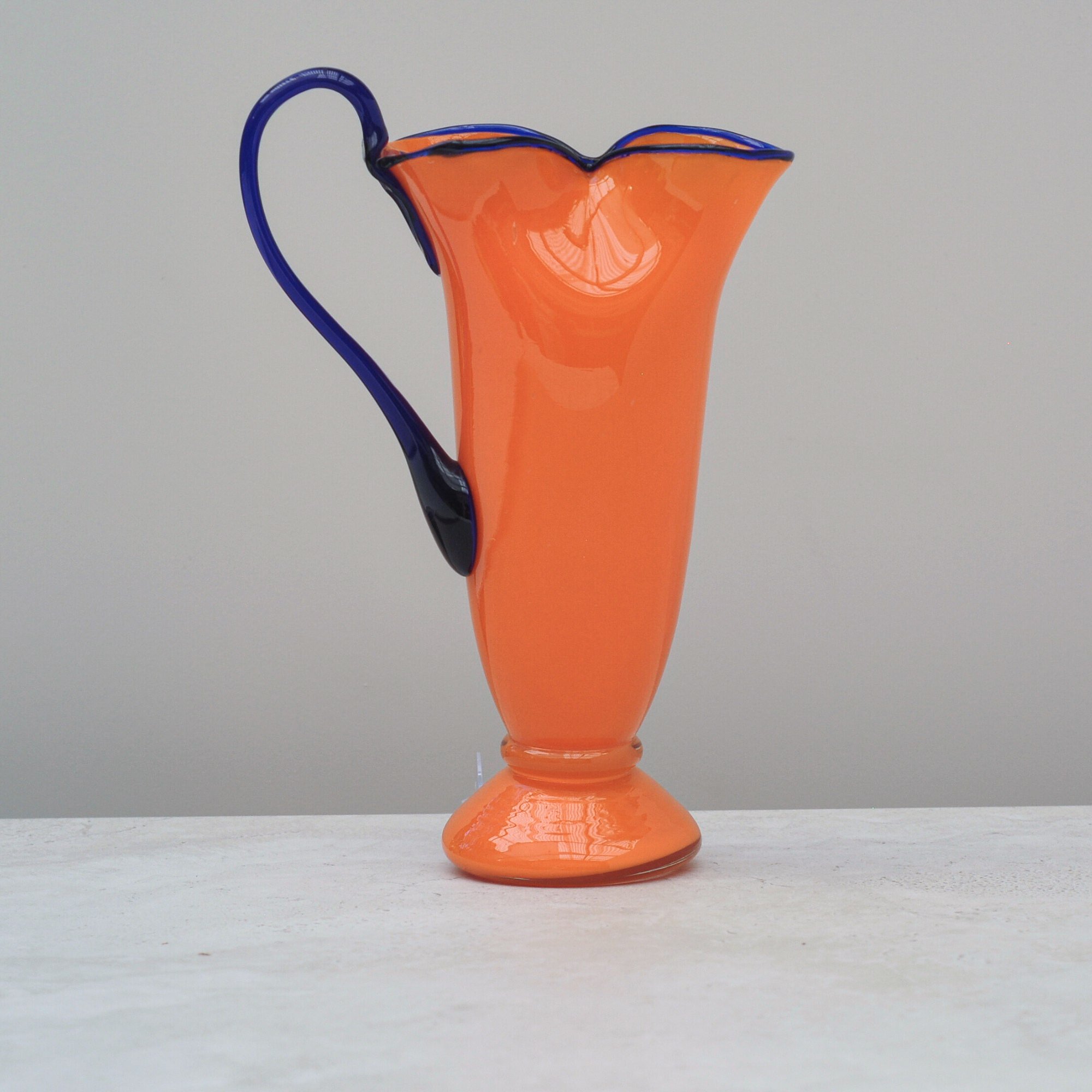
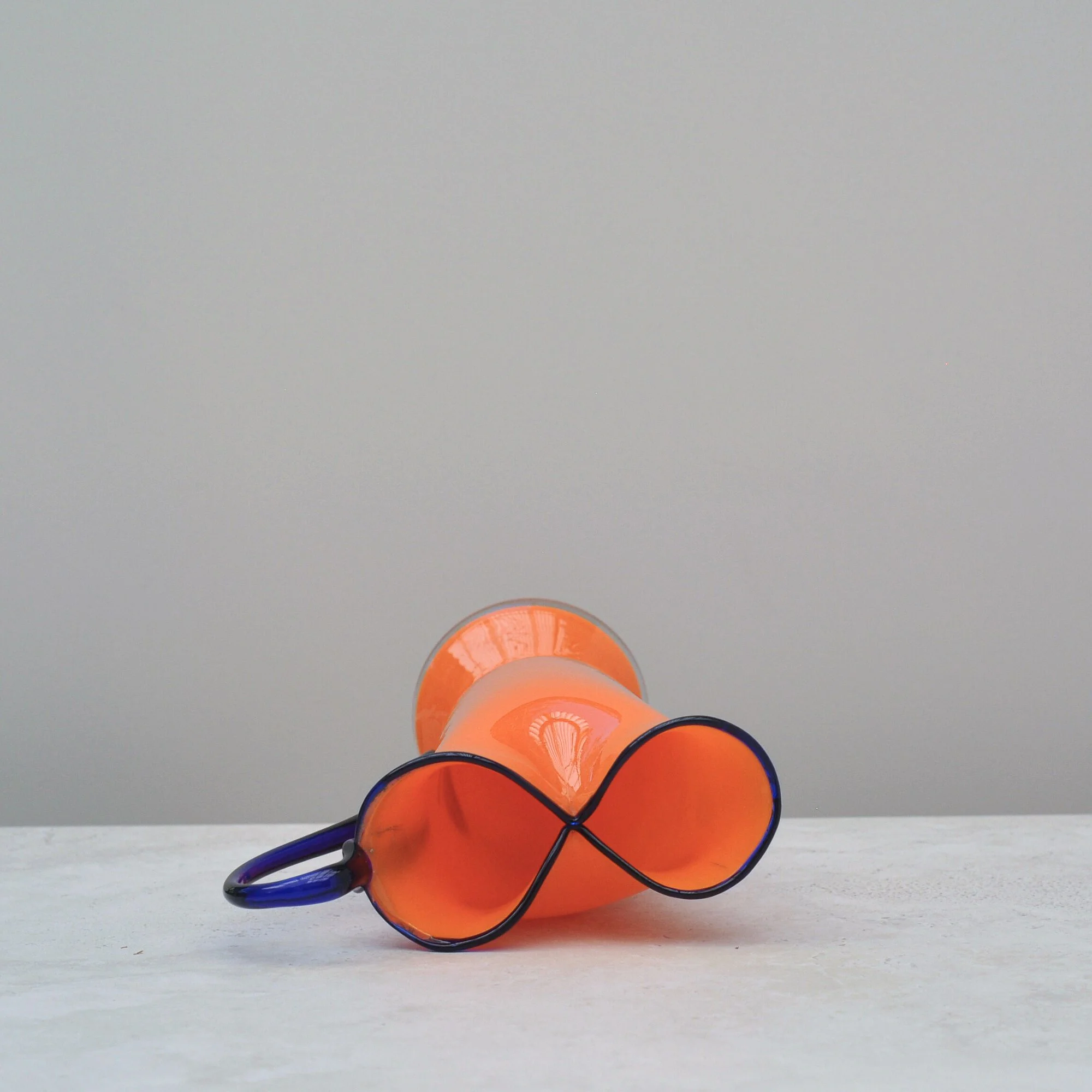
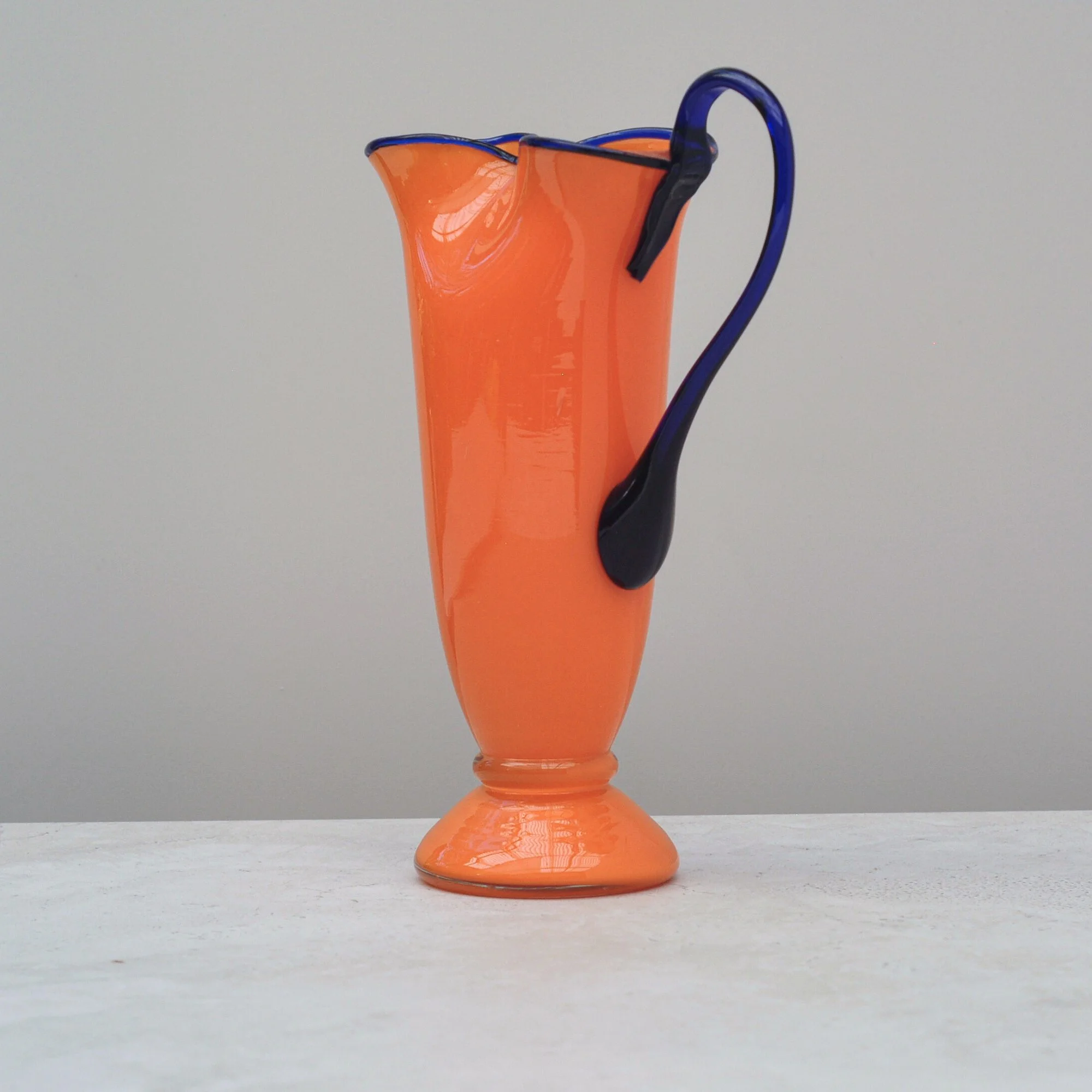
Talk about first impressions… the rich and vibrant orange and the deep cobalt blue of this hand blown glass jug (or ewer if you’re a little bit fancy) is totally breathtaking. She’s that glamourous woman who know how to make an entrance, delicate but confident, graceful but purposeful. She is that certain something.
Tango Glass is a style of brightly coloured Art Deco glassware made mainly in Bohemia (now the modern-day Czech Republic) during the 1910s - 1930s, it’s most iconic colours being the orange and blue of this fine piece. Made famous by makers like Loetz and Kralik, this jug remains elusive, she’s not marked or stamped, but she is of her day. I know you’ll be as intrigued as I was when I saw her. She is truly something to be enjoyed.
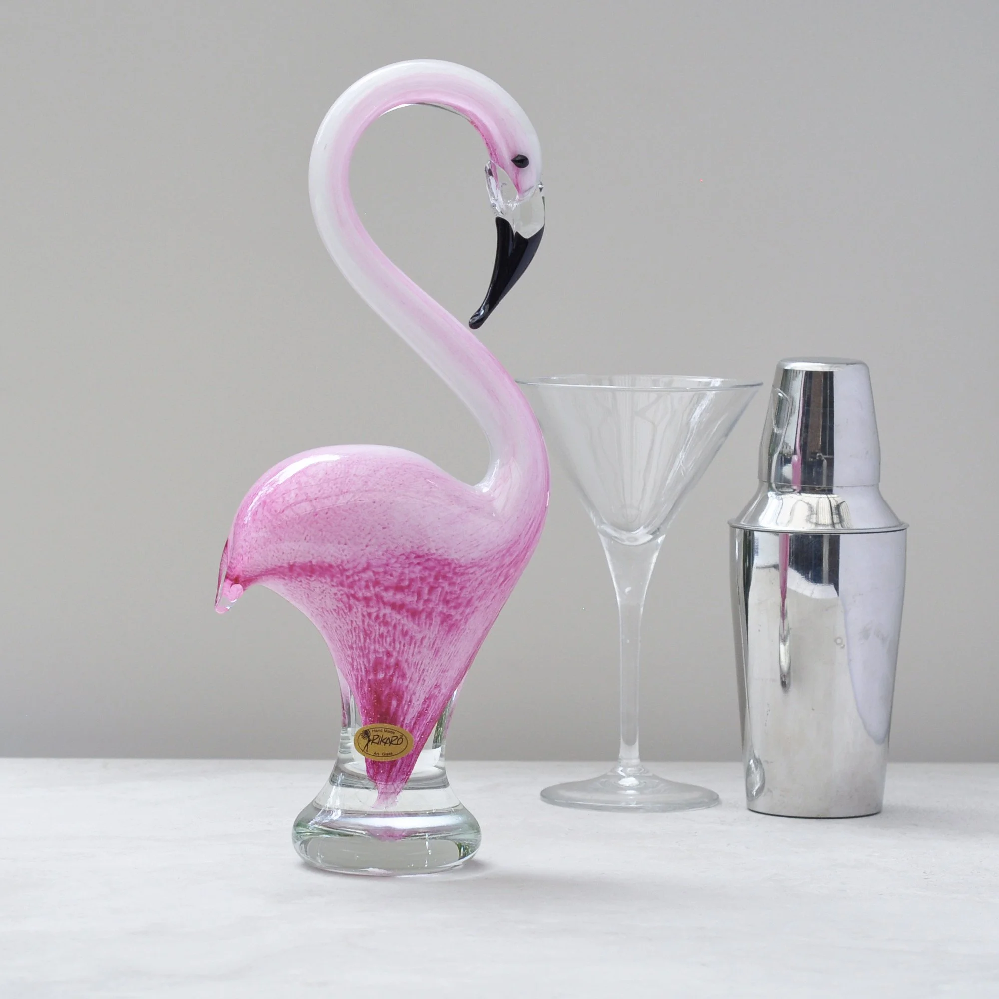
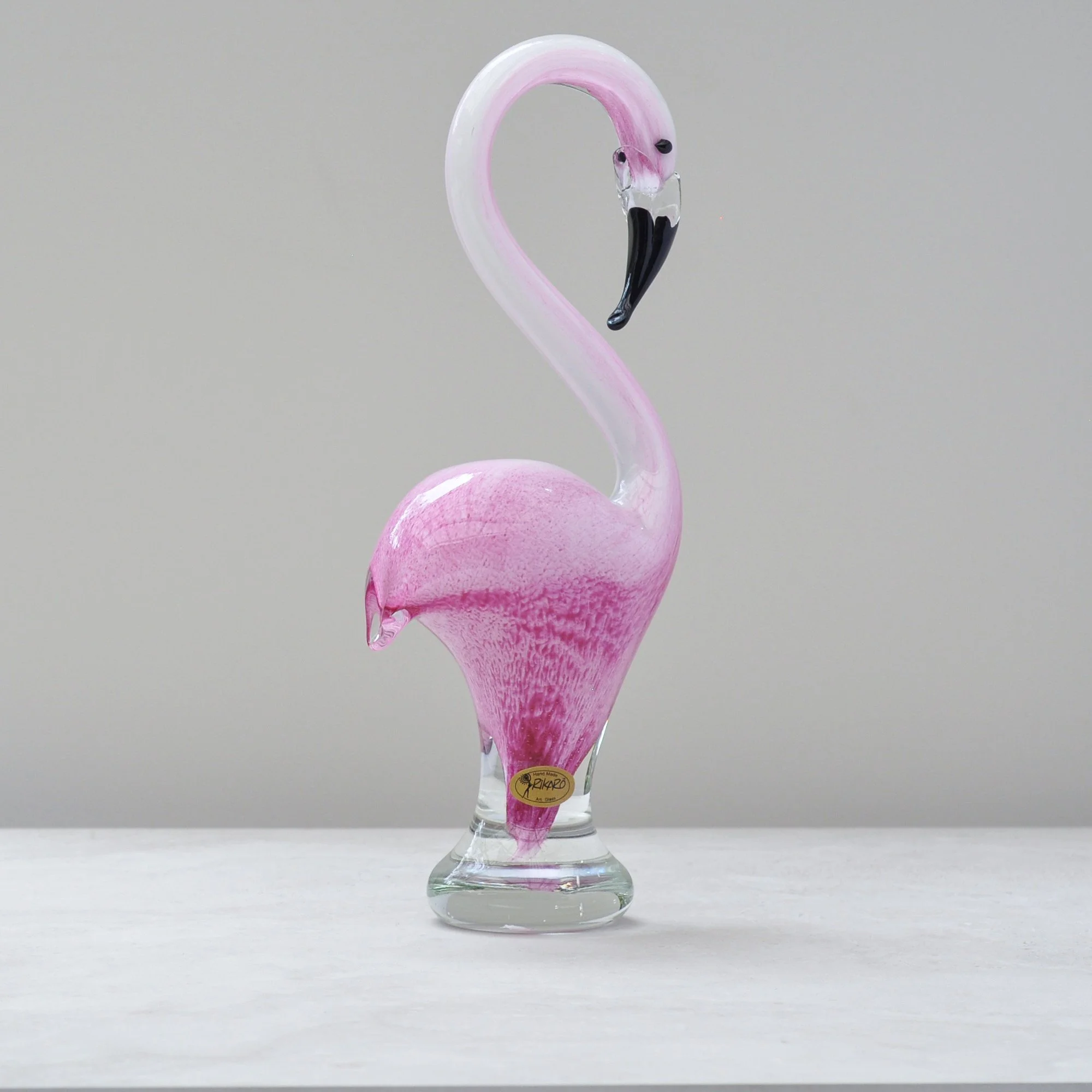
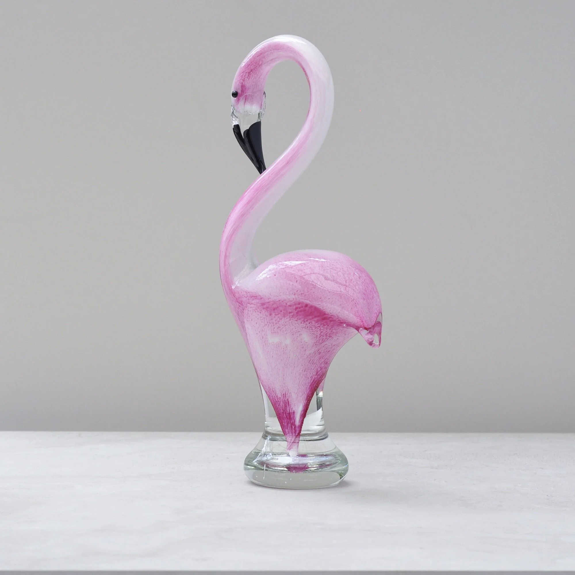
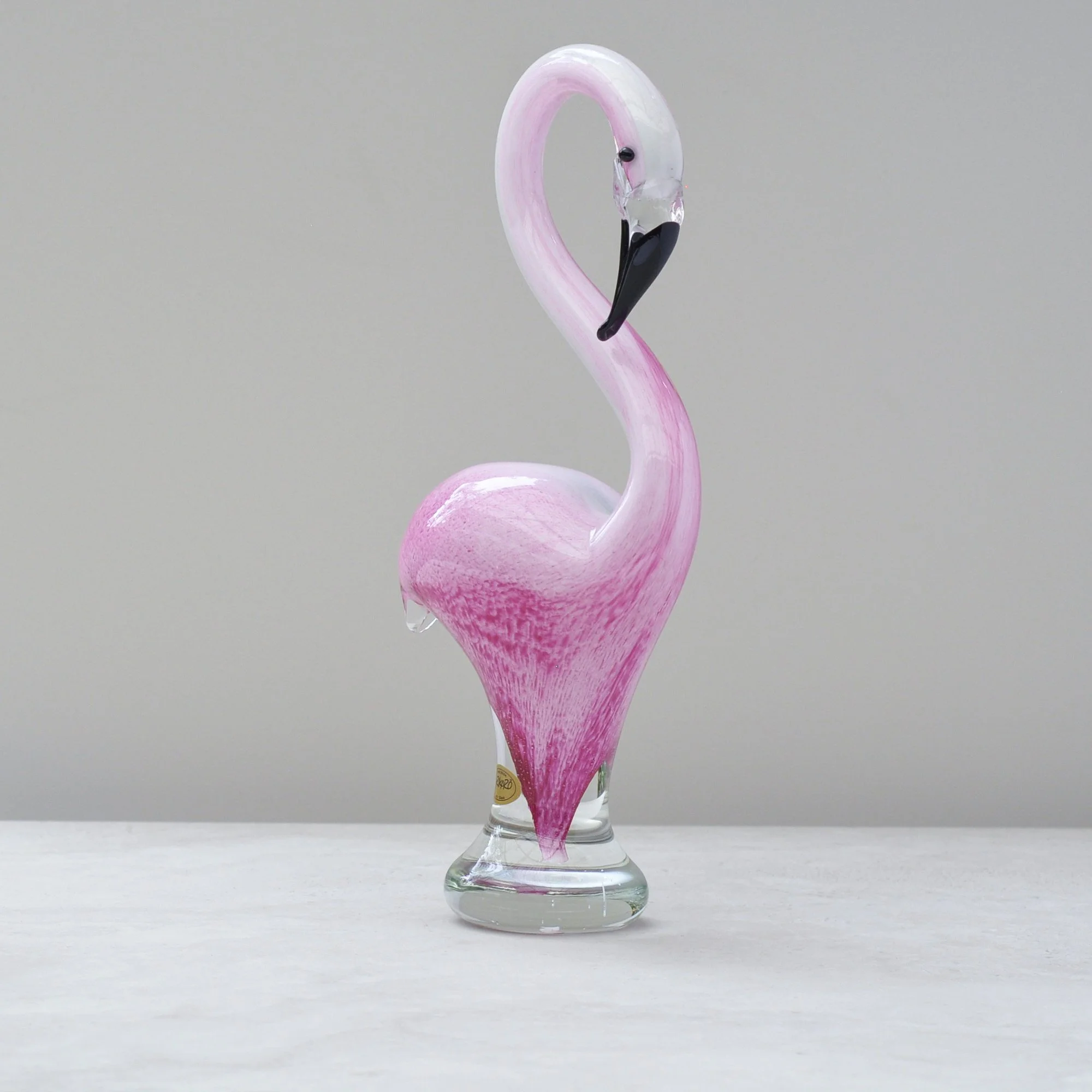
I have a great friend who once told me he loves flamingos. Ever since, every time I see one I think of him, so there was no hesitation in bringing this character filled, brilliantly pink and simply delightful flamingo into The Collection.
It’s tall, standing at nearly 30 cms, which gives it a great eye catching presence, you won’t miss it. It is also a great example of how the magic of hand blown art glass can bring a sense of fun into any space.
Can you feel its energy? Pink fabulousness!
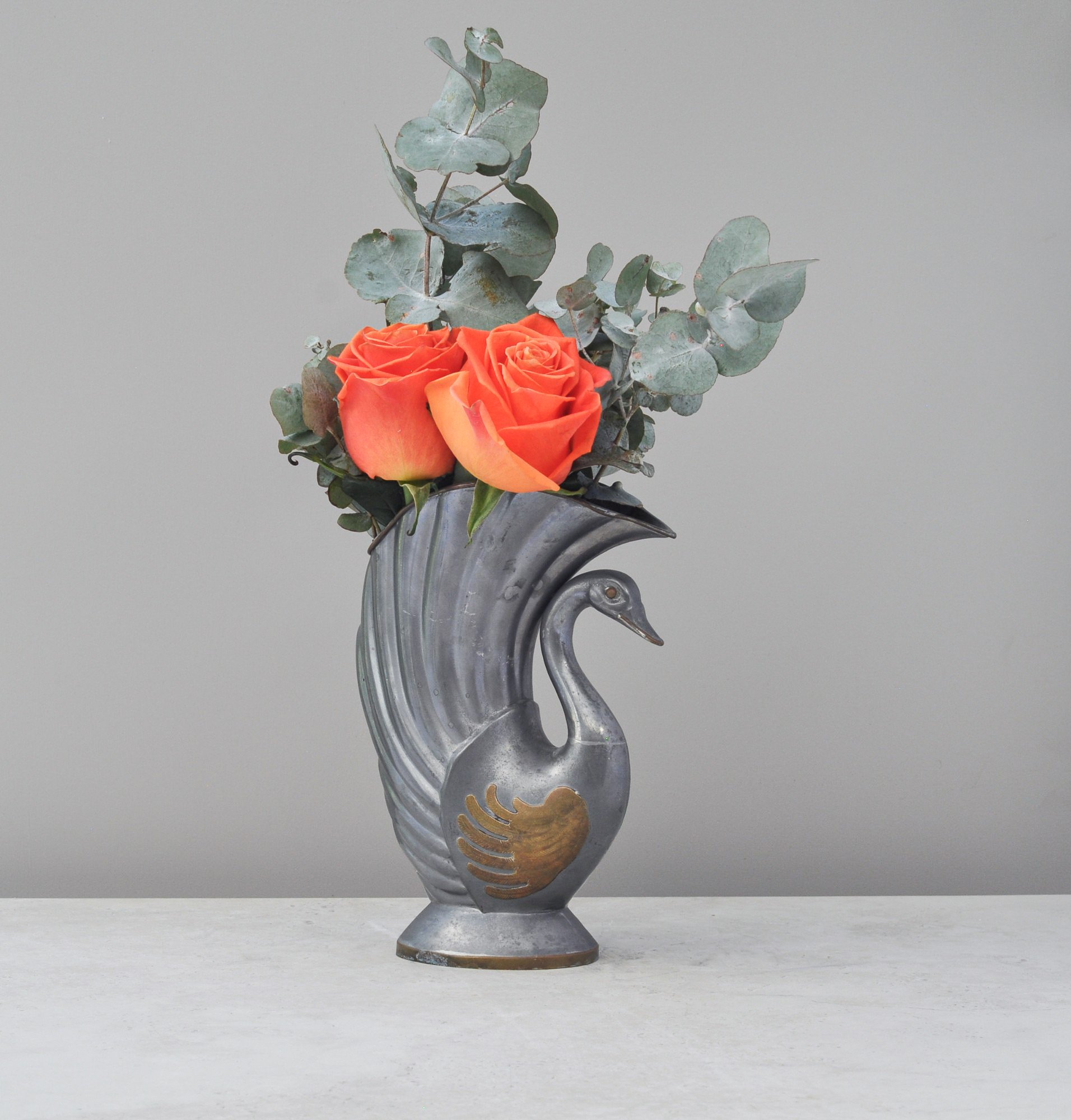
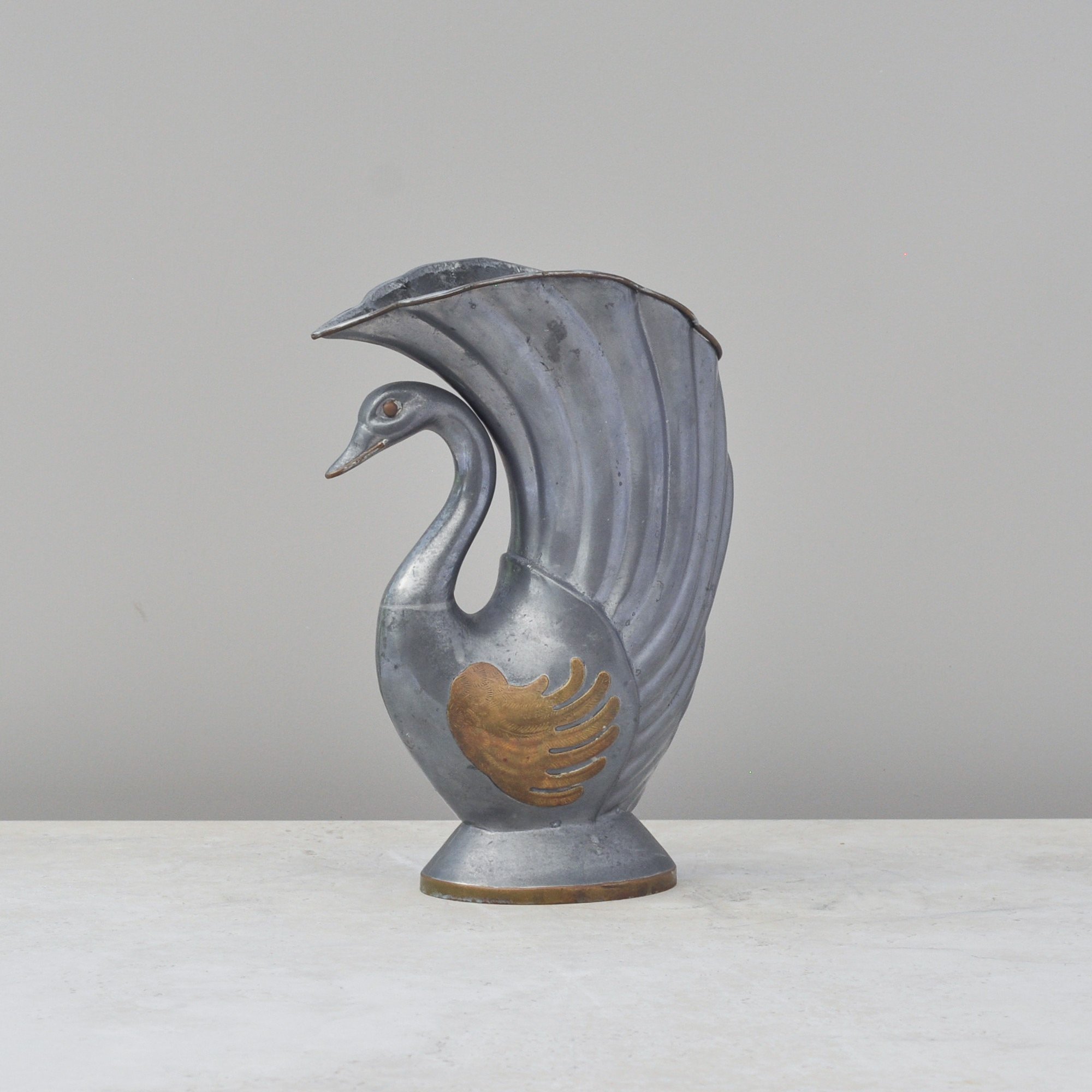
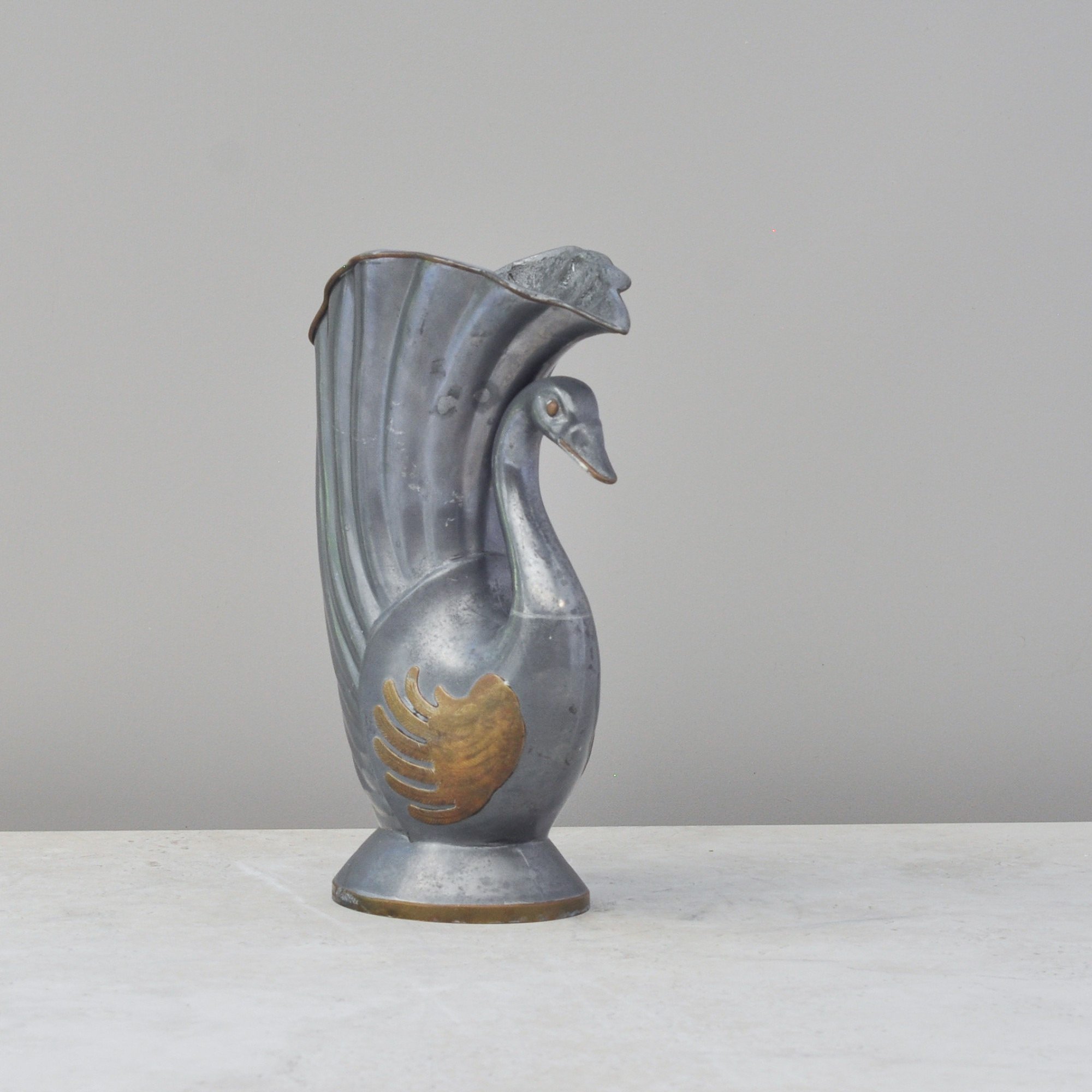
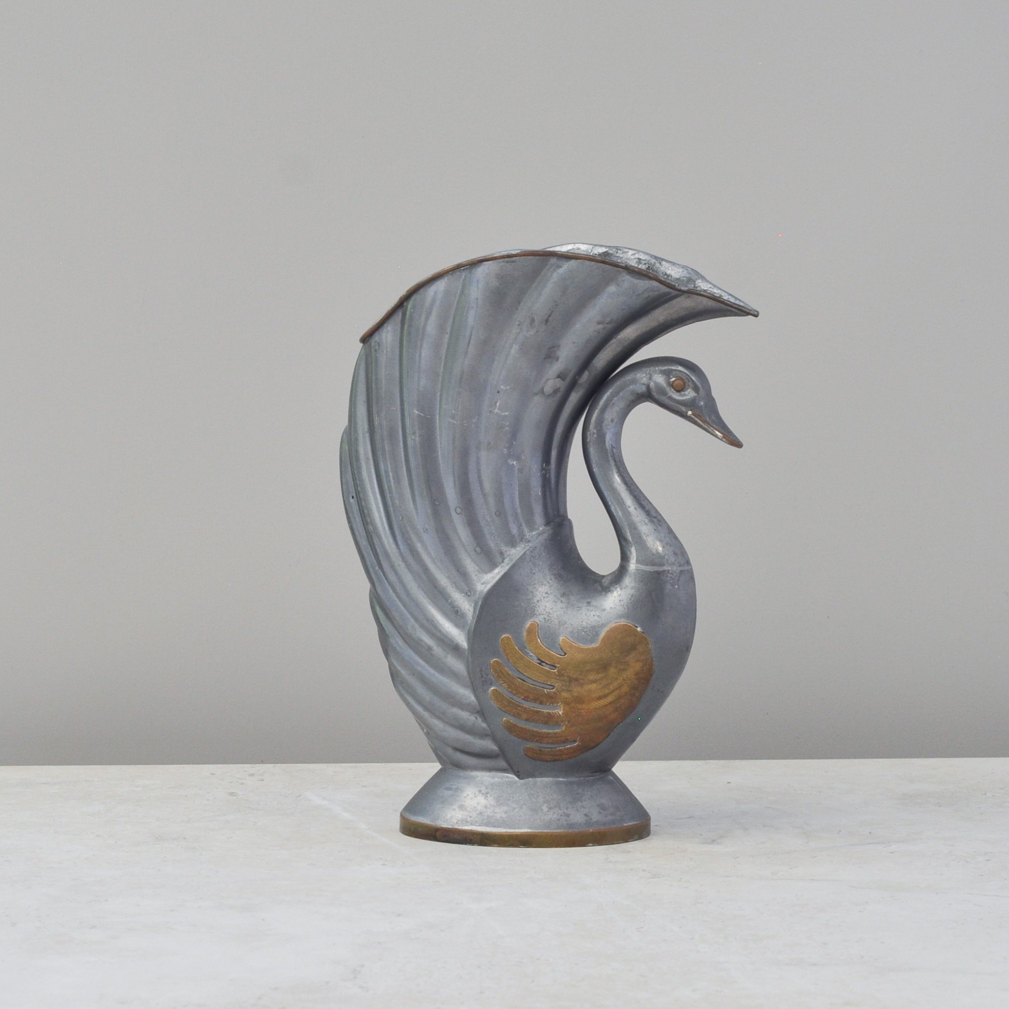
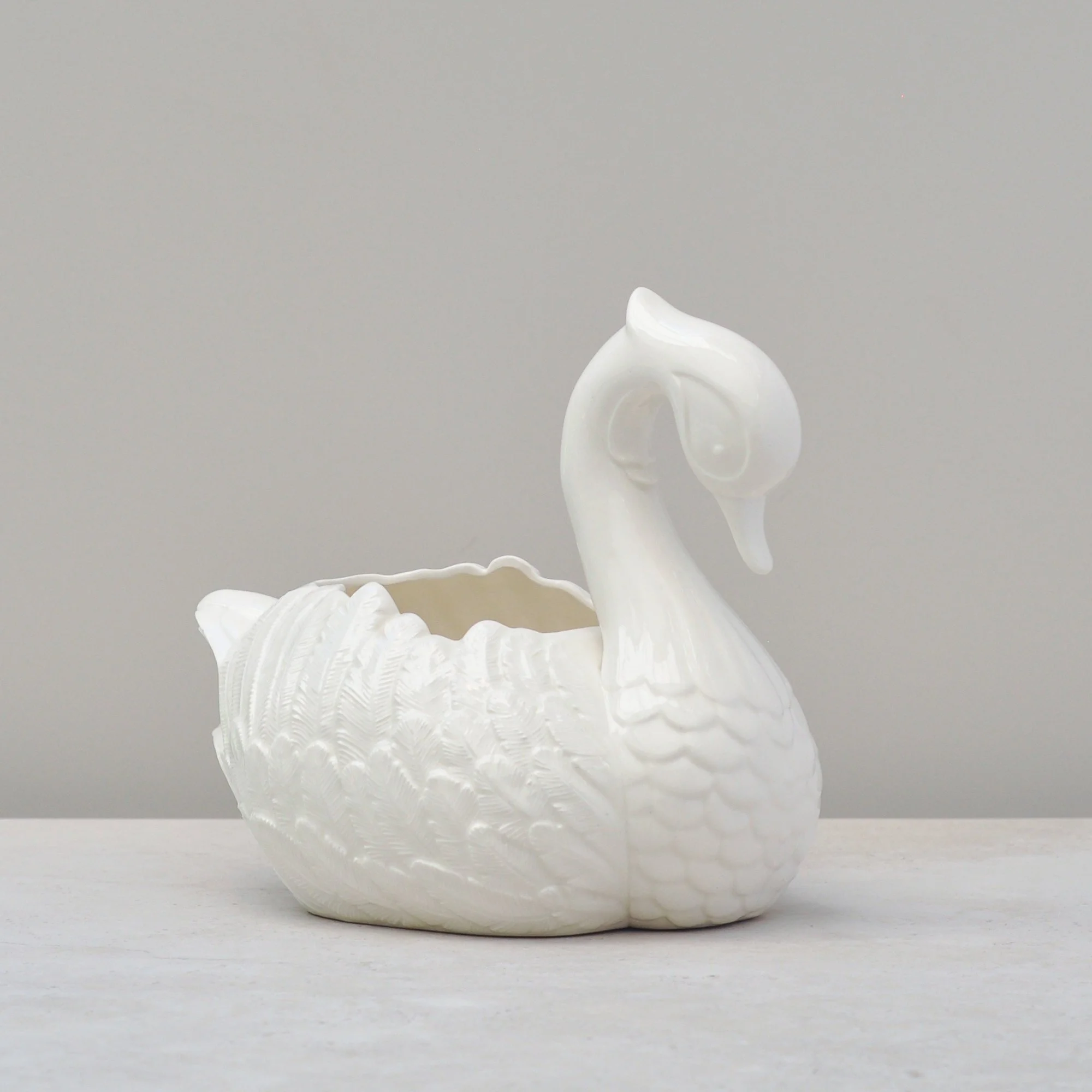
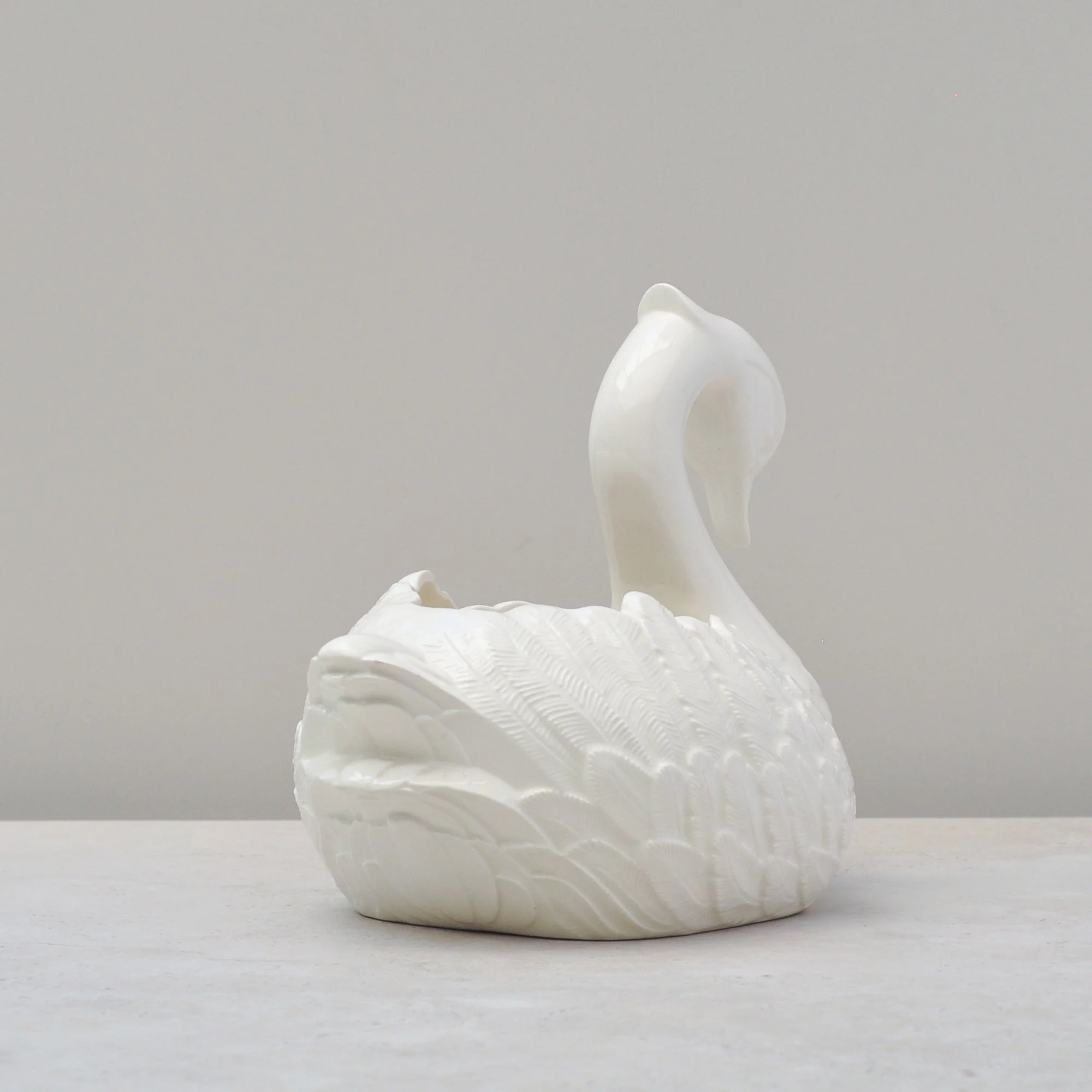
Pewter is rapidly becoming one of my favourite metals, and brass is always welcome. This swan brings them together, and when combined with the Art Deco inspired shape and sweeping form, there is so much to love.
This mid-century piece originates from Hong Kong but feels just as relevant for today. Heavy and sturdy, yet warm to the touch, it has the gentle, solid quality that makes pewter such a pleasure to live with.
Do you feel the love too?
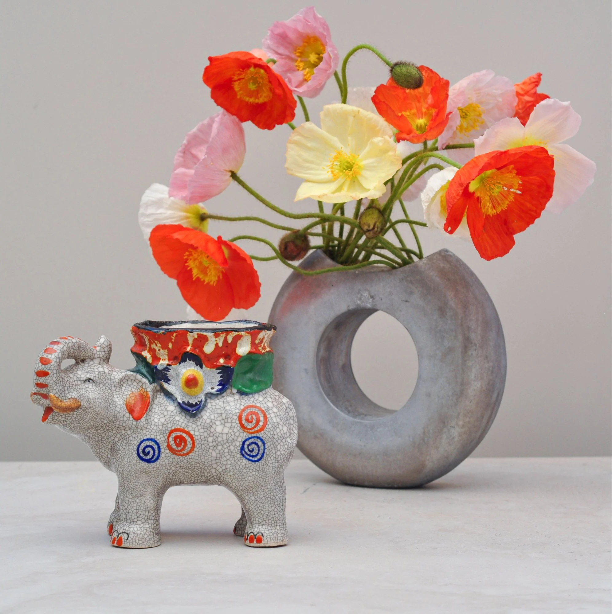
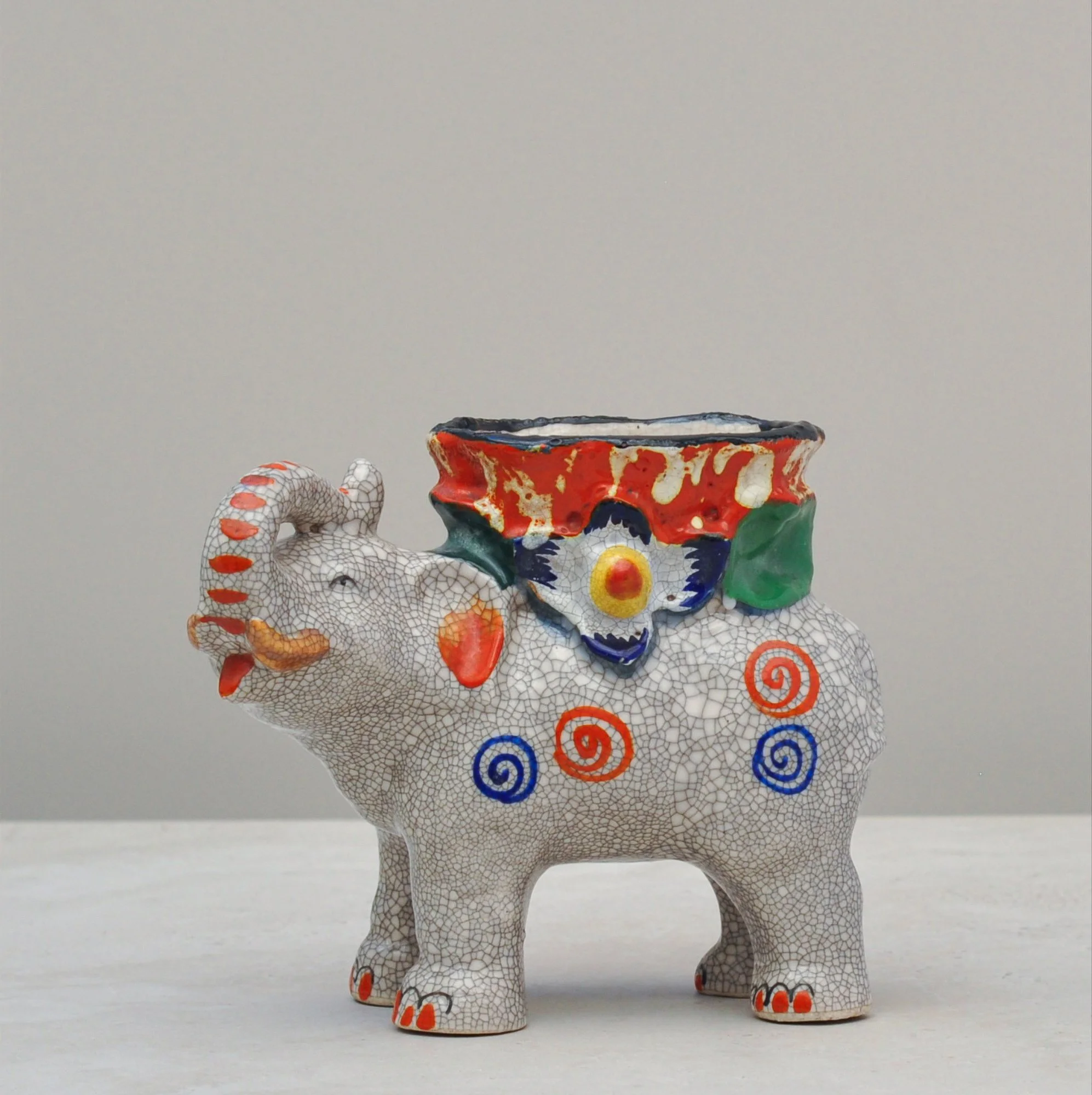
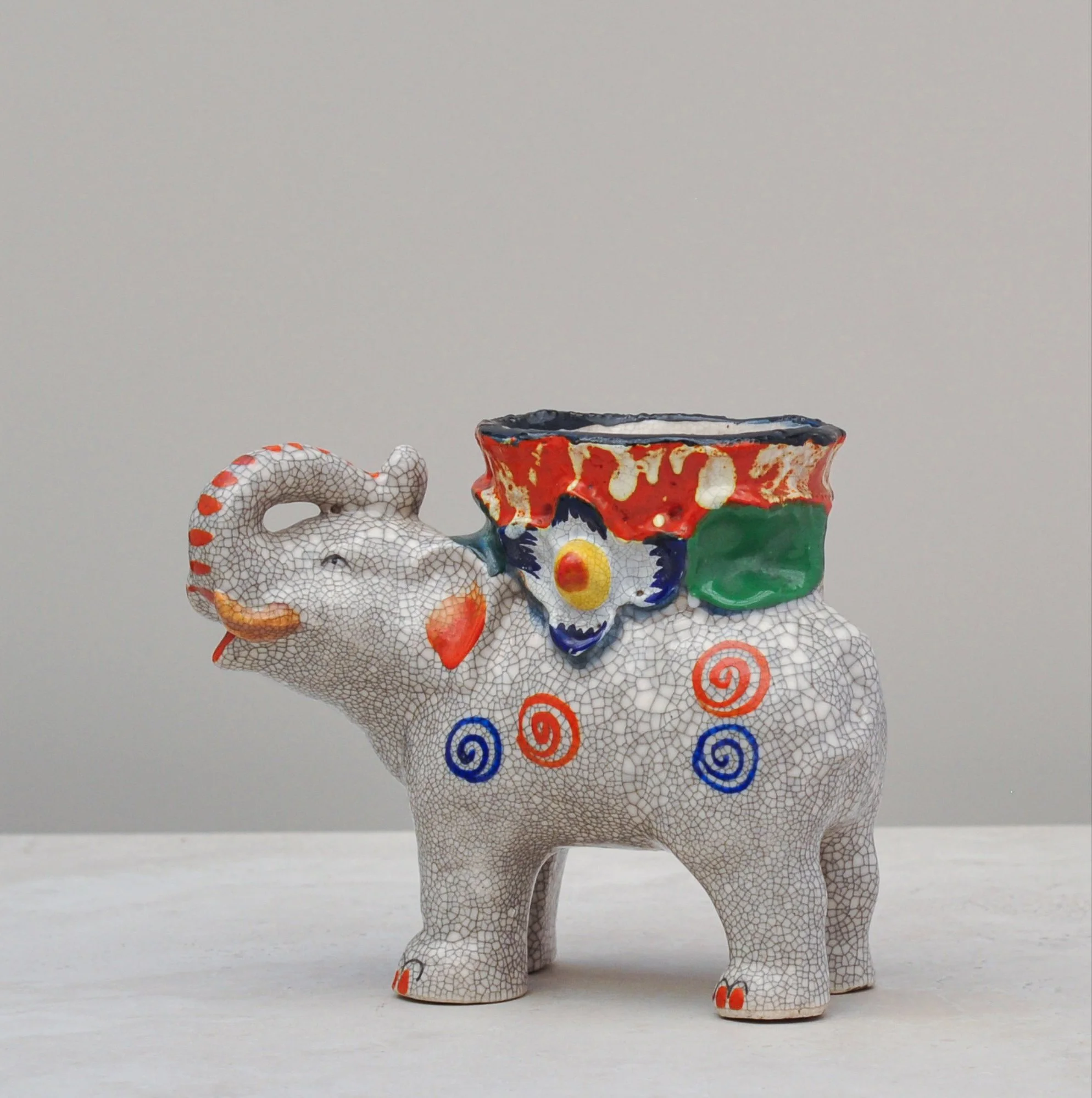
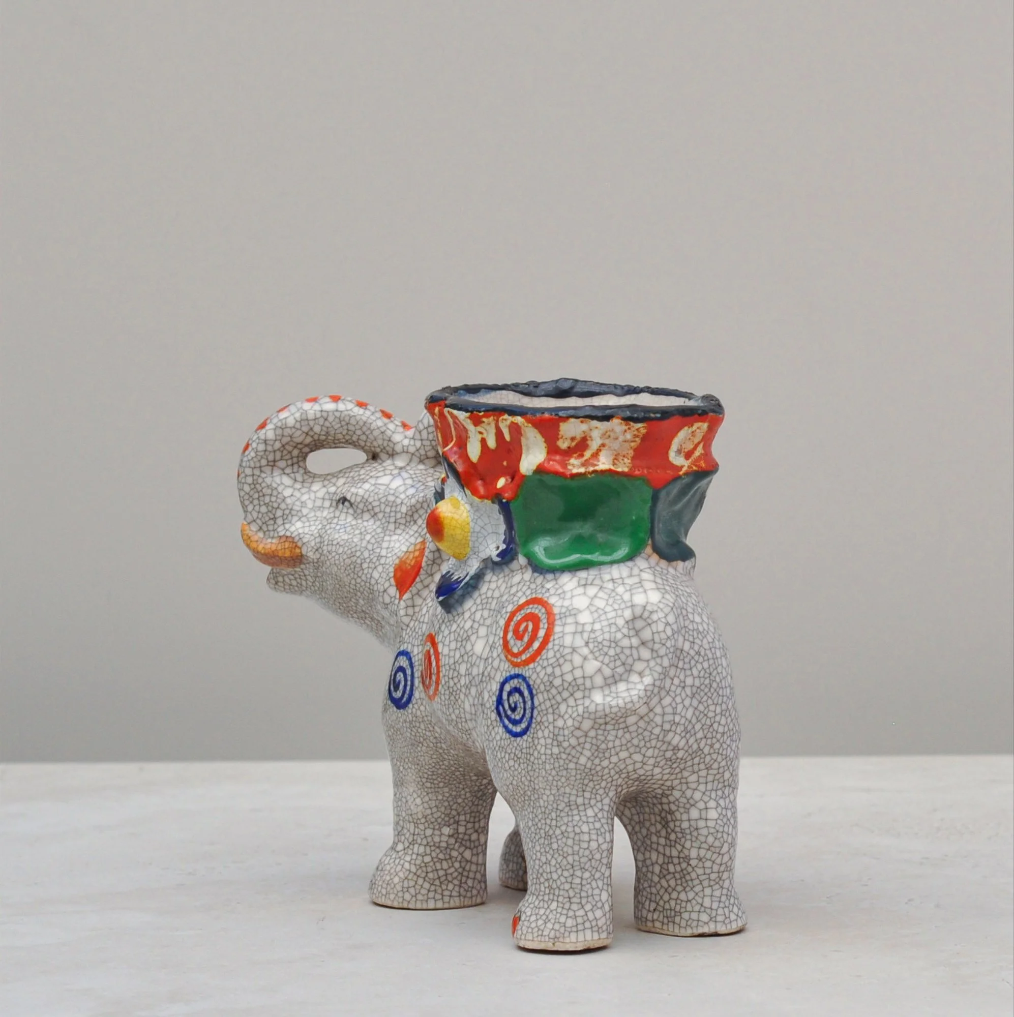
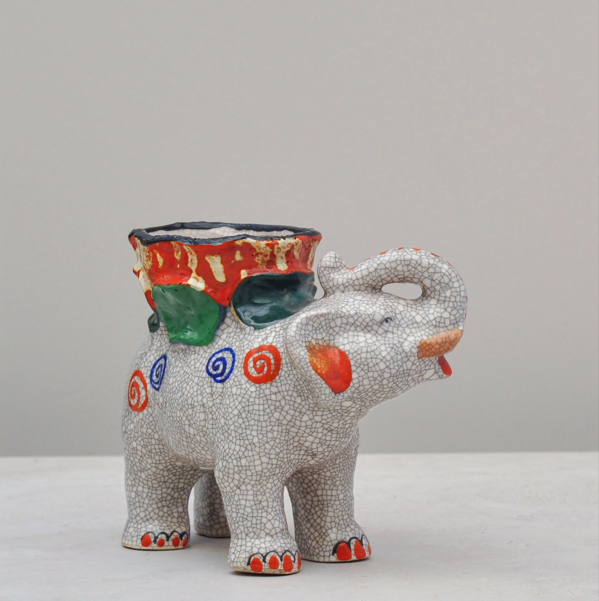
When you hear of an piece being described as magical, you’d have to be in the presence of this adorable, colourful and utterly delightful elephant. To look at him you can’t help but smile. He is, quite simply, joy.
Made of ceramic and hand painted, his bold and bright colours sit atop a crackled grey glaze which, when combined, bring a depth of individual character to this charming piece. He’s also hollow, with a wide opening at the top that begs for a little creativity and whilst you don’t have to fill him, imagine him carrying a dramatic succulent or a trailing green plant. He’s versatile, that’s for sure.
There is some age to him too, but just how old… well, he’s not giving away that secret. All I know is that if I had my way he’d be a piece for my own collection. He’s a hard one to let go of.
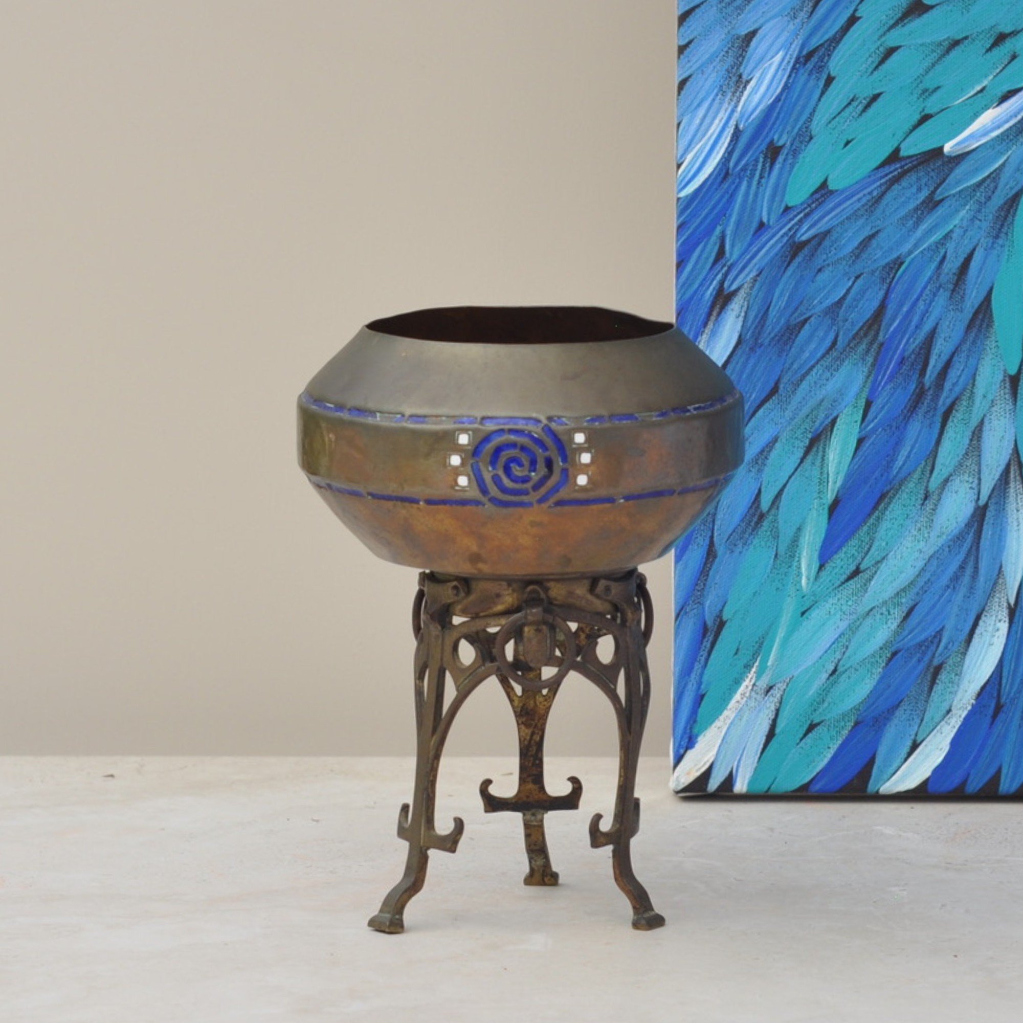
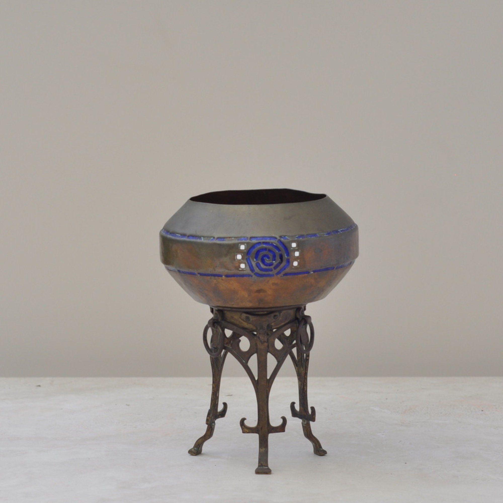
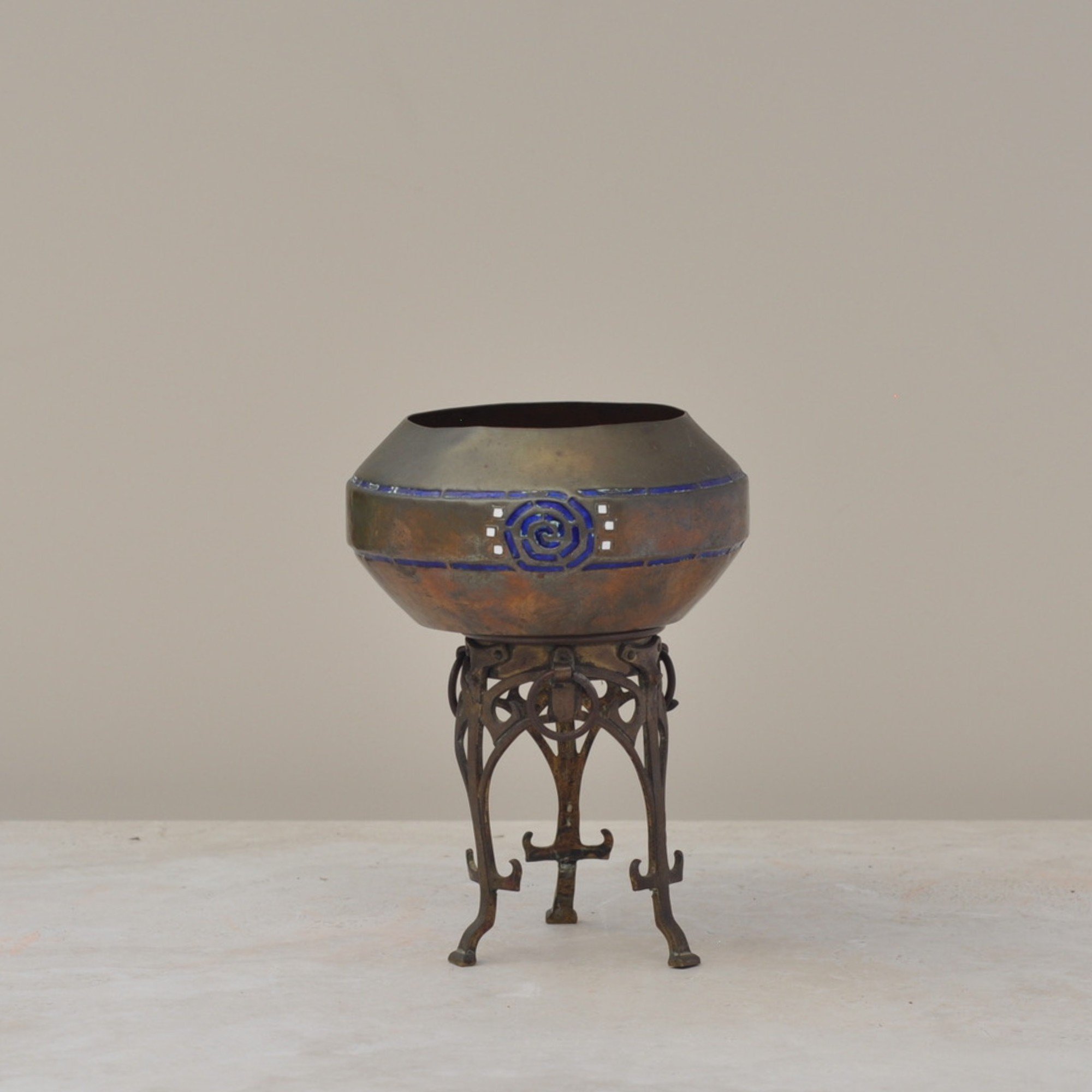
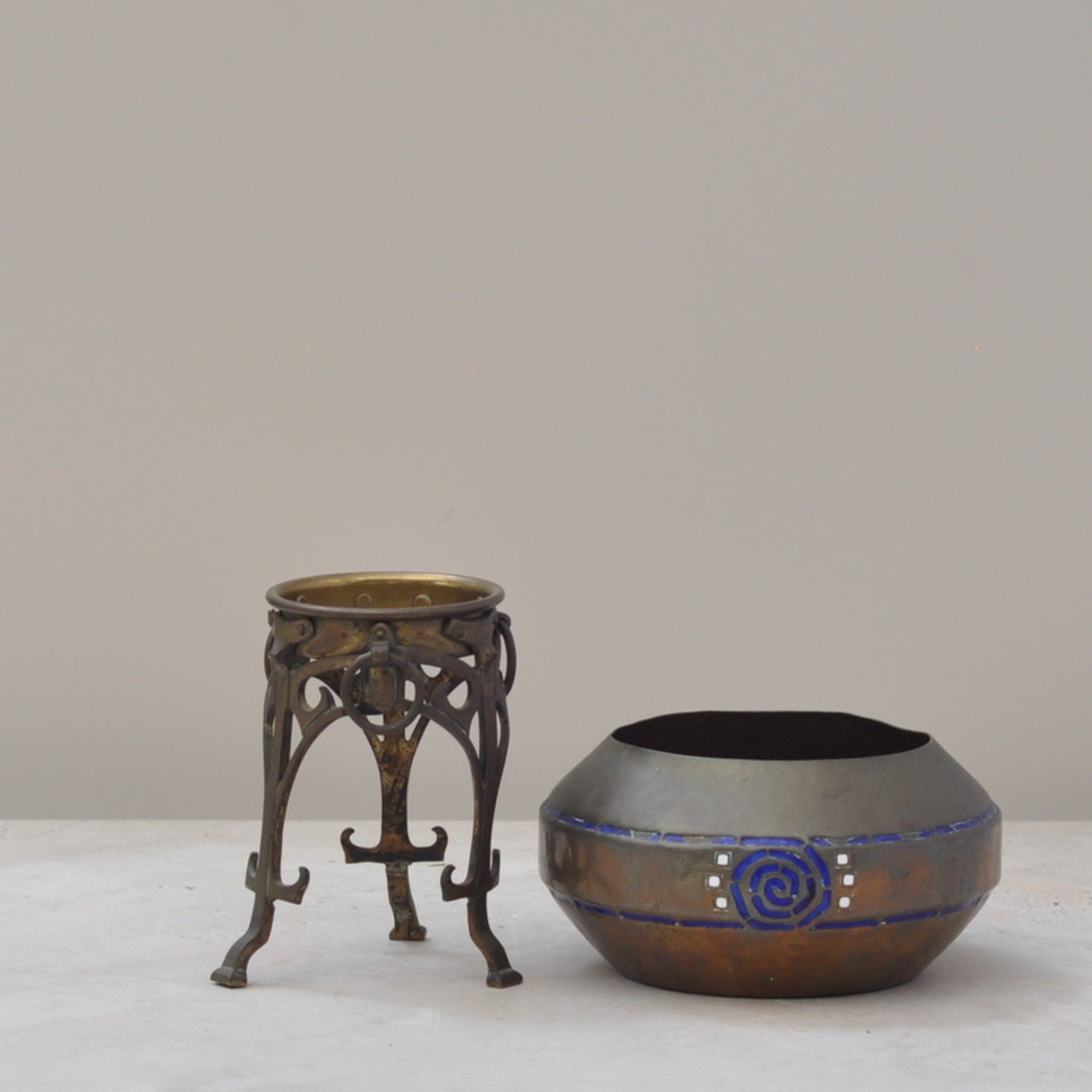
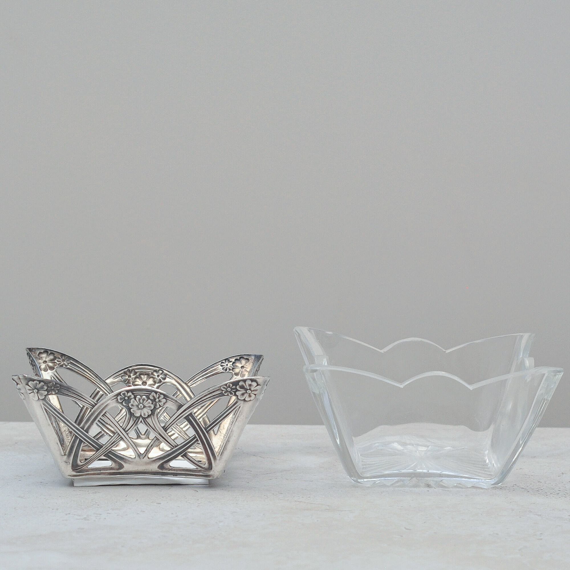
What a very striking and unusual piece, you may even think a little science fiction like. I was instantly drawn to it because it looks and feels so ahead, despite its age. And it is old. Created in the early 20th century, it captures a moment when designers were deliberately moving away from tradition and exploring new forms. Very Art Nouveau.
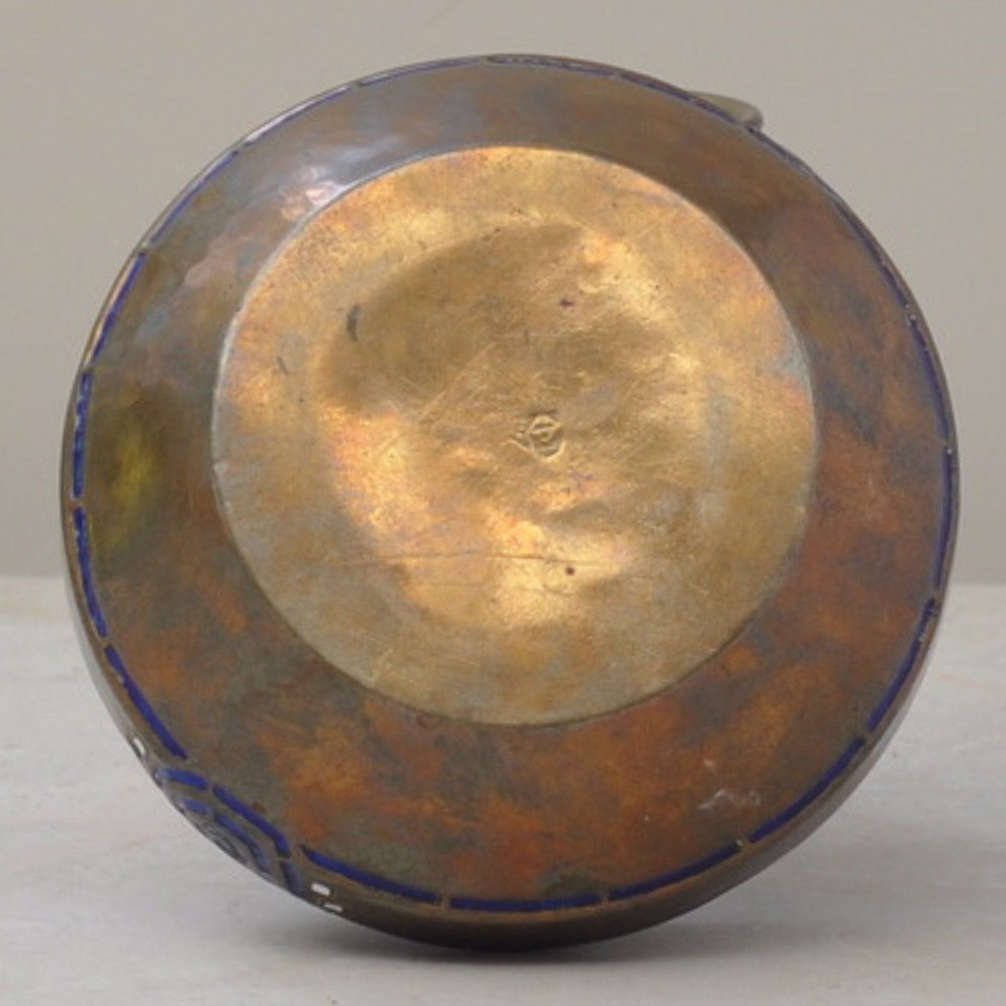
This is a Secessionist bowl by German maker WMF (Württembergische Metallwarenfabrik), with a warm brass body and deep cobalt-blue and white enamel decoration. The bowl sits on an particularly decorative and unusual openwork metal stand, giving it both presence and lift.
For lovers of the unusual, this wonderful piece is one for the collection.
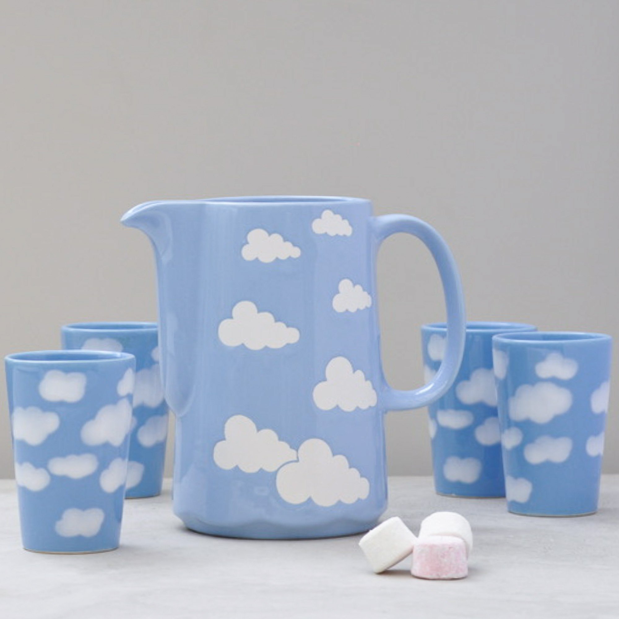
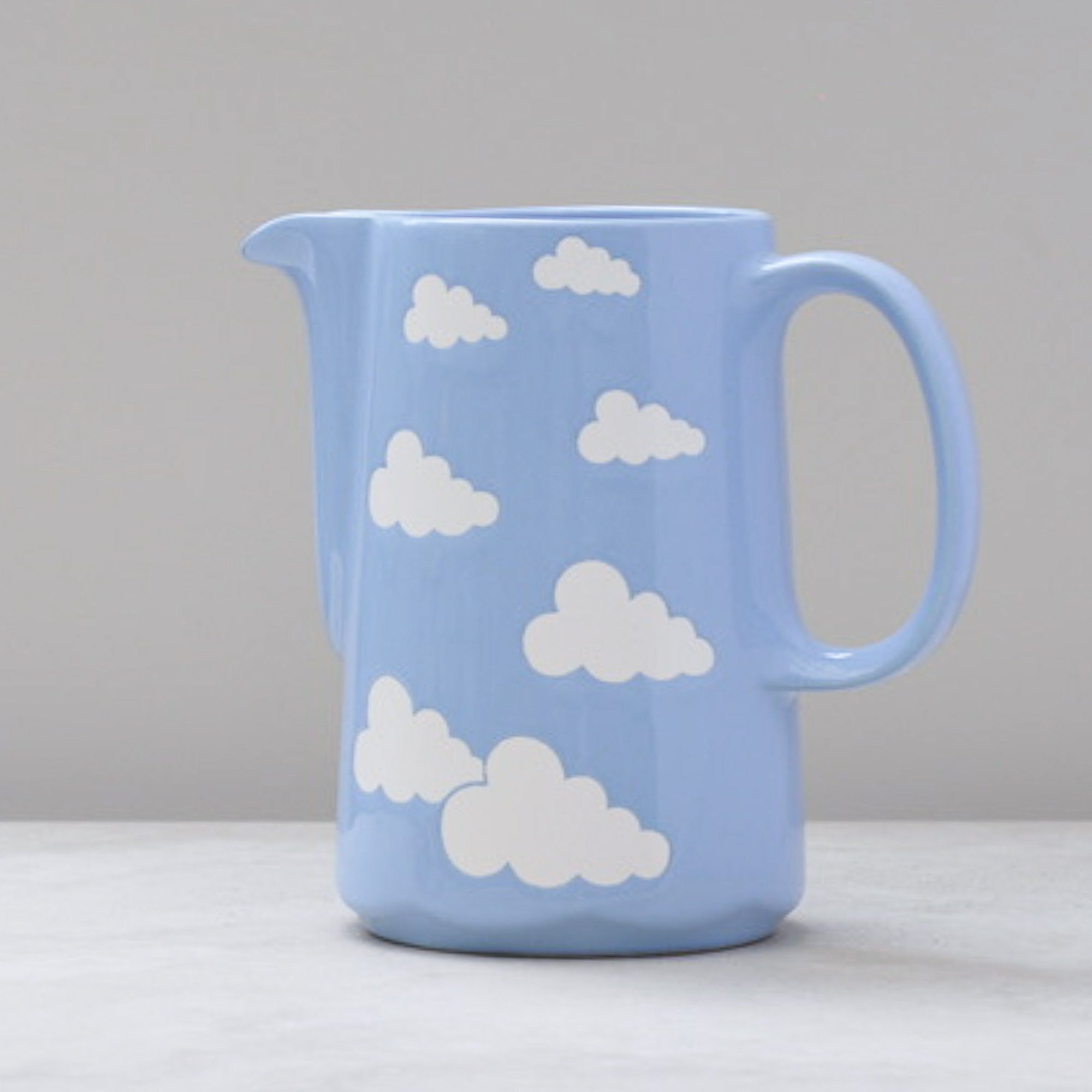
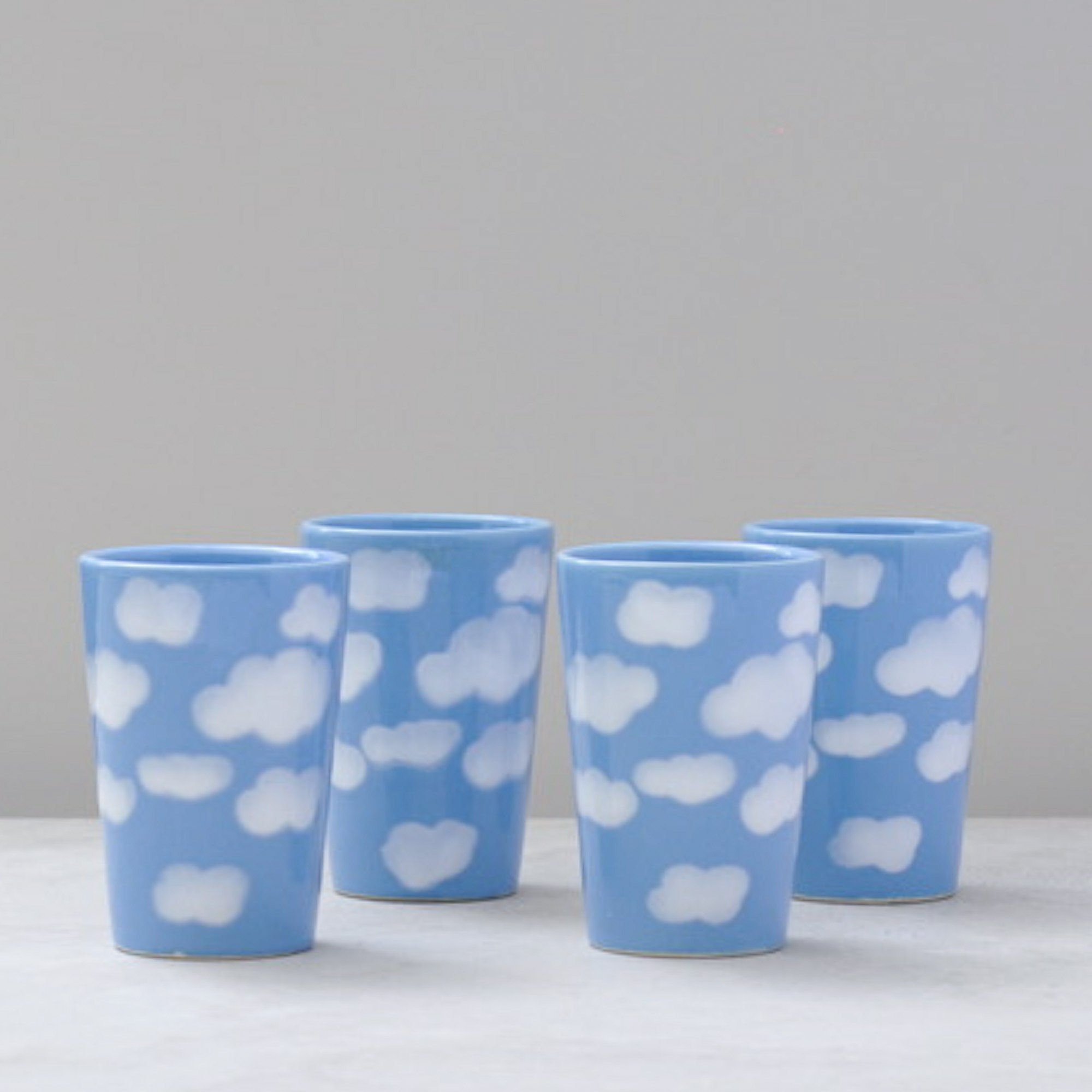
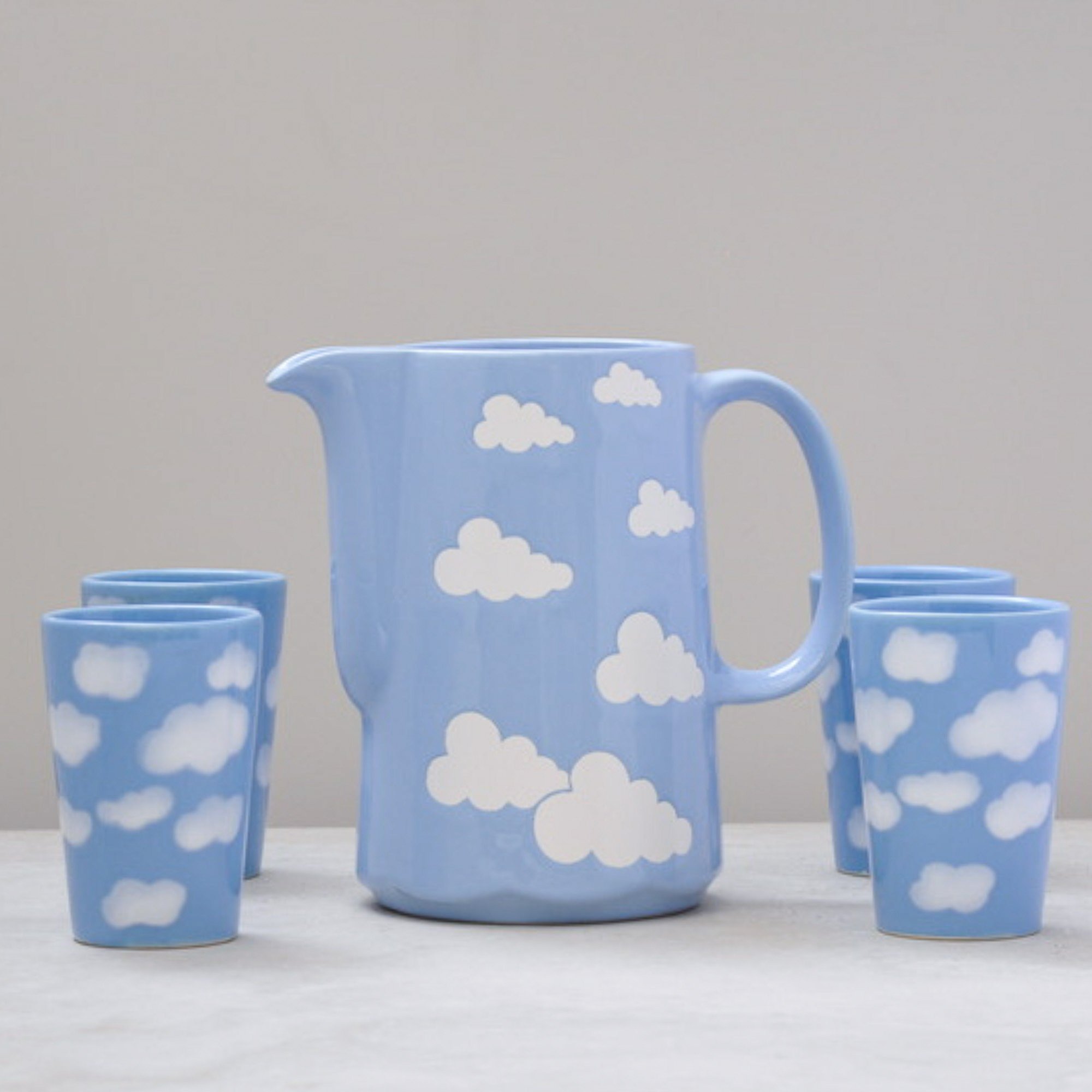
This piece captivated both my mum and me the moment we saw it. A little surprise find that quickly became the favourite of the day. It’s a Waechtersbach ceramic blue cloud jug and cup set that has made its way here from West Germany, a much loved mid-century design with an easy, happy and floating feel.
The jug is bright with its glossy blue glaze and matte cloud pattern. The cloud areas appear to have been masked during glazing, giving them a slightly recessed finish compared to the blue. This creates a beautiful contrast. The cups are fully glazed so the clouds feel as though they gently float across the surface.
A delightful, light and airy ceramic set that feels just right for hot chocolate on cloudy days or lemonade when the sky is blue. A piece that brings a little sunshine to those best shared everyday moments.
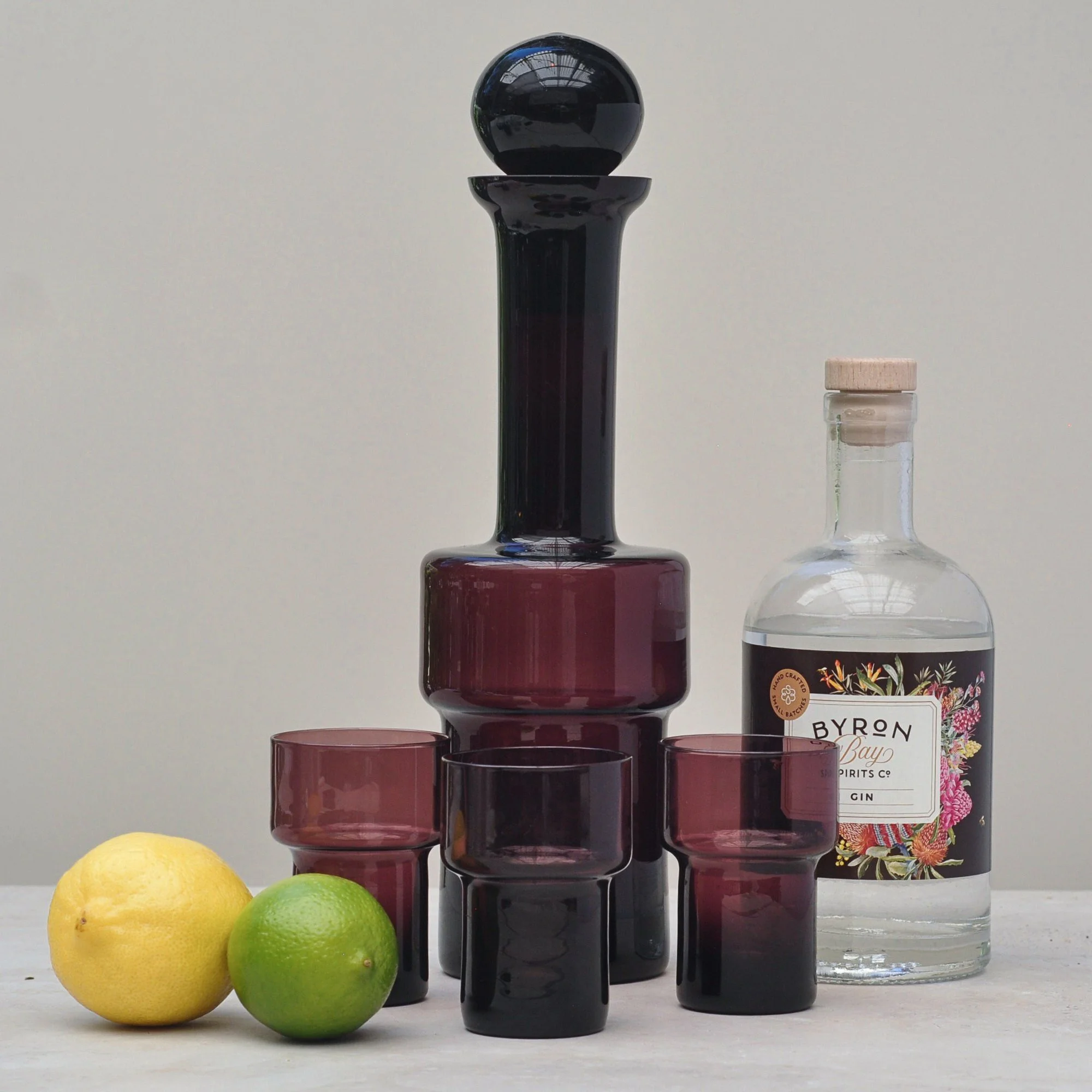
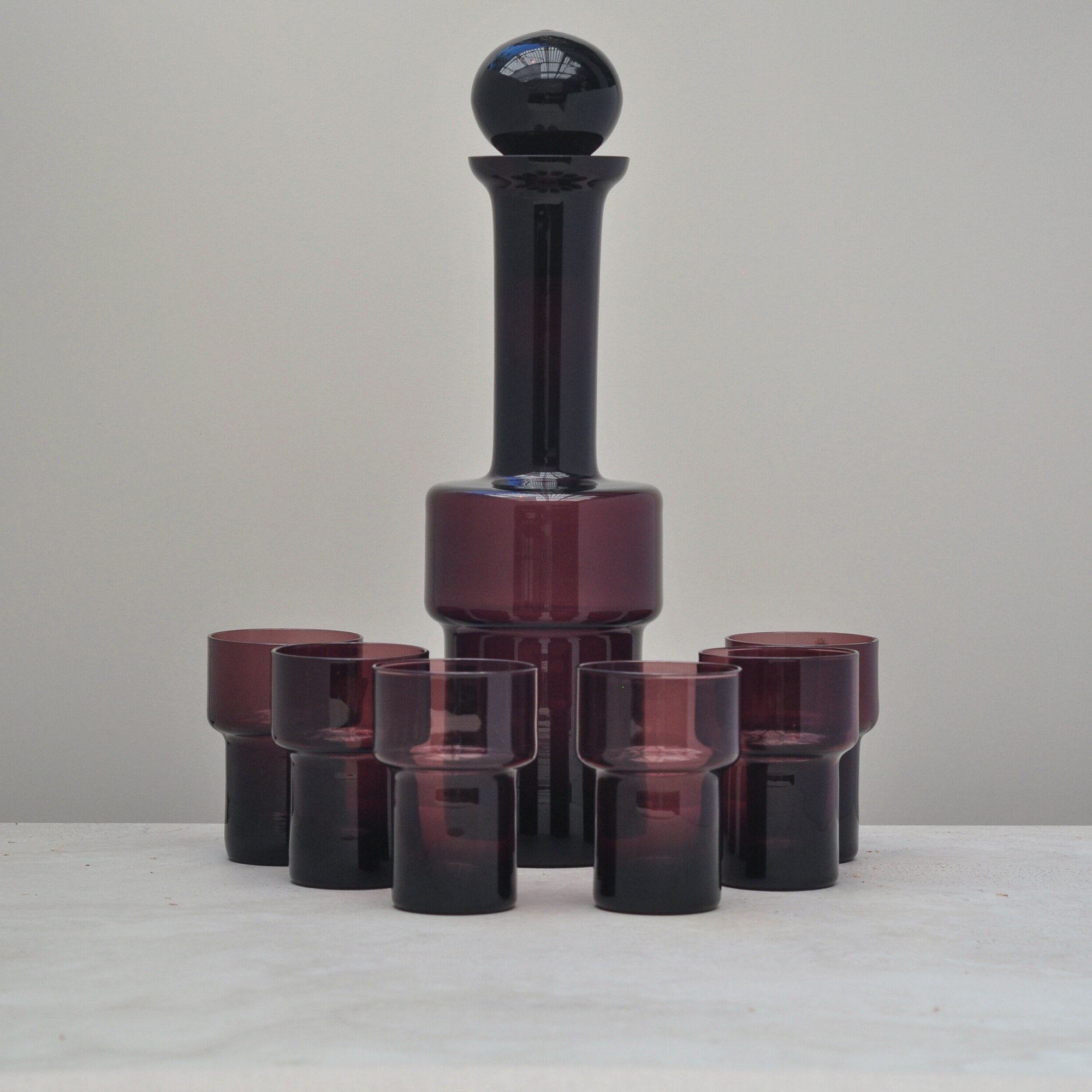
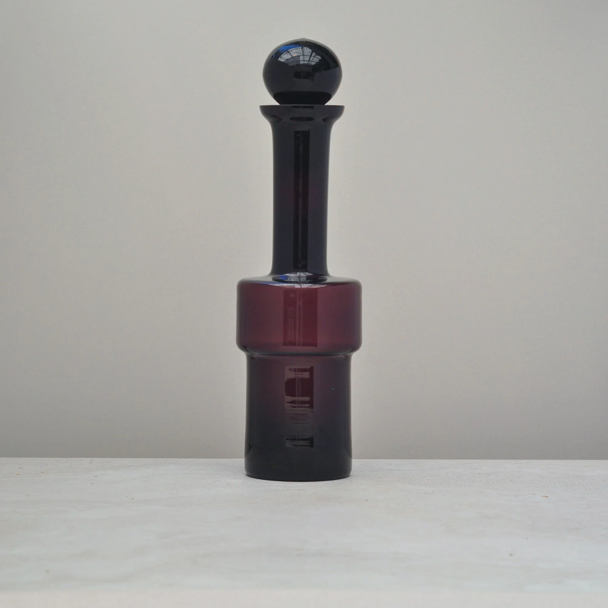
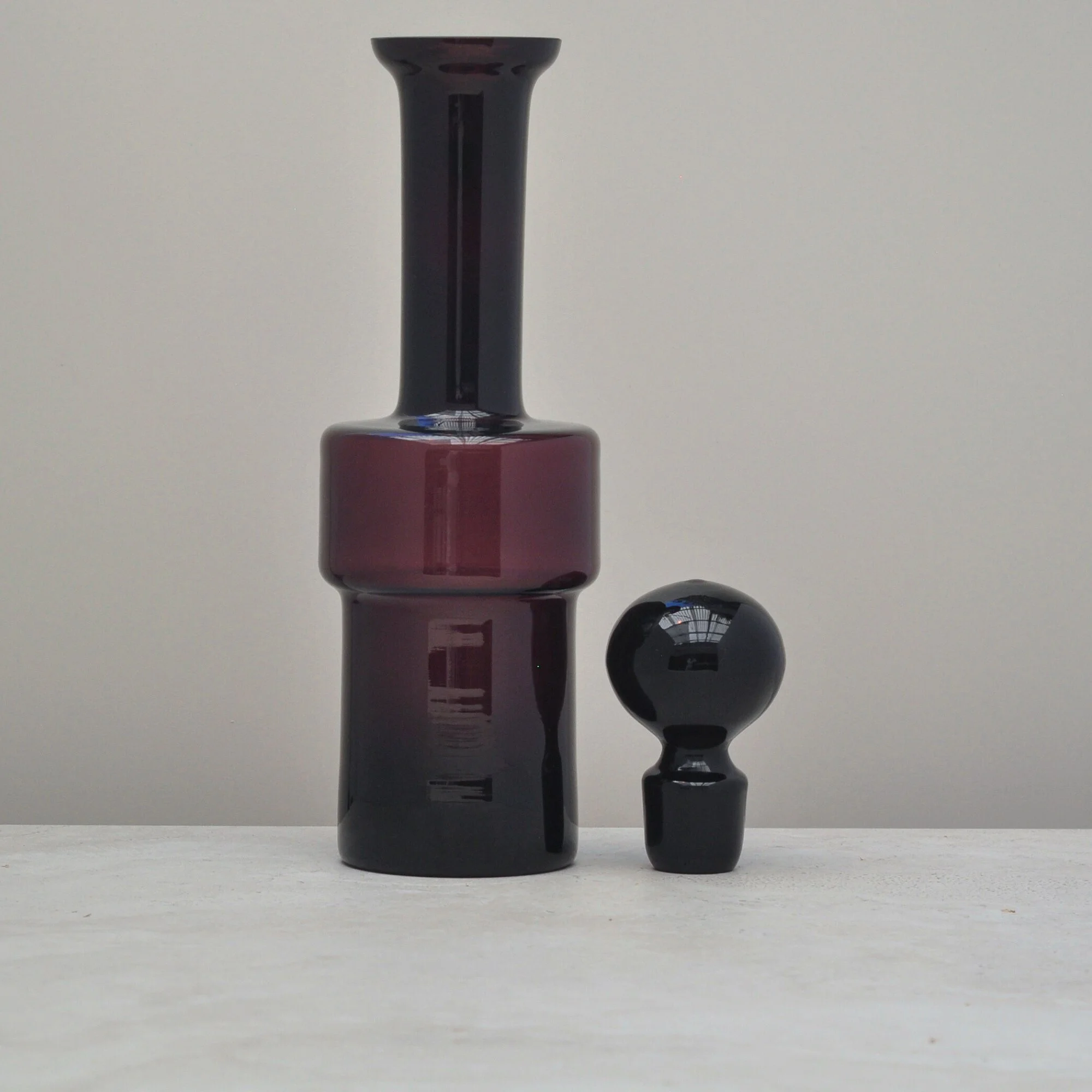
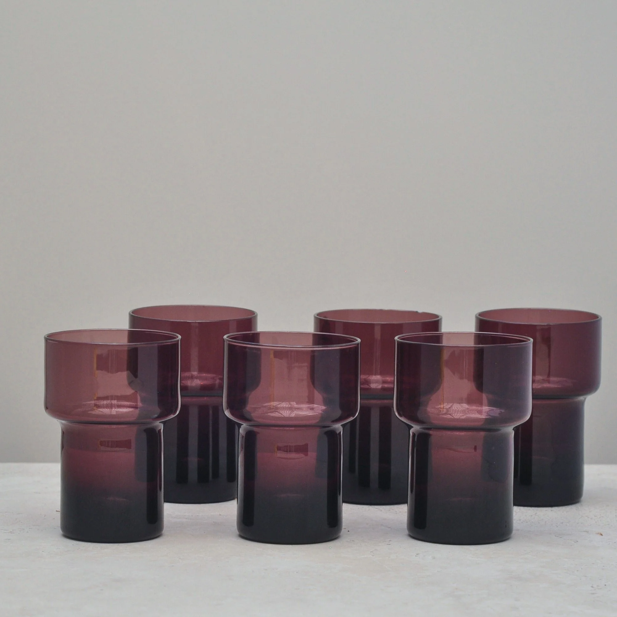
The first thing that hits you about this decanter and glass set is the colour. It’s the most amazing aubergine - rich, warm, deep and incredibly striking. The second thing to capture your eye is the distinctive style of the decanter. Its tiered layers, with a wider layer sitting in the middle and a rounded stopper on top screams mid-century Scandinavian or Finnish design. Again, striking.
The surprising element I discovered when researching this set was a small sticker on the neck of the decanter that said Made in Poland. I learnt that Poland has a strong reputation for high-quality craftsmanship with other European countries often subcontracting production to Polish factories.
This confirms what I thought when I first saw the set - visually stunning from a colour and style perspective and clearly the highest of quality. This is one very classically beautiful decanter and glass set.
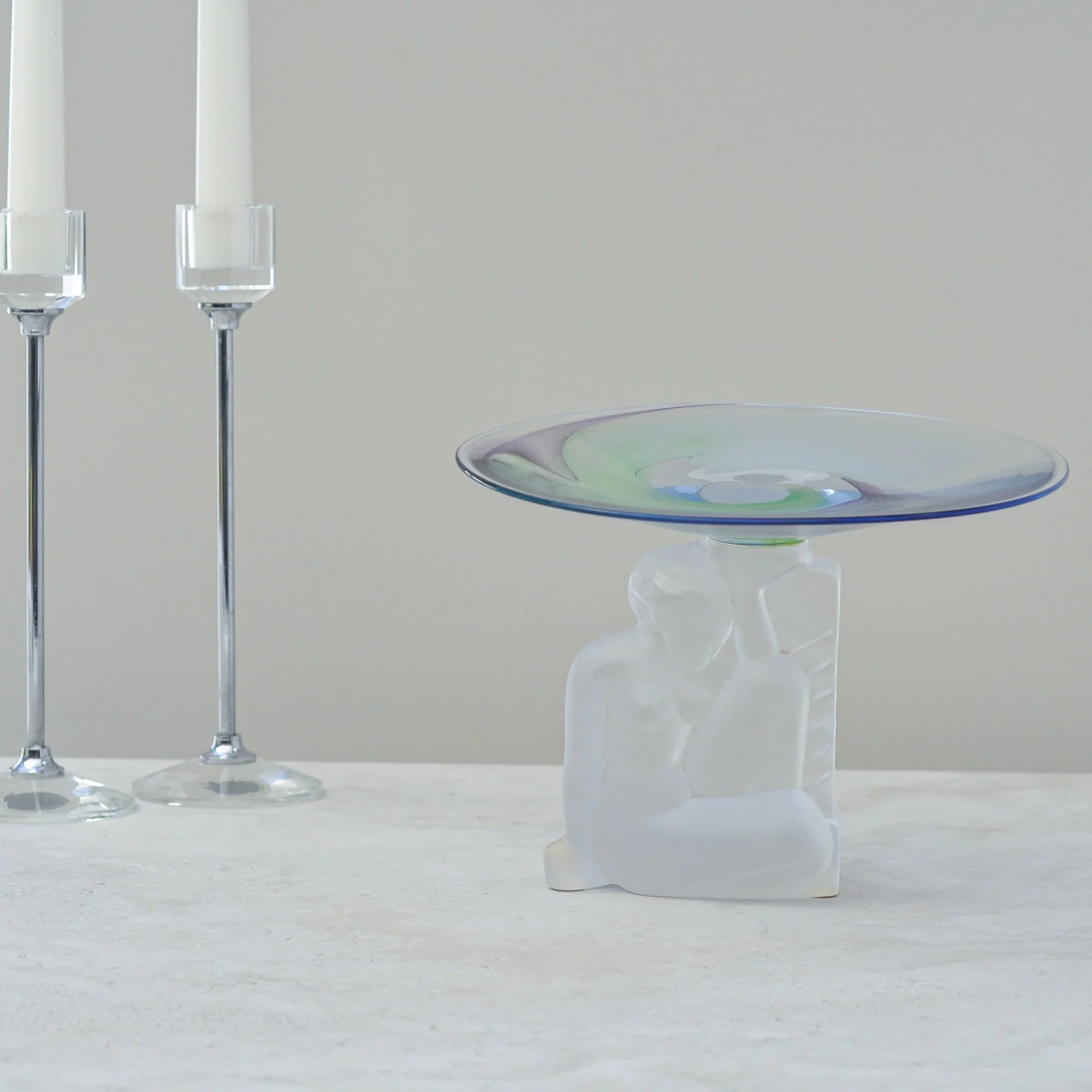
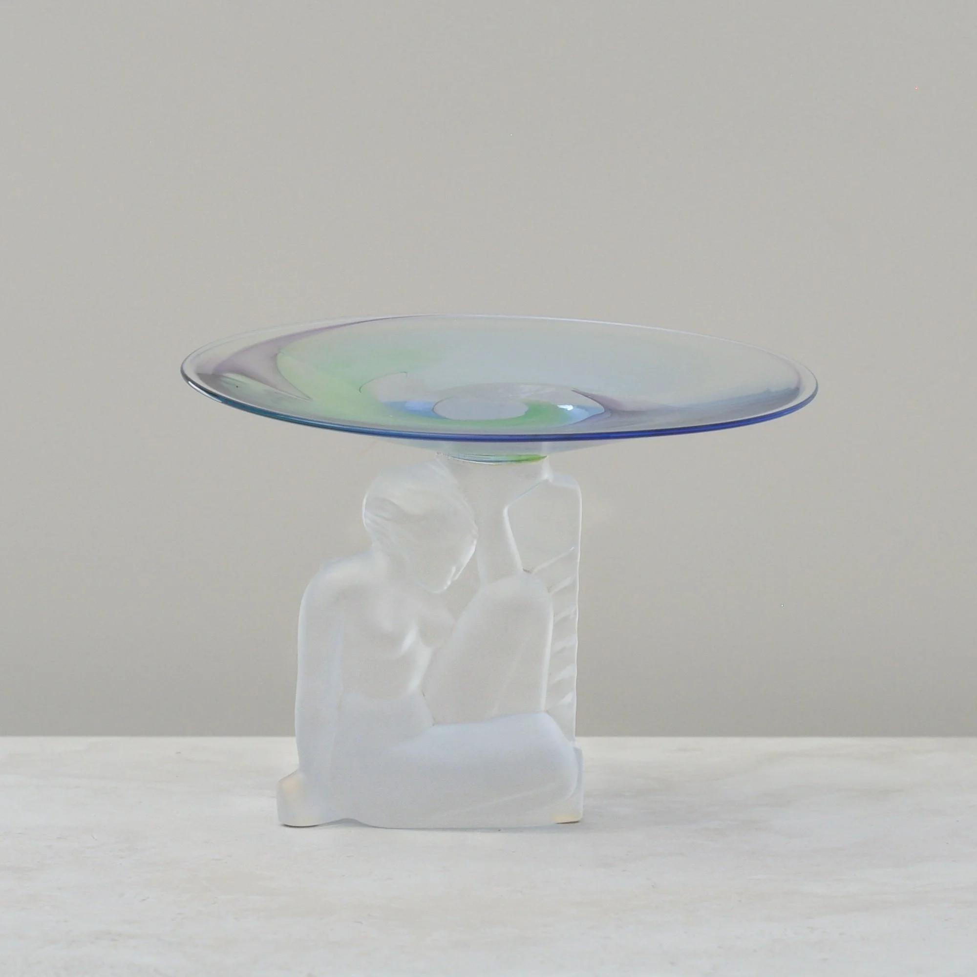
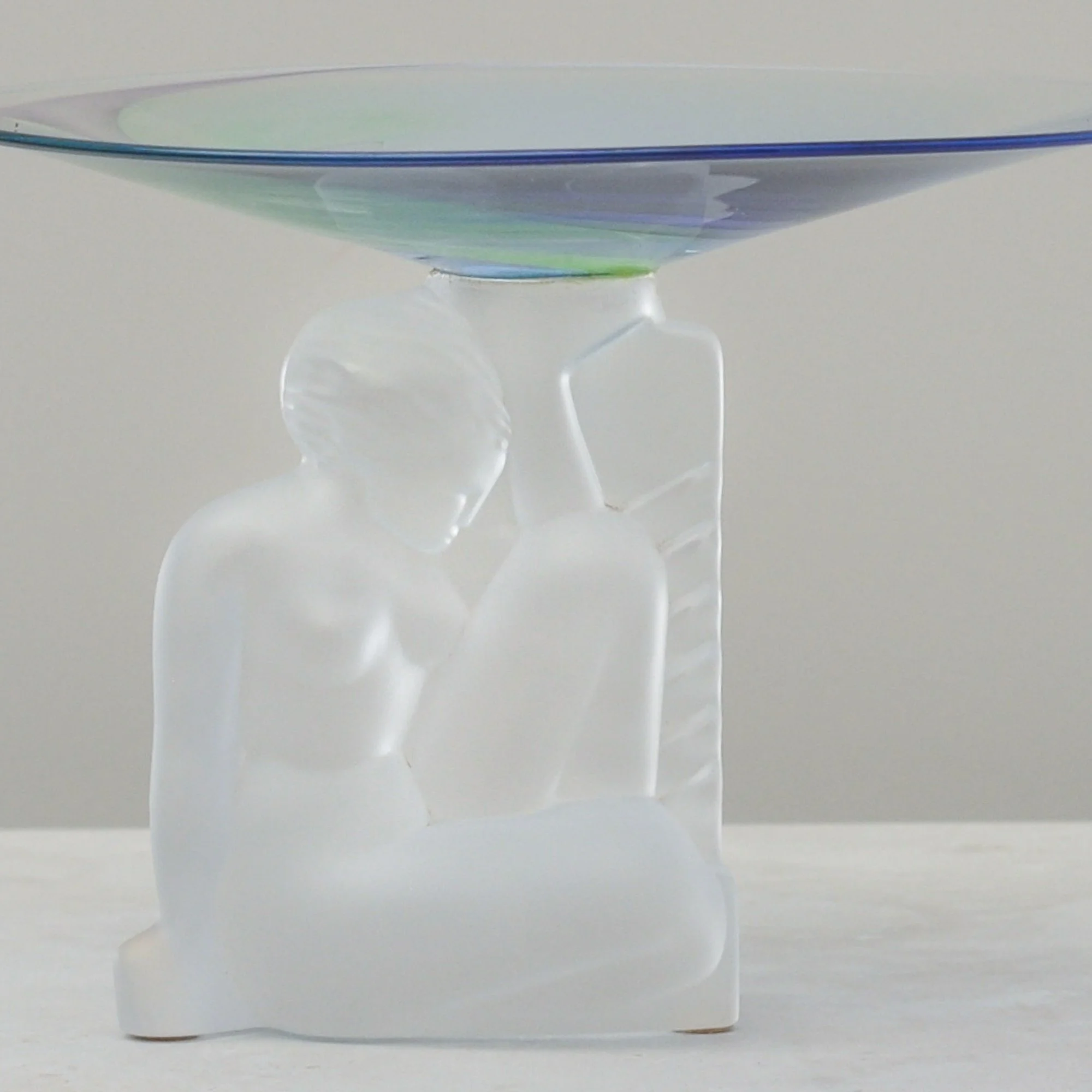

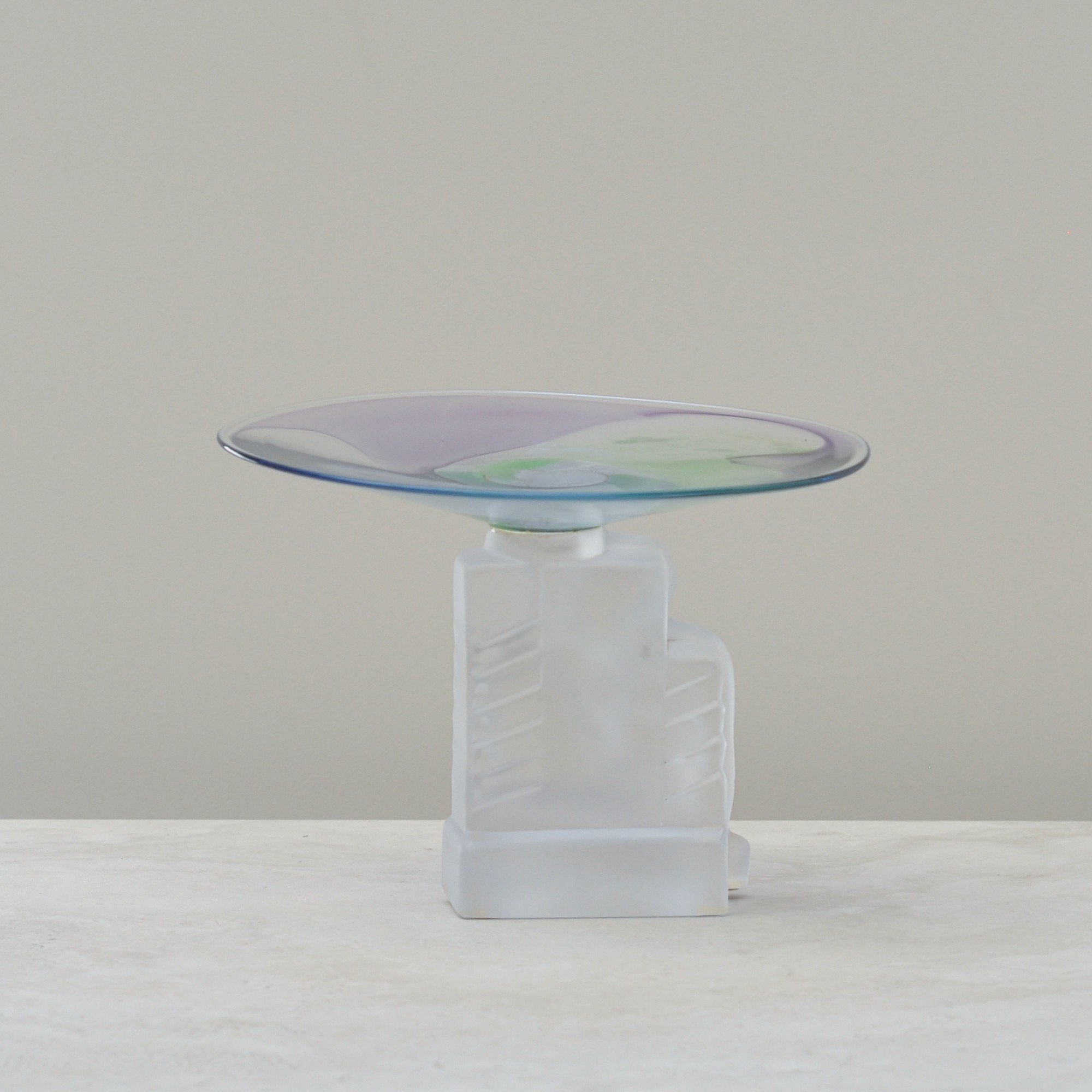
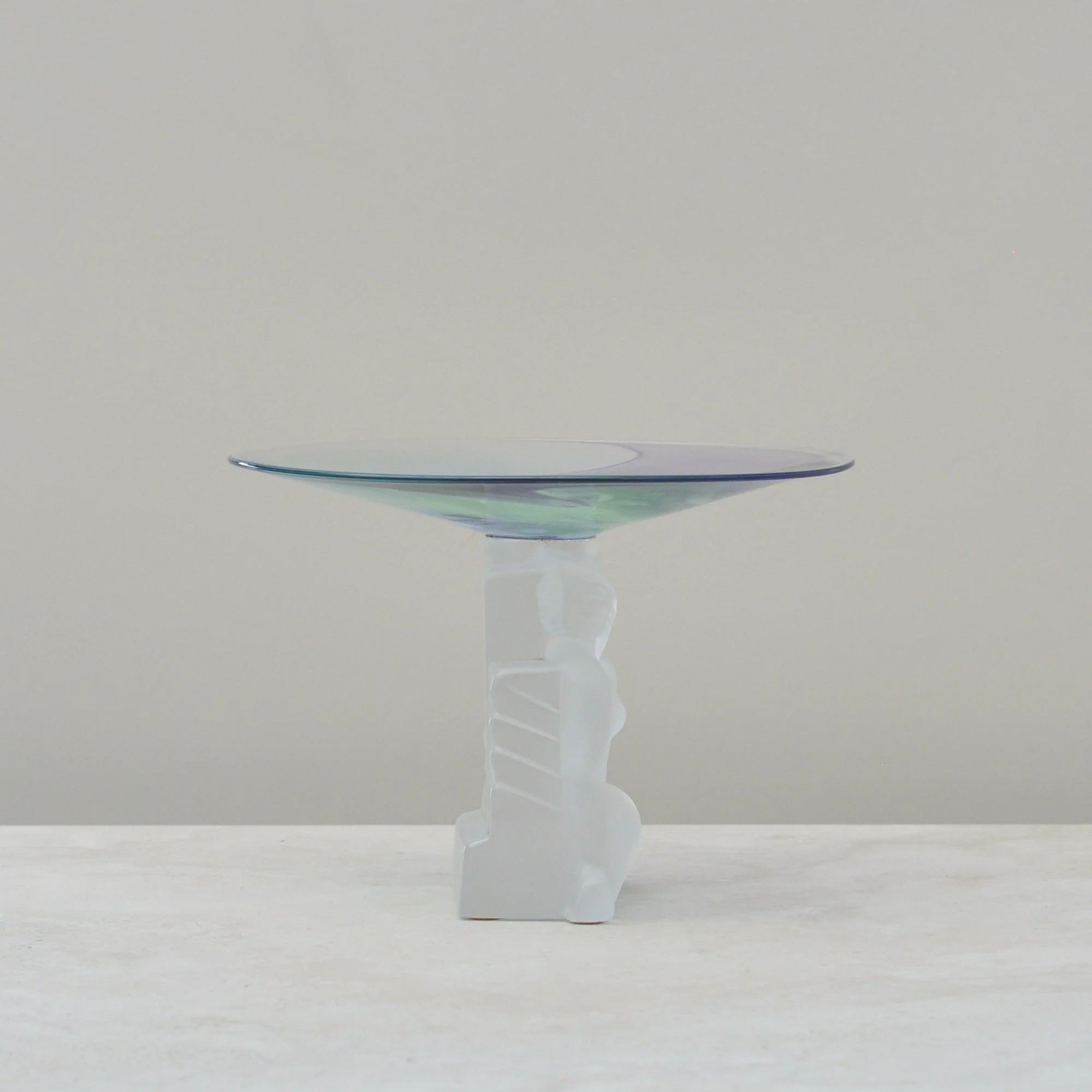
When I first saw this sculptural piece I actually had to catch my breath. It looks part art-deco, part modern but completely beautiful. It is also my mum’s favourite piece and it’s easy to see why, you can see straightaway how rare and special this piece is.
Made by Cristal de Sèvres, a well known French luxury crystal house known for bringing together traditional French craftsmanship with more modern artistry, the frosted female figure forming the base has a beautiful charm to it. Very feminine, very sculptural and very ‘art-deco’ in style. Above her sits a clear dish with a swirl of colour that moves gently from green to lavender which looks almost painted yet would be the result of a very talented glass maker.
My research tells me that the bowl on top may not be the original but this doesn’t take away from its form and charm. If anything, the contrast of styles only adds to her appeal - I suspect this is why I gasped when I first saw it. It is truly unique.
So if you love pieces that feel a little magical and a lot unexpected, I hope this piece speaks to you too.
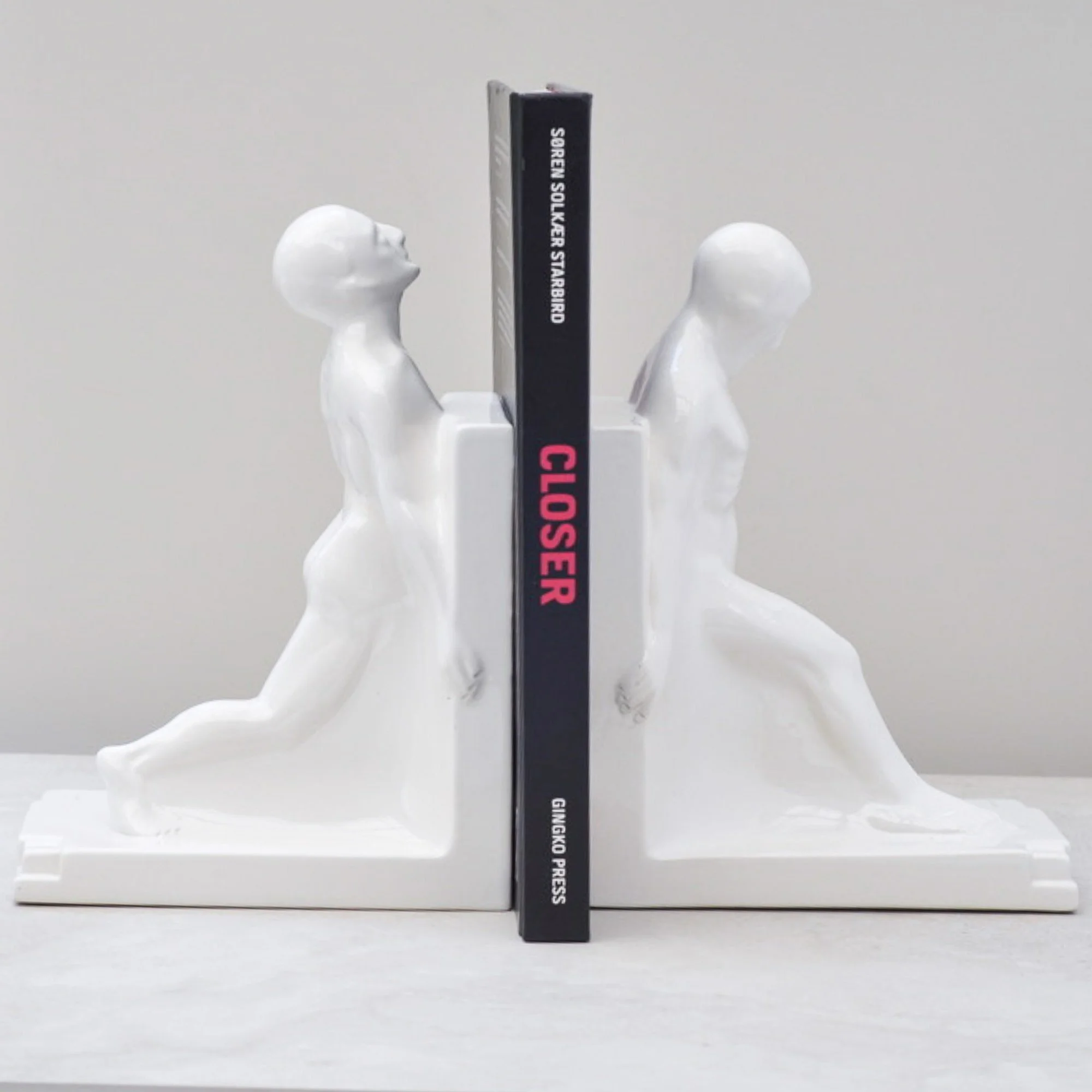
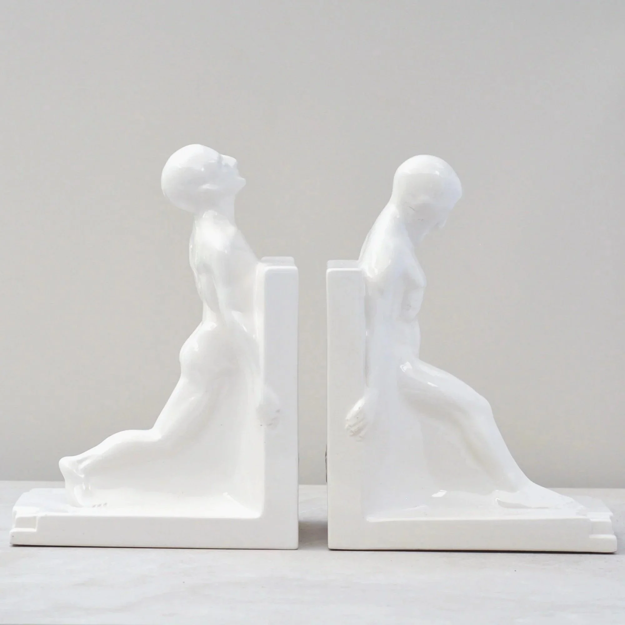
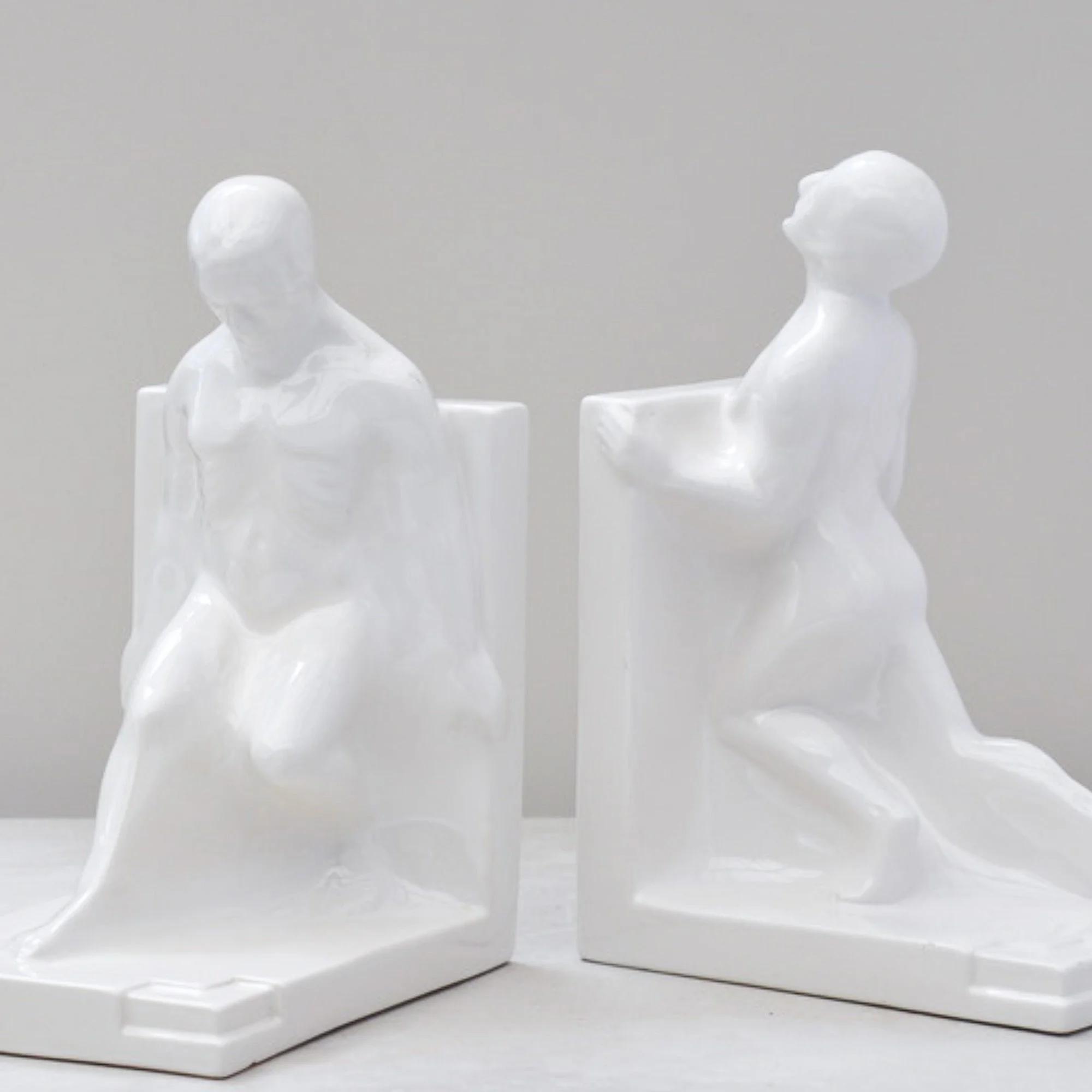
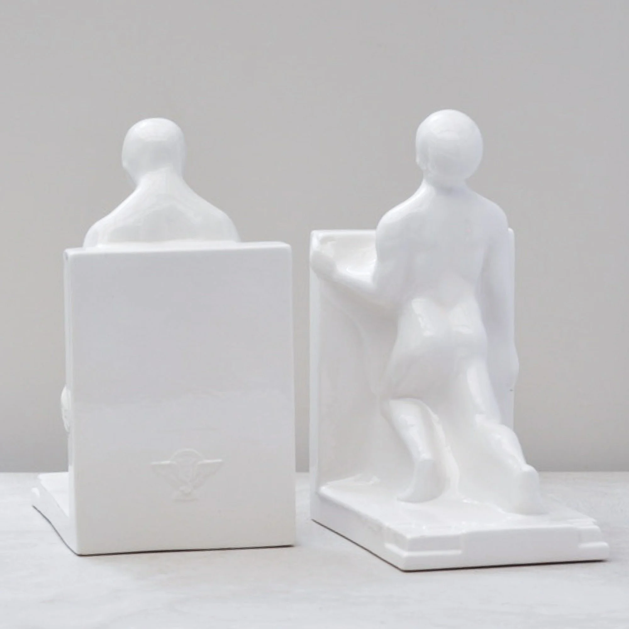

We so often see a posed, dancing female flapper. How fabulous is it to see a 1930’s man in all his form and glory.
Created in the 1930s by Dutch ceramicist Godefridus Boonekamp for Plateelbakkerij Schoonhoven, this unbelievable pair of Art Deco bookends captures everything we love about the period. Strong lines, sculptural simplicity and an unapologetic embrace of modern life.
This pair feels bold without being brash, playful without tipping into novelty. Exactly the kind of objects that spark conversation on a bookshelf or desk.
A brilliant piece for someone with a good sense of humour and even better taste. Any man or woman who appreciates design that blatantly challenges convention. Totally delicious.
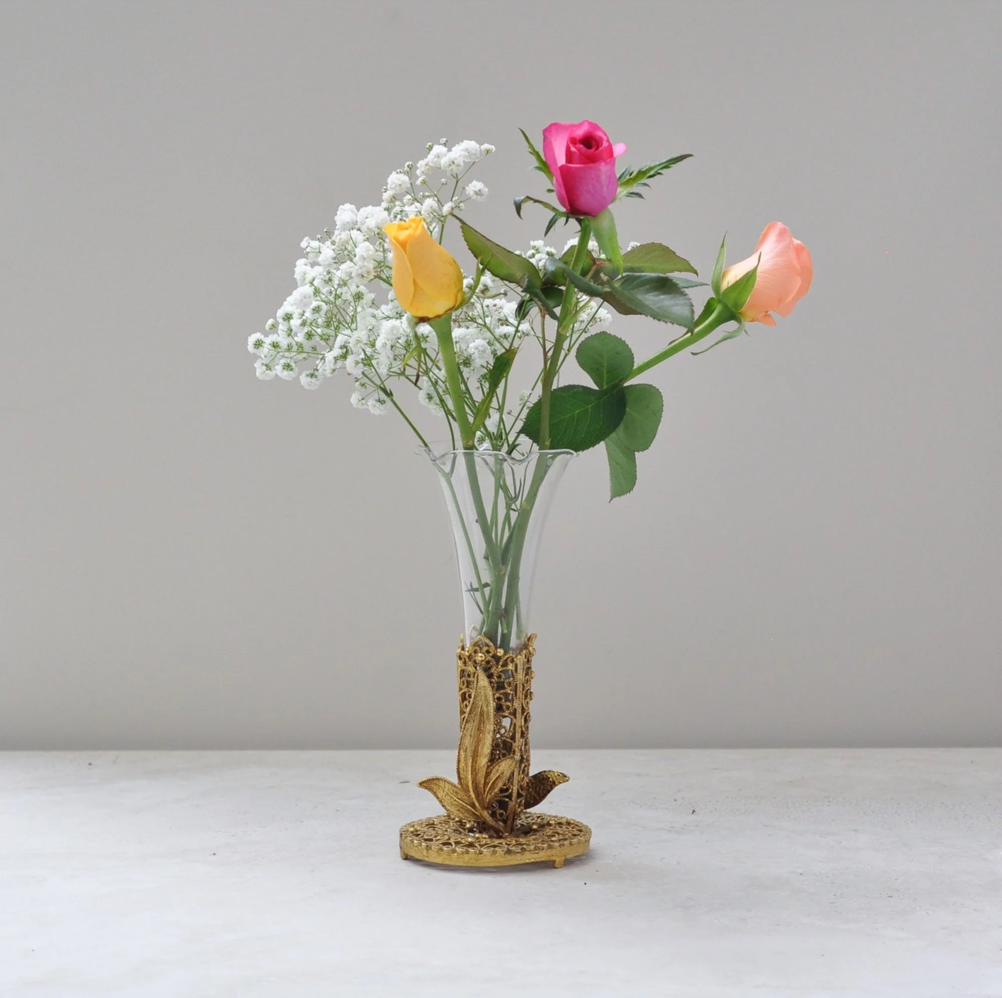
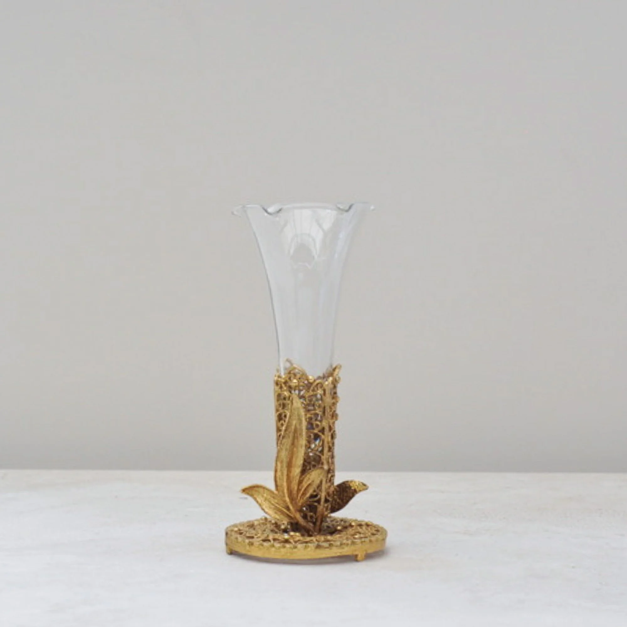
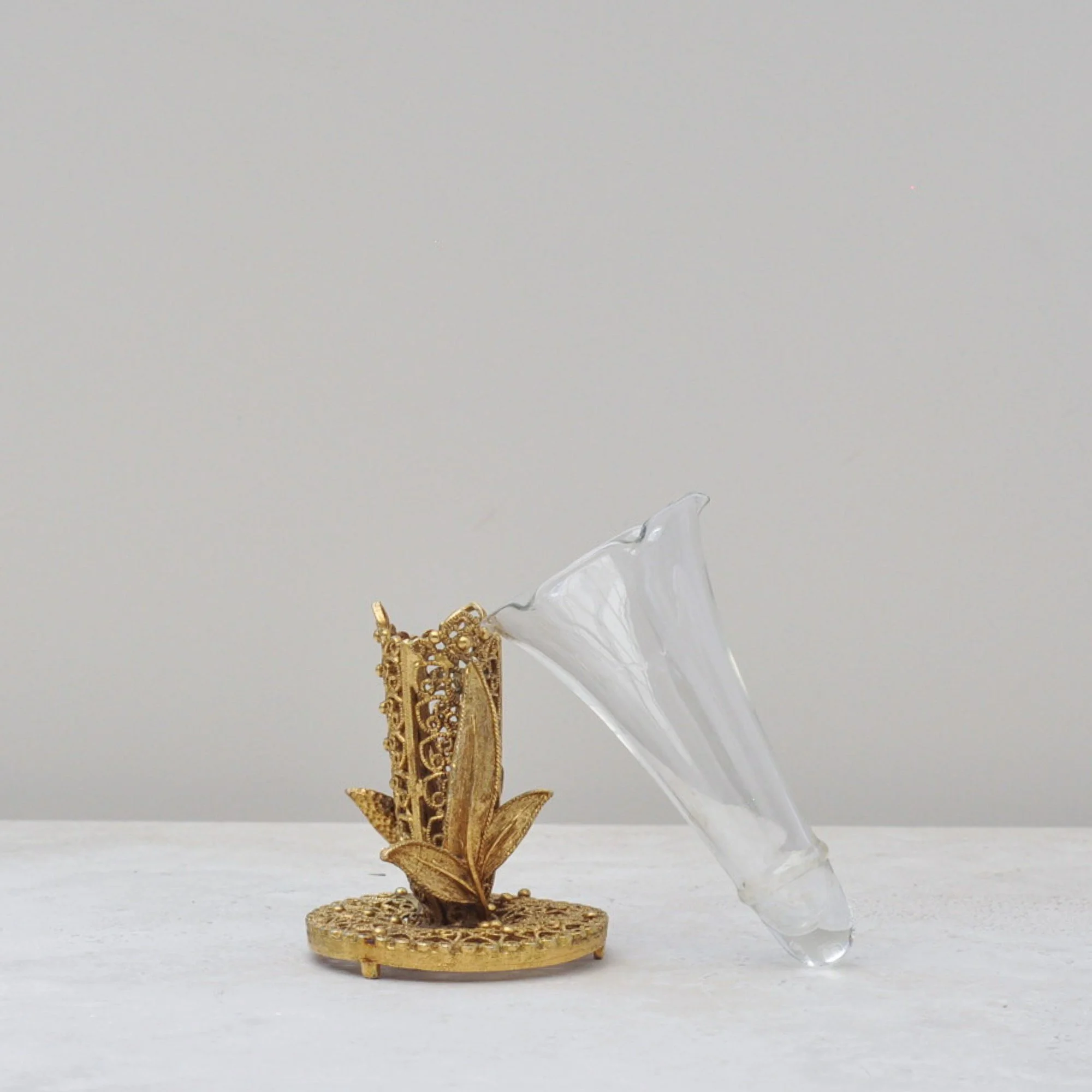
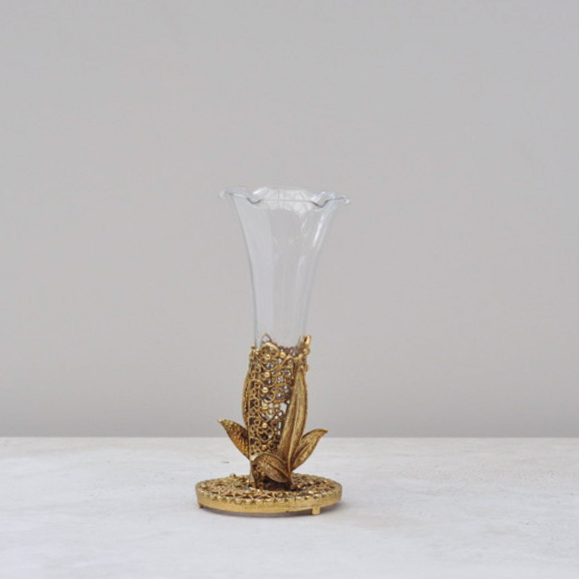
This totally charming mid-century filigree bud vase with a ruffled glass insert is both decorative and sculptural even without flowers, but I personally think it looks great with a little floral colour. Why not!
The filigree metal base, often referred to as ormolu, features delicate pierced detailing and a warm gilt tone typical of mid-century decorative pieces. The glass insert is removable and its sweet ruffled edge just adds to overall the delicacy the piece. When I saw it I loved it, don’t you too?
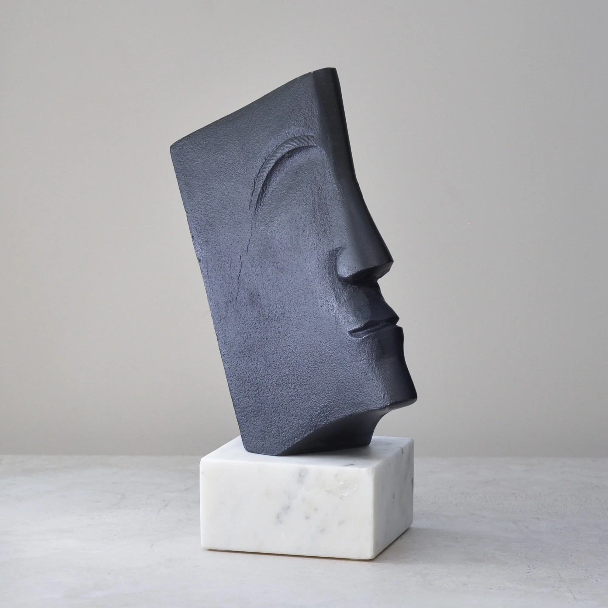
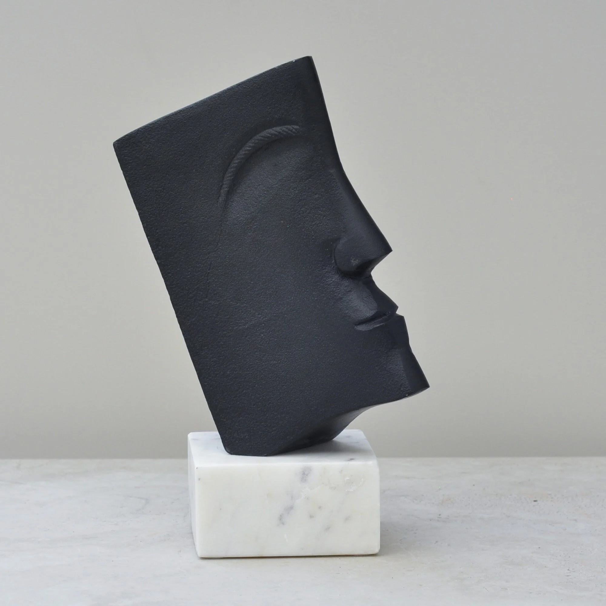
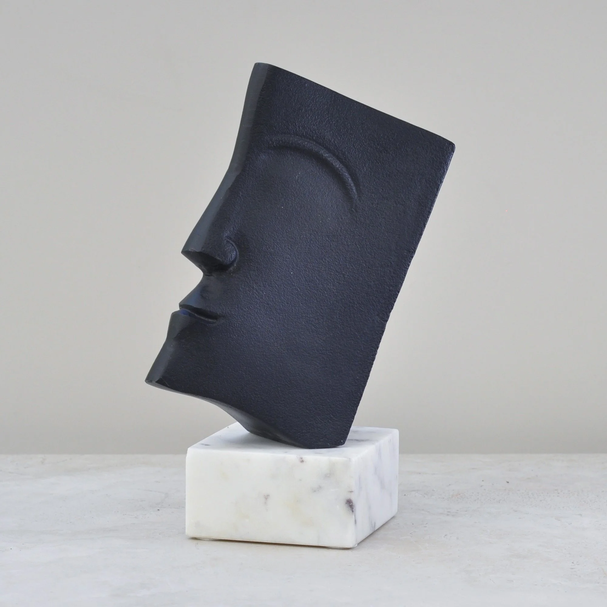

Affectionately known here at Again by Clare as Mr Black, this modernist sculpture is cast in solid metal and grounded by a white marble base, is talented at quickly capturing the eye. There is a quiet but imposing strength to him. I suspect it is the deep matte black finish, absorbing light rather than reflecting it, that keeps him feeling so grounded.
He feels architectural and considered. He knows how to hold his own.
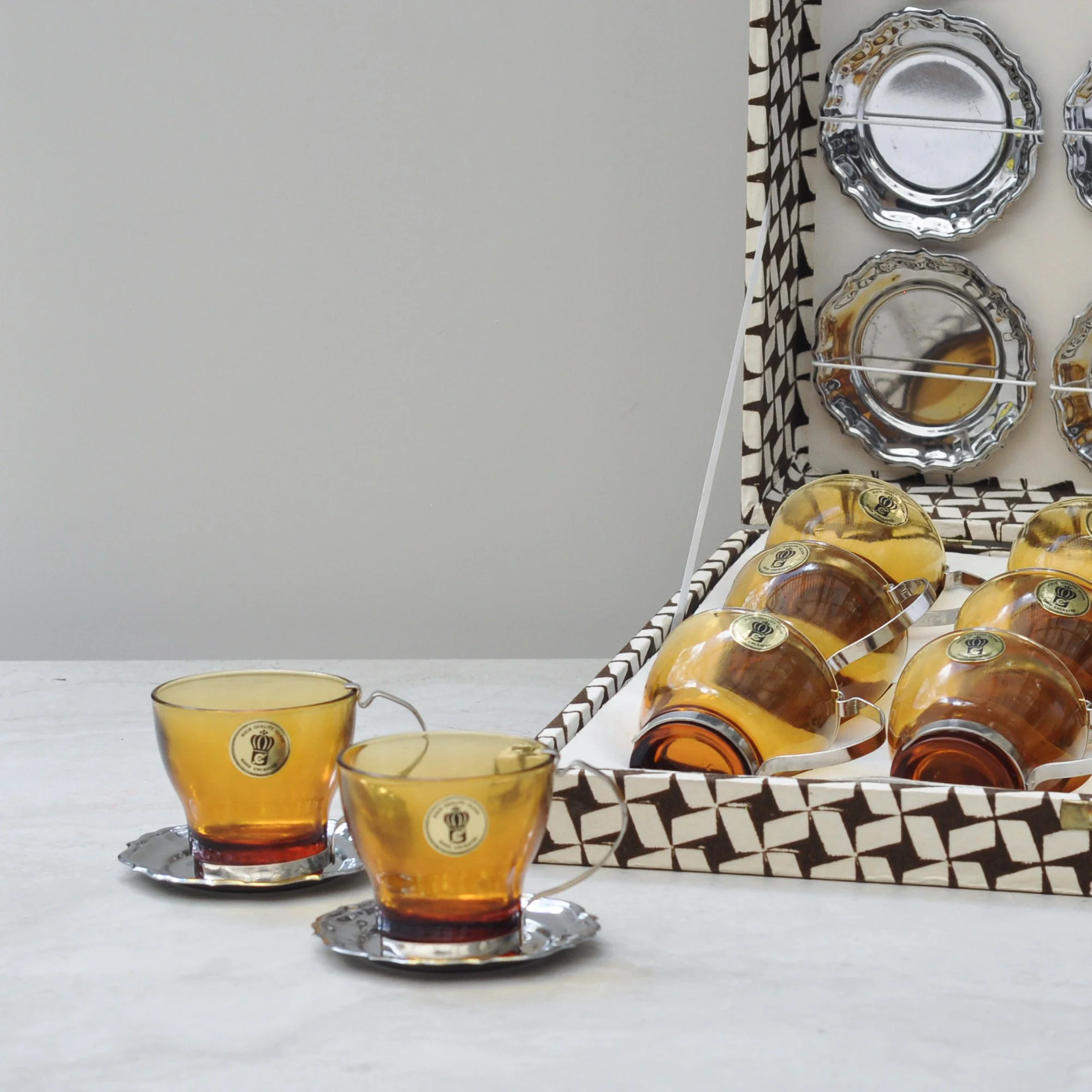
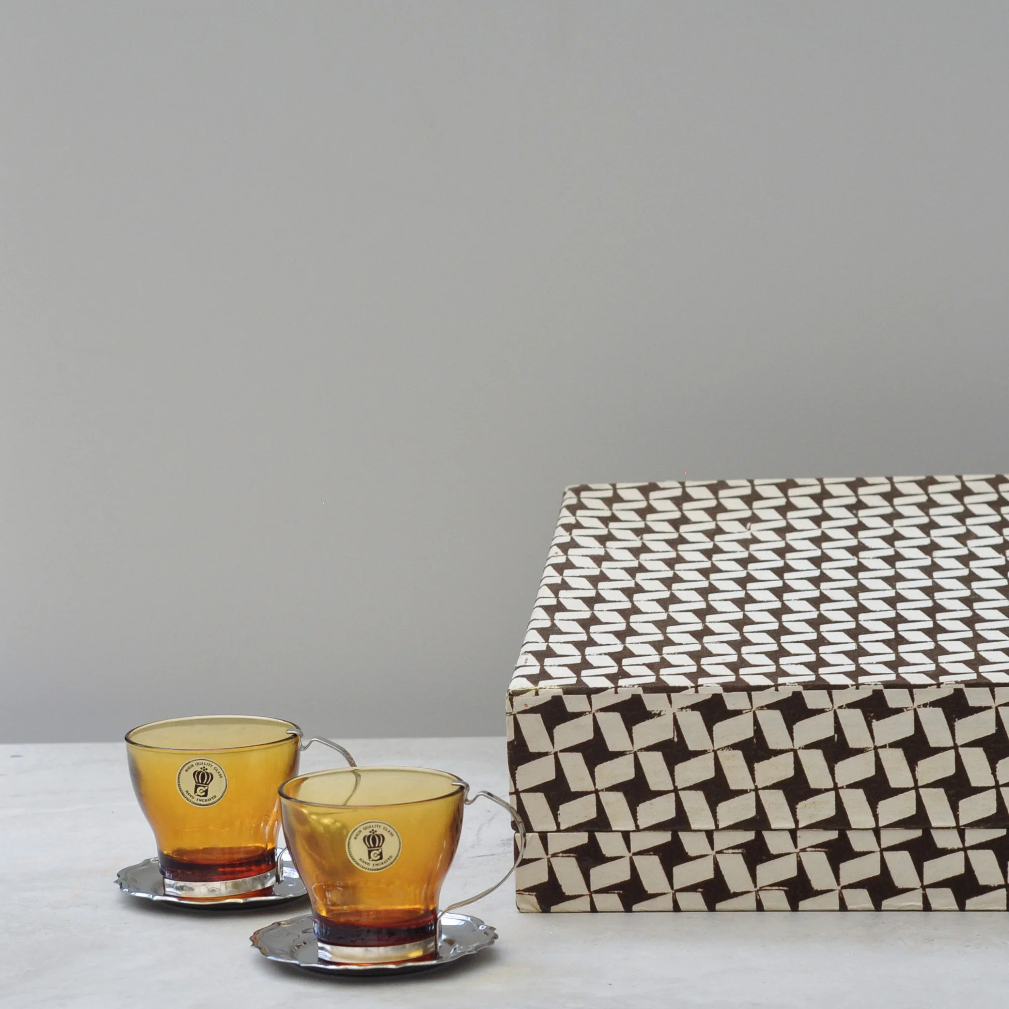
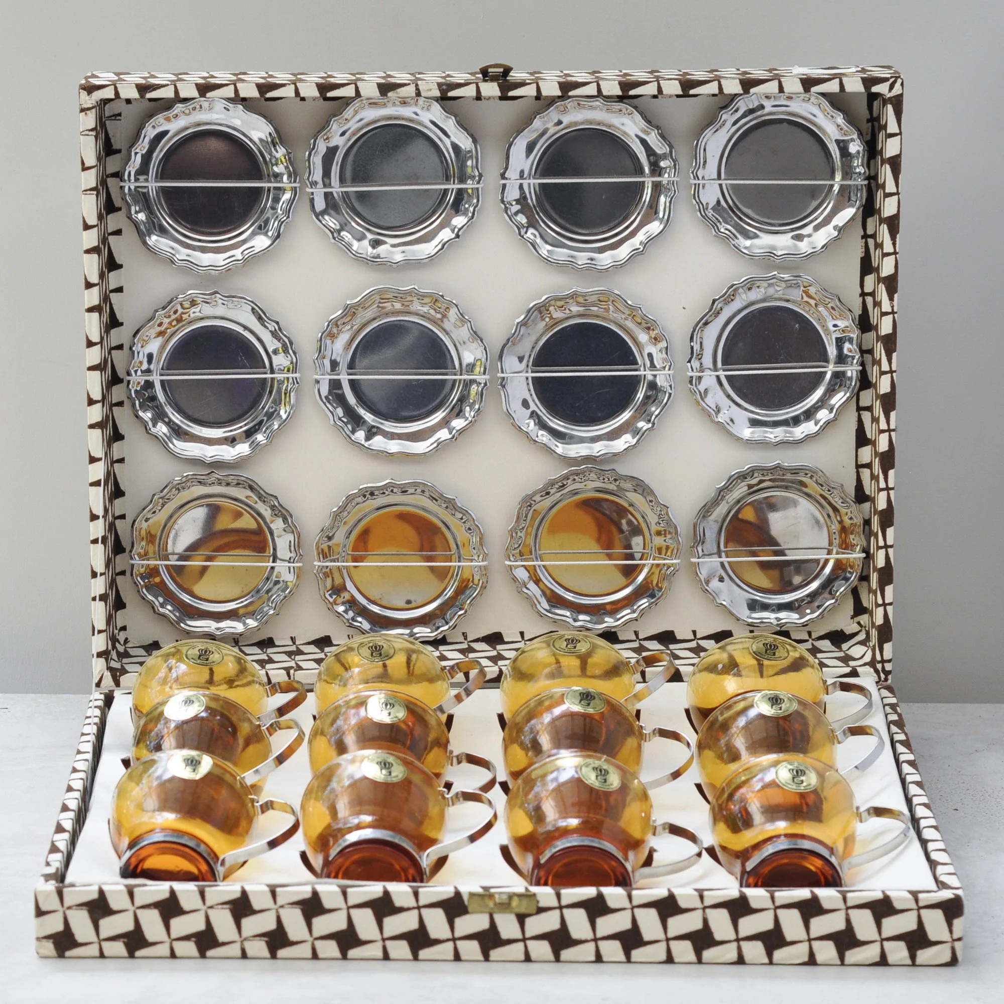
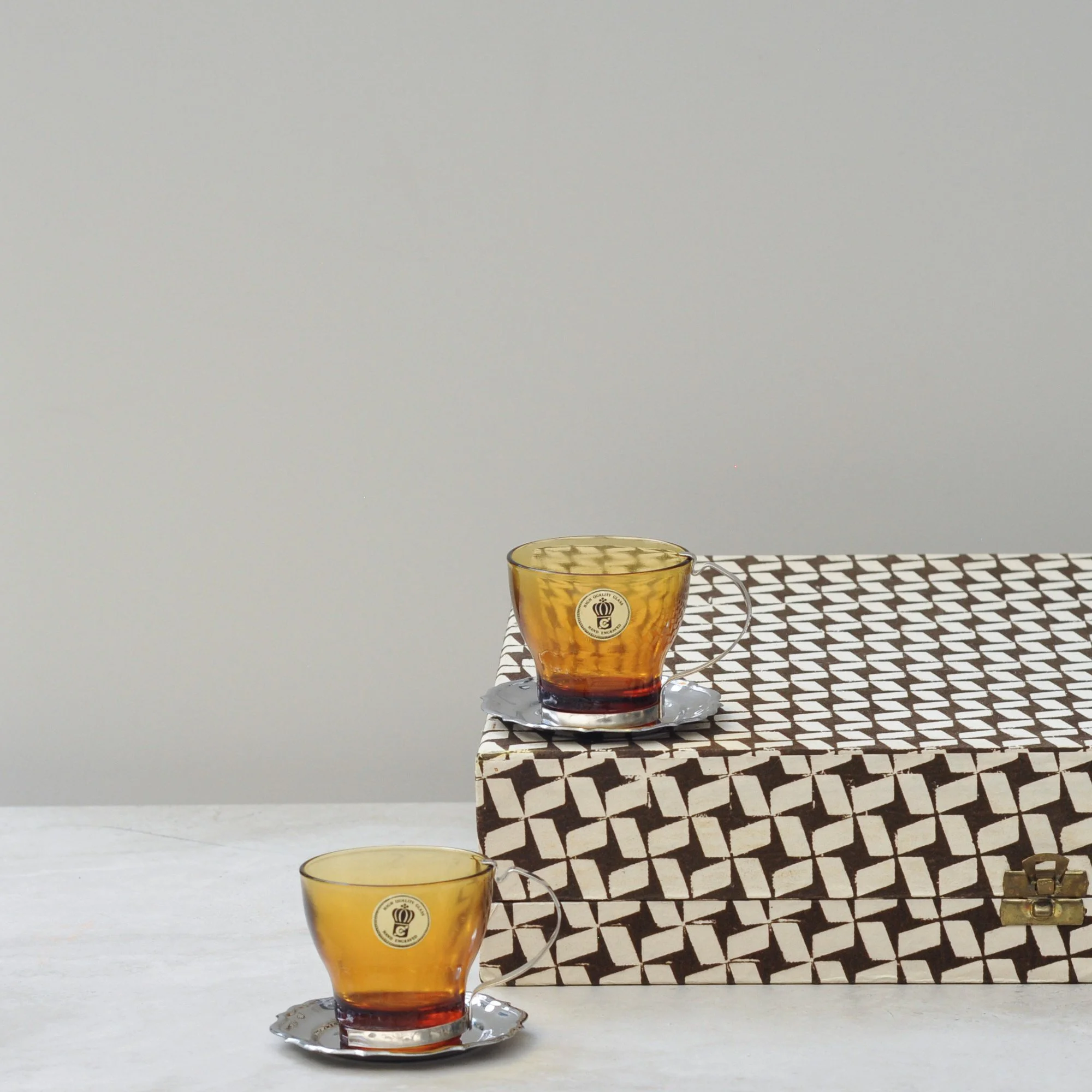
Here we have a true winner. Traditionally sold as a punch set (as noted on the original Italian label), these stunning amber glass cups with chrome detailing and matching silver saucers are perfectly sized for espresso or pre and post dinner shenanigans. They are a truly timeless mid-century classic.
Still housed in their original distinctive box, with original labels on each cup, it is a set that captures the eye and screams PLEASE USE ME. With 12 cups and matching saucers it’s designed for a table full of people having some seriously good fun. Don’t you agree?
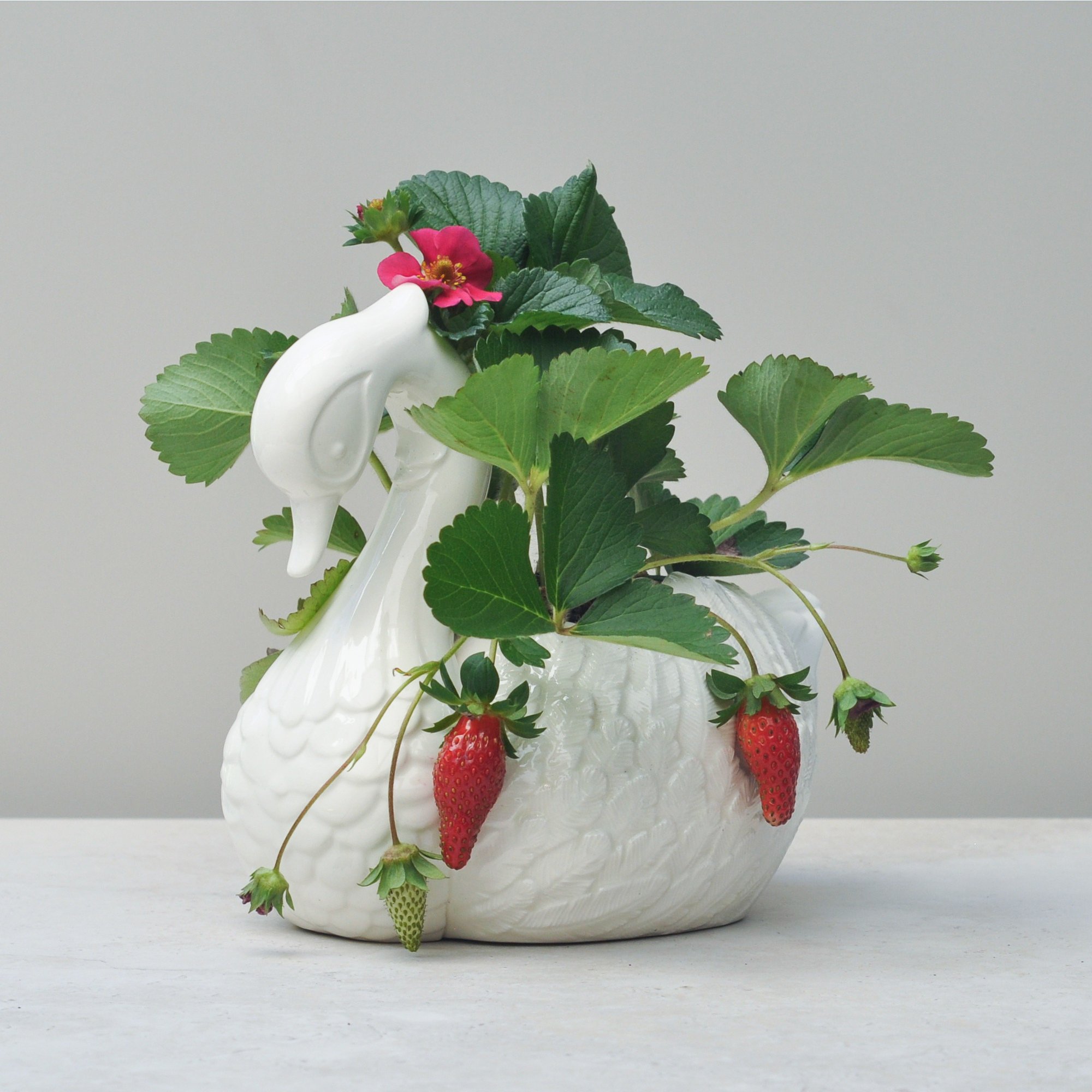
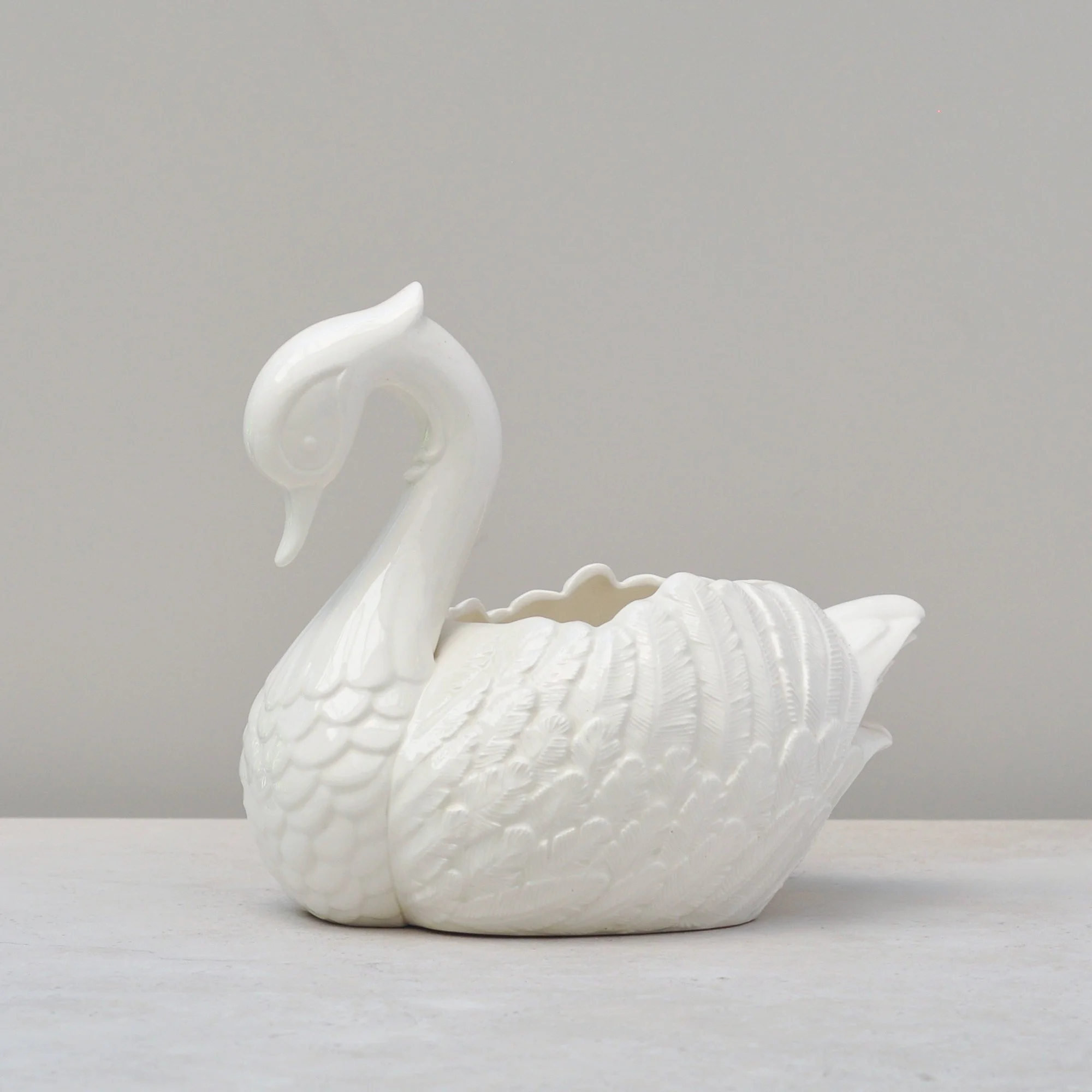
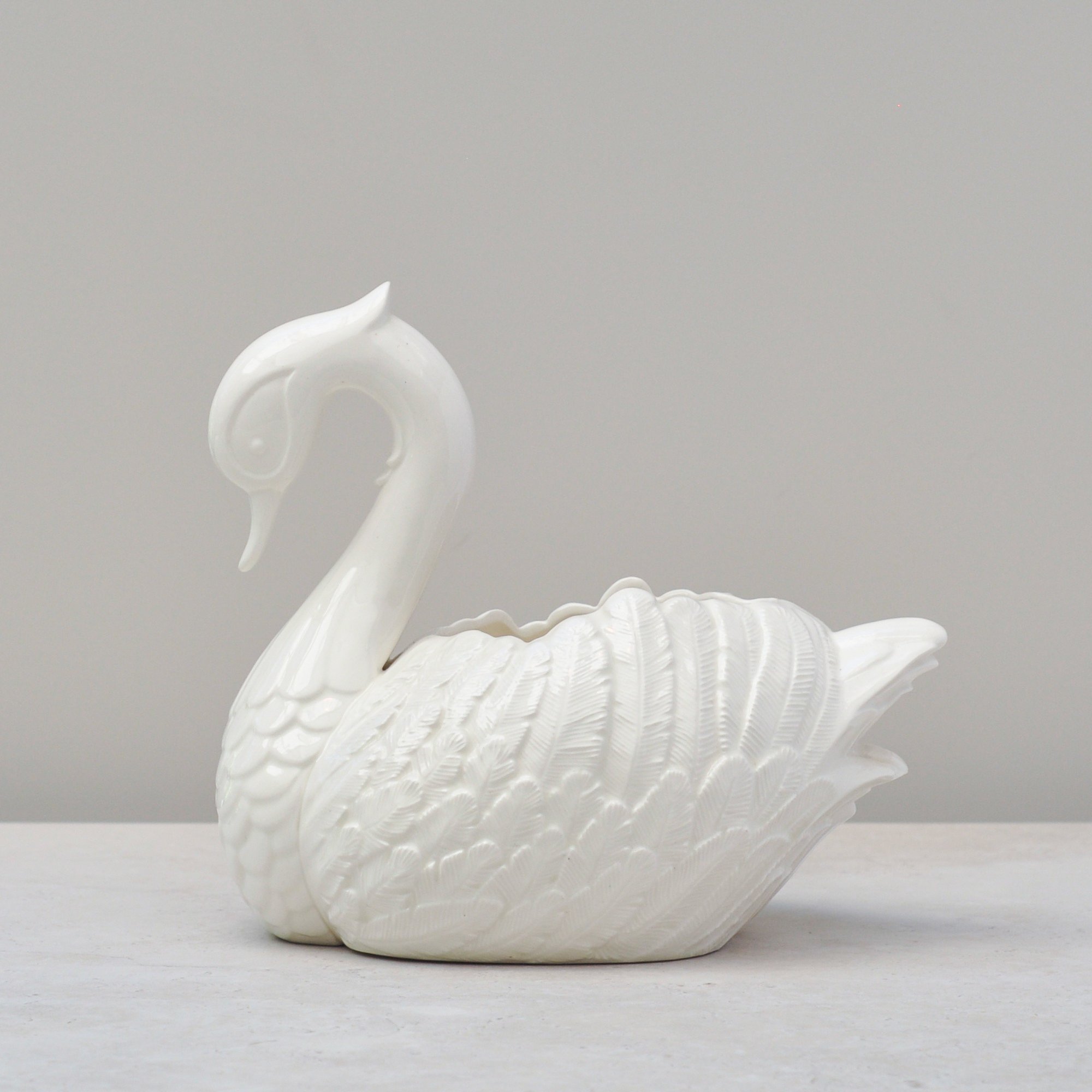
Who doesn’t love a swan?
This handmade ceramic swan shaped bowl from 1987 has so much grace and charm. The wonderful feather detail forms the lip of the bowl, balanced by a lovely stylised neck and face. And the tail… well, it’s just the cutest.
It is signed by ‘Sonya’ and dated the 2-12-87. I can’t help but wonder if she’d be chuffed to know her handmade ceramic is still loved some 38 years later. It really is a lovely one of a kind piece - sweet, special and endearingly stylish.
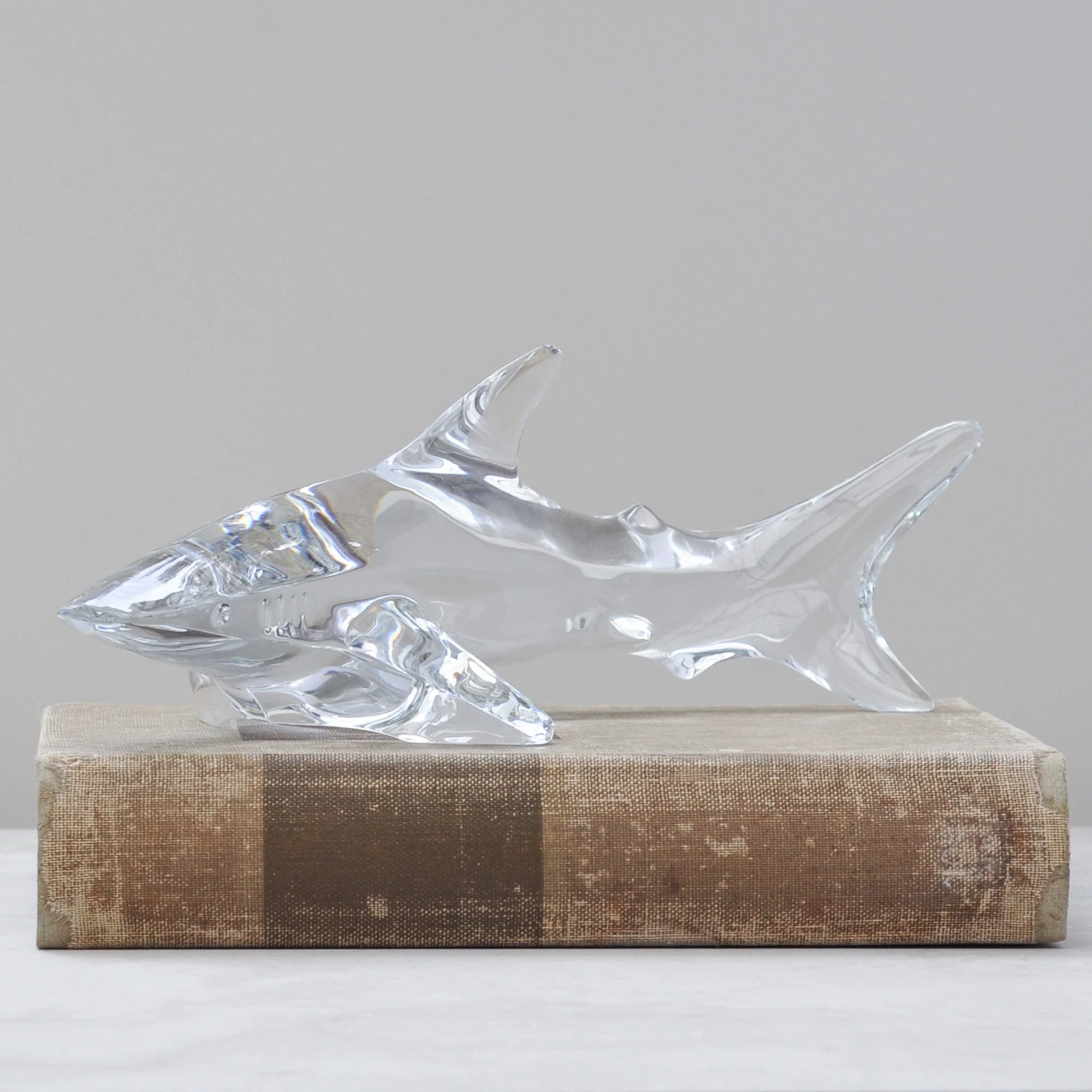
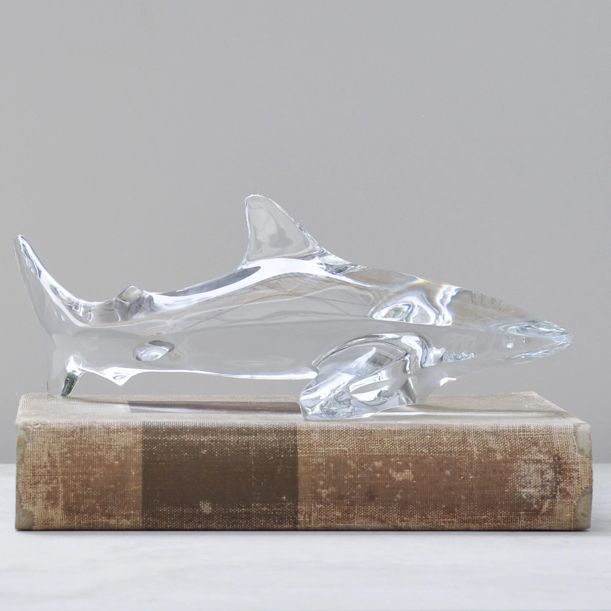
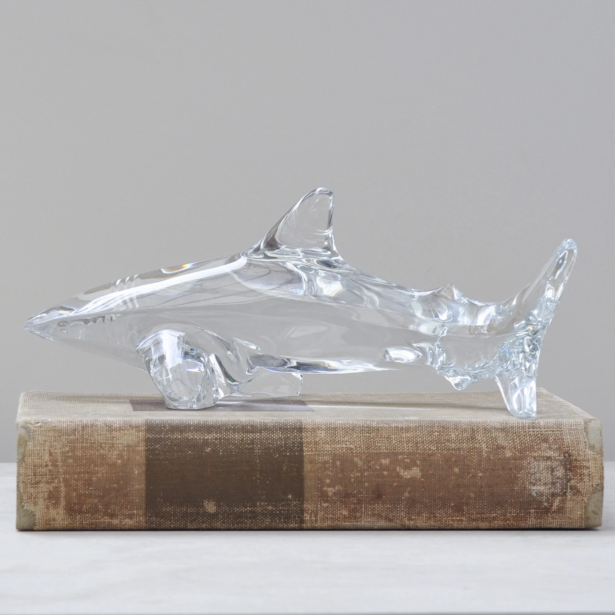
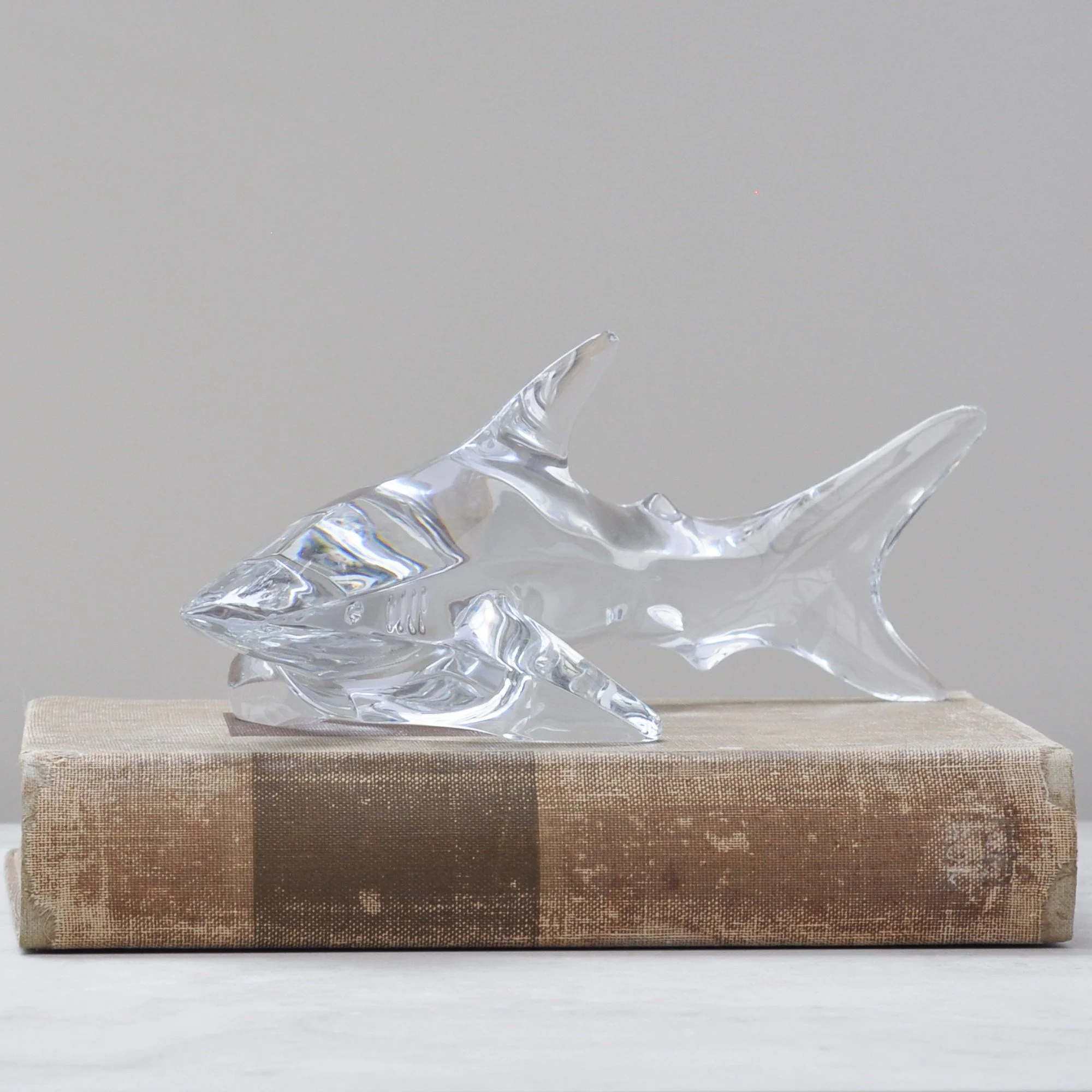
Trust me, this is a wow piece. Everyone who has seen this Baccarat crystal shark has said exactly that. Think words like amazing, I love this and this shark is incredible… and that is just from men!
It is heavy, beautifully clear and wonderfully surprising. The crystal catches the light effortlessly and brings a real sense of movement to the piece. There is something undeniably masculine and strong about it, a sculptural replica of nature at its finest.
Thank you, Baccarat, for producing this piece in your finest crystal. You truly created something special, perhaps even the perfect gift for the man who is notoriously difficult to buy for!
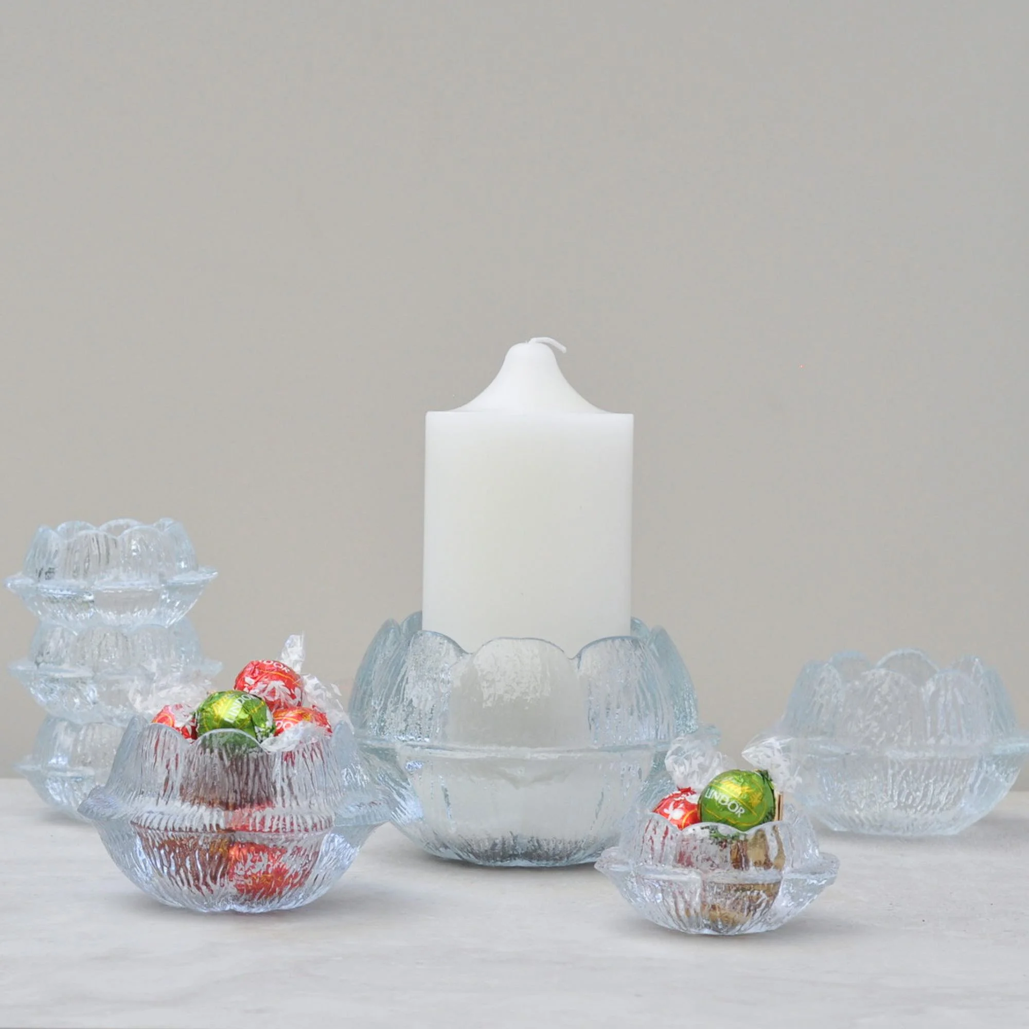
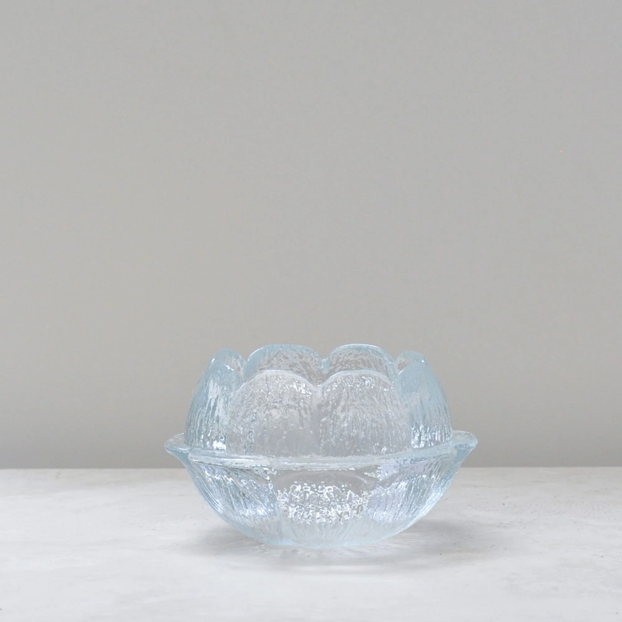
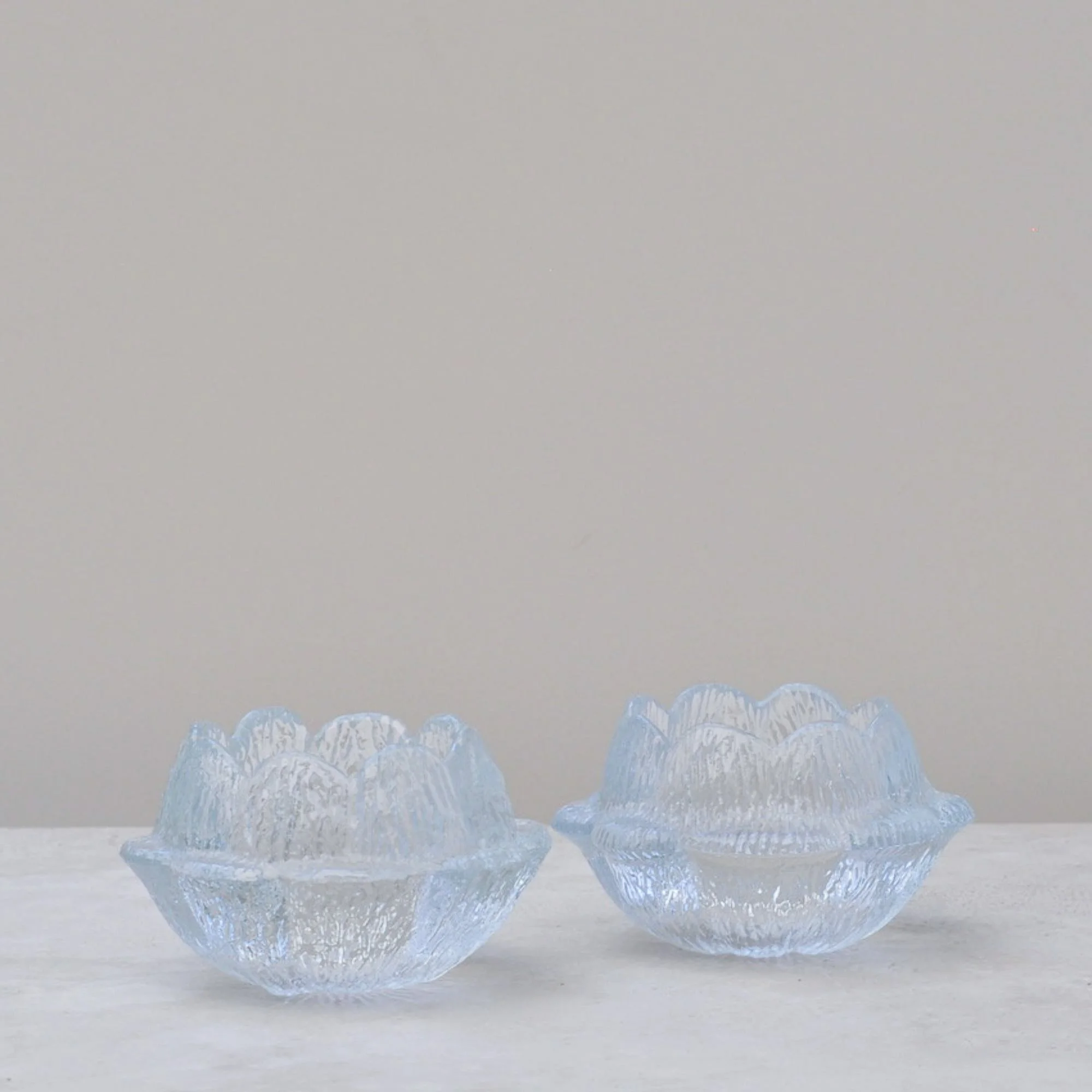
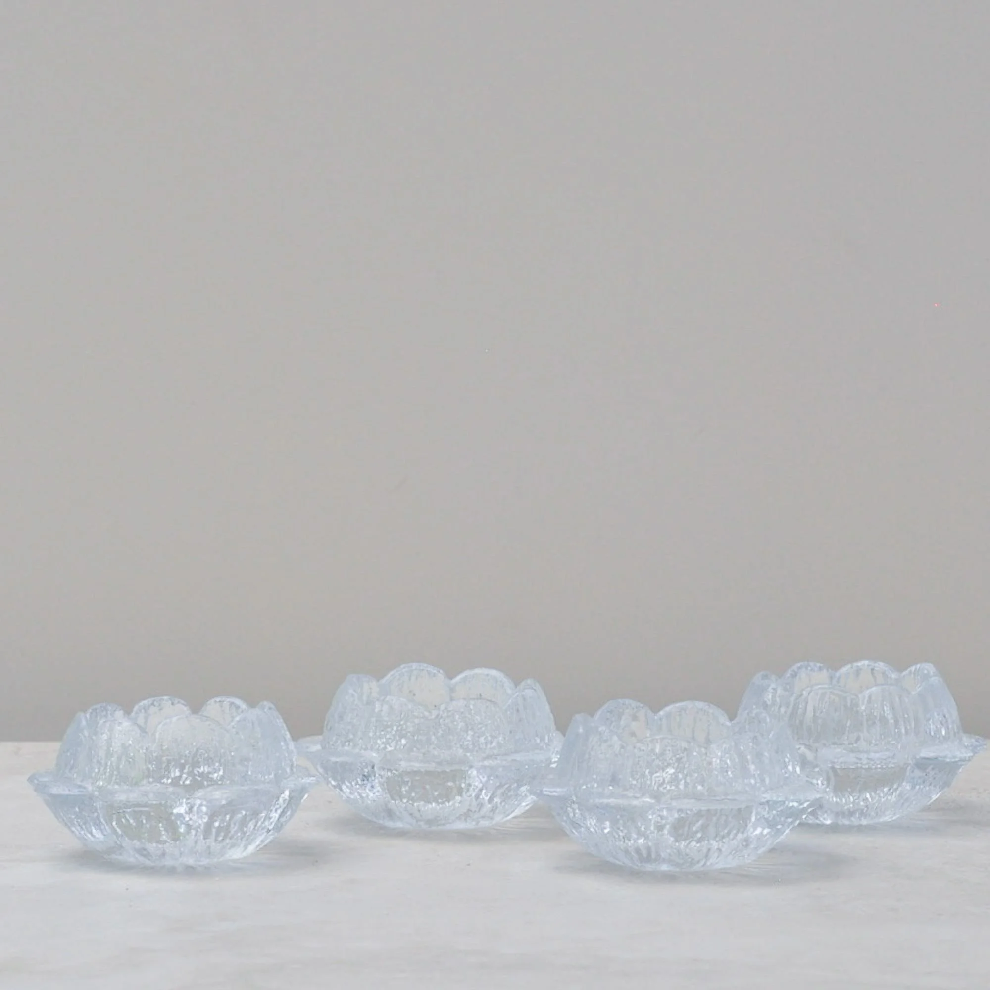
I’ve made a conscious decision to keep these seven glass beauties together because as a group you’ve got the start of a seriously good styling moment. What’s more, while they’re best known as candle holders, don’t let that stop you. They can be filled with just about anything. Can you see where I’m going with this?
Designed by Sidse Werner for Holmegaard in the 1970s, these iconic “Akande” (Water Lily) glass candle holders are a classic of Danish mid-century design. This generous group includes one large, two medium and four small holders.
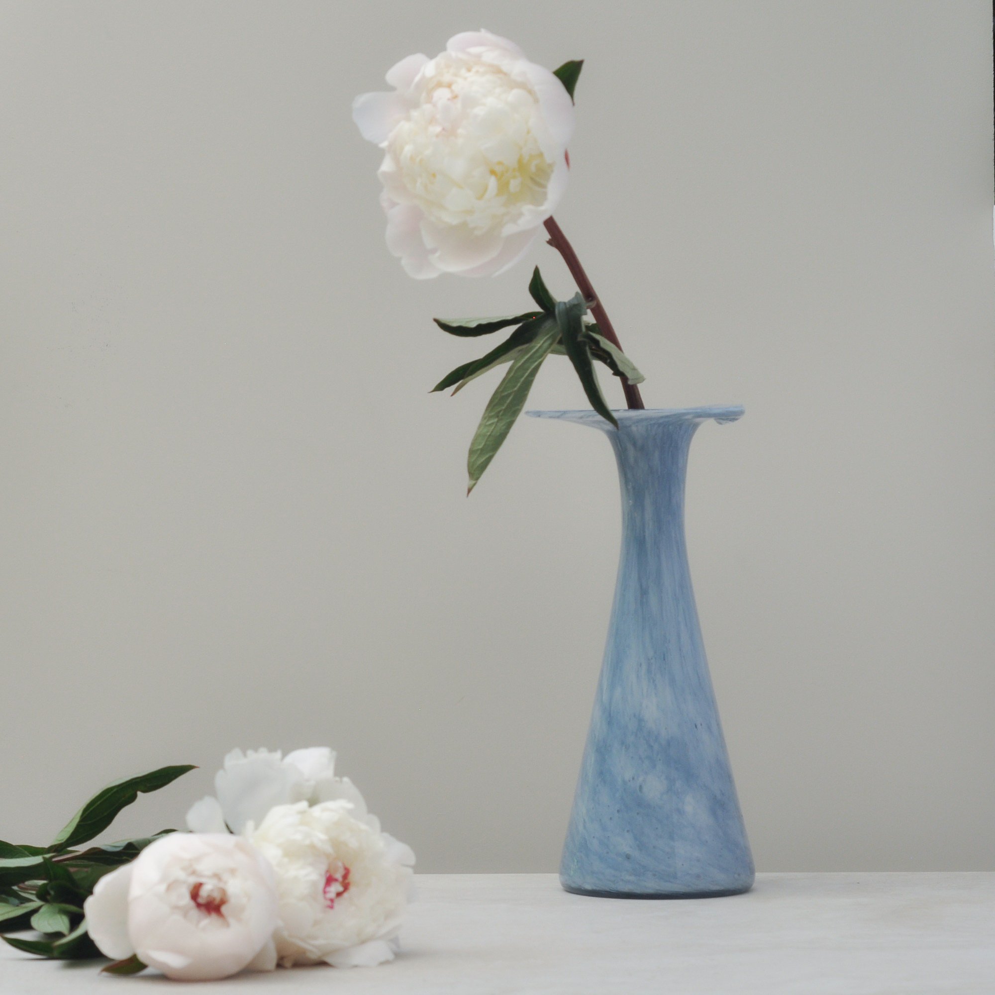
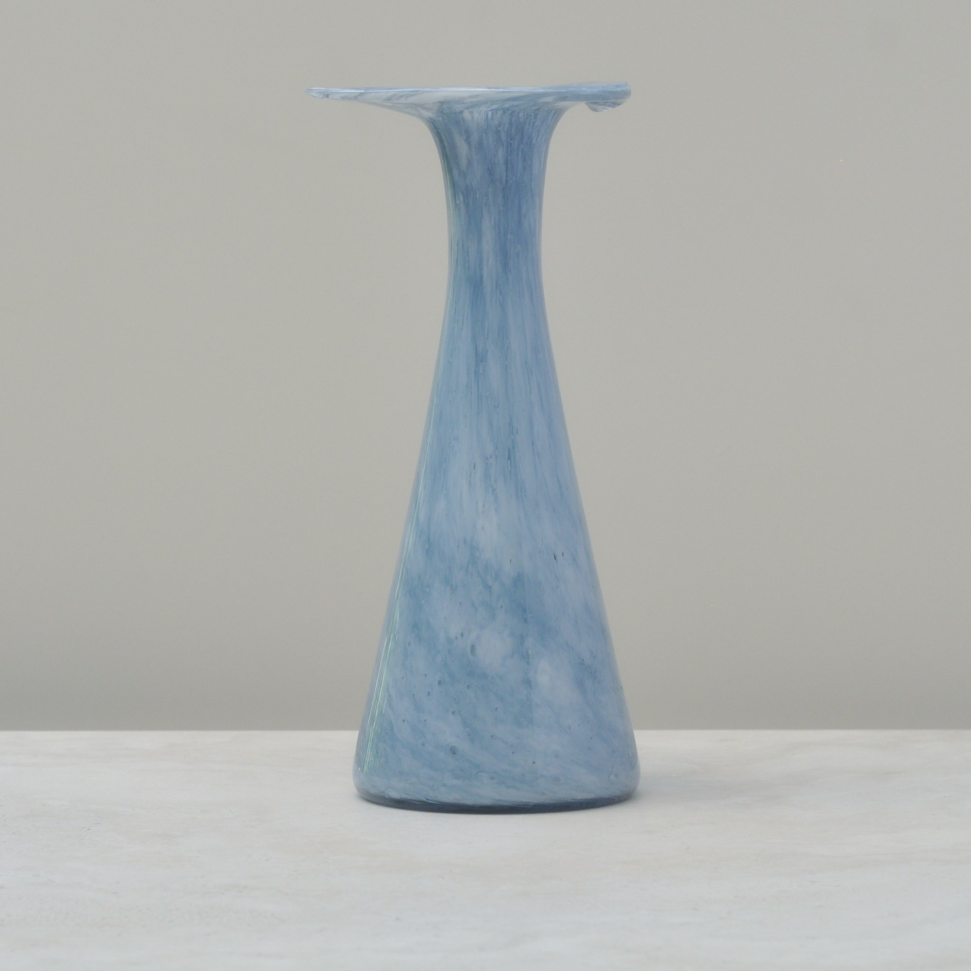
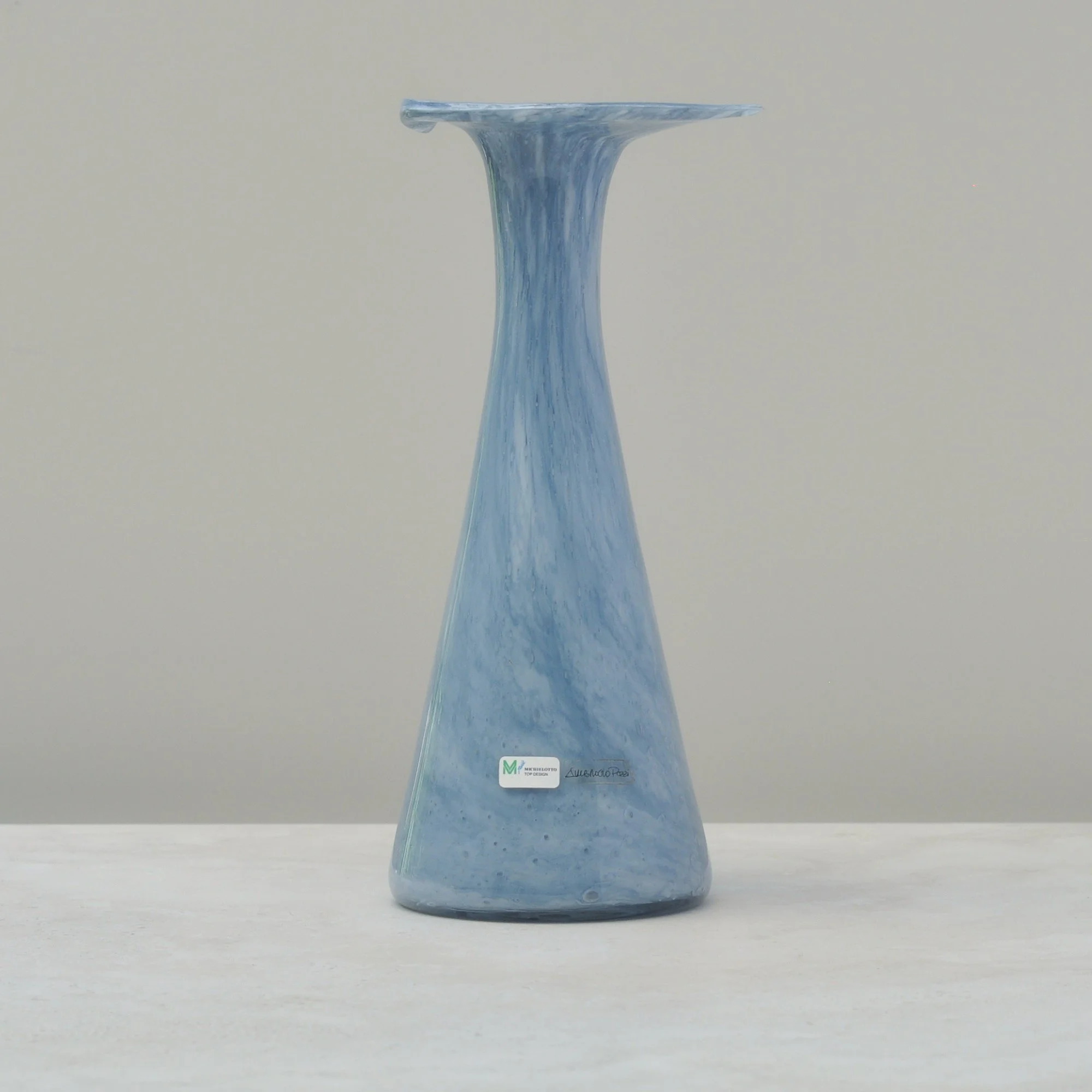
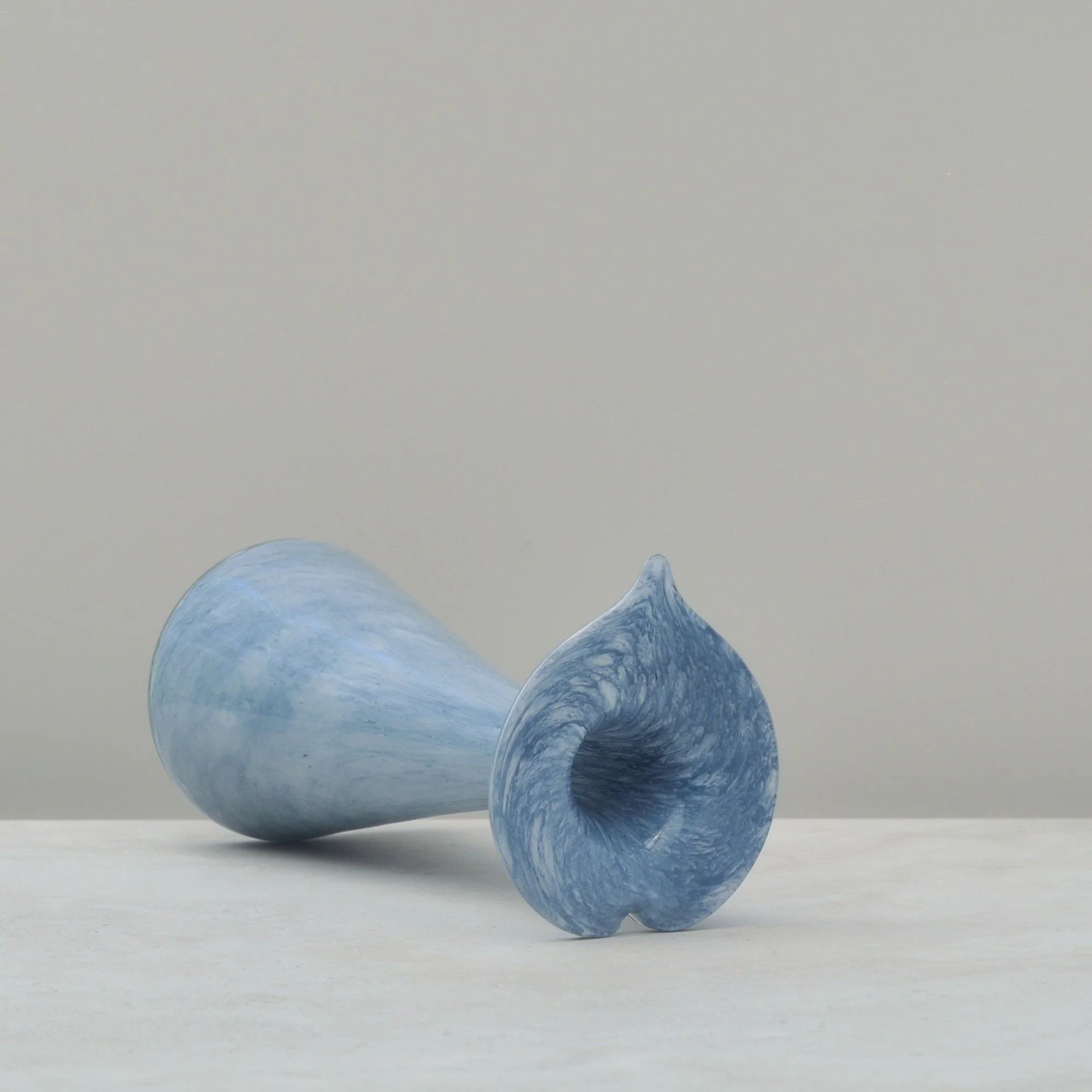
Who isn’t drawn to the colour light blue. There is always something soft and gentle about it but when you add a lip shape that isn’t quite a heart and isn’t quite a circle you have instant personality without being overstated. This must be what drew me to this delightful piece.
I’ve since learnt that this vase was likely made in small batches by the Subrocio Pozzi workshop for Michielotto Top Design so has the character forming variations you’d expect from handblown glass. The sticker on the base also tells me it was sold locally in Italy so we know this vase has had quite the journey. Final destination - your place perhaps?
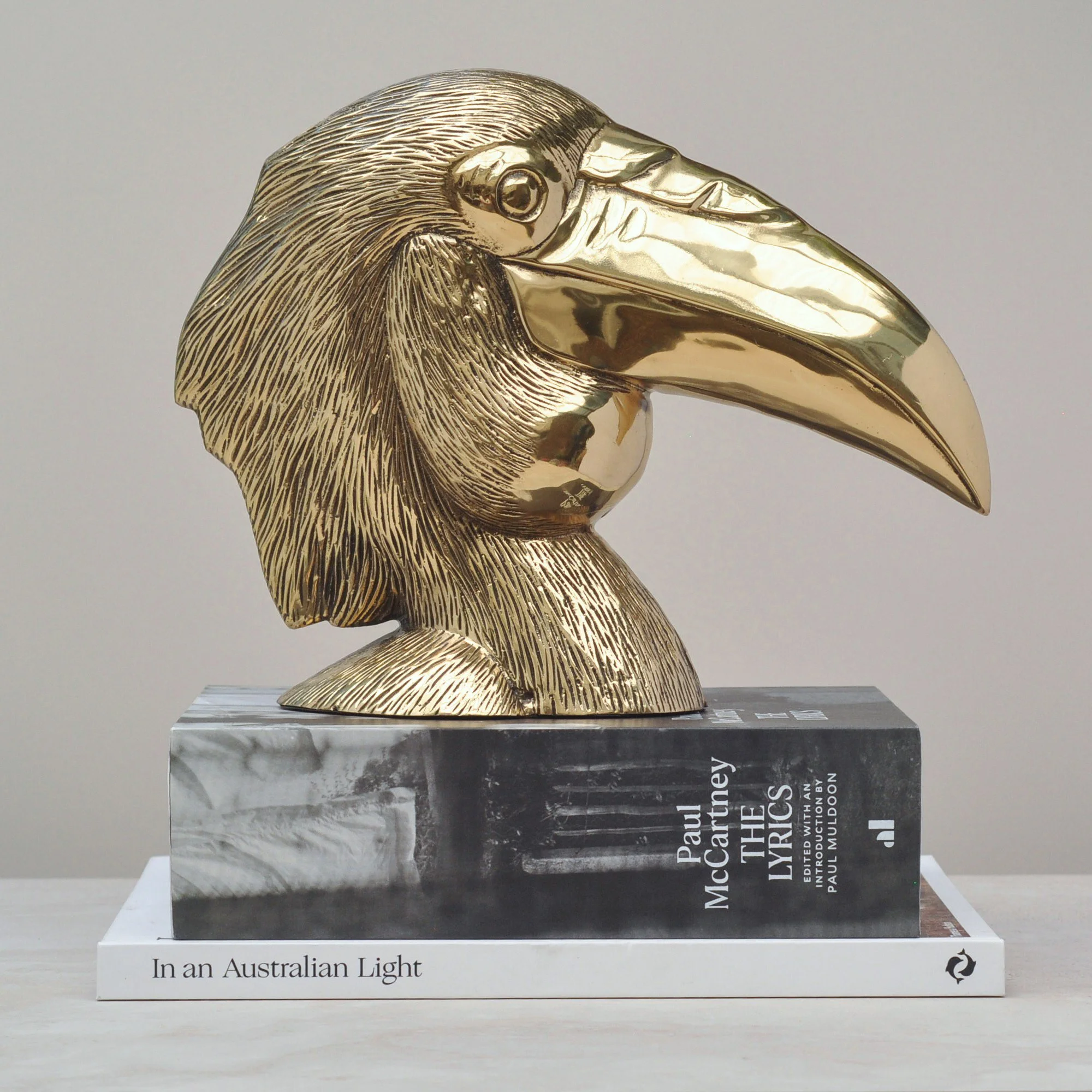
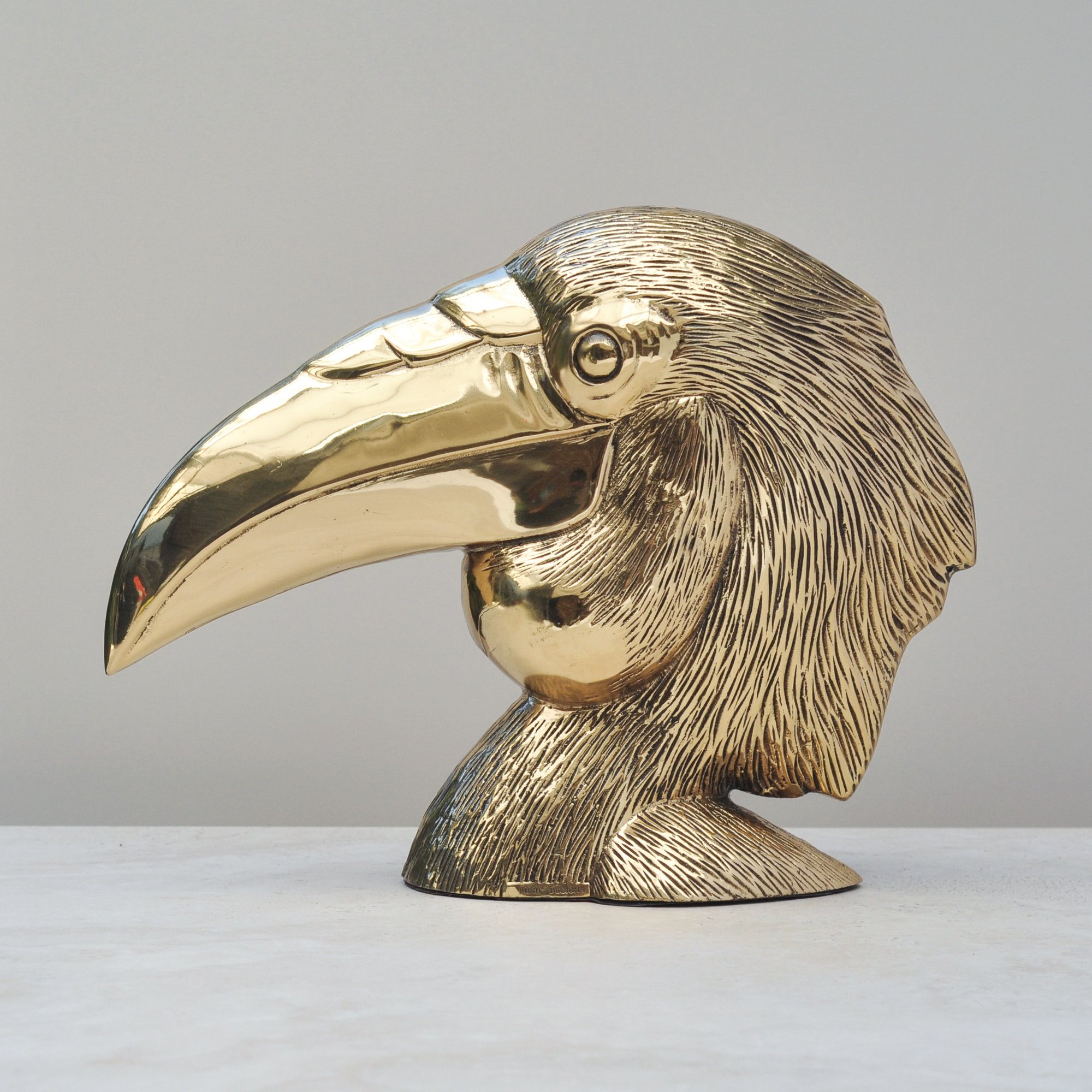
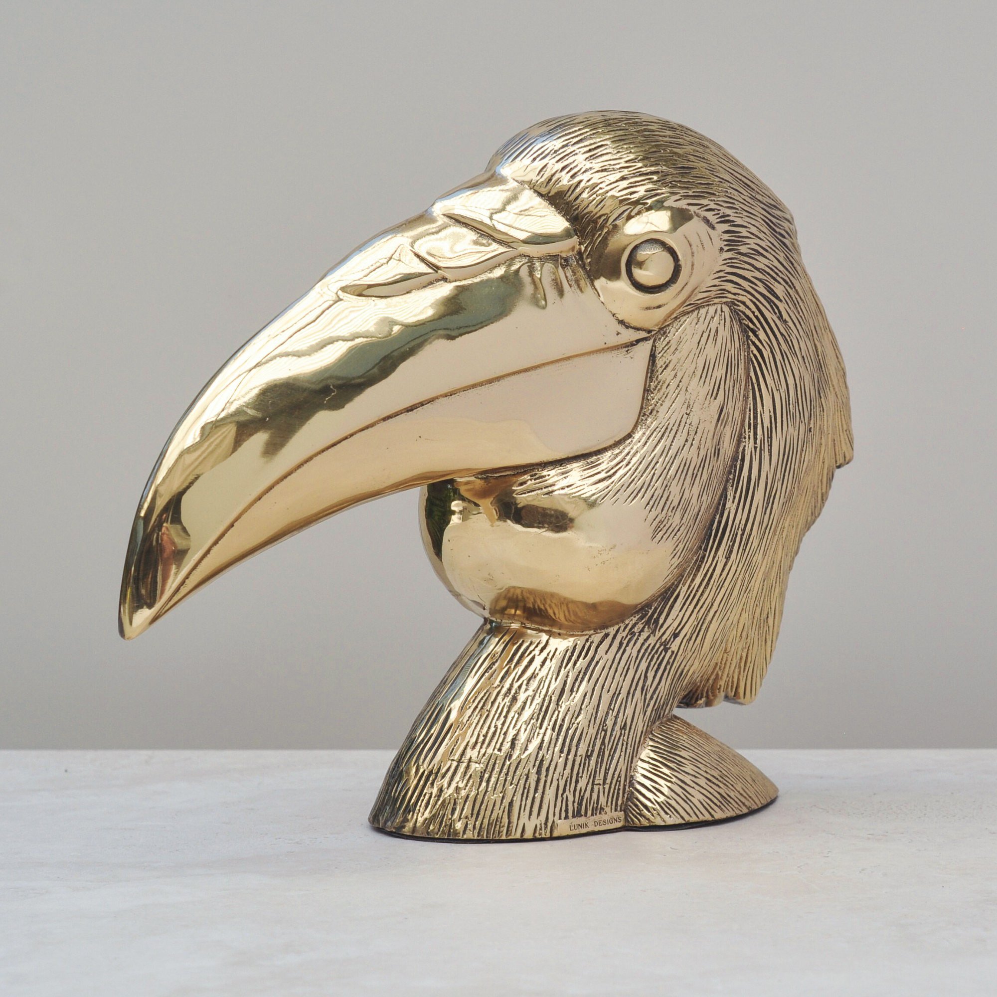
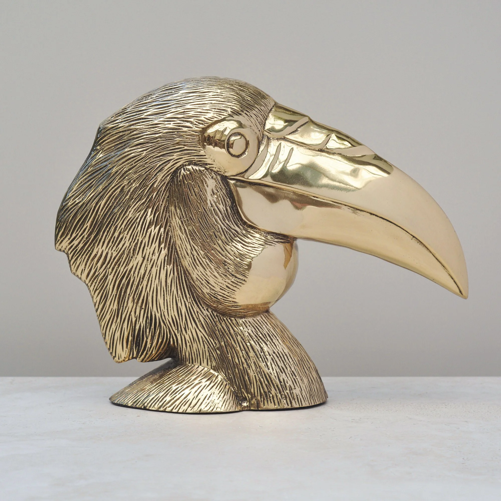
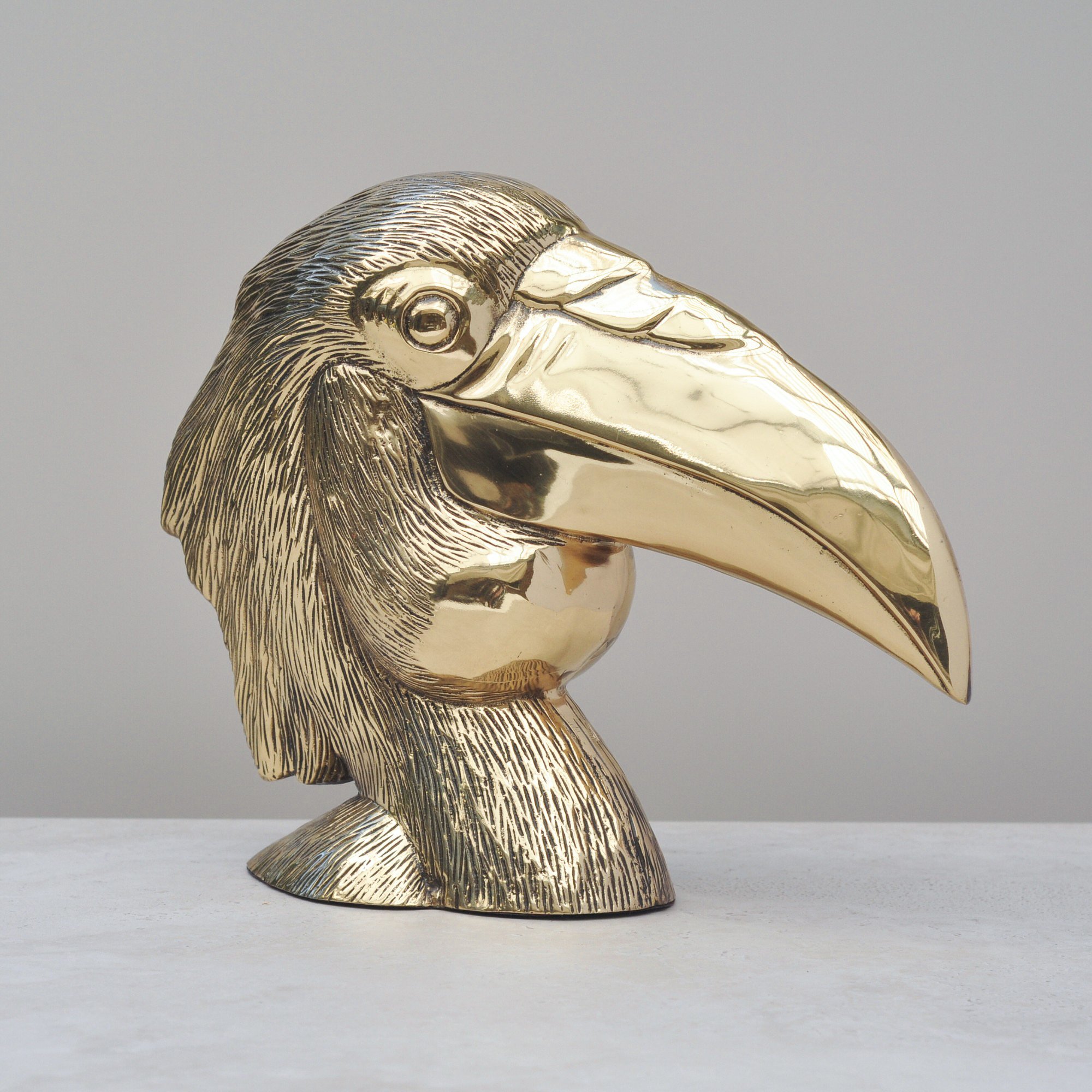
Talk about presence, this sculpture has it all. Bold, bright and unashamedly brassy, there is something utterly delightful about this bird. He’s totally elegant, timeless and deliciously fabulous.
Little is known about this wild treasure but I do know he is rather something and quite the one of a kind. A real conversation piece that deserves to be pride of place. All who see him, love him, as I know you will too. Trust me, you’ll be hard pressed to find another stunner just like him.
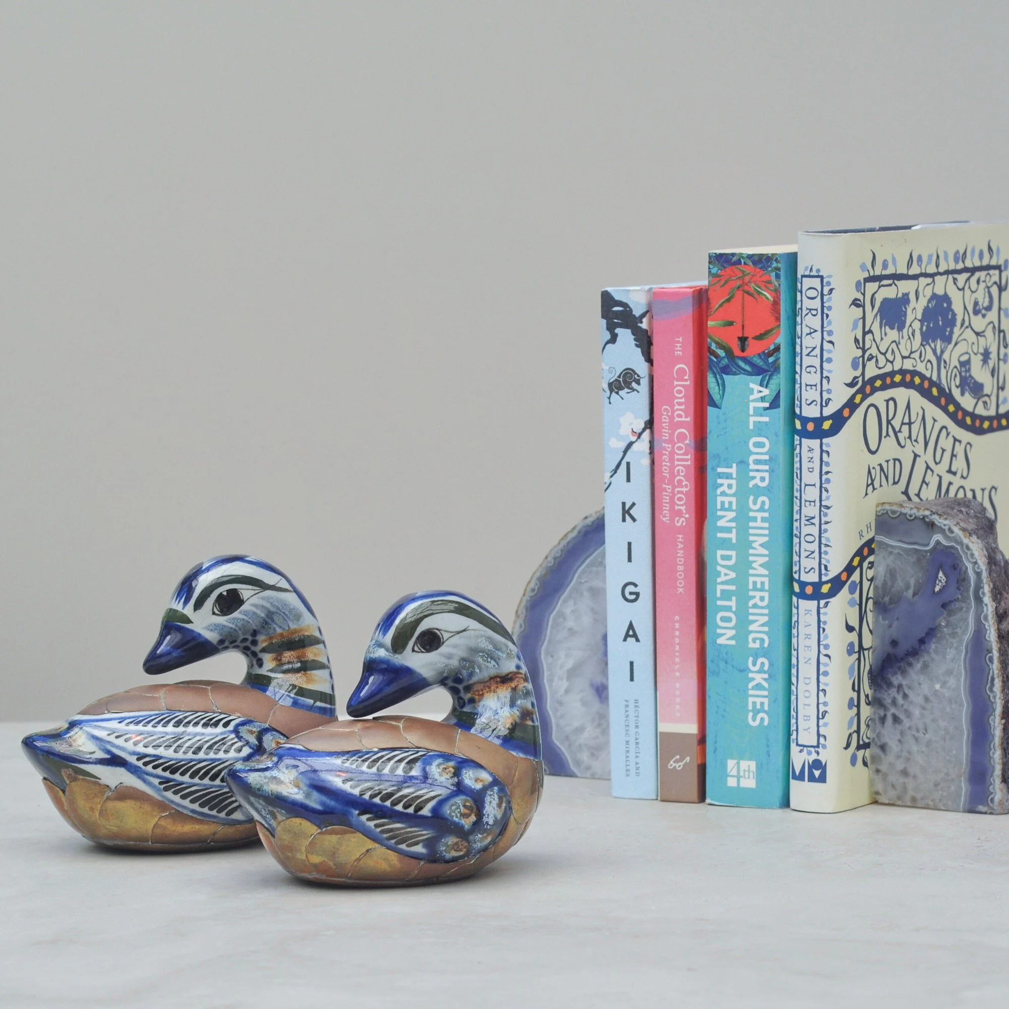
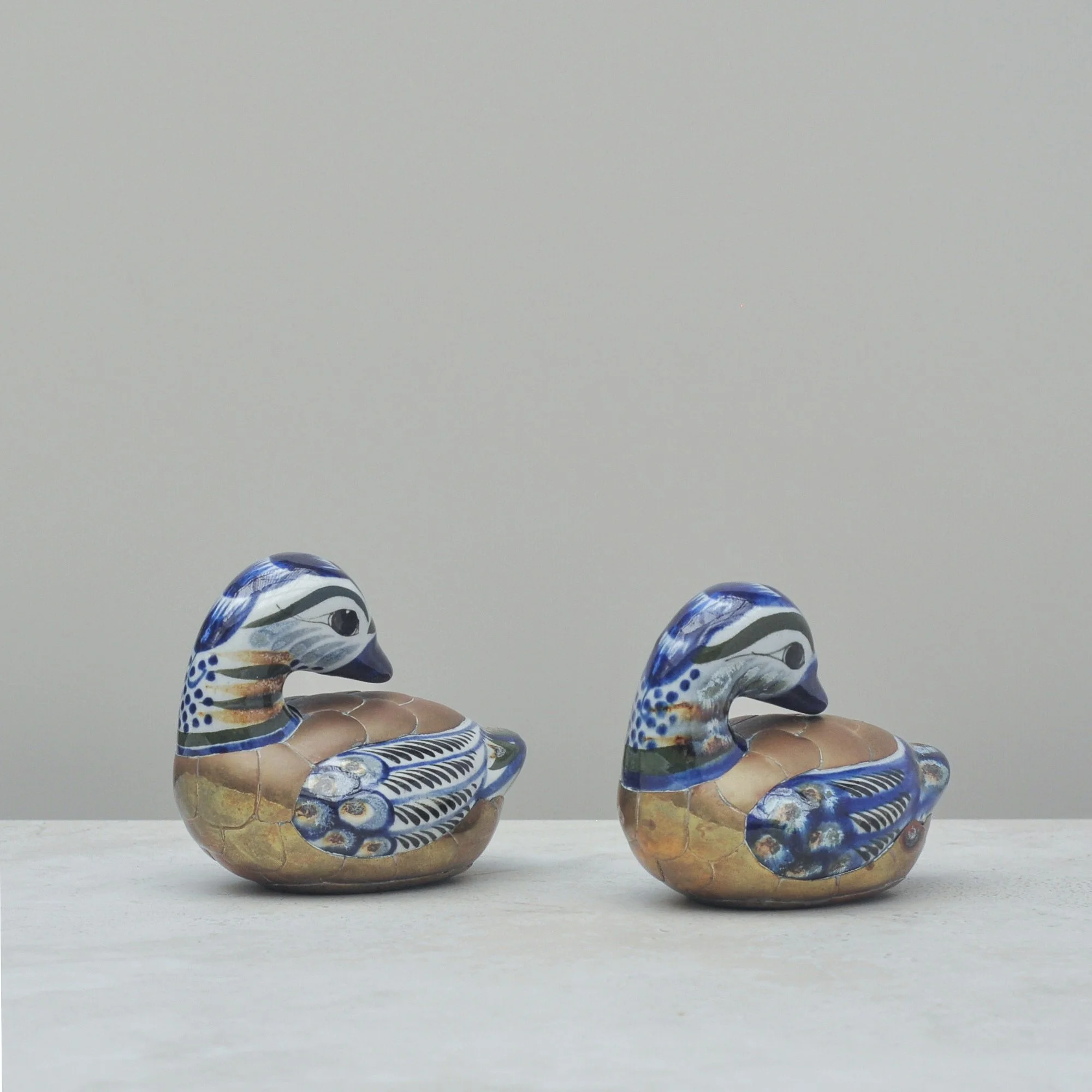
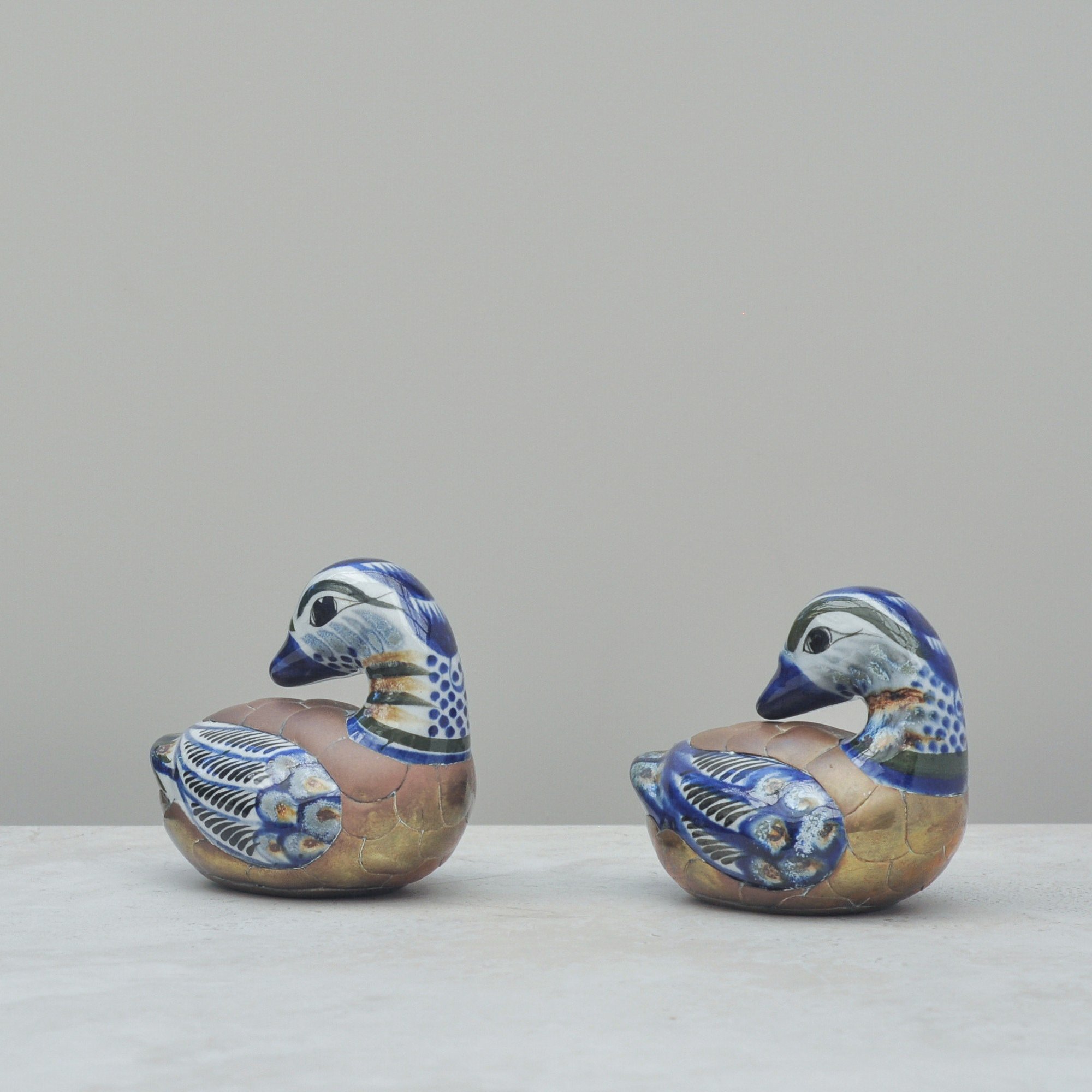
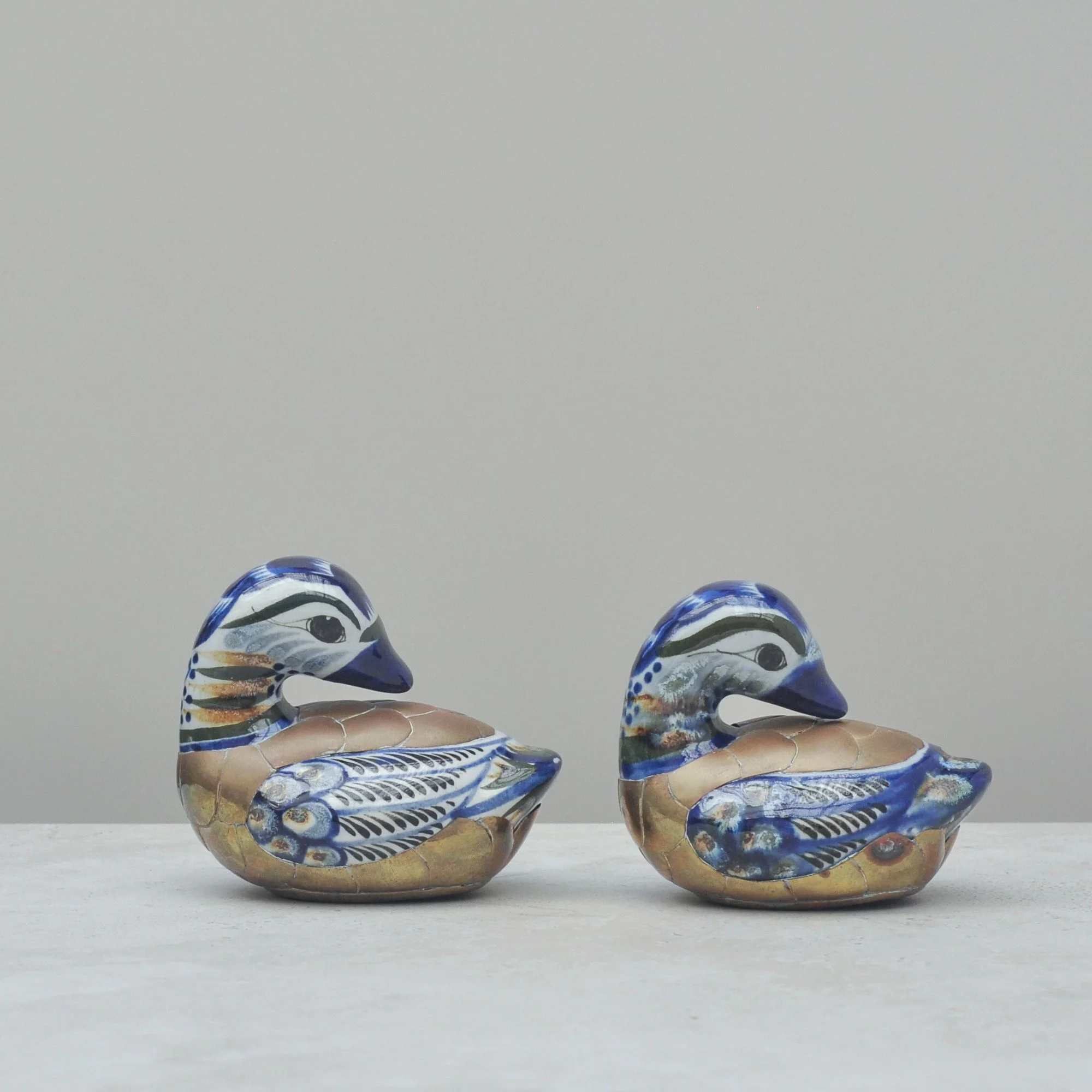
Oh these ducks are purely adorable. A sub-style of vintage Tonalá pottery - a form of hand-painted Mexican folk art - they use mixed media to incorporate brass accents. They’re vibrant, glossy and full of character. They even feel like they have their own personalities, no doubt helped by their slight difference in size.
They are also ageing better than most, with their overall patina adding beautifully to their charm. Never polish their brass, the warming brass tones complement their bright glaze so well. Interestingly, they are also showing small areas of rust, likely the natural result of the combination of brass and the porous clay beneath. I find this totally magical - it only adds to their appeal. See? Totally adorable.
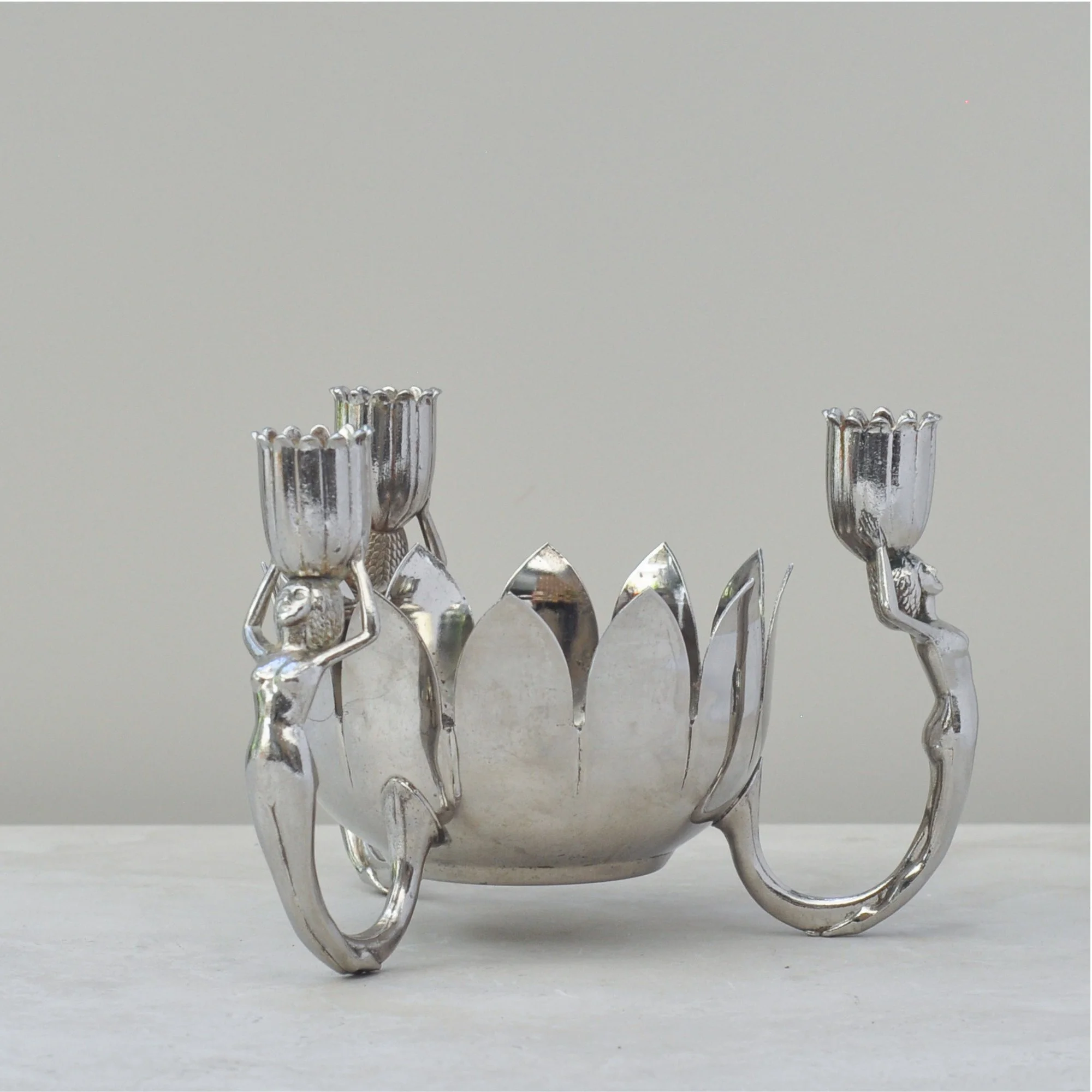
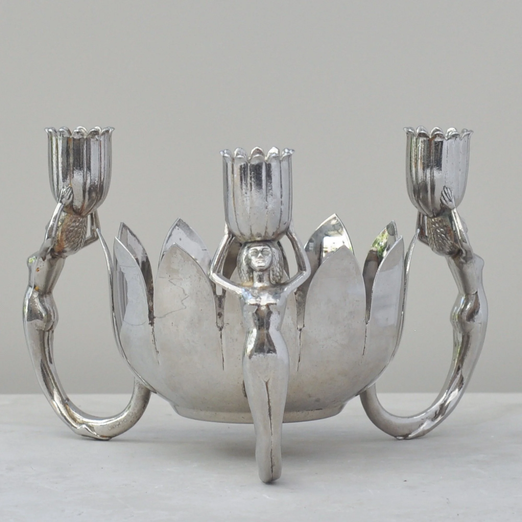
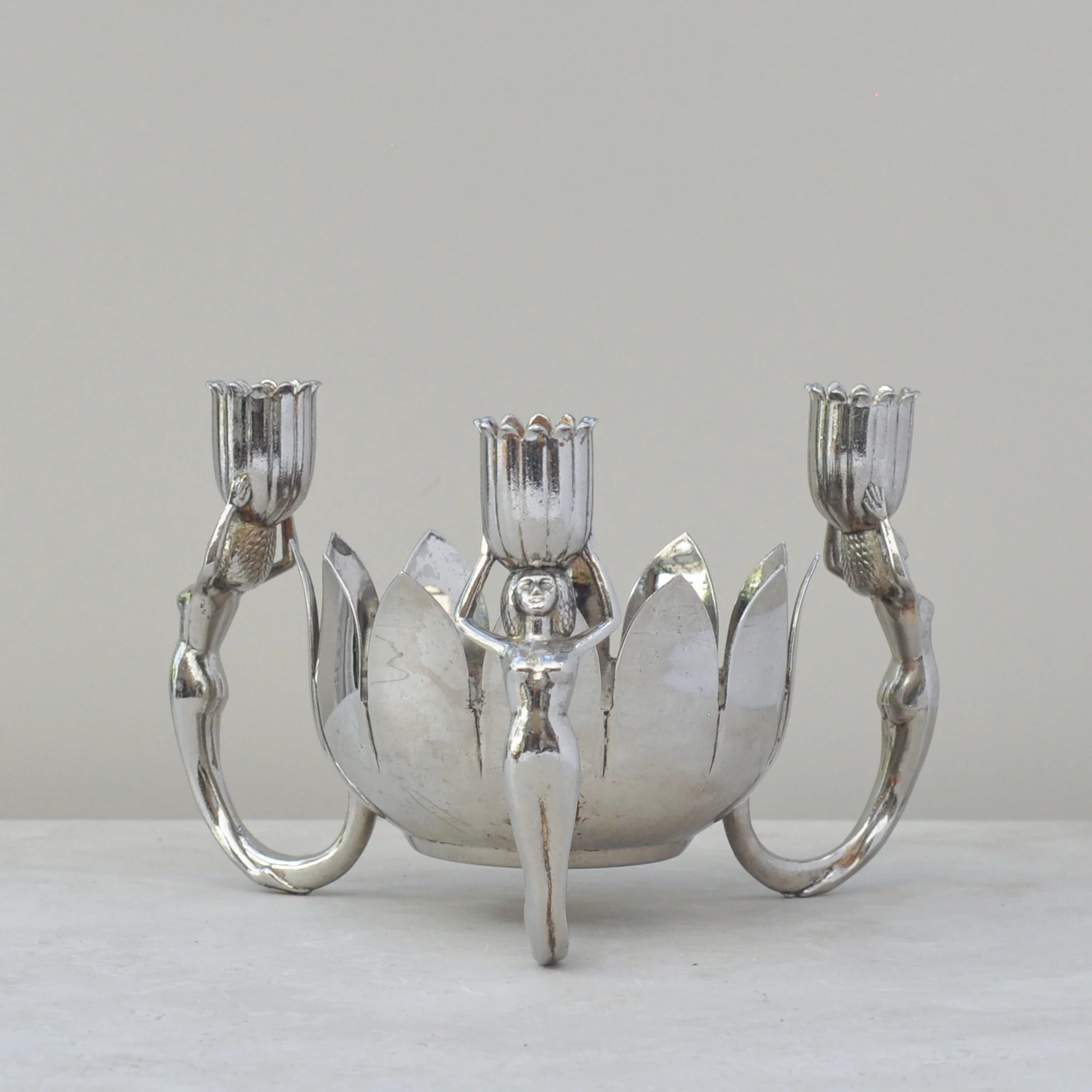
I found these ladies under a table, tucked in a box of assorted silver-plated pieces, and honestly I had no choice… I had to buy the entire lot. These ladies are that special. A true standout, total eye-catcher and seriously fun.
Most likely mid-century, although could be older, this sculptural centrepiece features three stylised female figures supporting tulip-form candle holders around a lotus-blossom bowl. Art-deco-ish, beautifully feminine and wonderfully dramatic, it’s a rare decorative piece with a striking, one-of-a-kind presence.
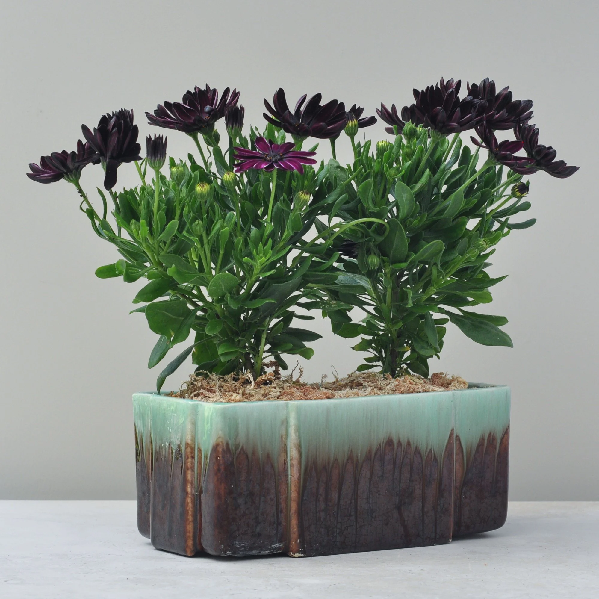
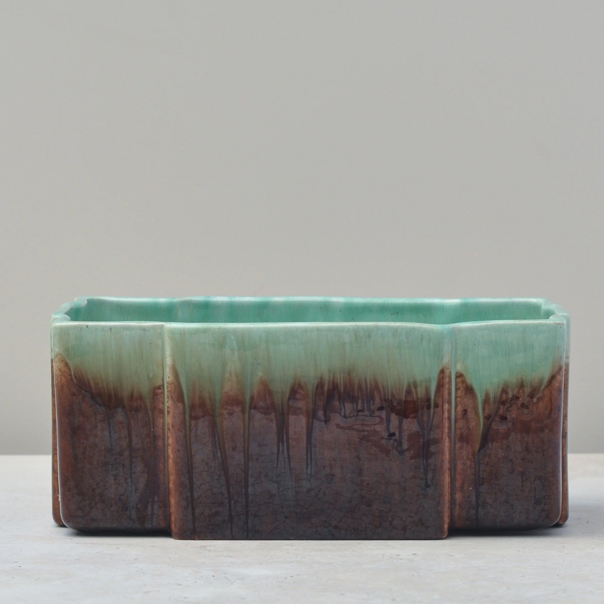
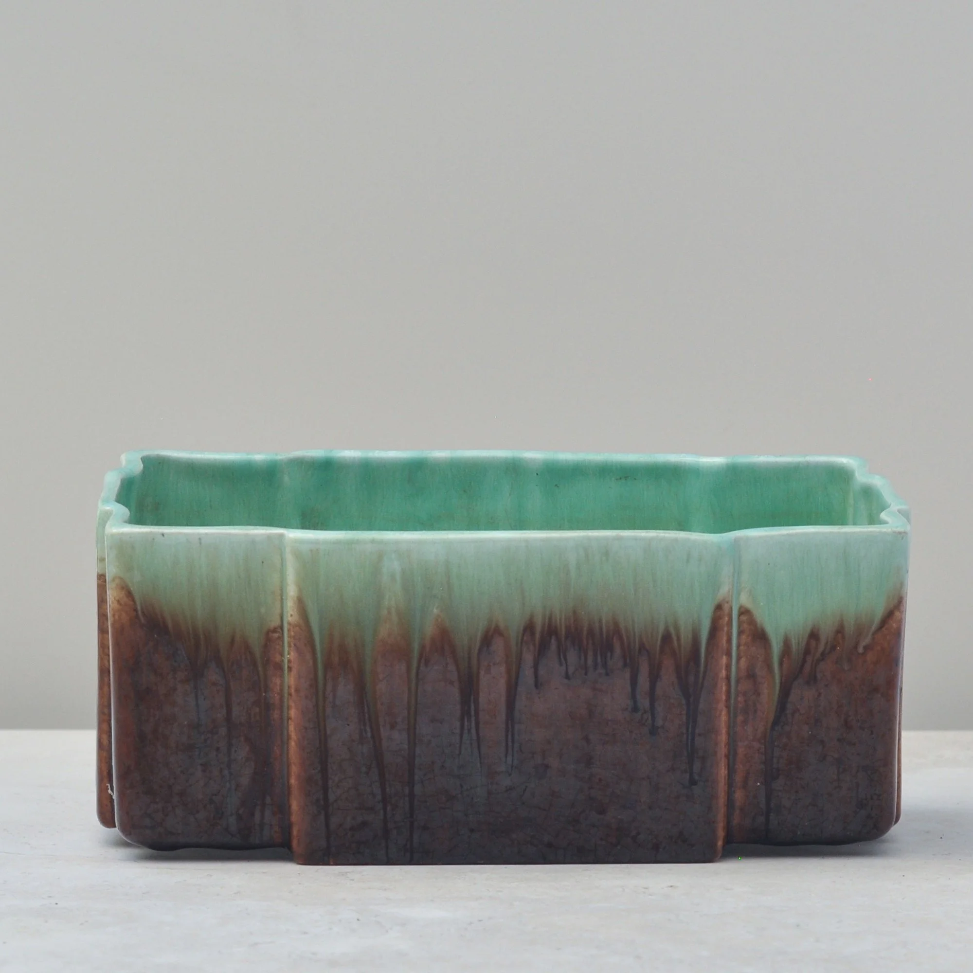
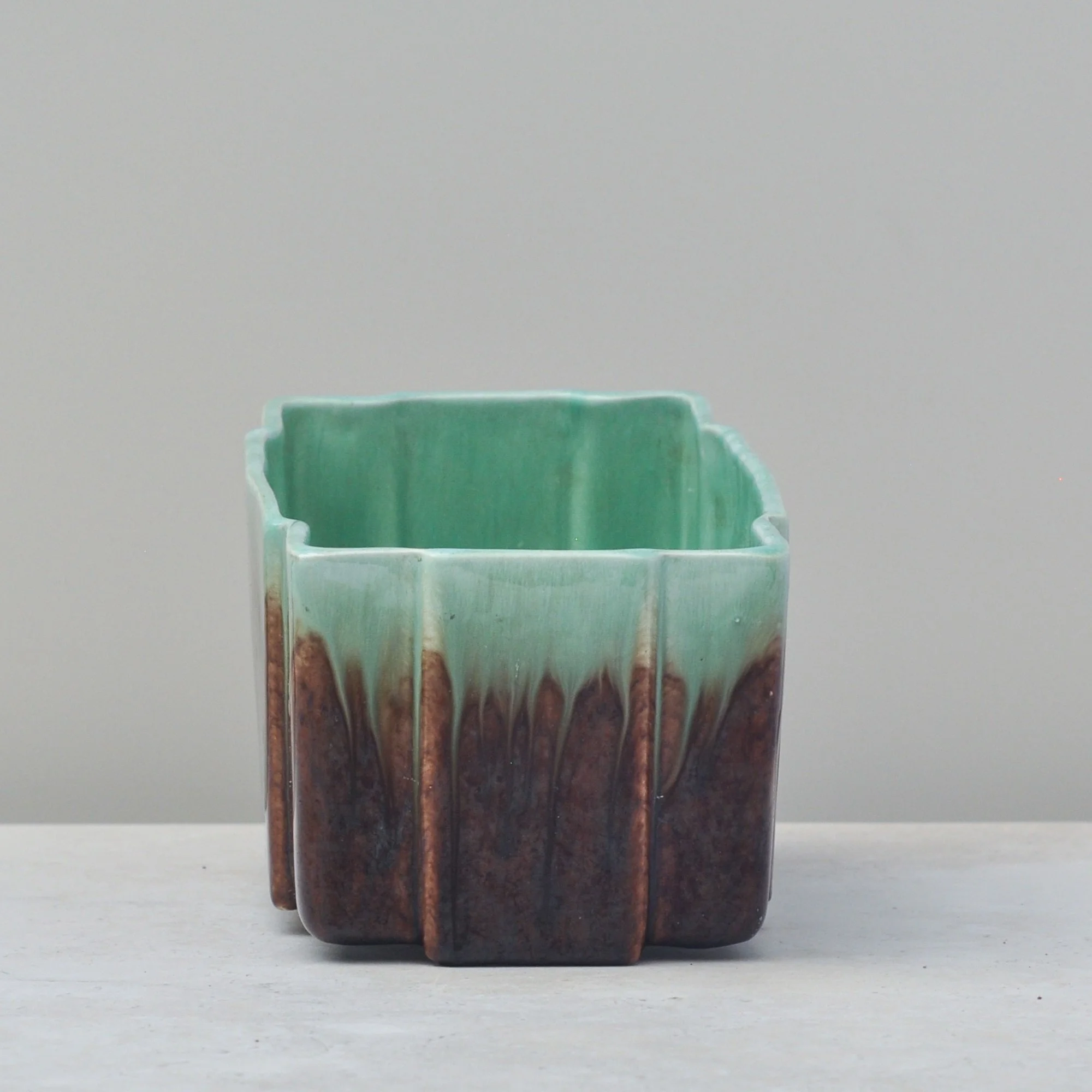
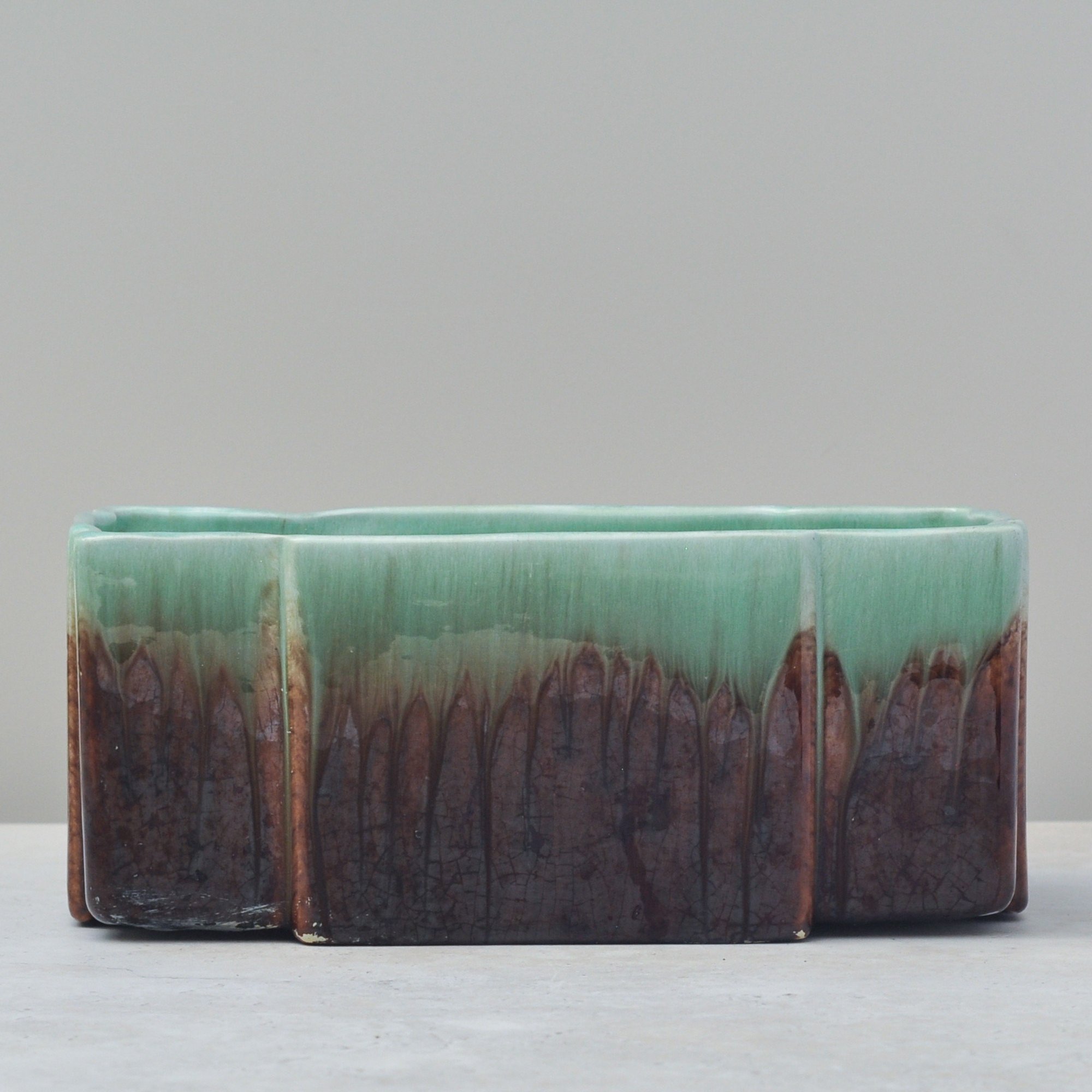
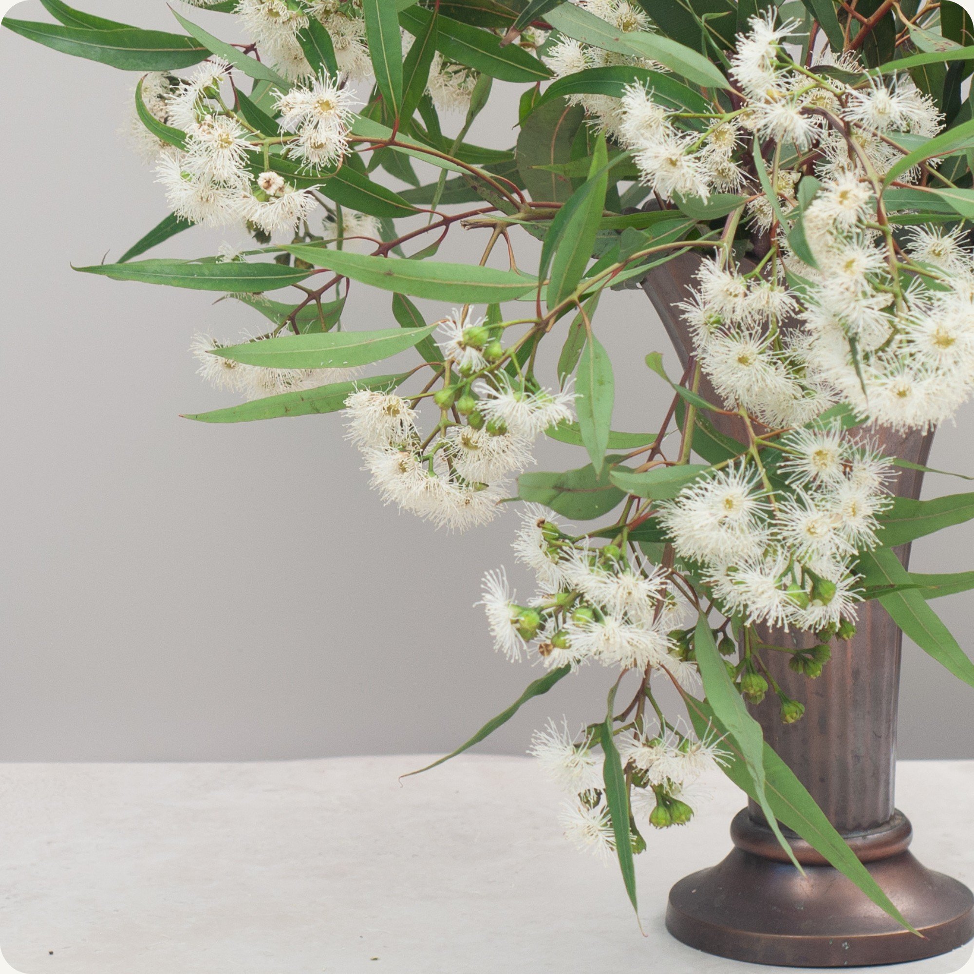
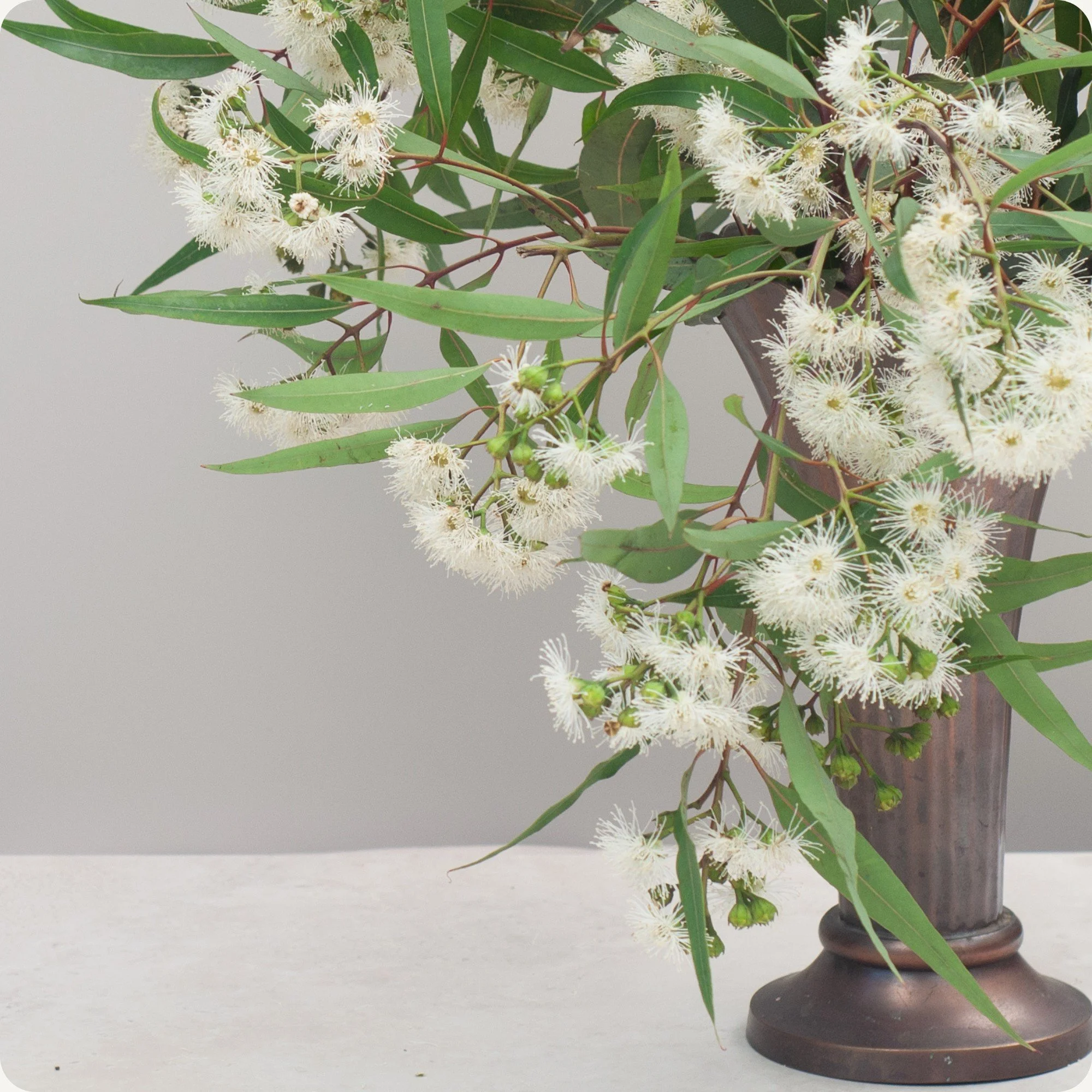
A little Art Deco and very Australian, this vintage planter was produced in the 1940s as part of the Trent Art Ware line by Bakewells Pottery in Sydney.
Finished in a classic green and brown drip glaze over a ribbed, geometric form, it captures the strong Art Deco influence seen in Australian pottery of the period. The green glaze falls softly down the sides and reminds me of eucalypt leaves, giving the piece a real sense of place and an unmistakably Australian feel.
It’s a wonderful example of mid-century Australian art pottery, full of texture, colour, history and Aussie charm.
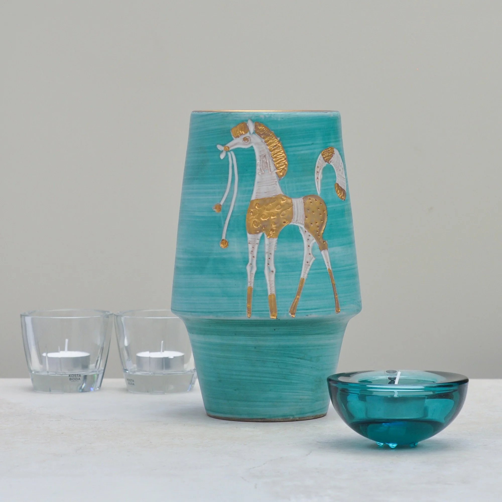
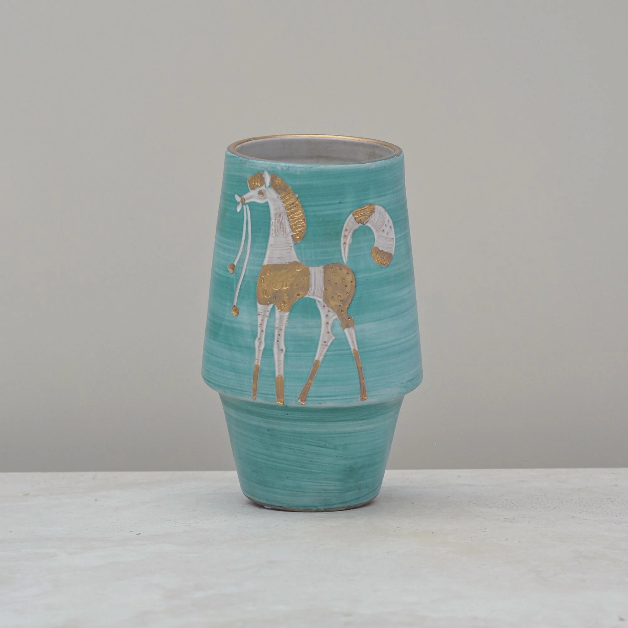
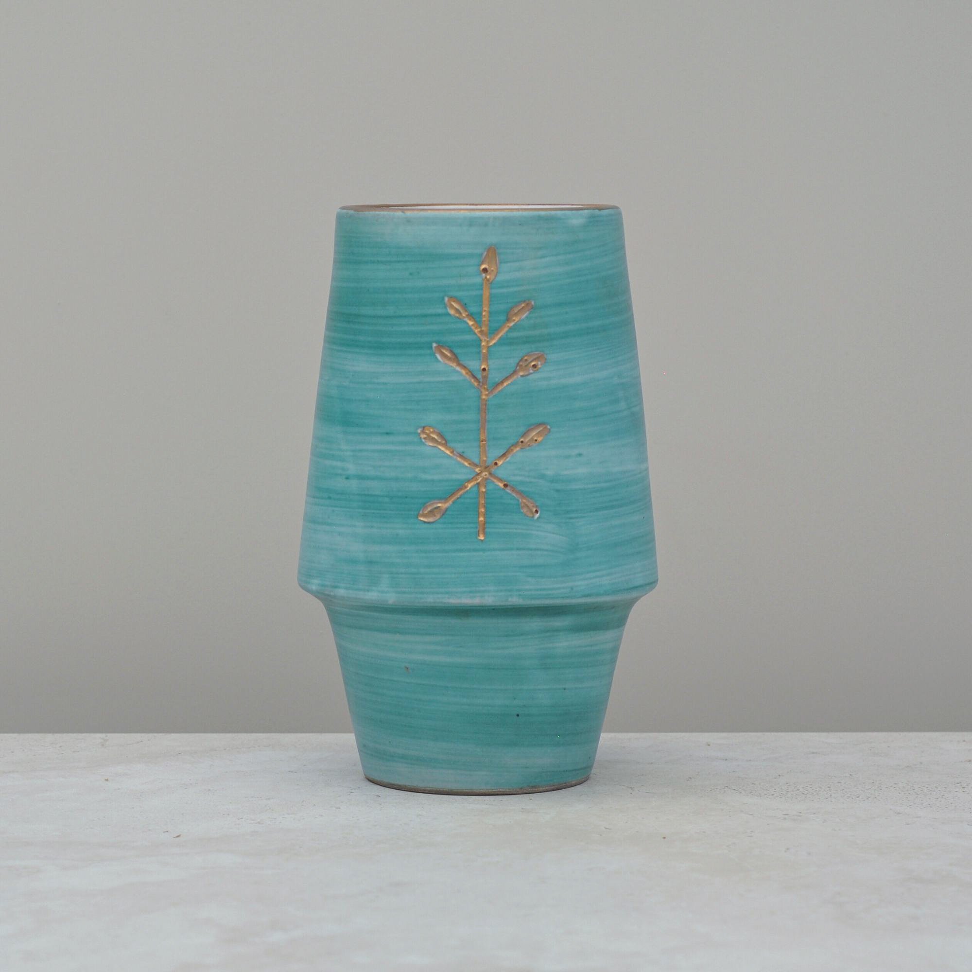
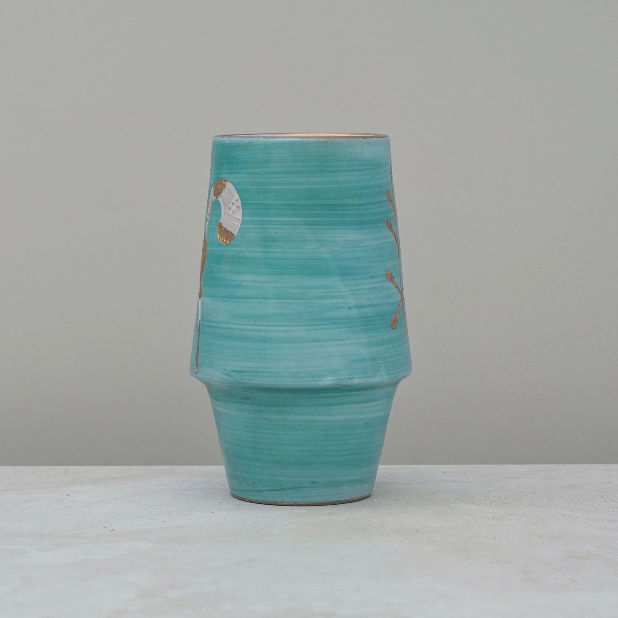
This striking aqua green vase champions the mid-century era from which it came. Its elegant lines, colour choice and stylised horse pattern capture both the simplicity and minimalist nature of this much-loved era.
This vase was made in Italy, as identified by the mark on the base, and whilst the actual artist is not known it does bear all the evidence of a well-made handmade piece of its time.
The horse is brilliant. Its stylistic and simple form clearly demonstrates the uniqueness of this vase. You can actually see how the pattern was drawn into the clay. There is also a pattern on the rear of the vase, which I think may be a stylised tree, but I can’t be sure. All I know is that whilst this vase is classic mid-century its design charm is still very modern and just right for today.
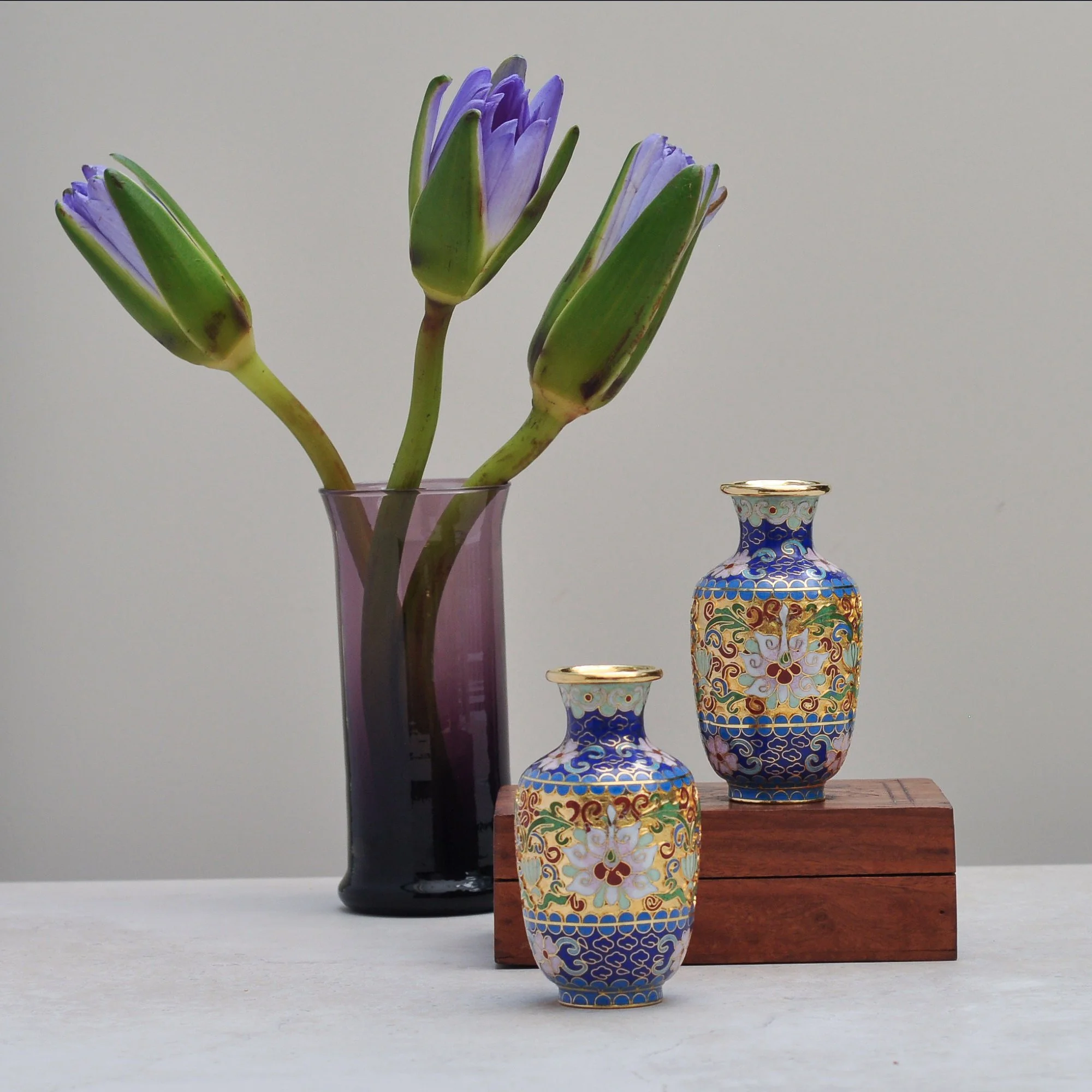
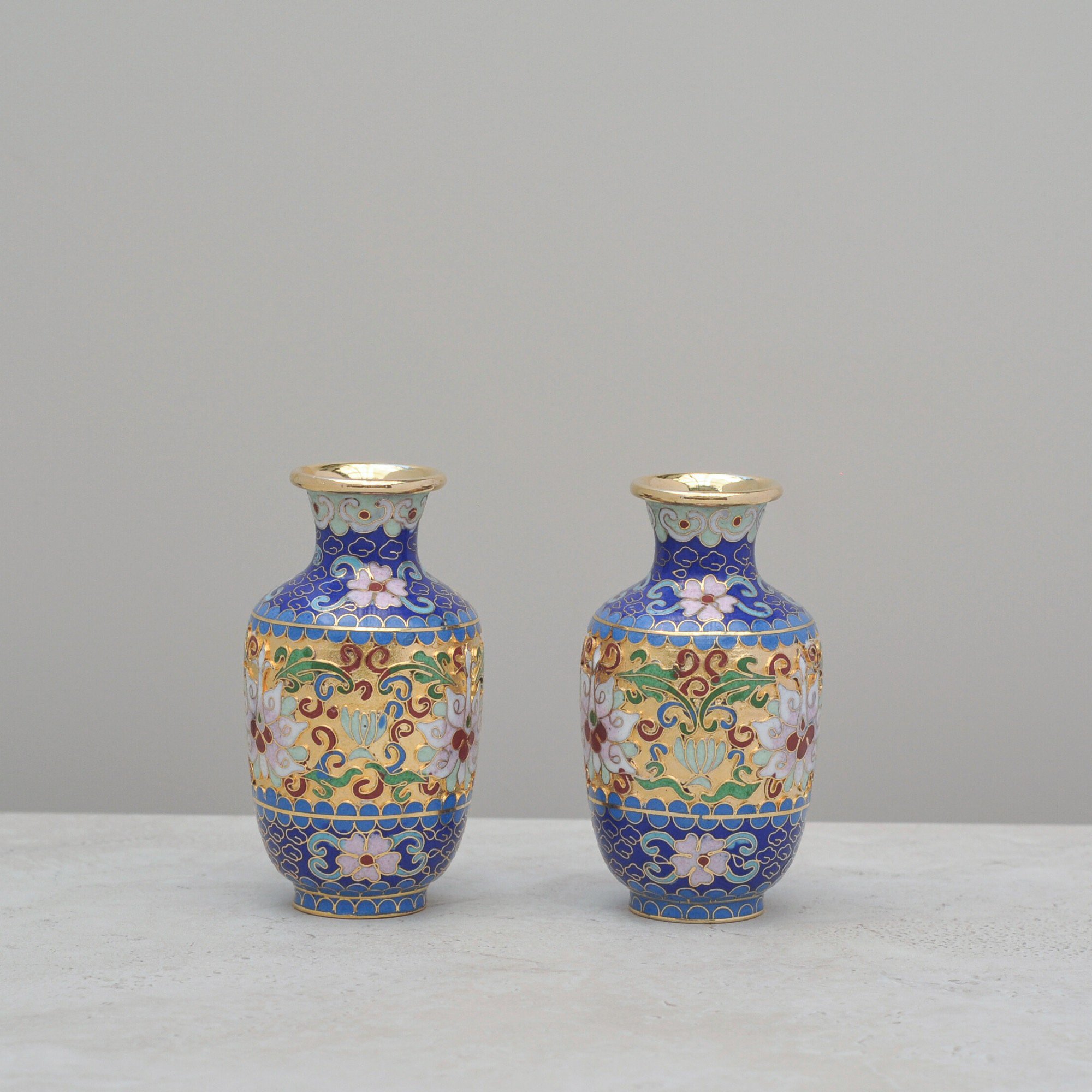
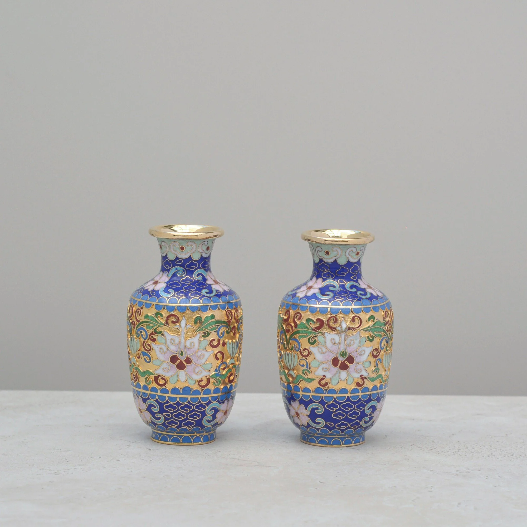
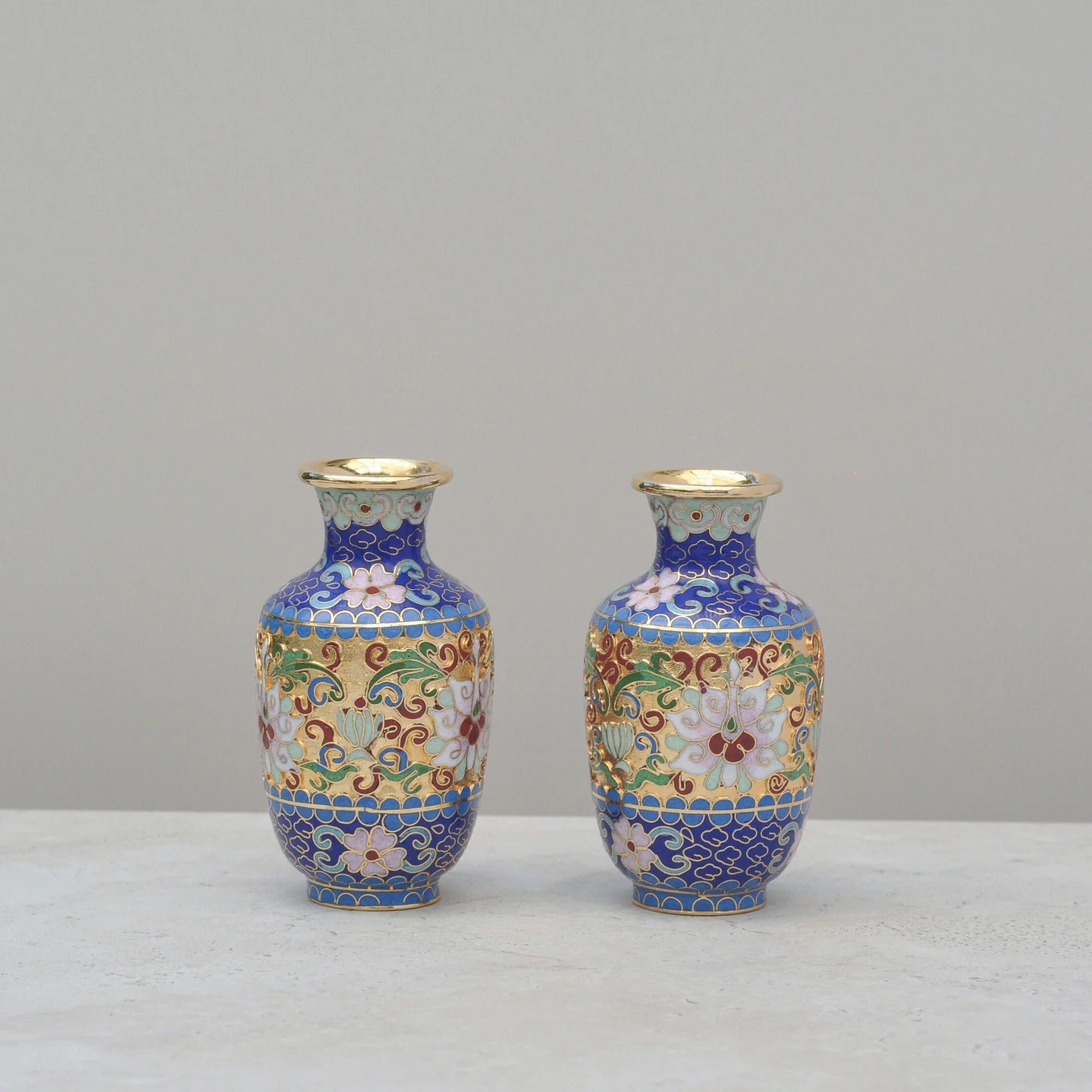
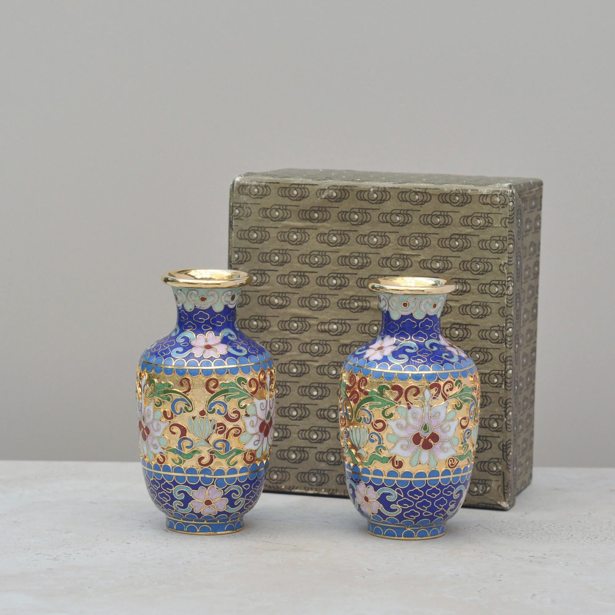
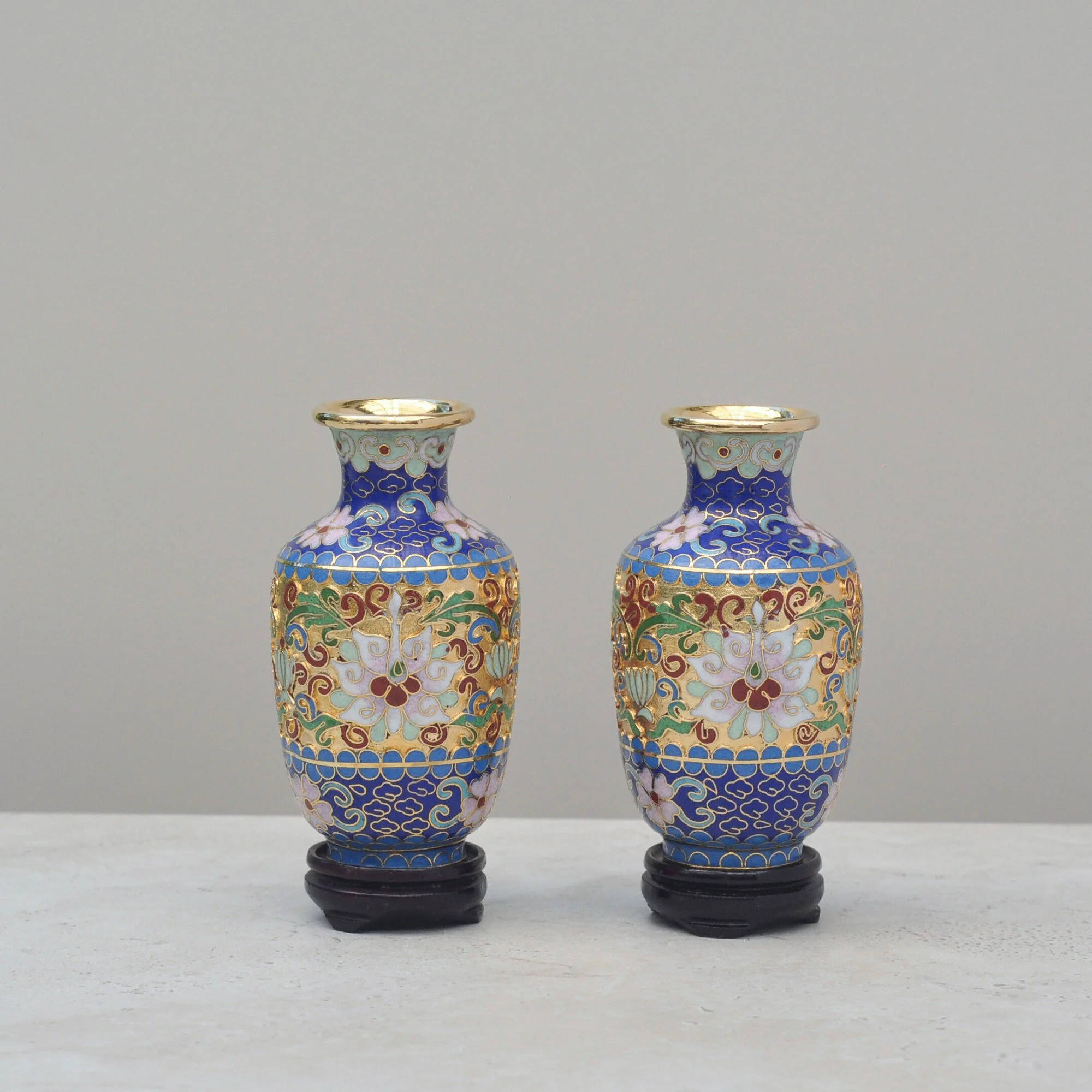
When I spotted these, I picked them up instantly and a lady next to me turned, smiled and said “you’ve got good taste.” I couldn’t agree more. The colours of these little vases are nothing short of amazing. The blues, pinks, greens and reds, mixed with the gold, are truly eye-catching. I didn’t hesitate.
These are Cloisonné - a method of embedding enamel within a delicate metal frame, in this case most likely brass. They would be of Chinese origin, they’ve mastered the fine art of Cloisonné over centuries, and mid-century pieces. Small but incredibly colourful they would add a spark to any room and the Asian influence is certainly on trend. This pair is exquisite - a moment of brightness to be admired and adored.
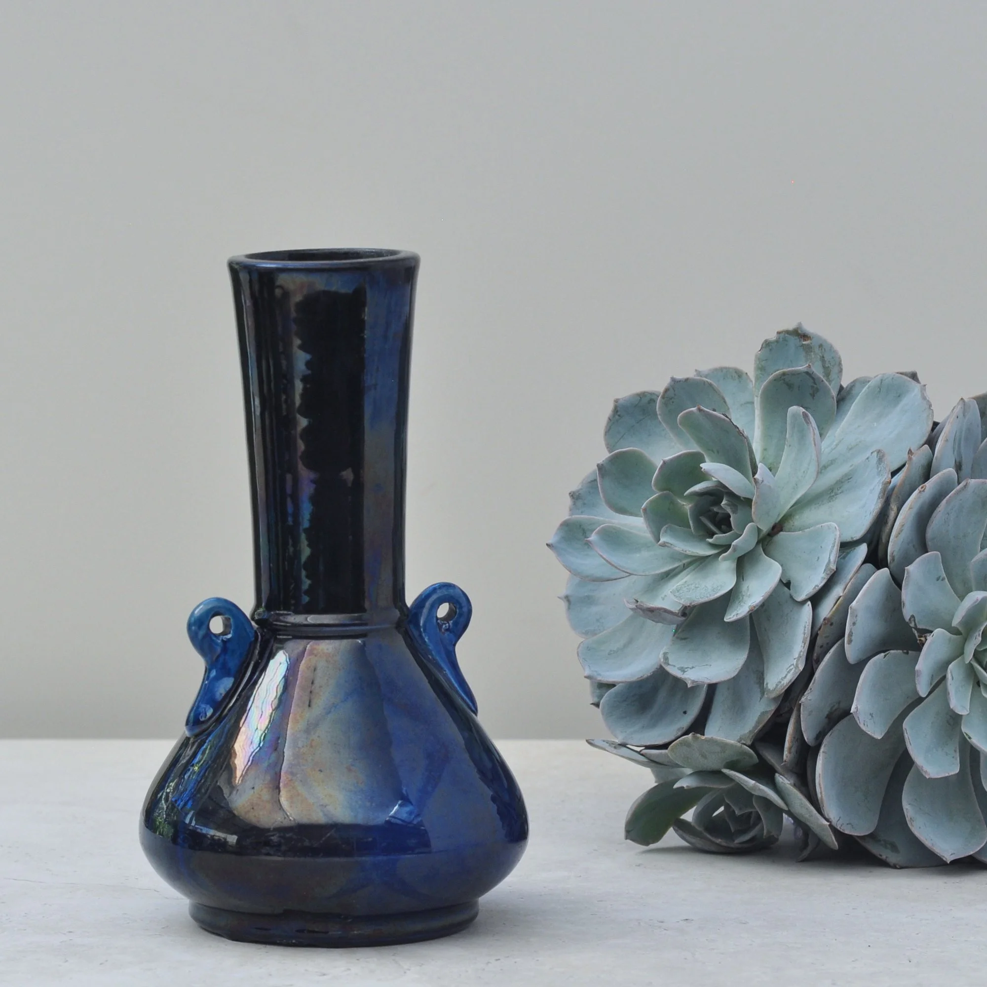
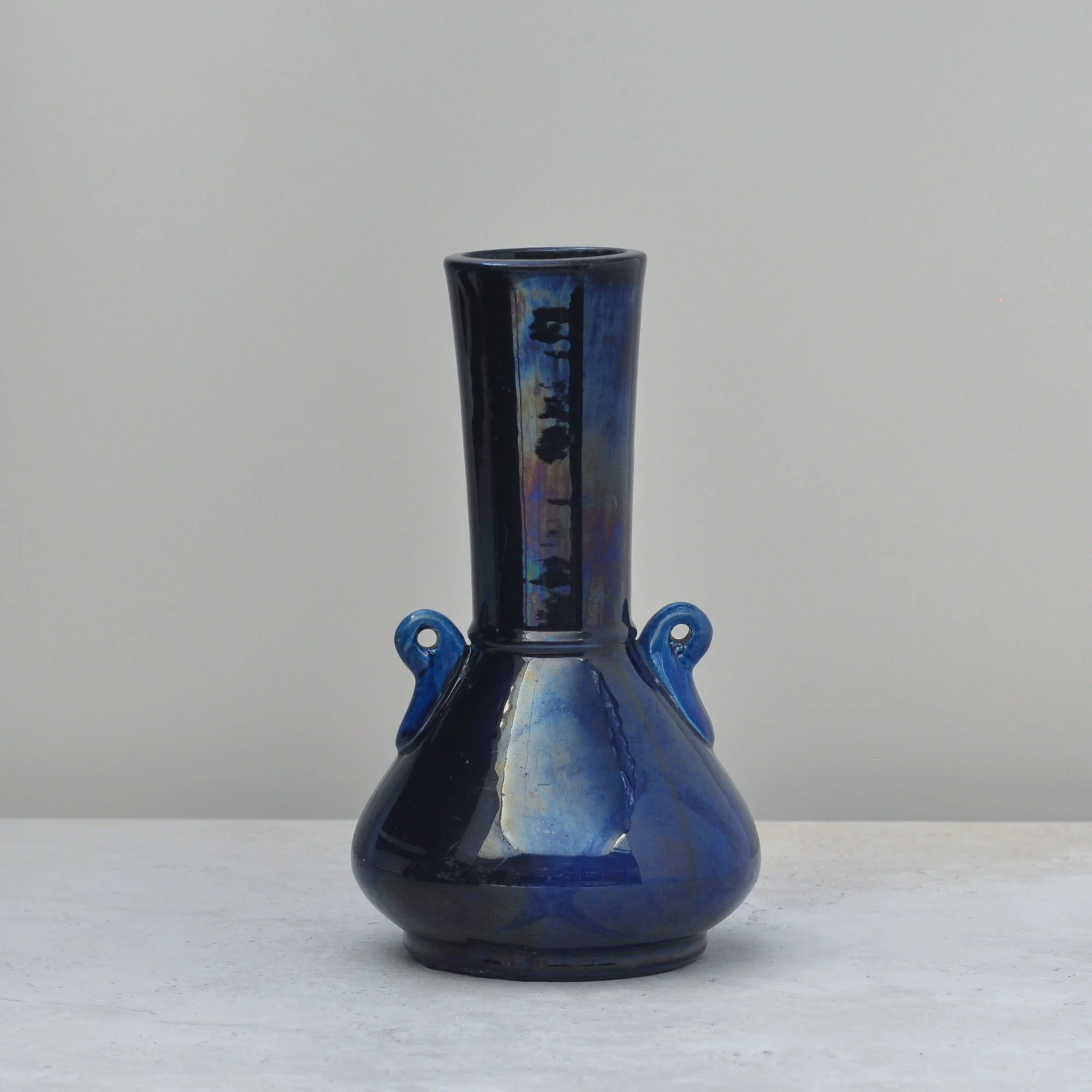
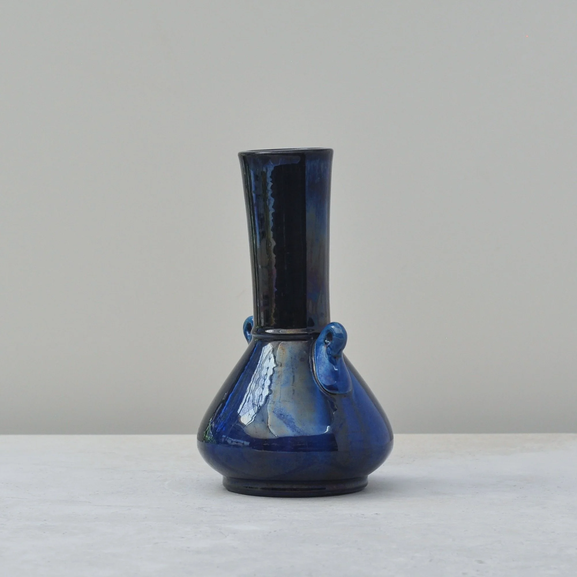
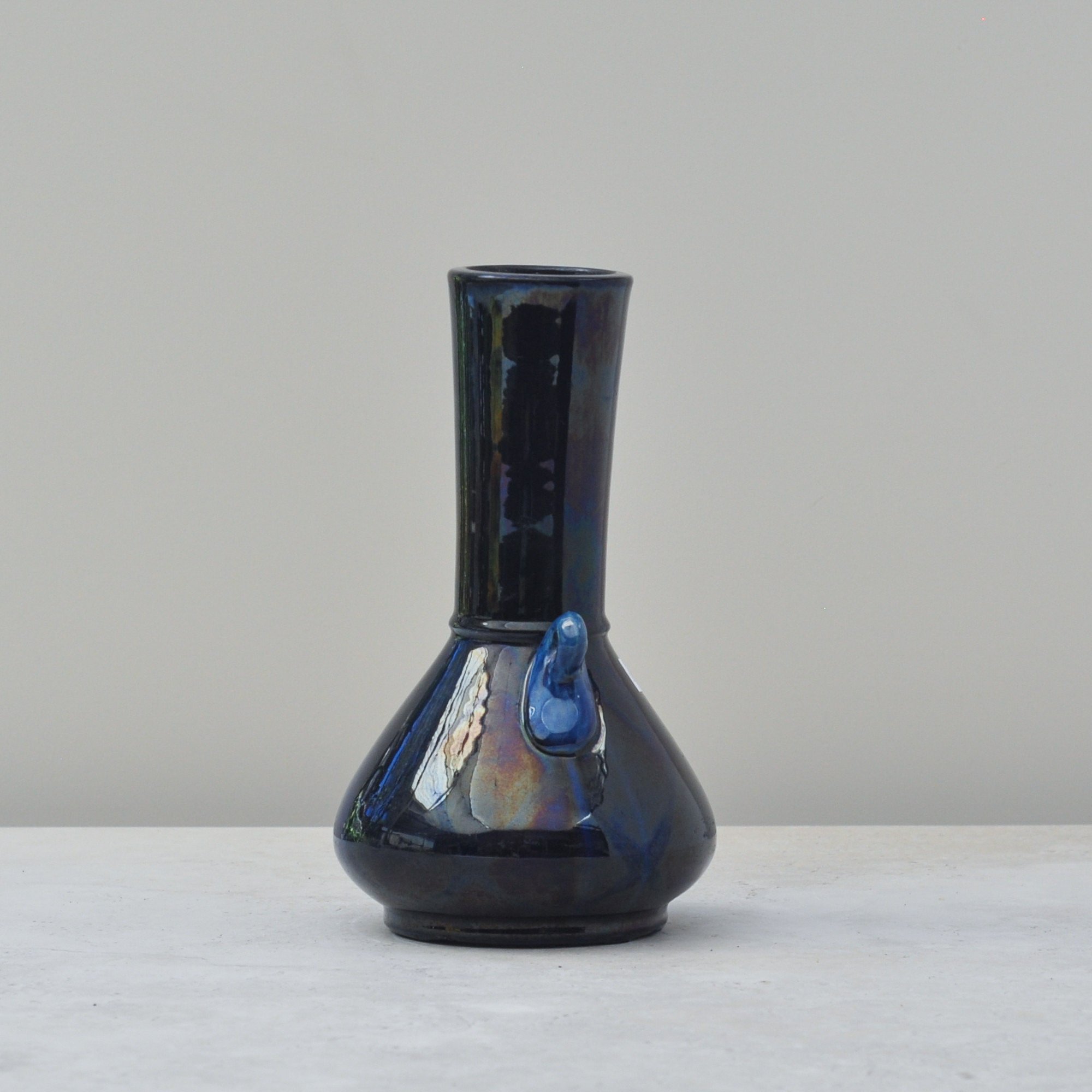
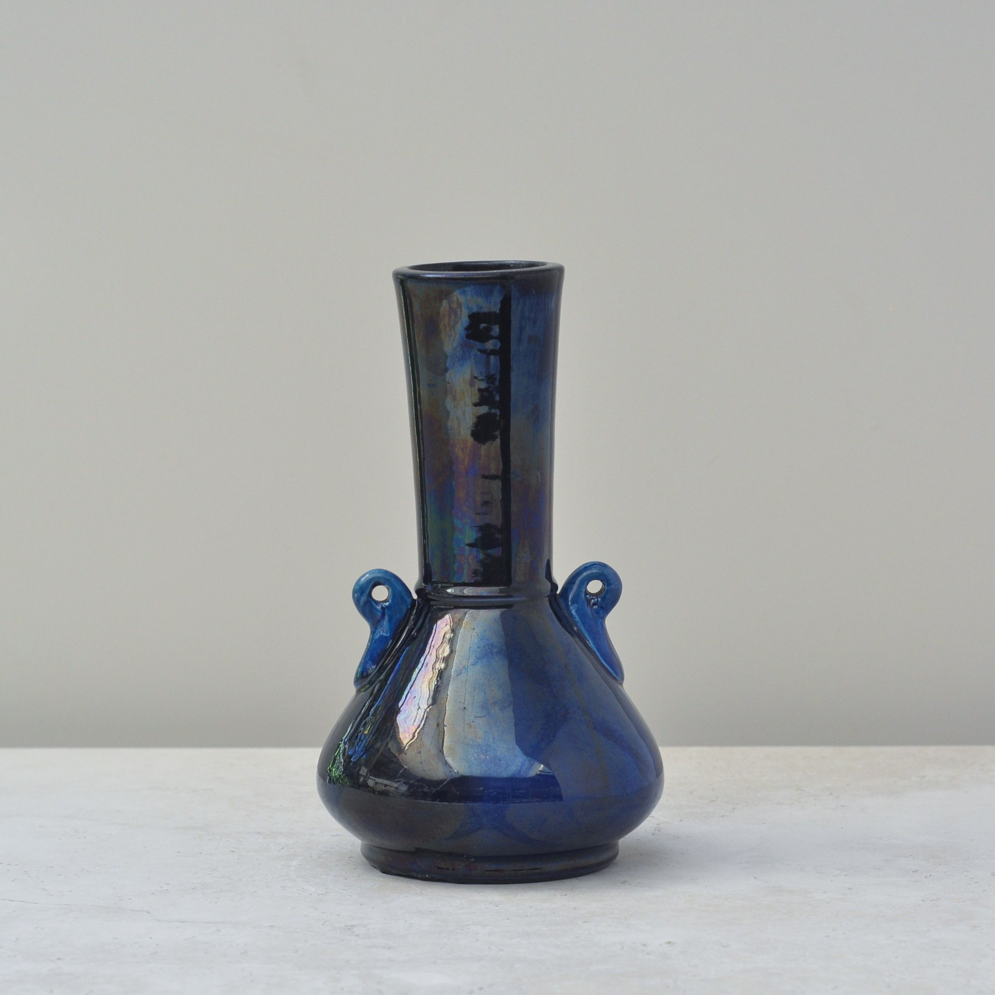
Blue, lots of blue. Drips of blue. Iridescent blue. Magical blue.
This striking Japanese art pottery vase is finished in a deep, iridescent blue glaze with subtle vertical movement through the surface that tricks the eye and makes you look closer, the result of soft drip movement which was a hallmark of Japanese art pottery from the late 19th to early 20th century. Then you spot the iridescence and you can’t help but pick it up, turn it towards the light and there it is… you smile. Magic.
The colour is one thing, the shape the other. Elegant with its rounded body and slender neck the small loop handles on the shoulder which give it an Art Nouveau feel. It has a great colour, incredible curves but a real sense of delicate beauty. A balance which only the Japanese seem to find. Very special indeed.
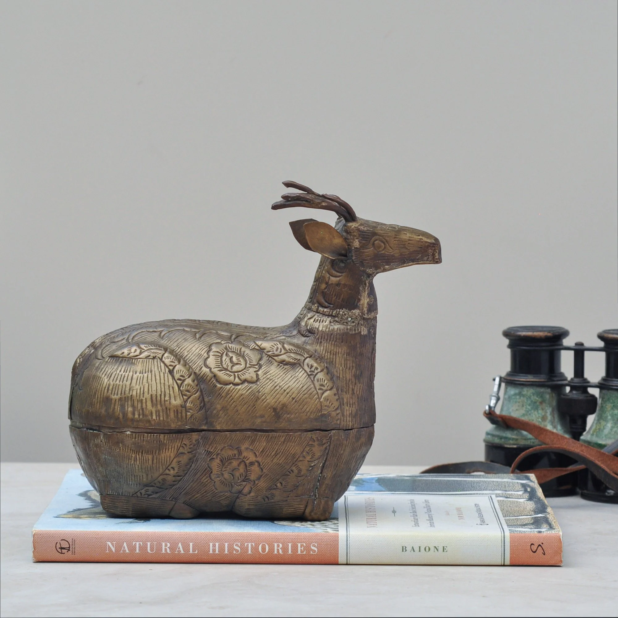
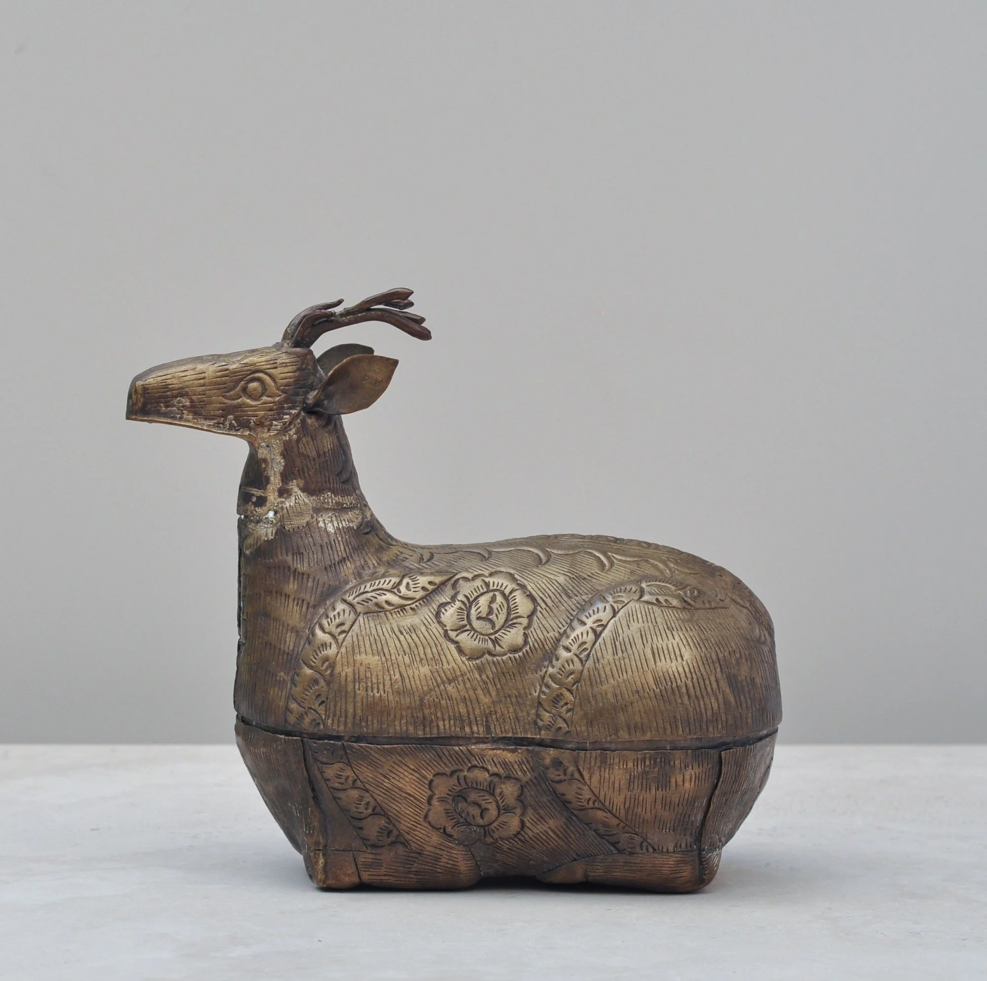
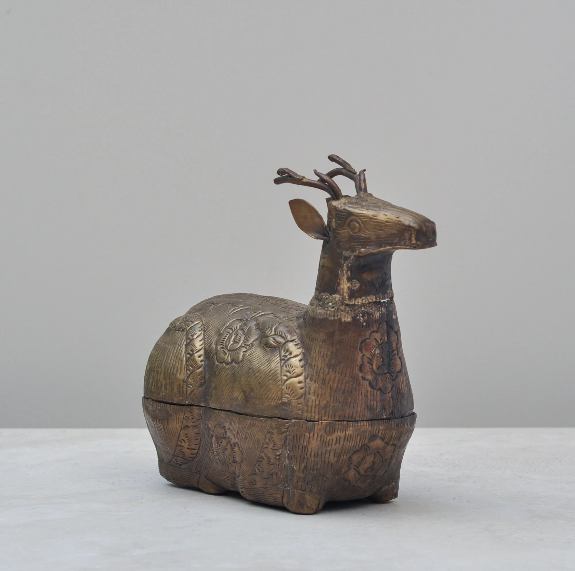
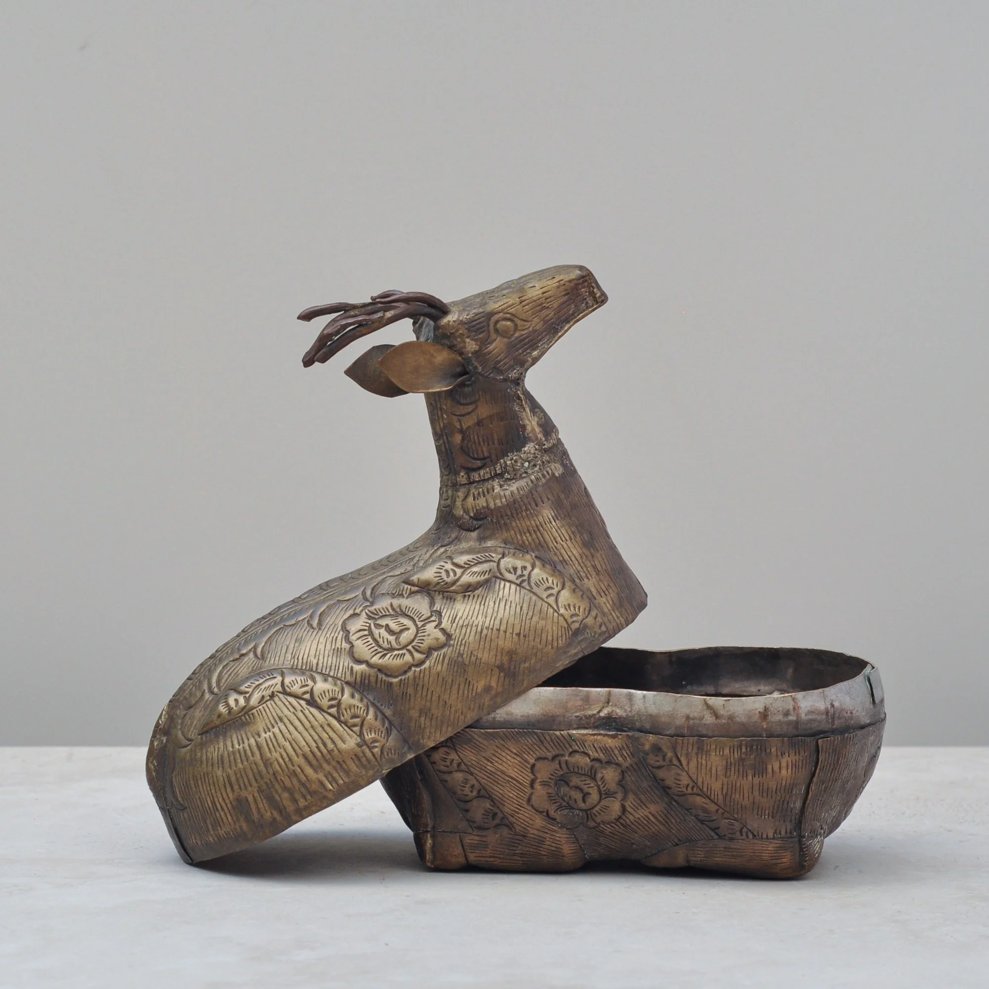
Oh gosh, haven’t I gone down a rabbit hole trying to learn about this rustic, totally handmade and stunning piece of brass shaped as a deer - or is it a stag? I know it is likely from Burma or Cambodia and would have been used to store betel nuts for chewing.
It’s age… as it is totally handmade there is no evidence of any machine based work on this deer, even the welding is rudimentary, and the colour of the brass would indicate a long and loved life we could place it earlier than the 1950s. It could even potentially be from the late 1800s, early 1900s, but for now that will remain a mystery known only to the deer. Herein lies some of its charm, don’t you love the wonder and intrigue these delightful pieces bring?
But what I do know, this piece is spectacular and needs a place where it can rest proudly and gracefully. Total respect for the craftsman who made it, it deserves to be forever admired.
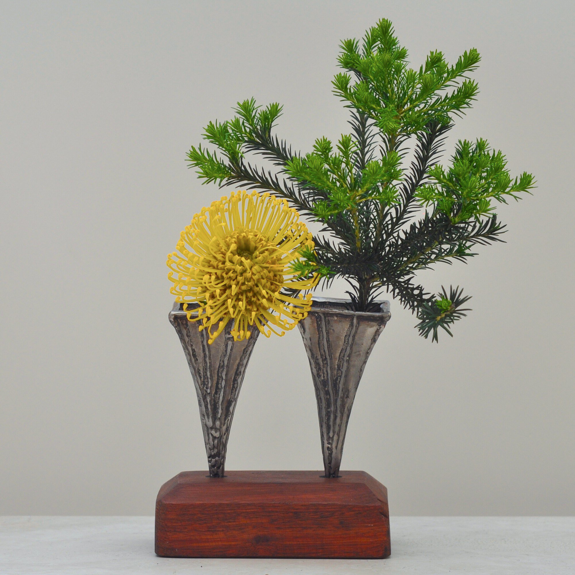
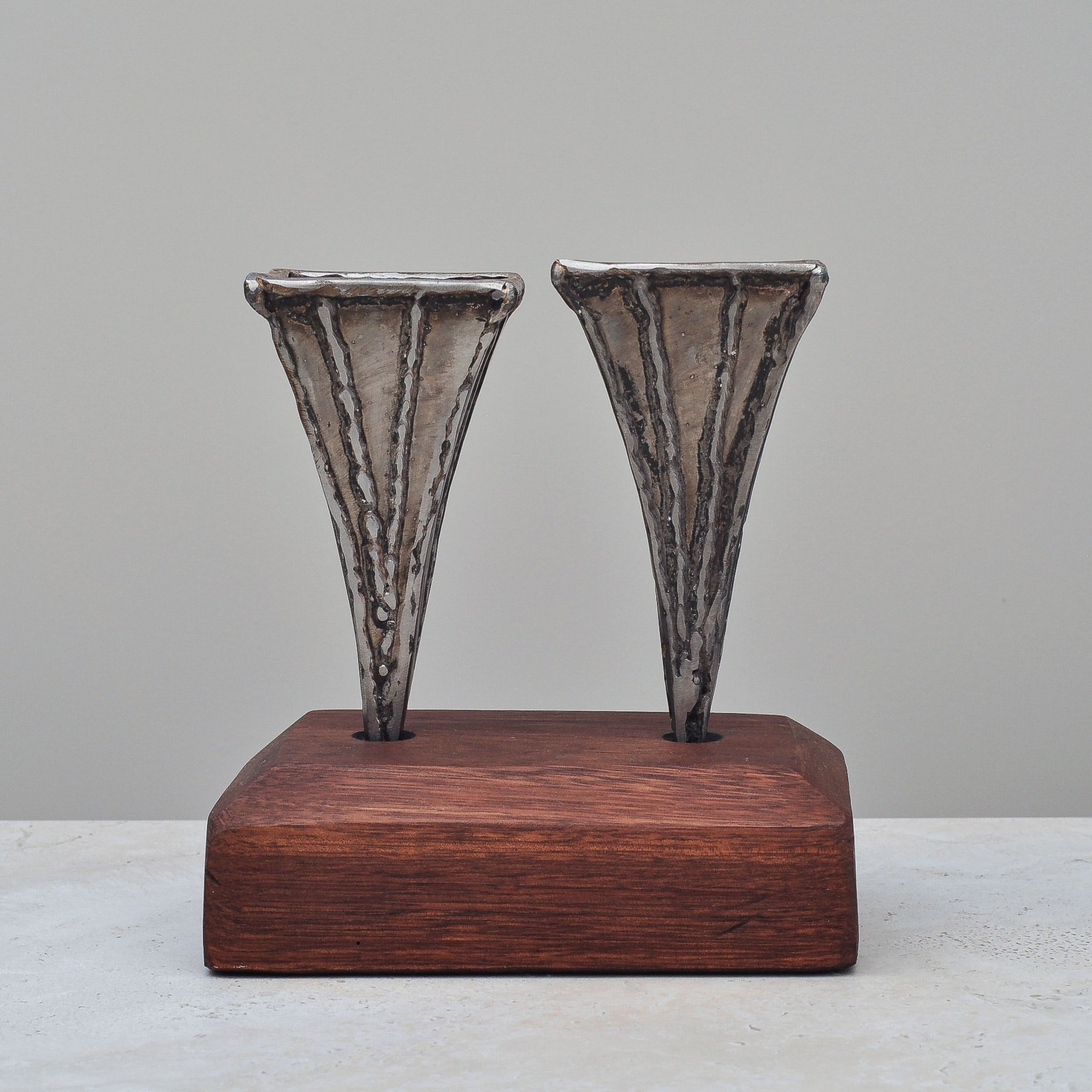
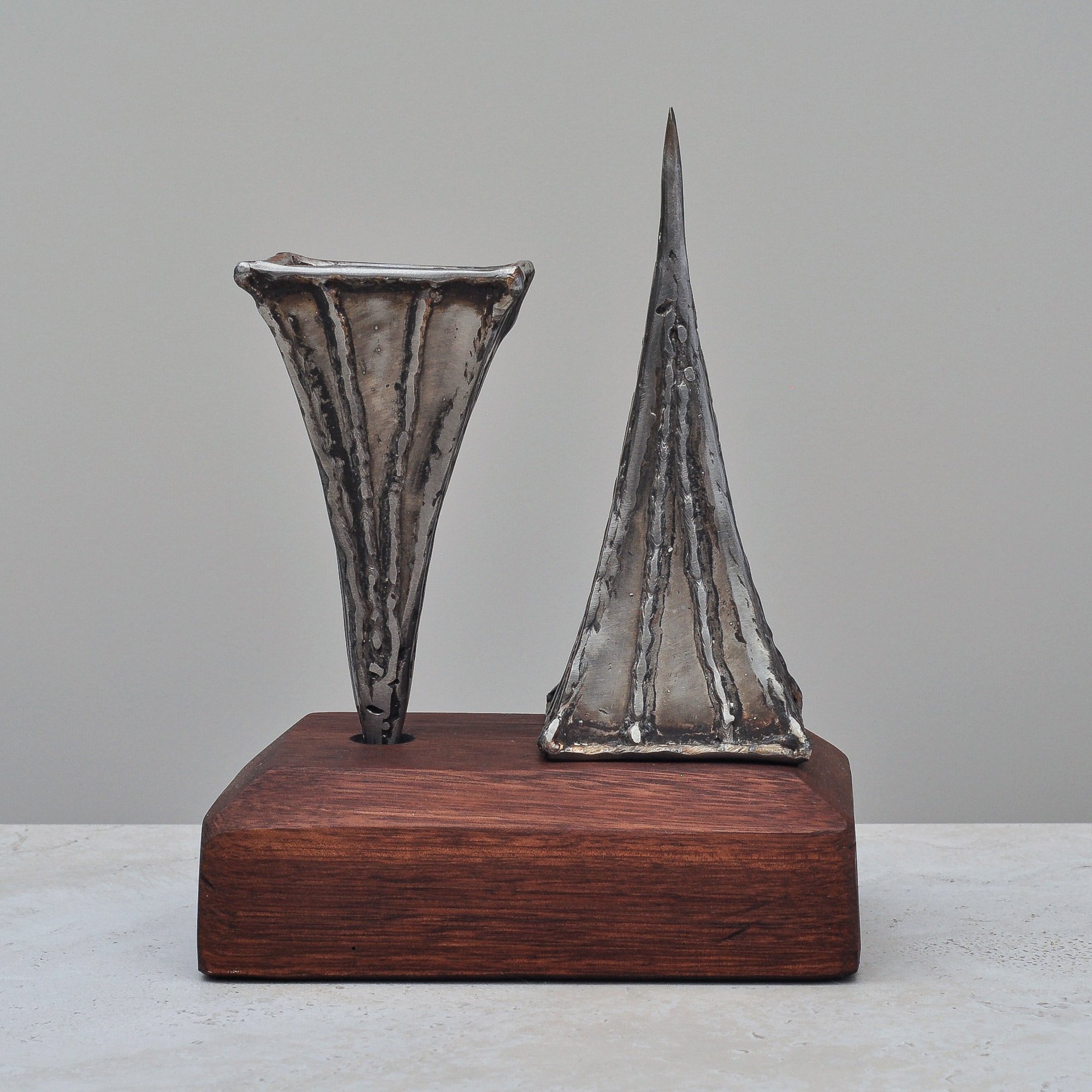
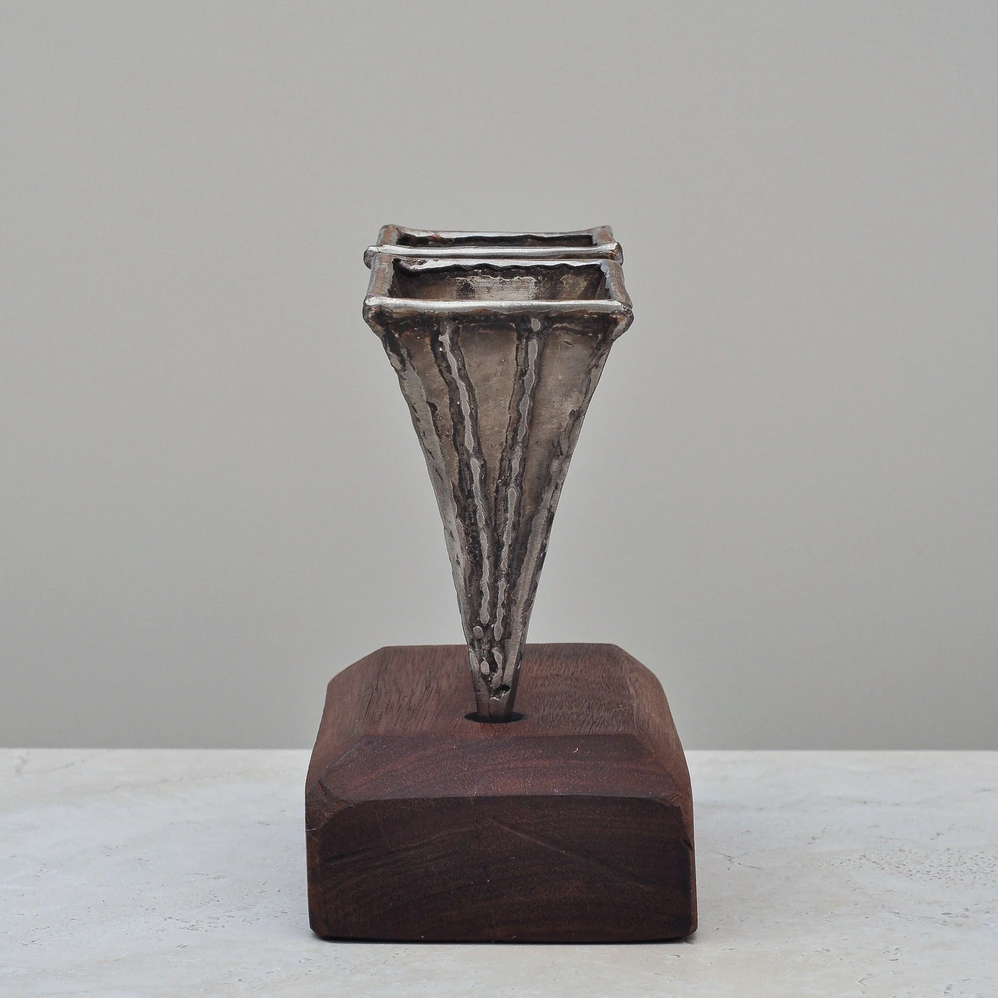
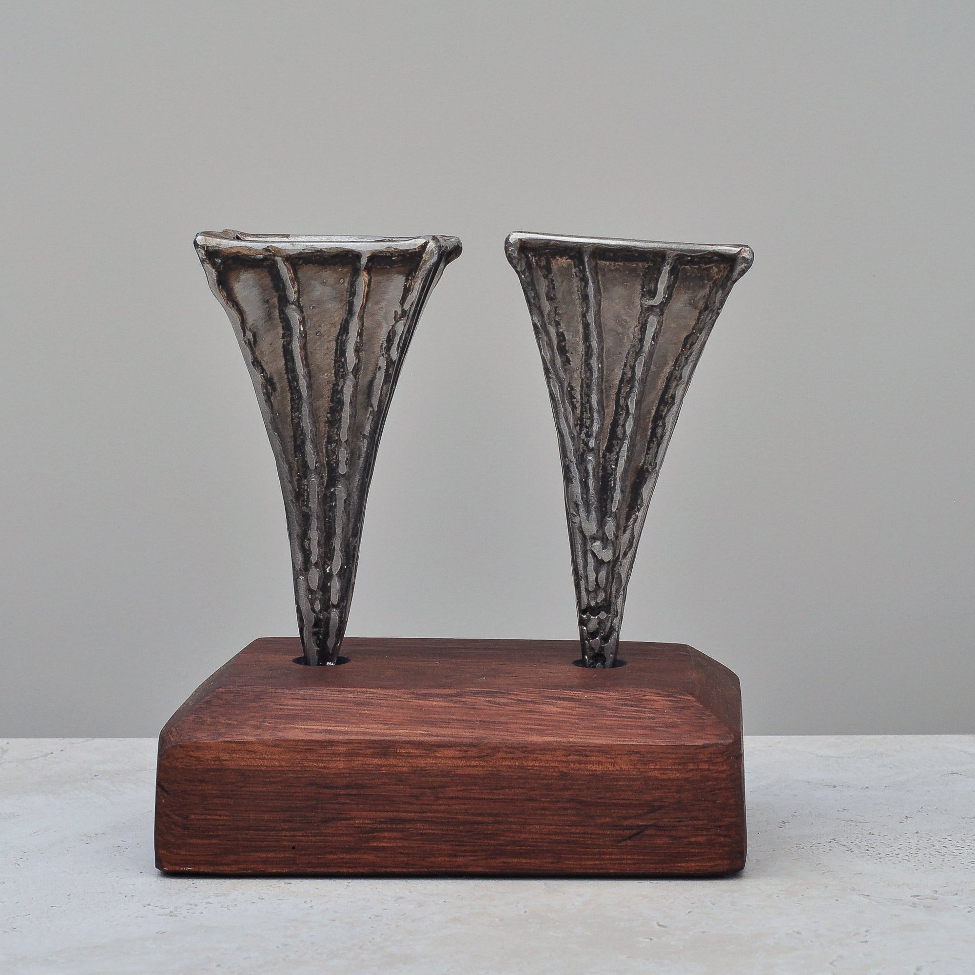
My love of Brutalist-style sculpture started in childhood with an amazing bronze in my grandfather’s office. I have never forgotten it so when I saw this pair of metal vases with their angular shape and creatively welded metal form I couldn’t pass them up. They’re hard, firm, solid and brutal - yet have a style that is somehow feels gentle and welcoming. I suspect it’s thanks to the slight curve that spreads up to the top of each vase. Brutal, but warm.
They’re by Australian artist, Nik Markovina. In my research I learned he is a painter, sculpture and jewellery designer who once had a stall at Paddington Markets. He recently exhibited at ‘Subterranean’ with Russell Austin and Bianca Esteban at Basement Gallery, FunHaus Factory (Gosford).
While I know little of the artist, what I do know that these vases are unique and special - a true one-of-a-kind set. A strong and bold statement piece that would add character to any home.
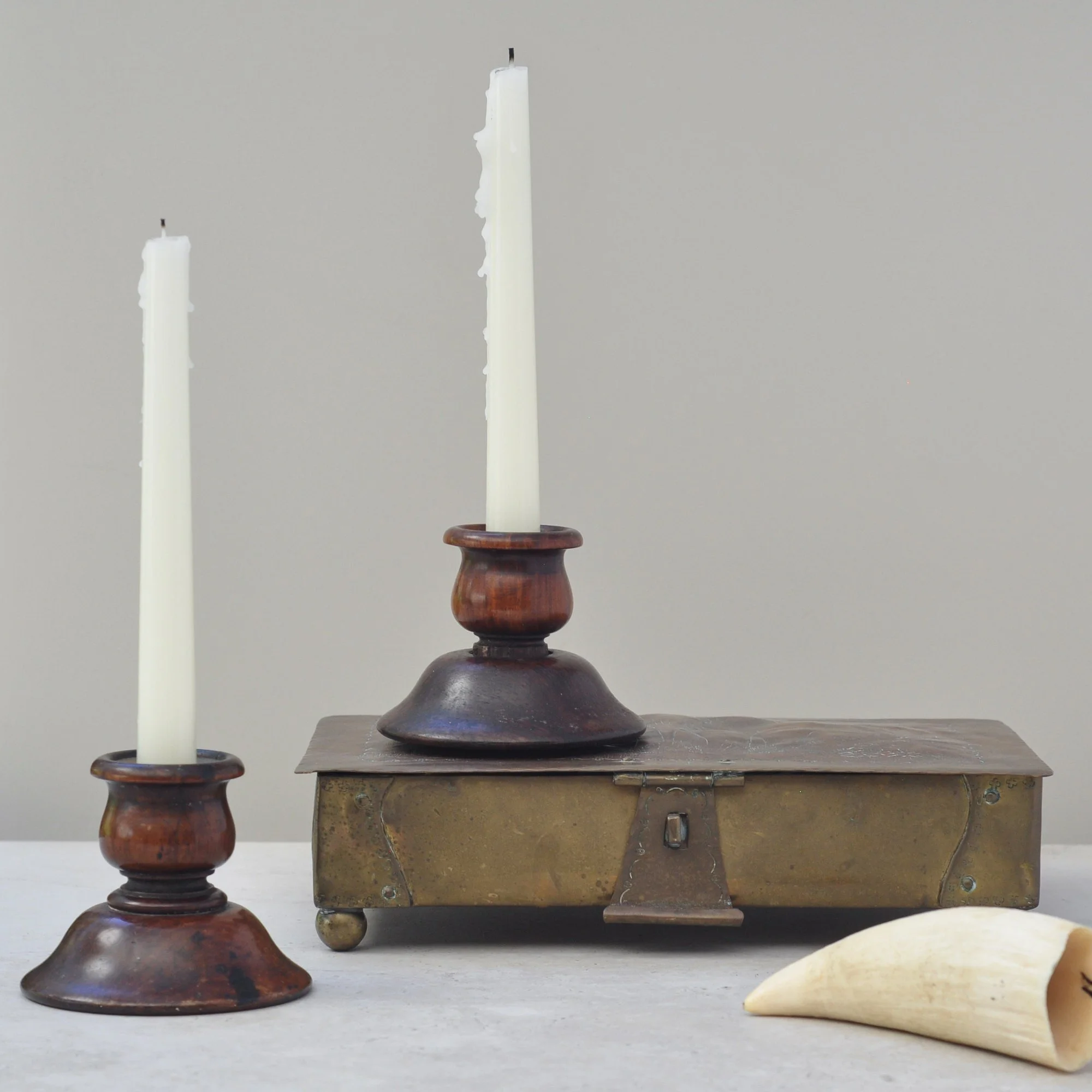
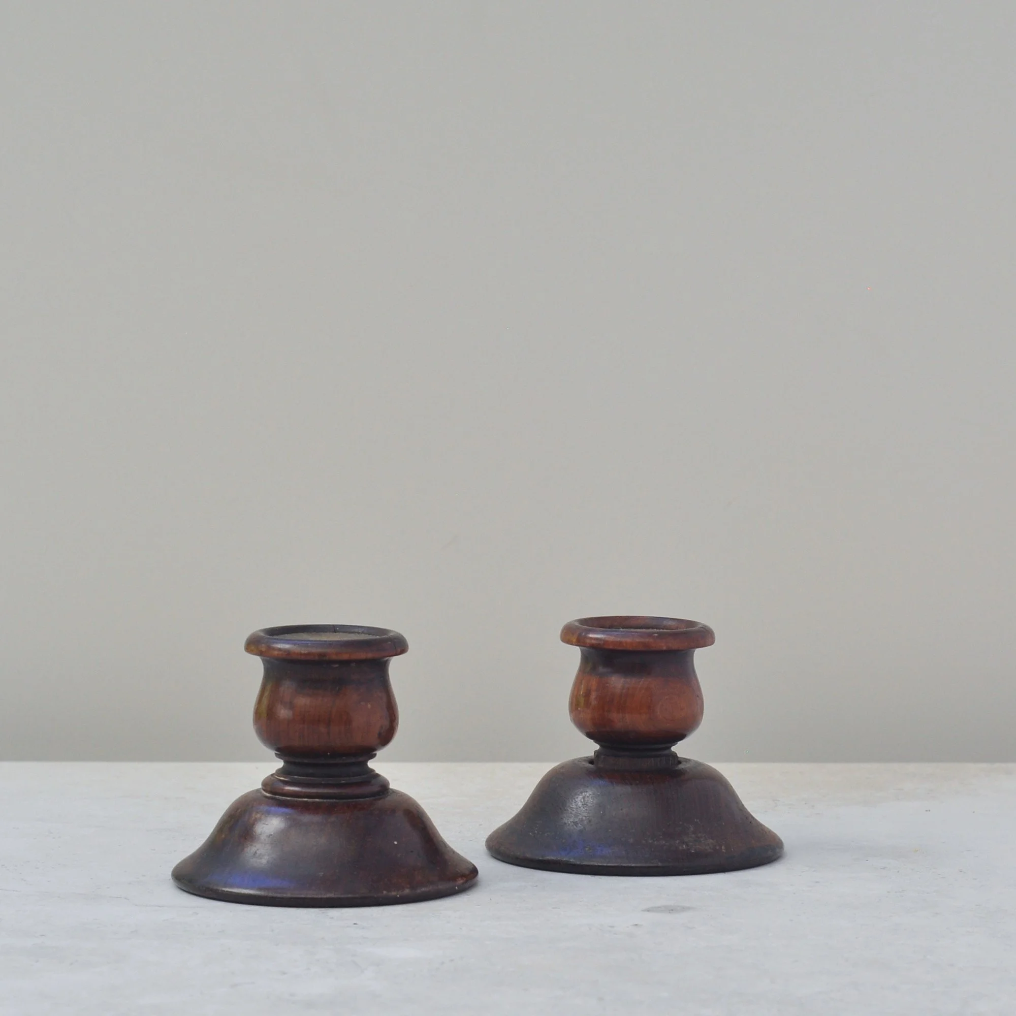
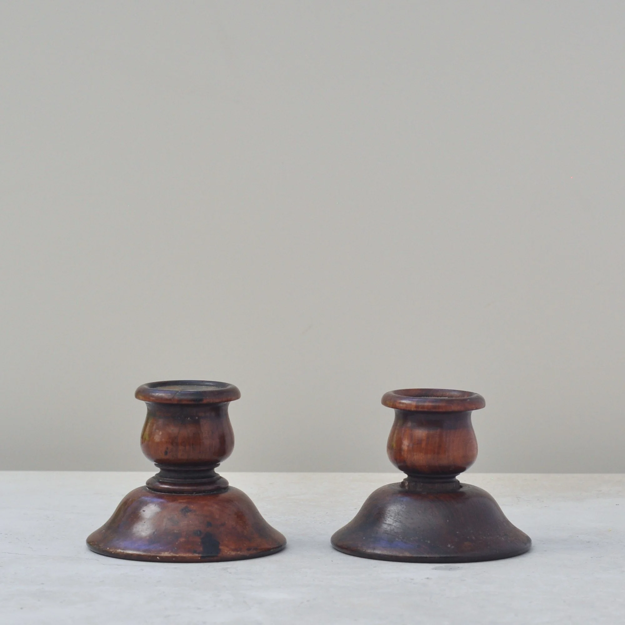
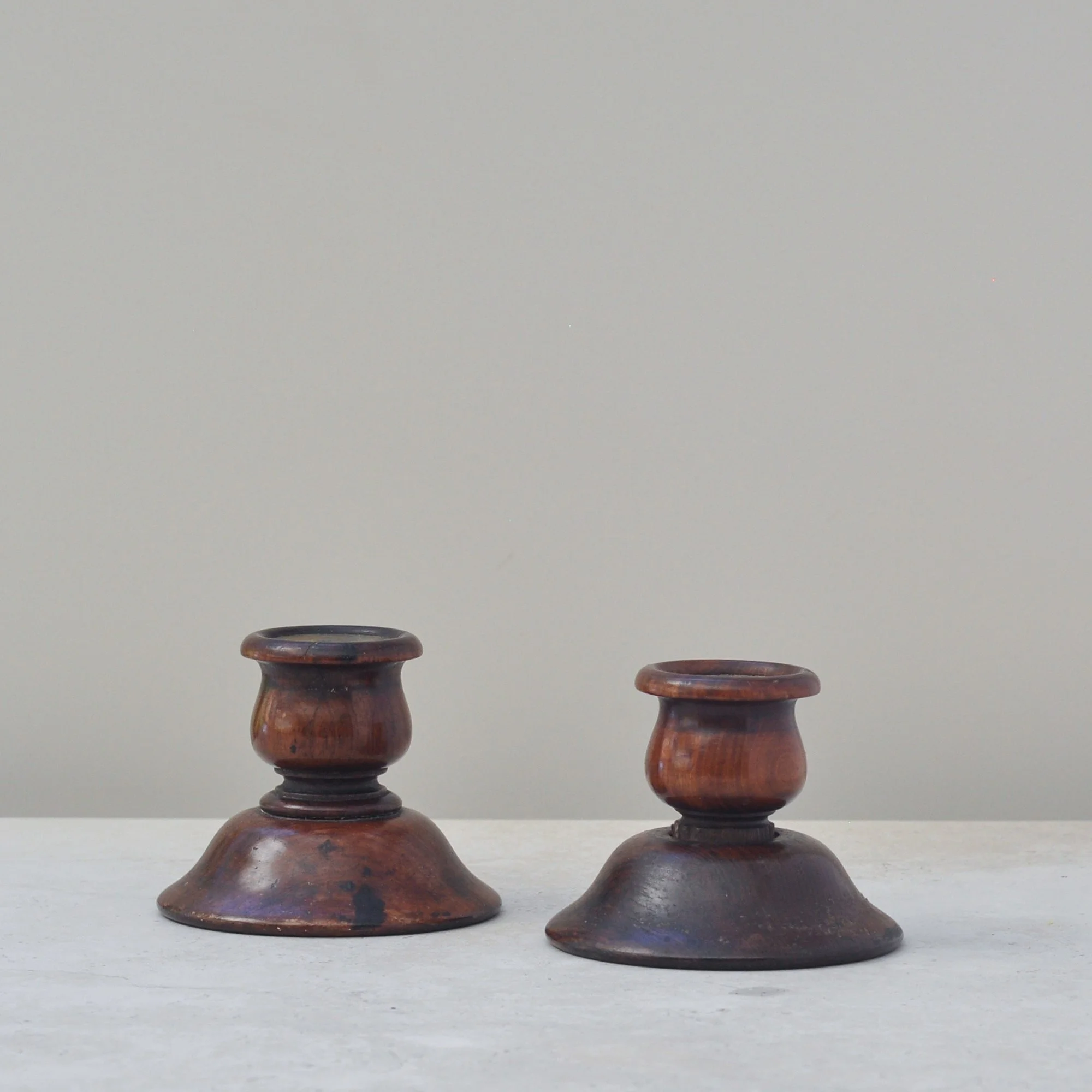
This was love at first sight. I saw these wooden candlesticks on a table and was instantly taken to an old-world room with wood panels, chesterfields, gold-framed portraits and an open fire. I couldn’t wait to pick them up and, as expected, they felt great - solid, weighty and dependable. They are a proper antique. They are wonderful.
Made from turned wood, they were crafted by a hand with real skill. The copper inlay speaks to their quality, and the patina is quite something, showing years of use which has only added to their quality. They are a very special pair indeed. Timeless.
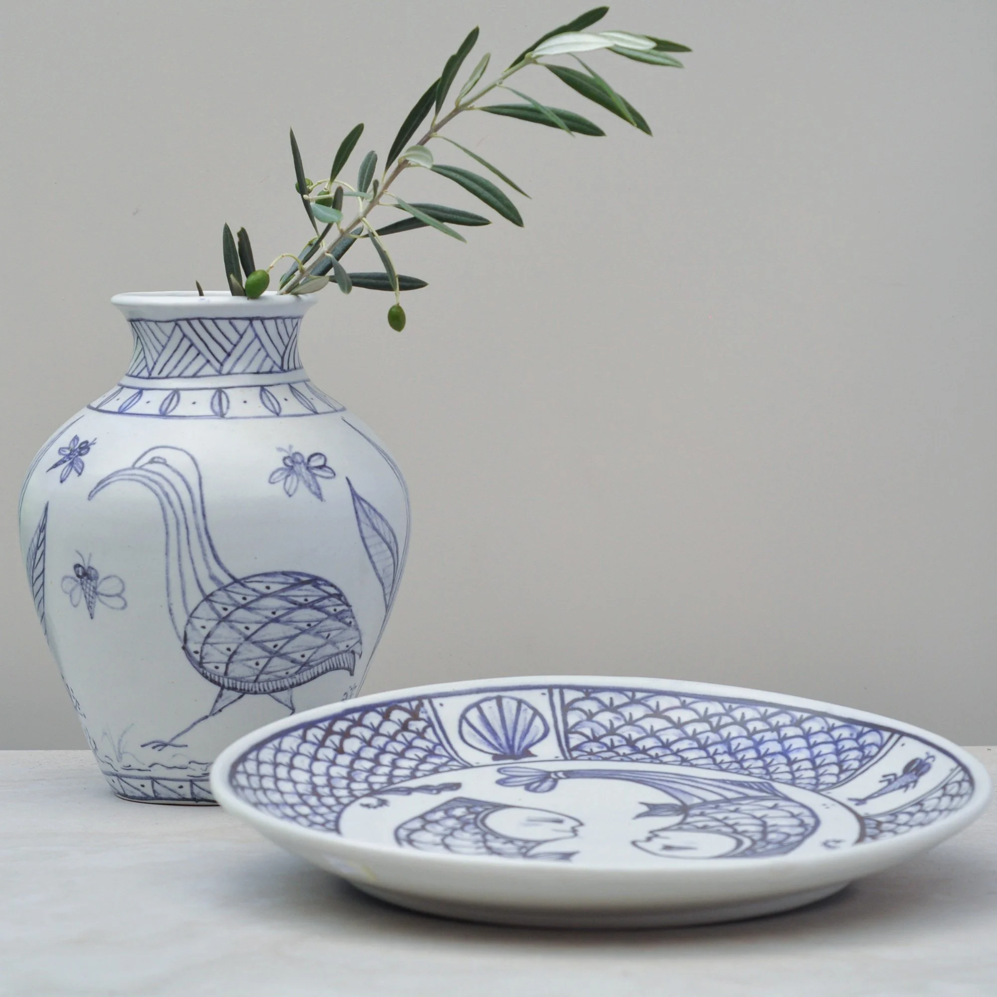
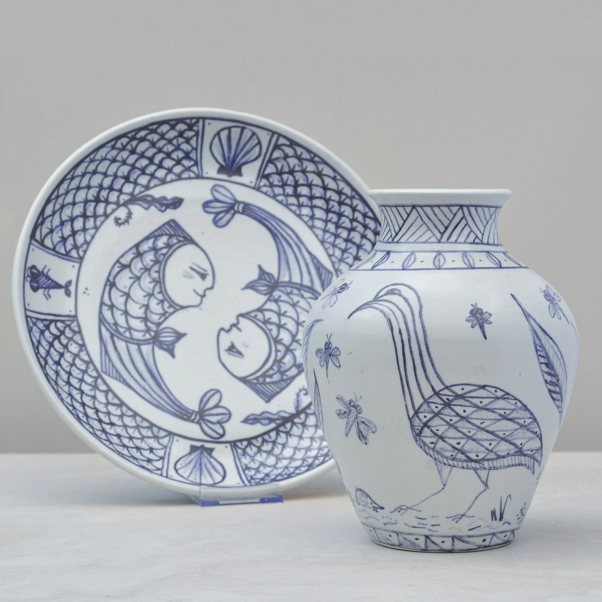
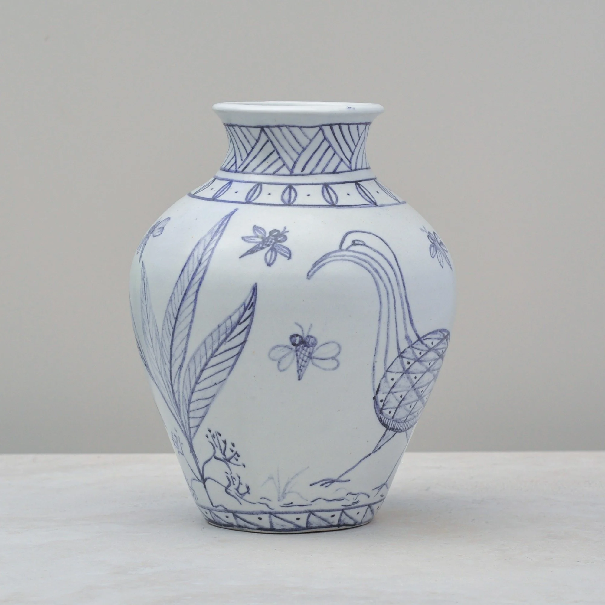
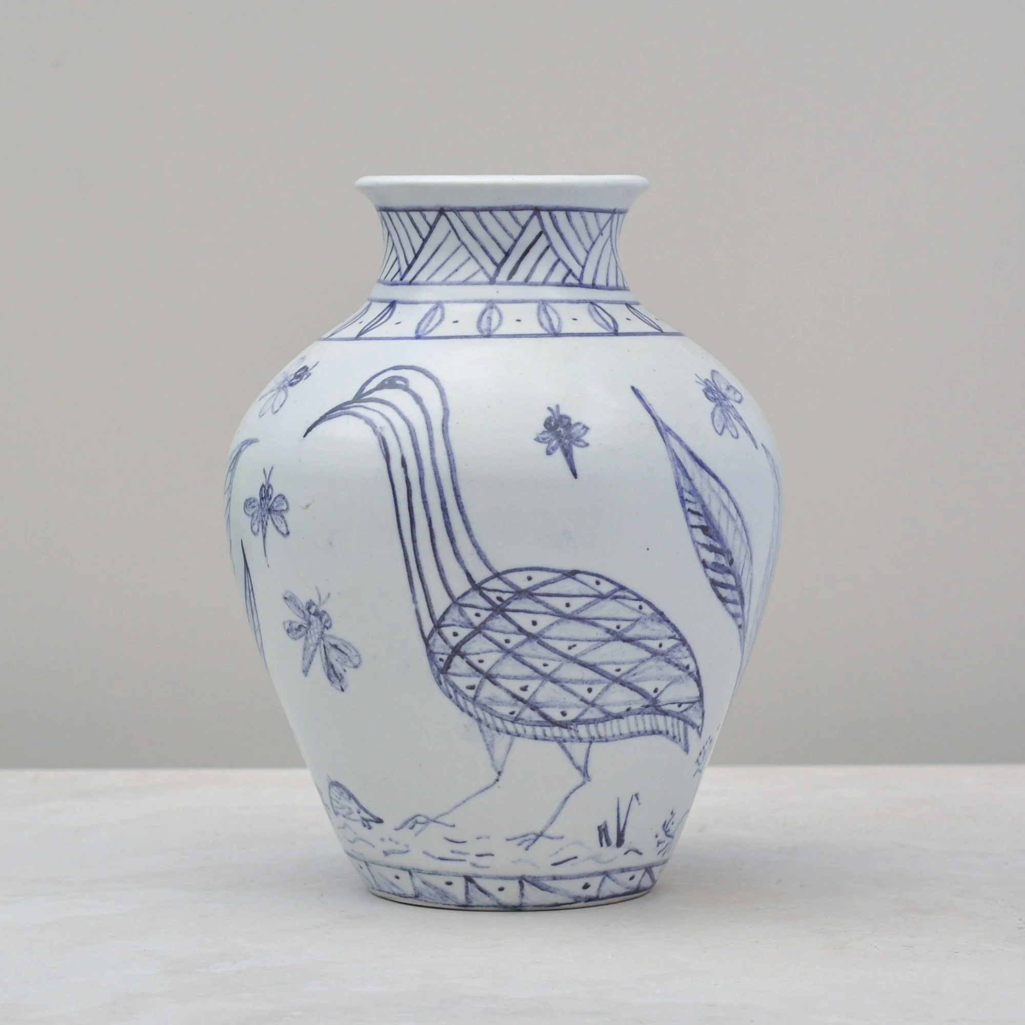
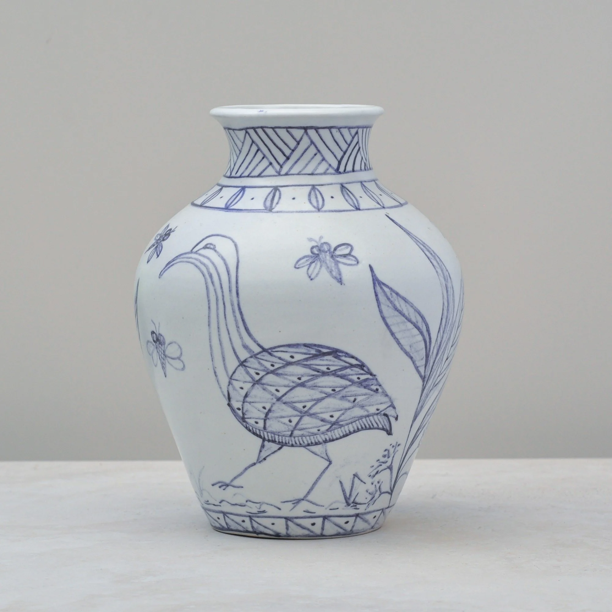

If pieces could be a place, this bowl and vase set would take us straight to the Mediterranean - sitting under the warmth of the sun by clear blue water, with a large seafood platter and crisp white wine. Their whimsical hand-painted images of birds, bees and wonderfully character-filled fish on the white rustic ceramic share that same delight. Sun, space, water and joy all in one place.
They do have an artist, but not one I can identify. I think that only adds to their charm - perhaps even adds a little mystery. But there’s another element that needs sharing, they feel wonderful. The ceramic is smooth, cool and soft to the touch. This set is certainly one of a kind - a wonderful kind.
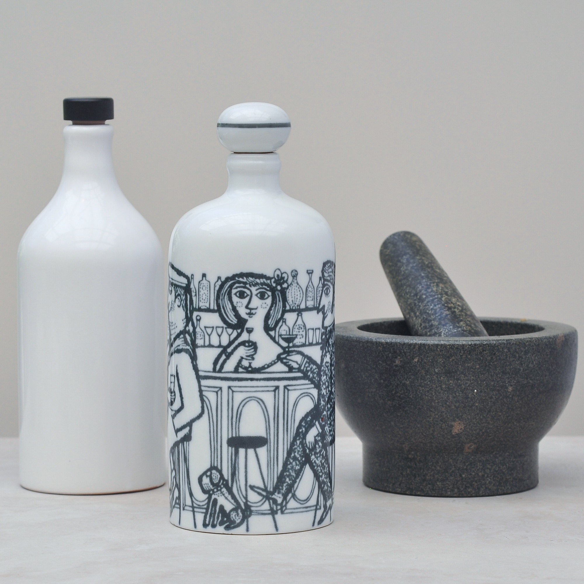
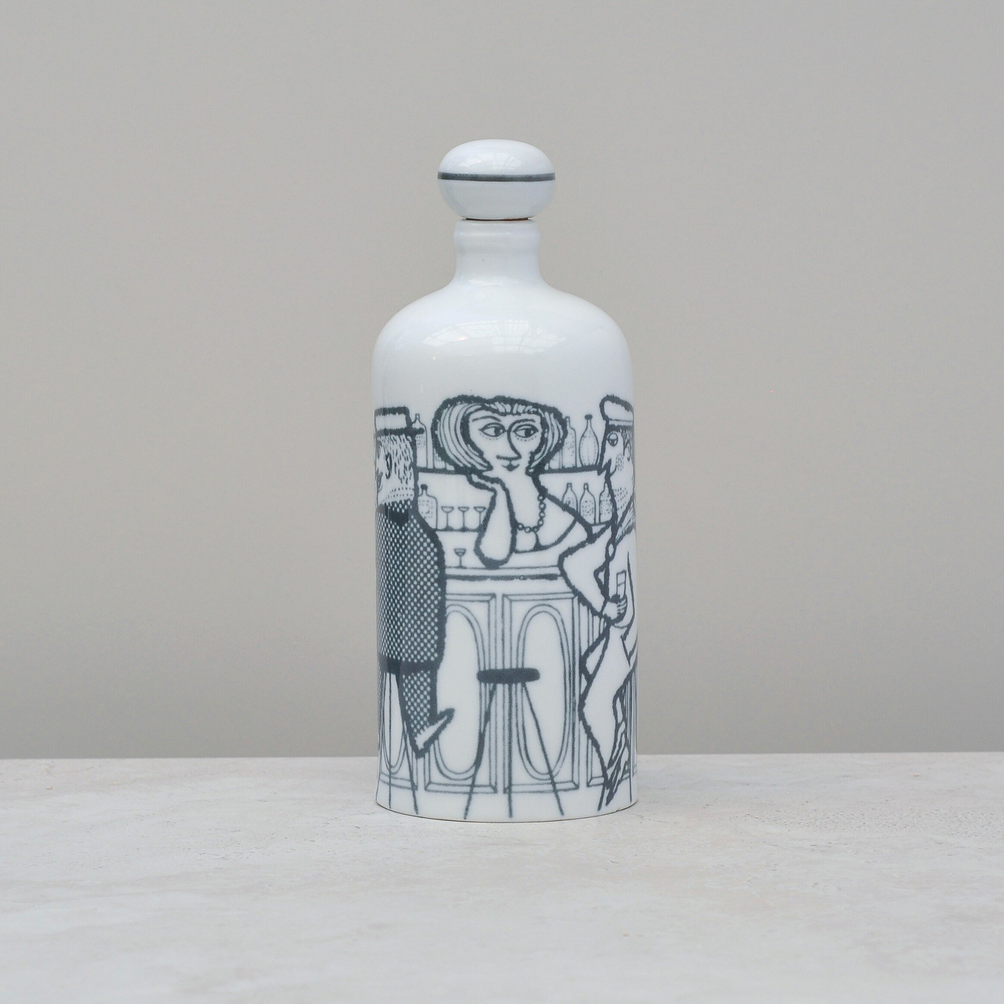
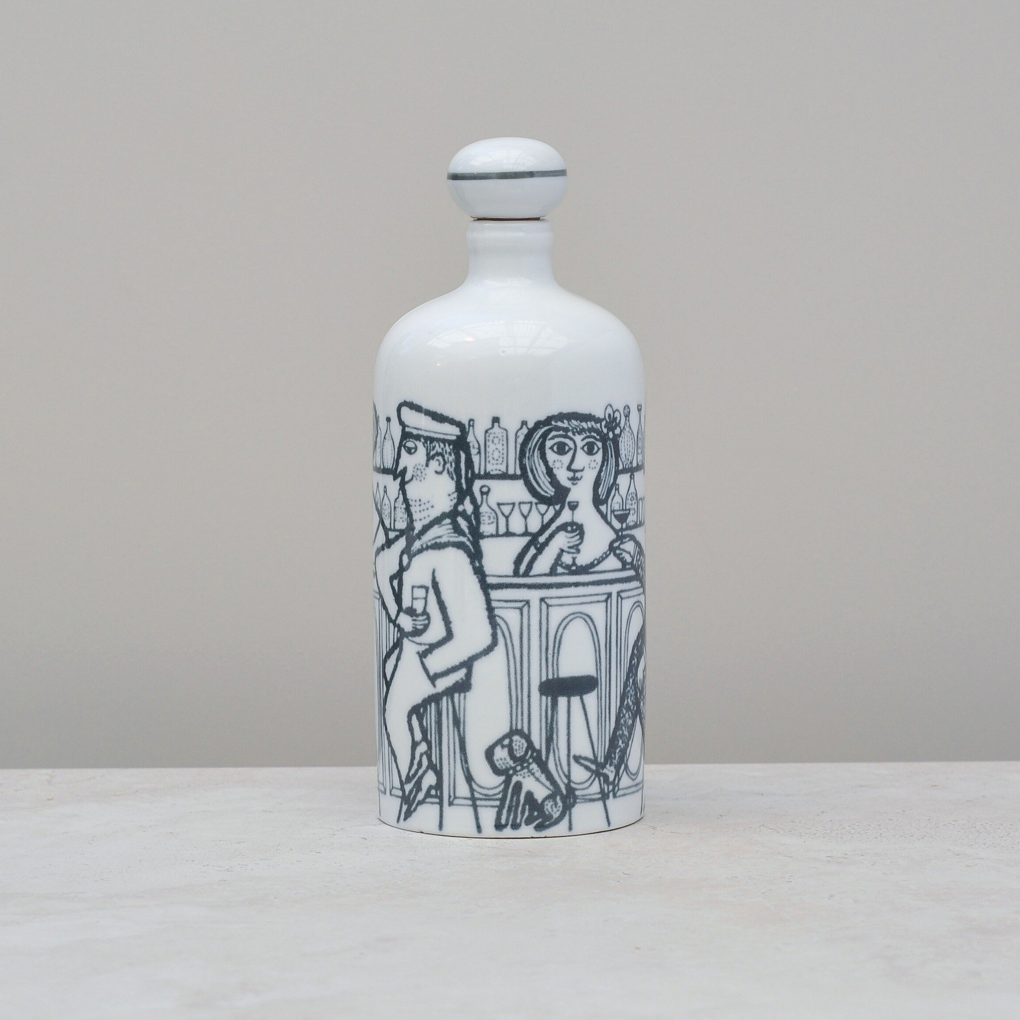
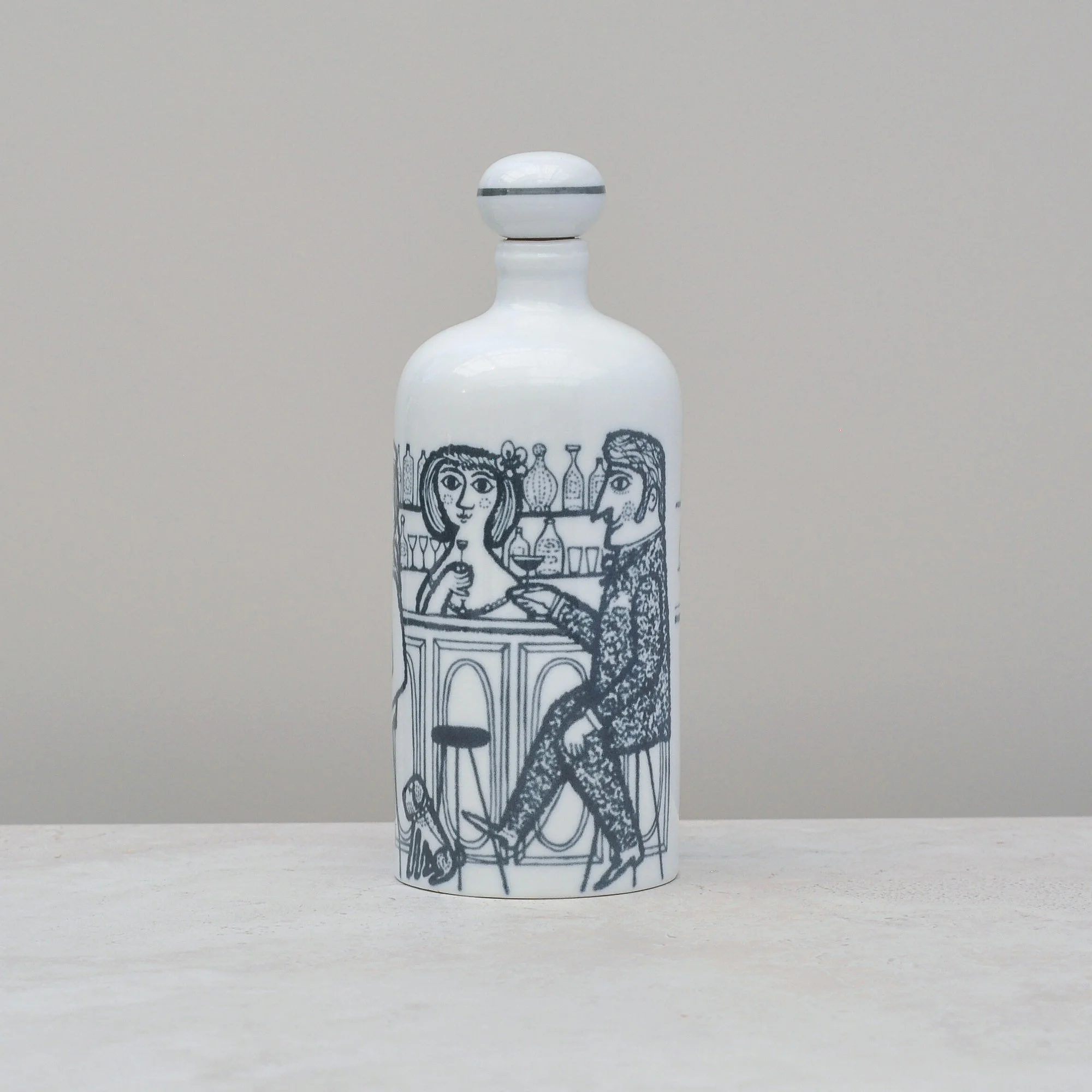
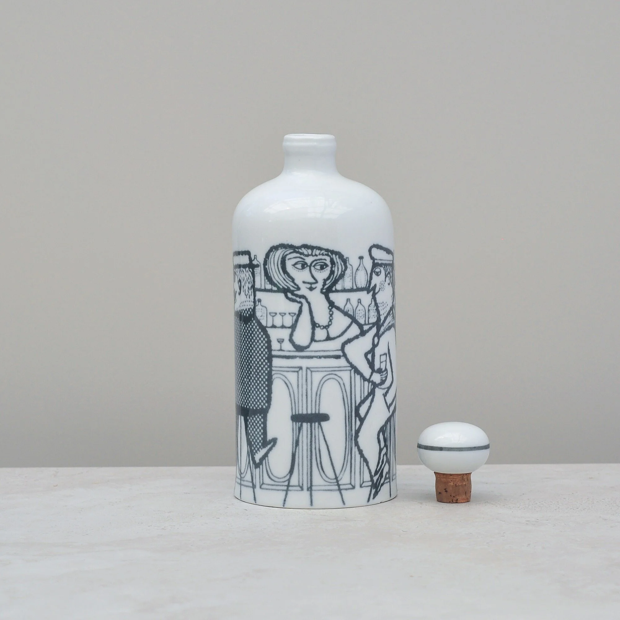
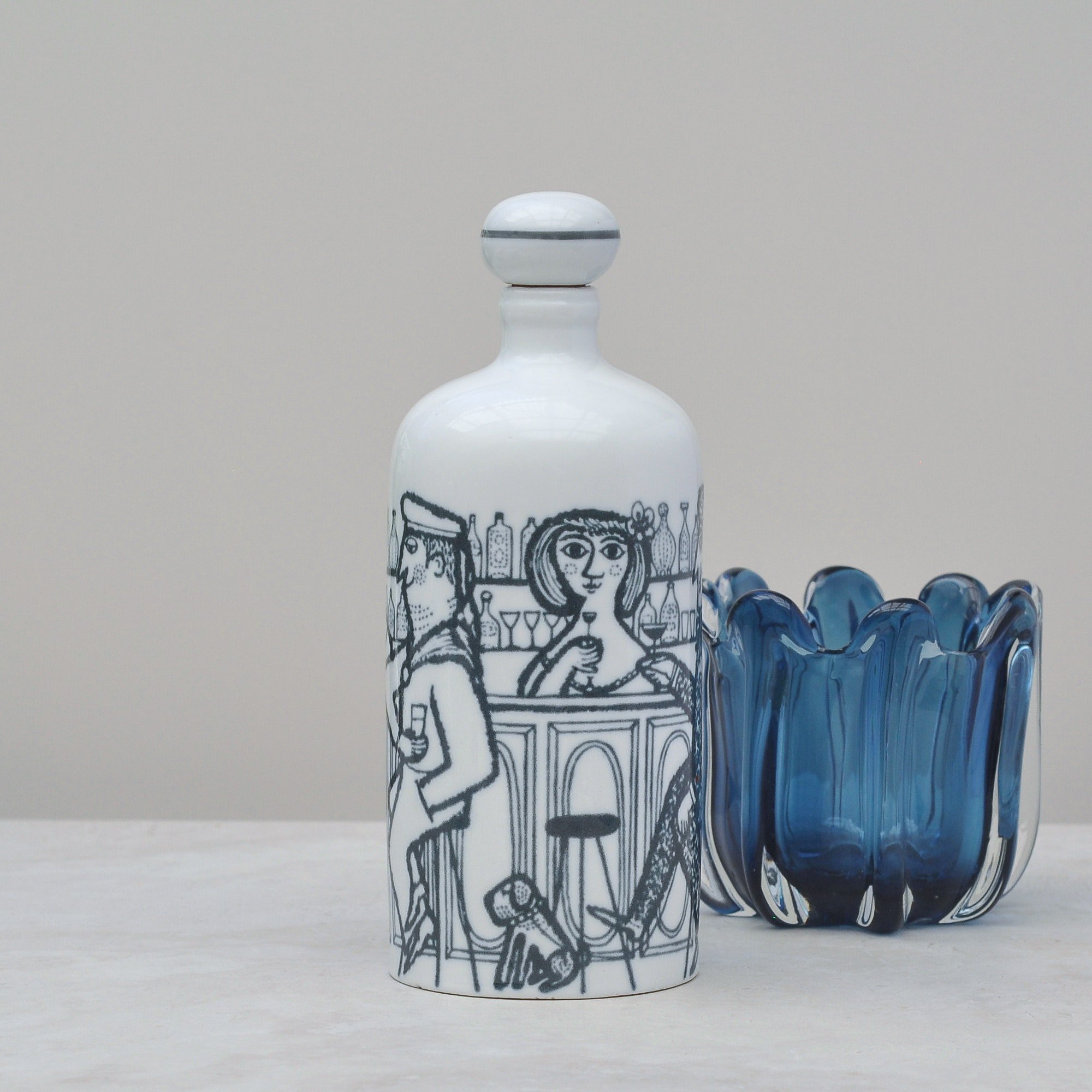
This playful mid-century West German decanter has such an air of fun and frivolity about it that you will want to pick it up and explore all it’s delightful curves. Made of high-quality white porcelain with a blue underglaze, it celebrates a joyful looking bar scene with two women, three men and, of course, the dog.
The bar scene actually gives away one its little secrets - in its day it would have been used as a decanter for carrying spirits and may have also had a matching shot glass. The company that produced it, Porzellanfabrik Altenkunstadt Karl Nehmzow, was well known for their barware which today make highly collectable pieces. This one is no exception, it certainly if full of charm.
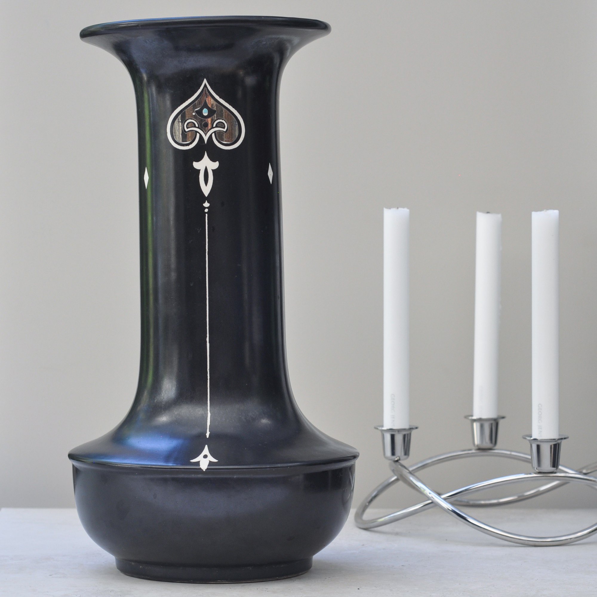
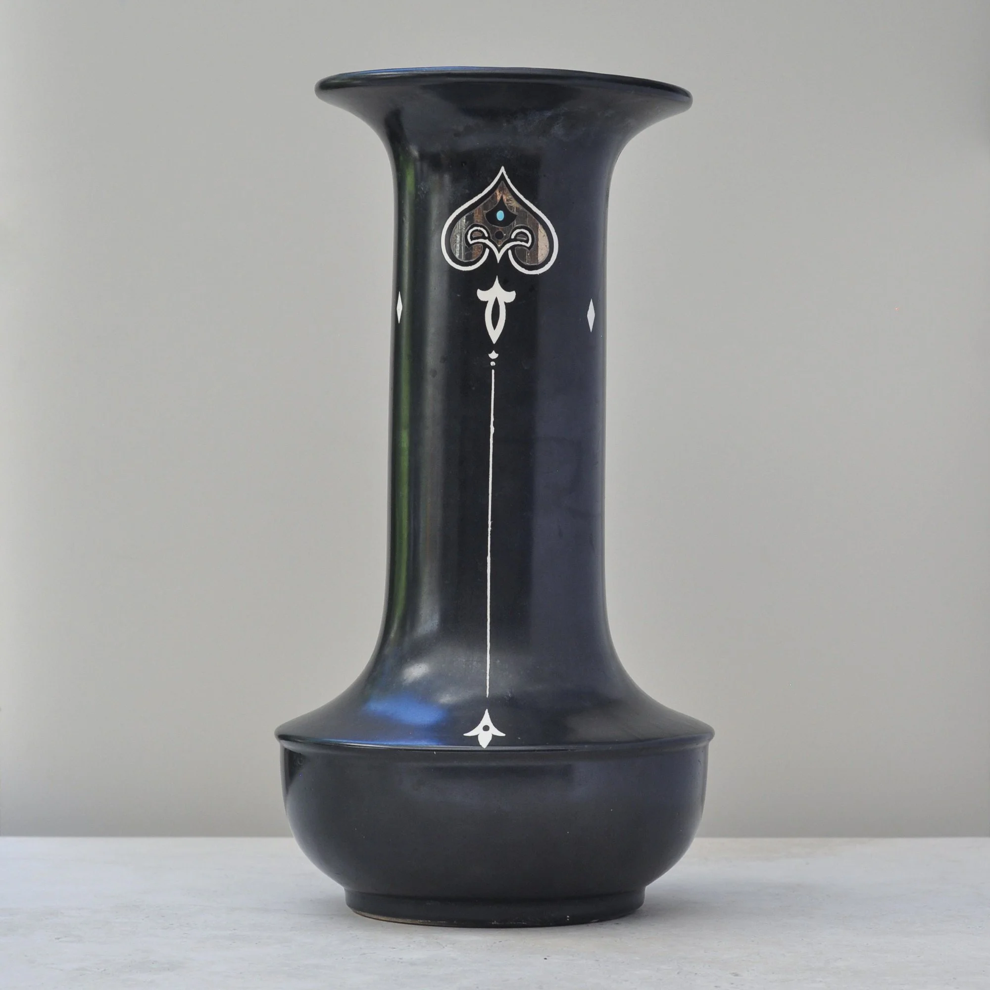
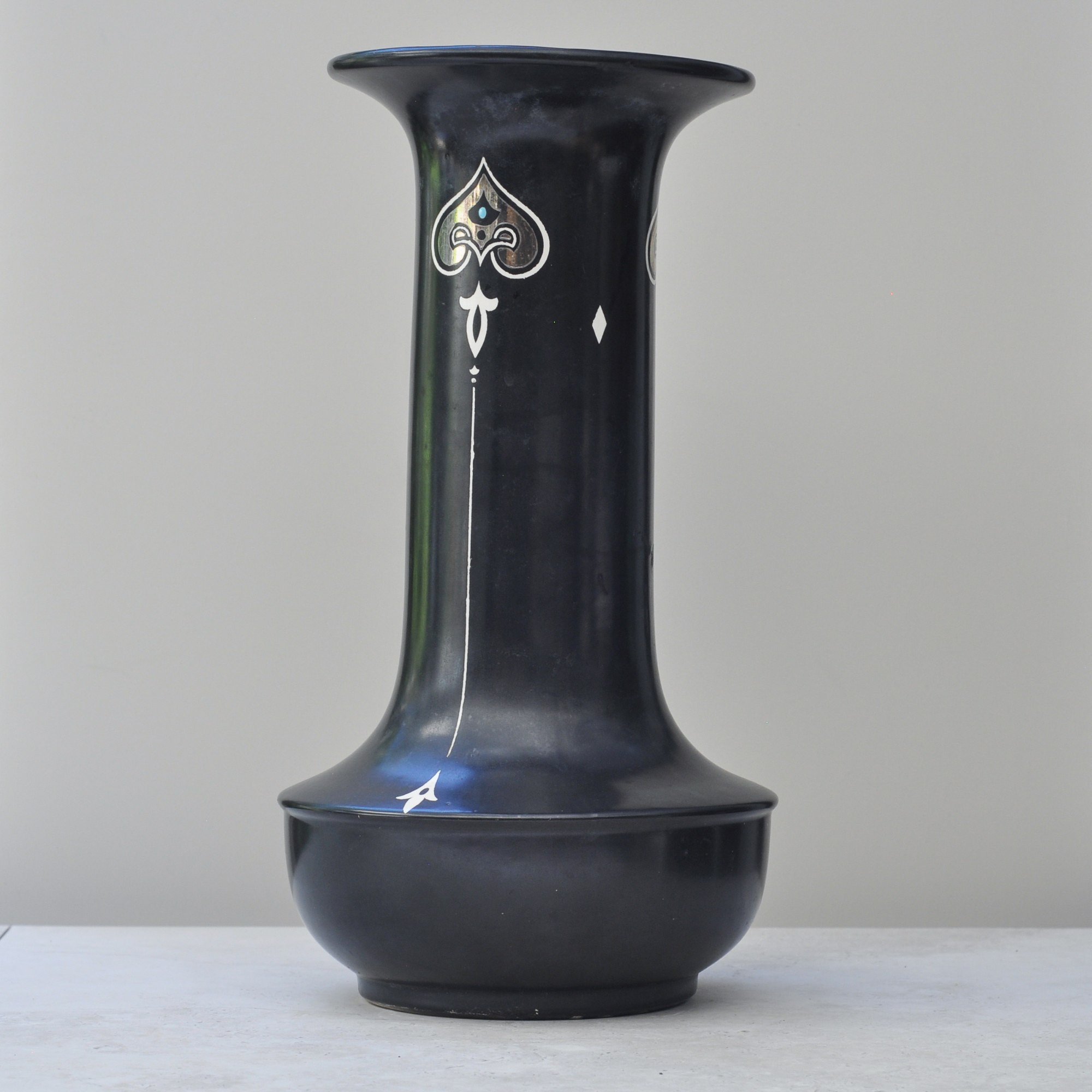
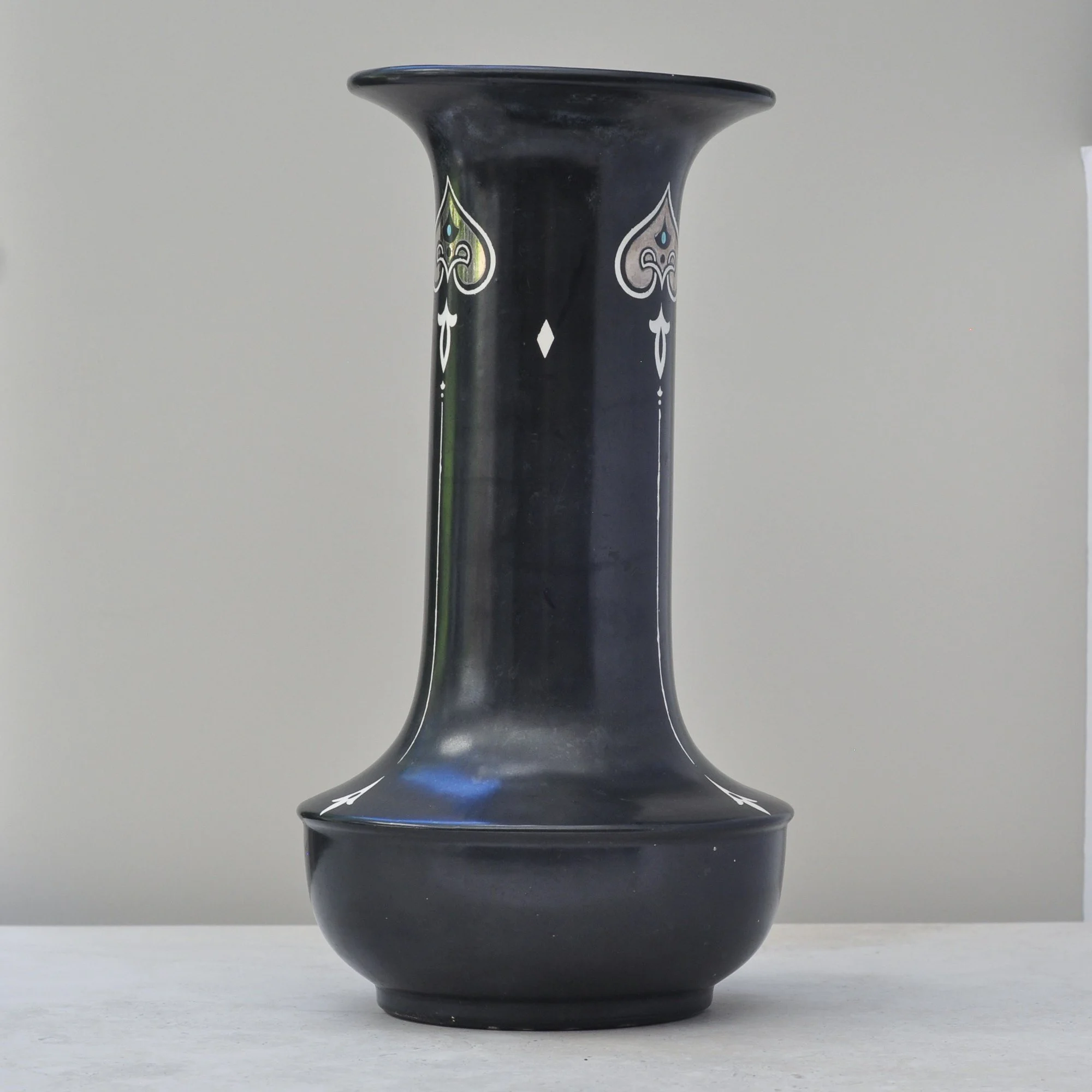
This tall, dark and handsome vase was made by the celebrated pottery house Shelley in England around the turn of the 20th century.
Its height and slender form are balanced by a gently flared rim and rounded base, giving the piece an almost architectural presence. Finished in a deep, dark ground, it is decorated with a stylised white, silver and blue motif that reflects the flowing lines and symmetry typical of the Art Nouveau period.
A particularly large and impressive example, this is a truly timeless piece and a beautiful expression of the quality, design and craftsmanship produced by Shelley during this era. It still sits beautifully in today.
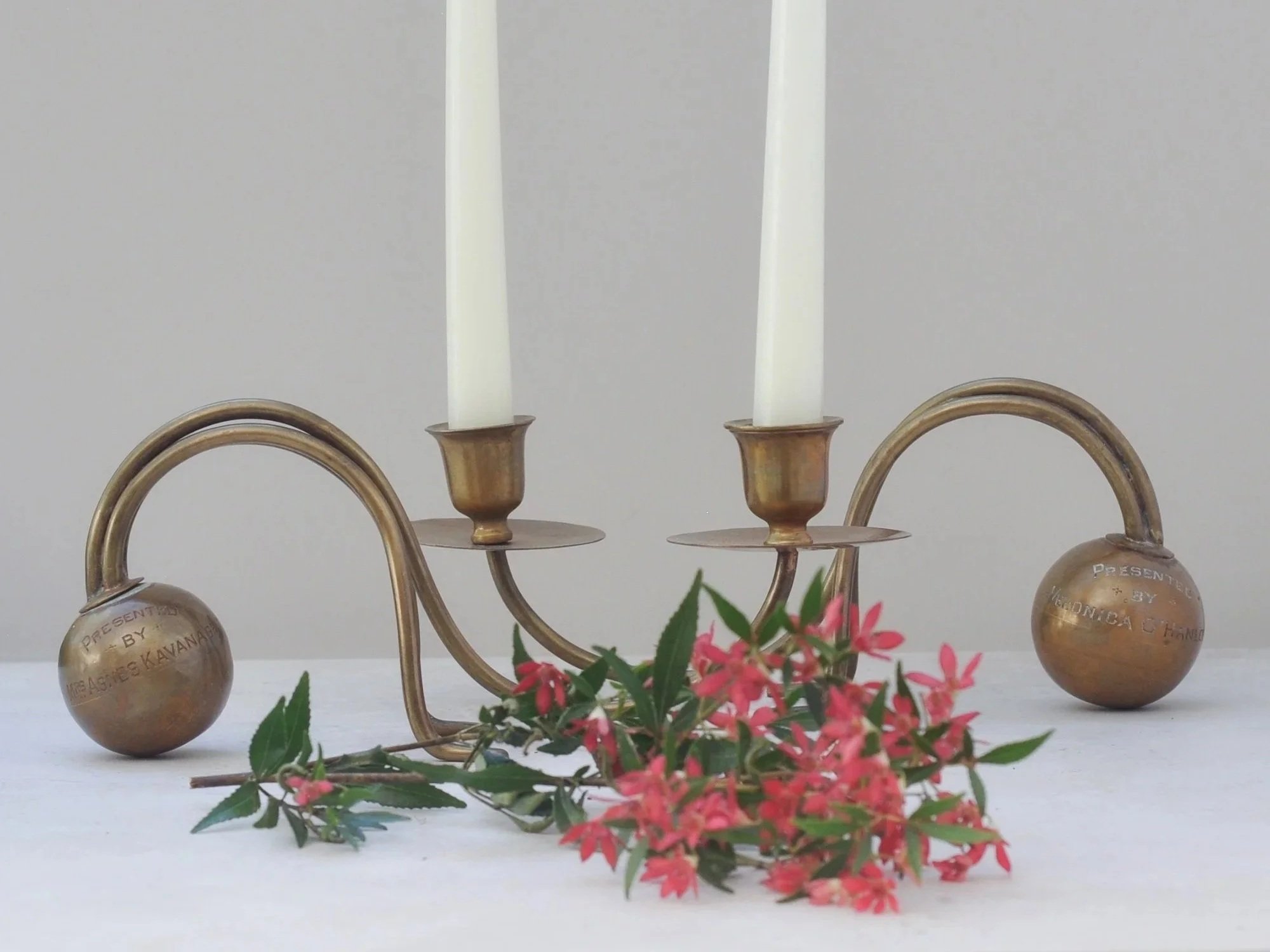
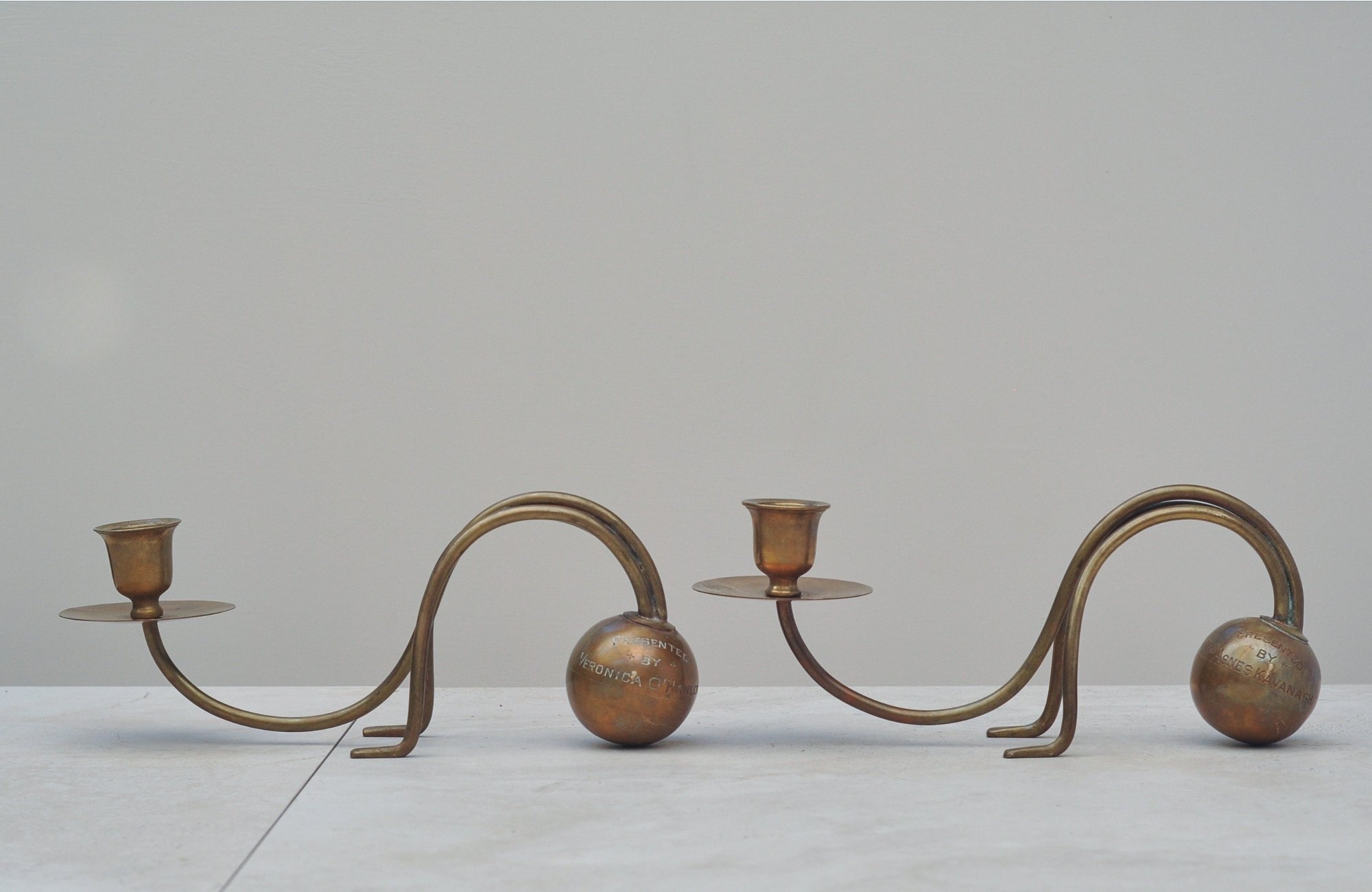
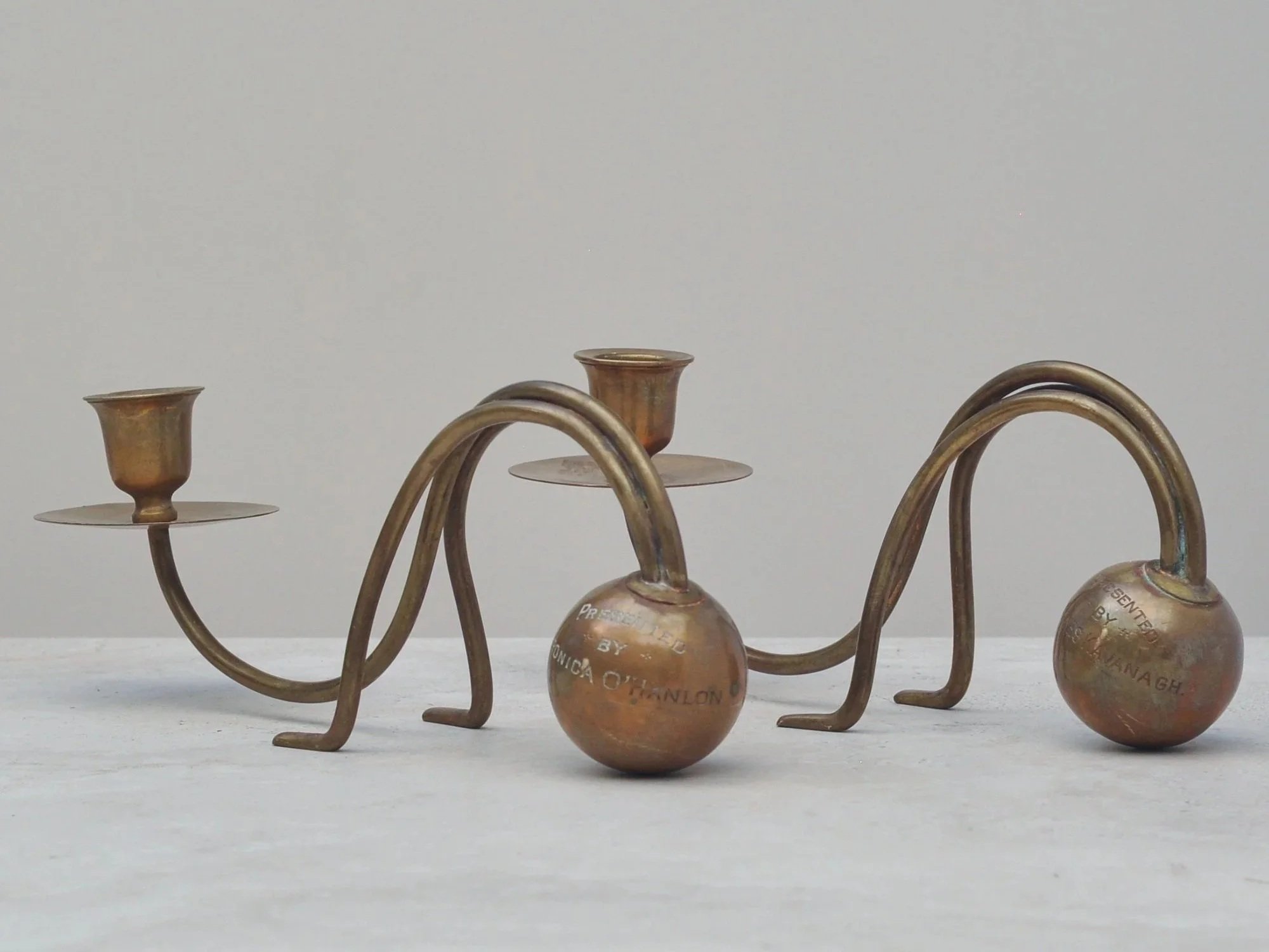
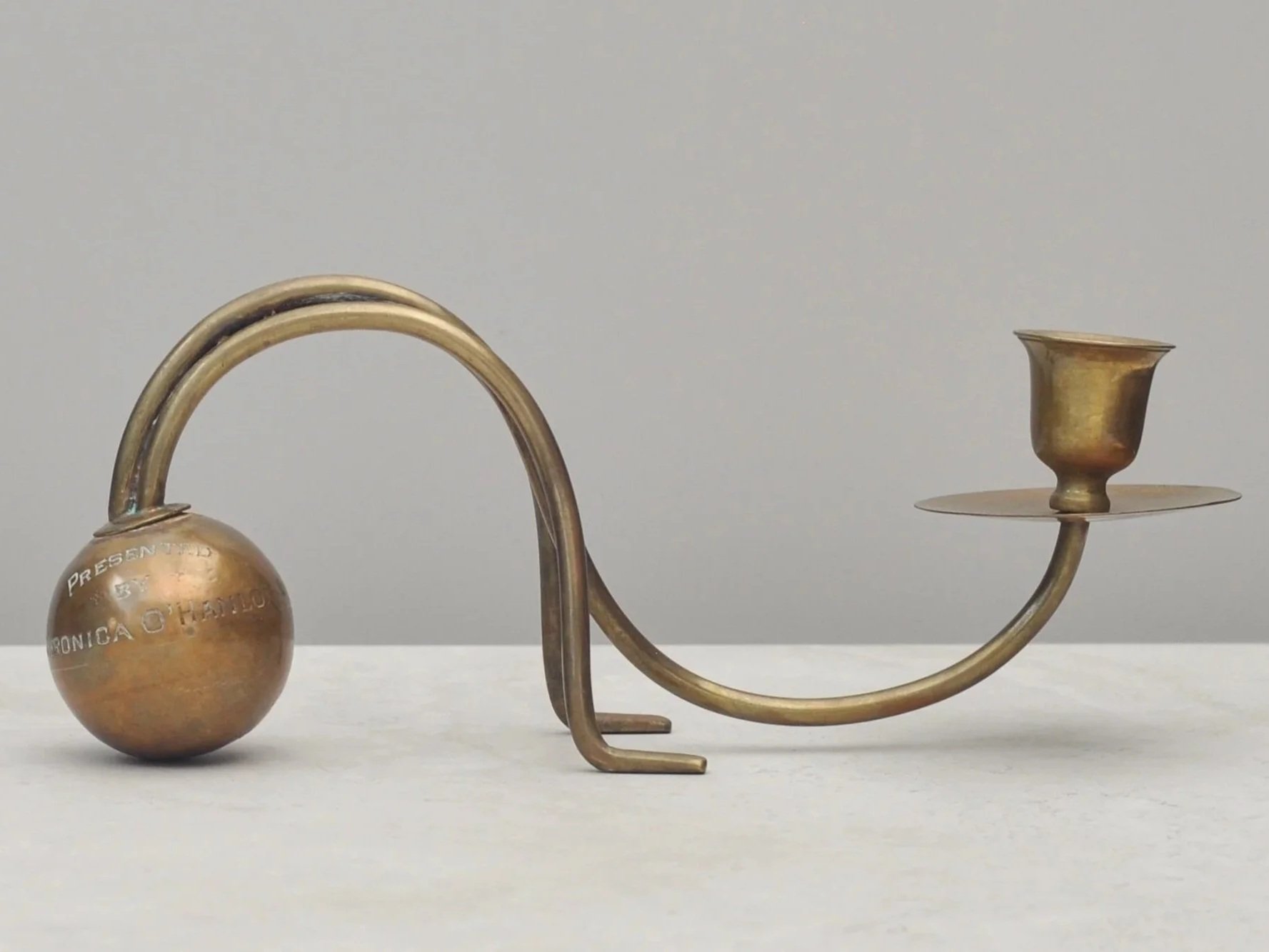
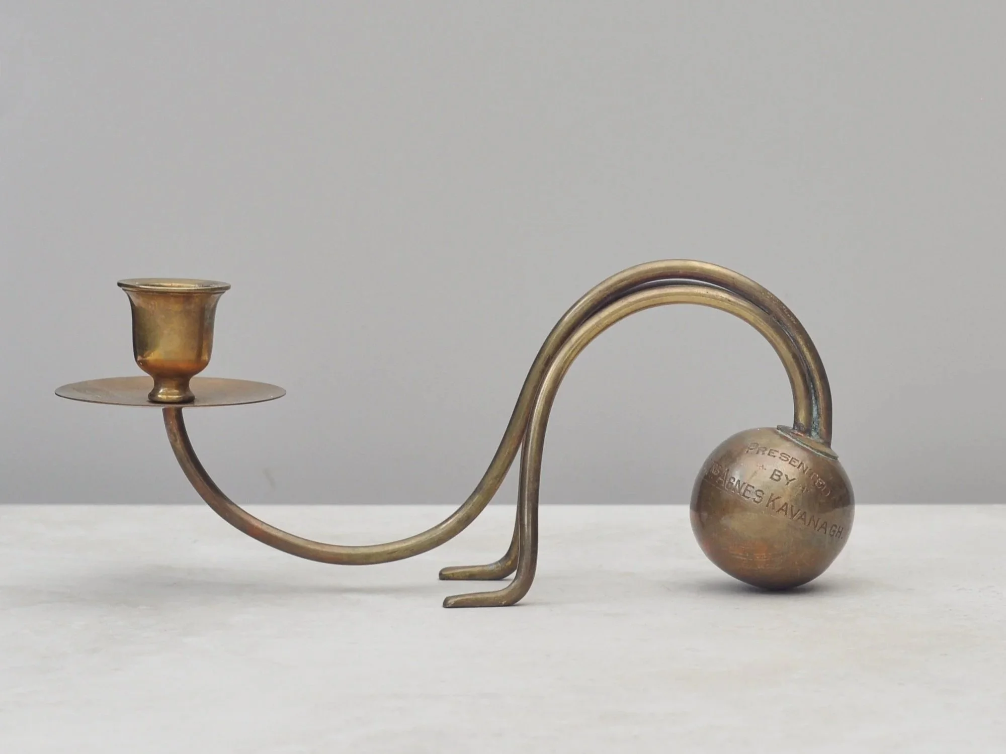
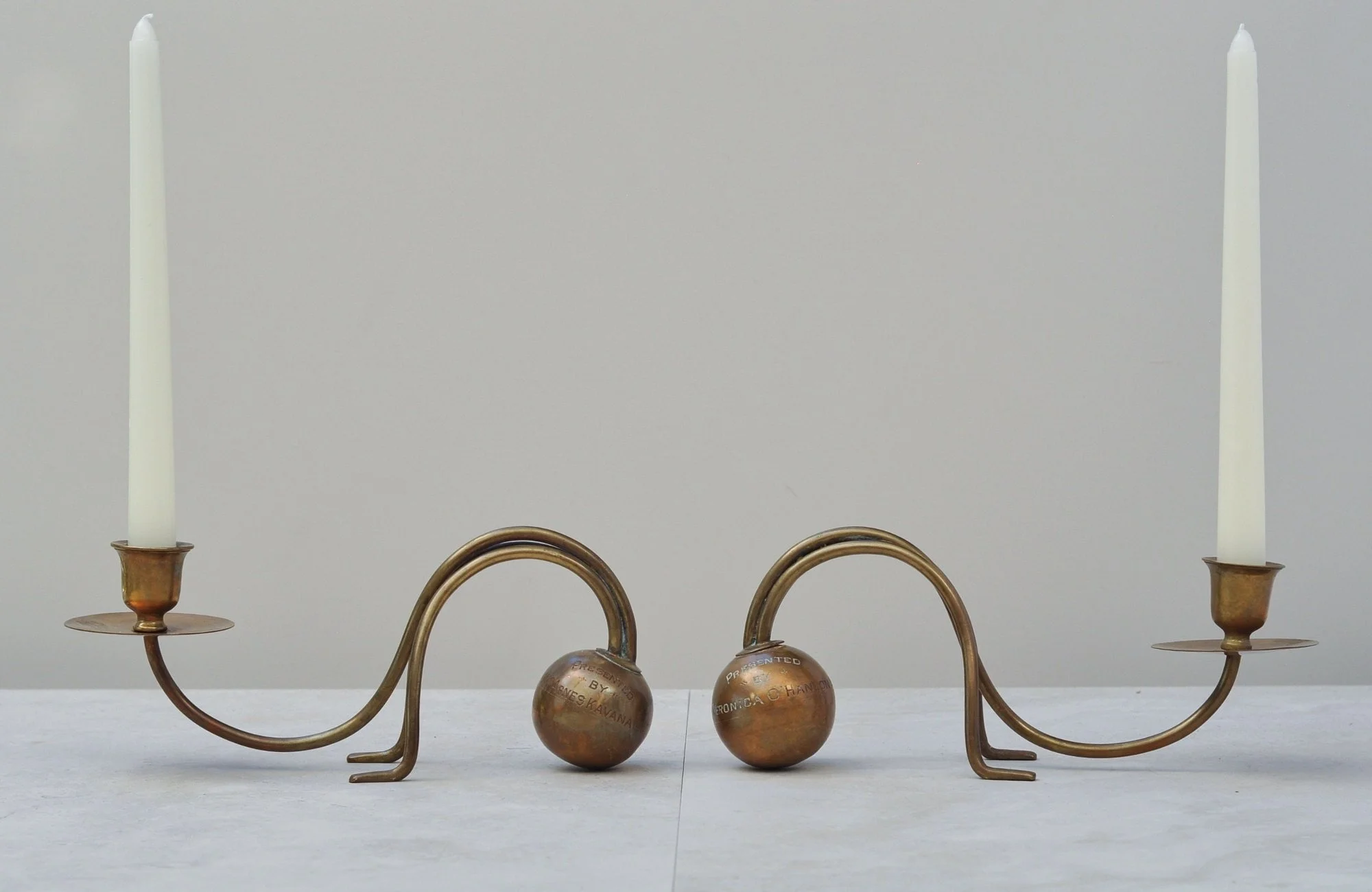
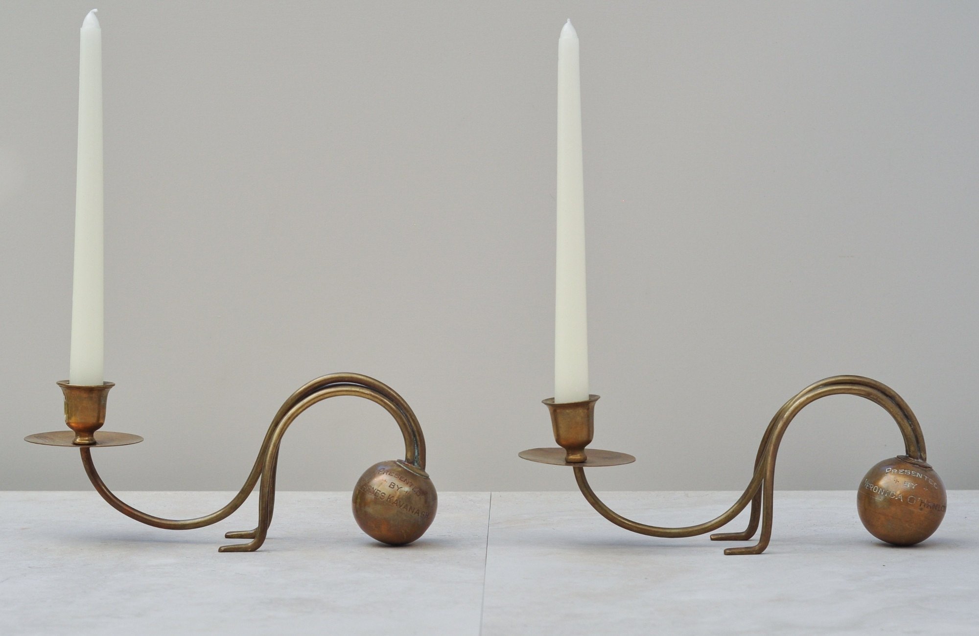
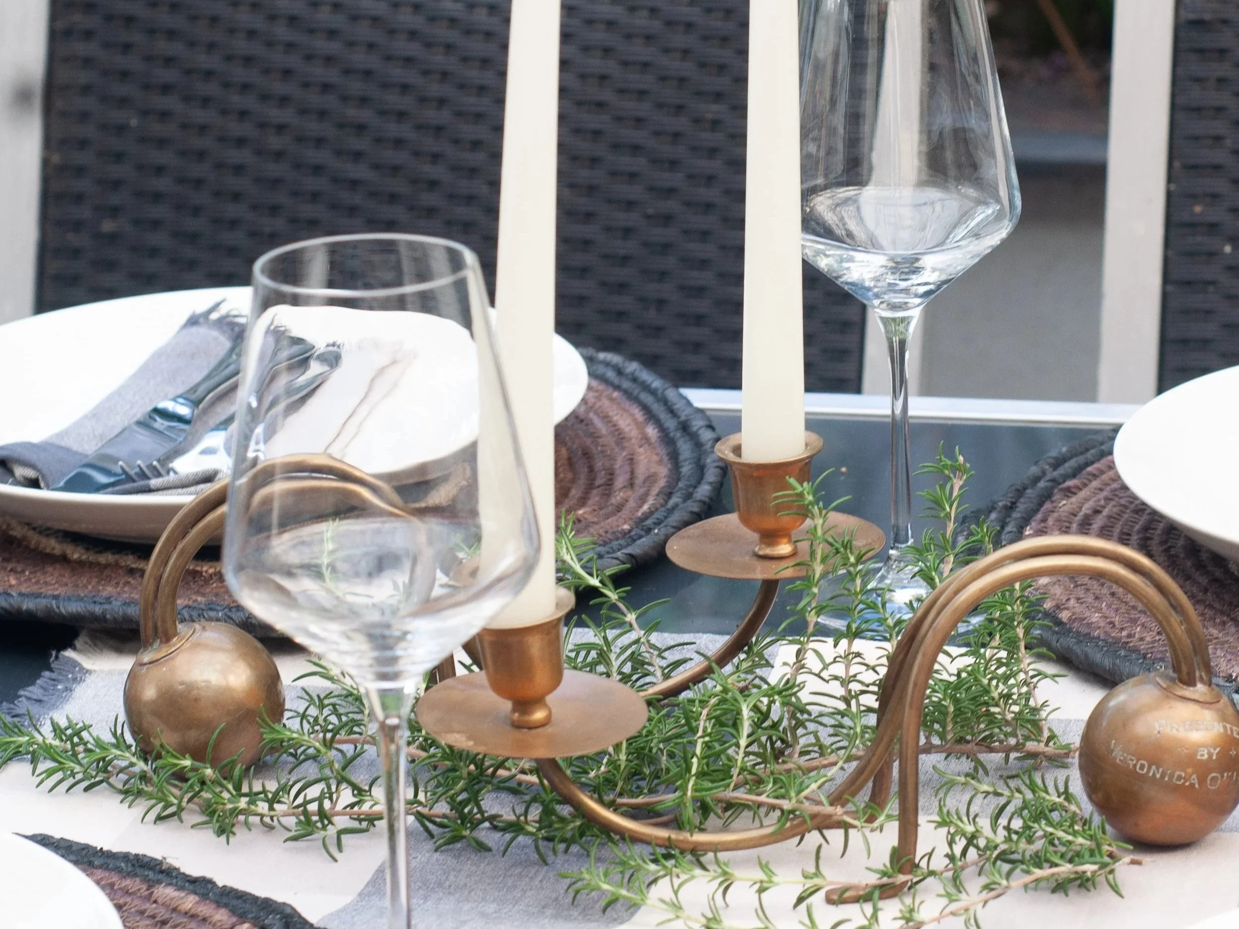
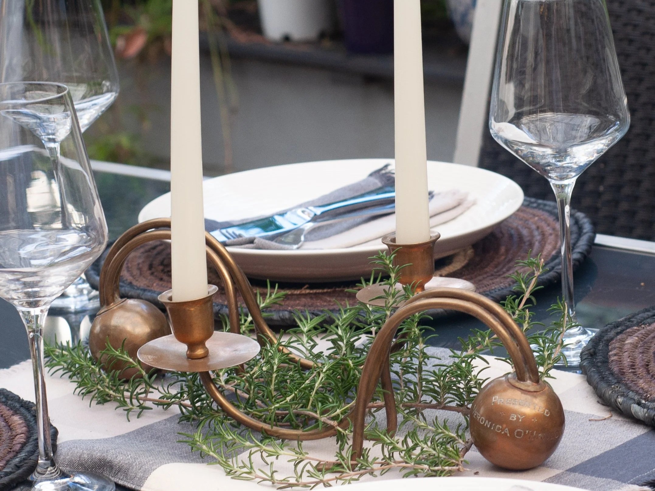
Wow. Simply wow.
I’m struggling to find the words to describe how someone clever took two brass balls stamped “Presented By..” and imagined something so stylish, sculptural and unique. They are truly one of a kind candlesticks, full of character and form.
I don’t doubt Ms. Agnes Kavanagh and Veronica O’Hanlon, the two ladies who originally presented the brass balls, would be proud. Their names now live on in a design that shows how beautifully the old can be reworked into something new and modern. You will never find another pair like them.
May I present them to you…
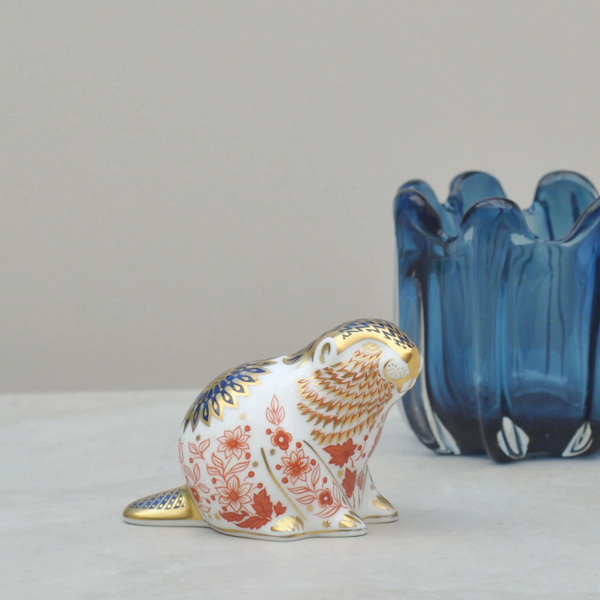
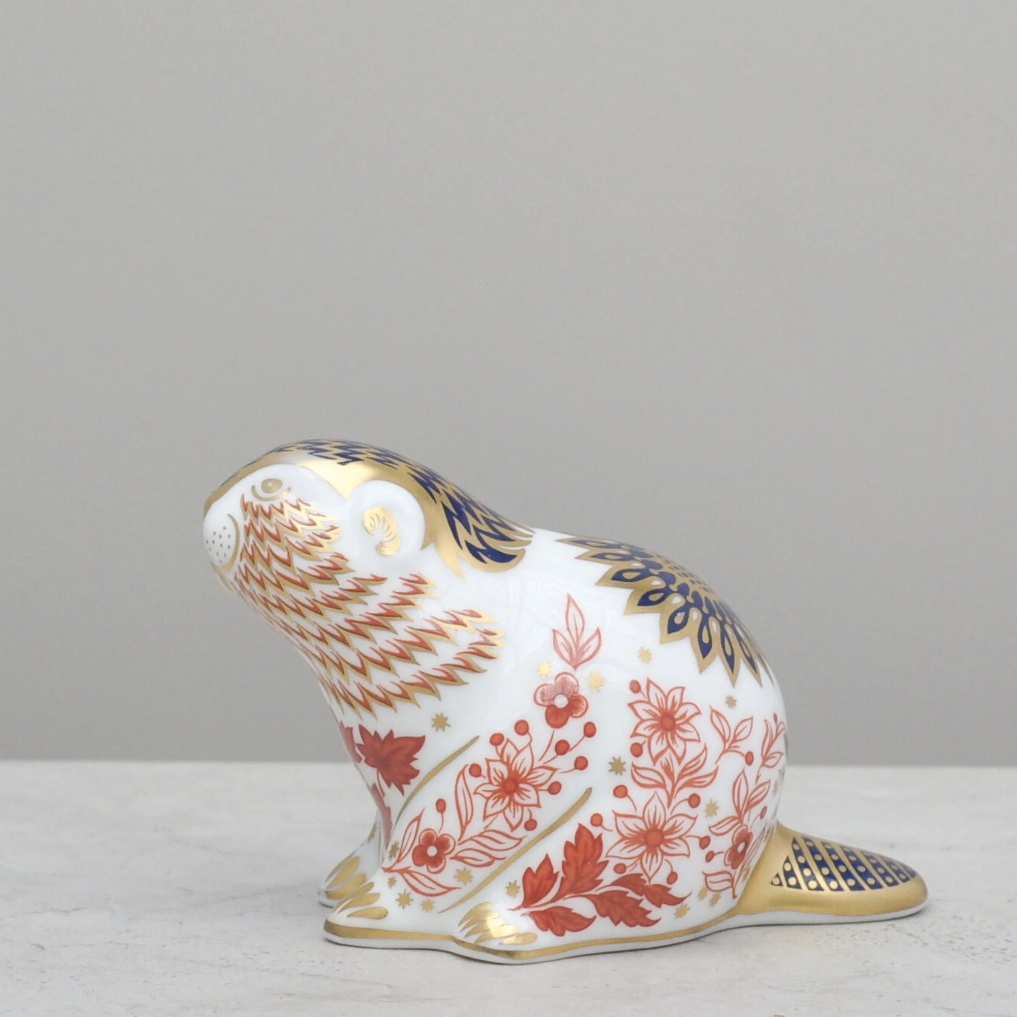
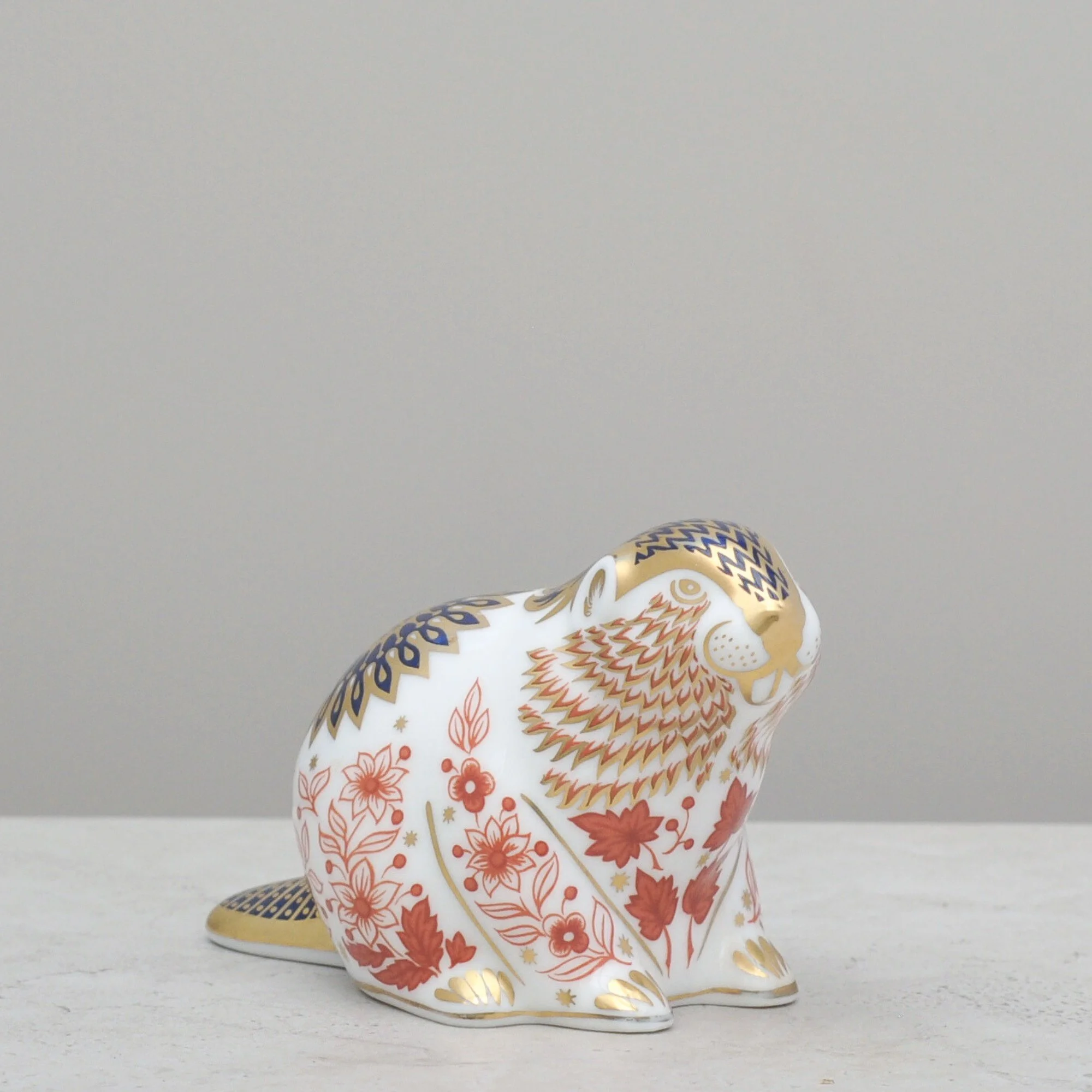
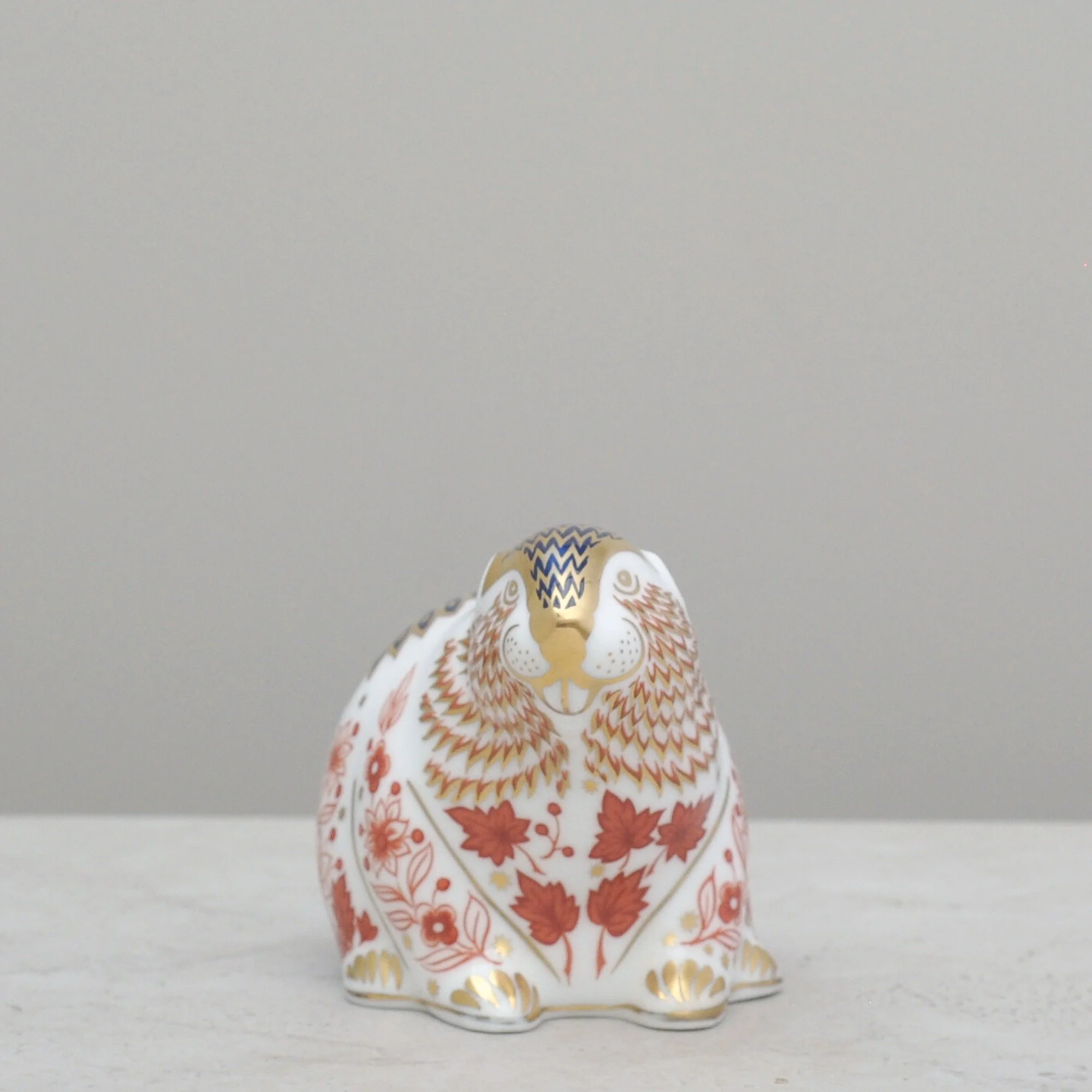
What instantly draws you to this little chap are the colours - the vibrant red, the rich navy blue, the generous gold highlights — all against the crispness of fine white bone china. He’s a good one too, with his gold button on the base indicating the best of Royal Crown Derby quality. He even has his original box.
There’s a reason these are incredibly collectible. They have all the elements that make Royal Crown Derby paperweights a joy to the eye - characterful subjects, beautiful colours and superb craftsmanship.
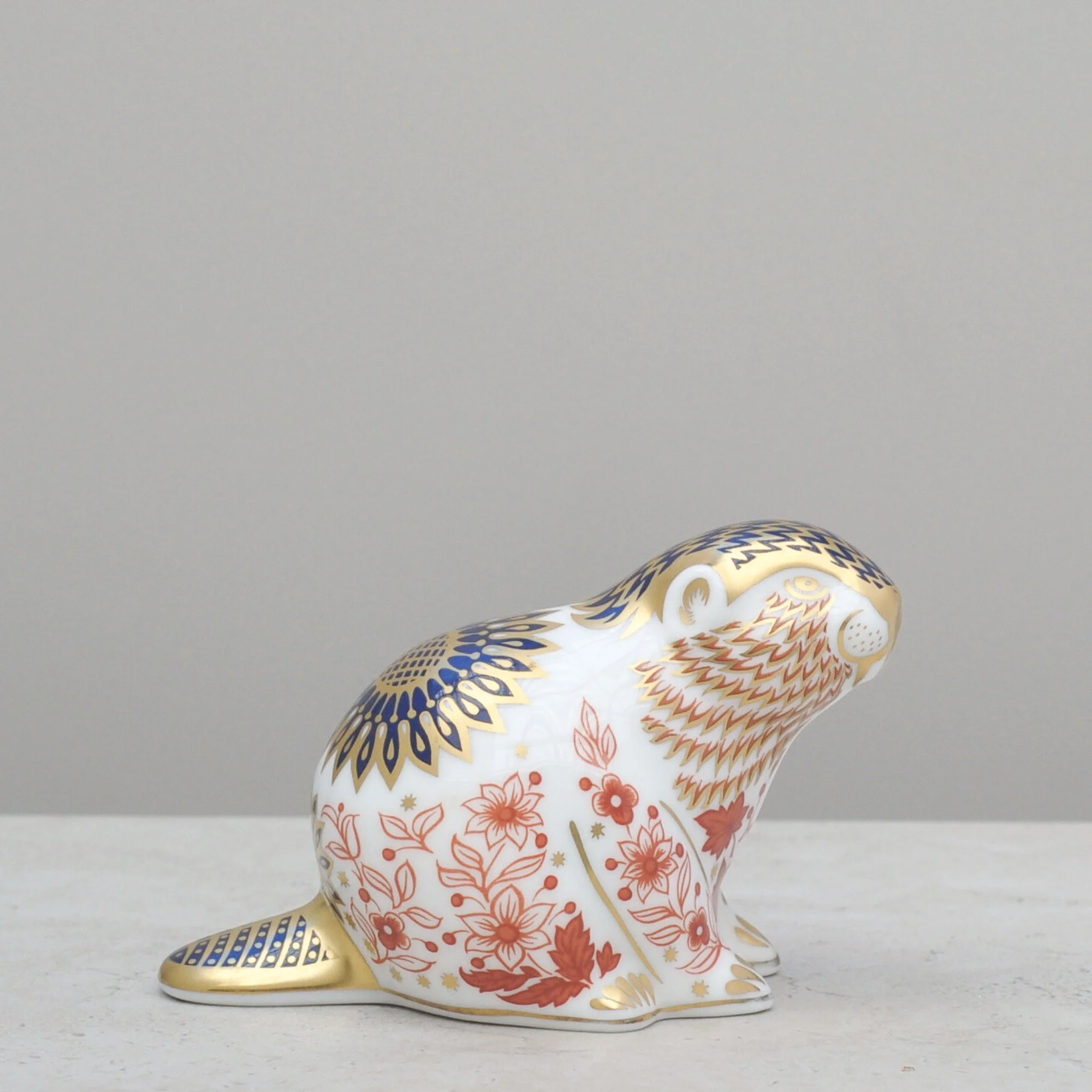
I had planned to stay away from the more ‘traditional’ collectable items but there was something about this beaver I couldn’t pass up. I wasn’t wrong either - my twelve-year-old son instantly loved him, calling this his favourite of all my finds. It makes me wonder whether this beaver might spark a child’s collecting interest. With a range of over 450 different animals, there are certainly many more of these treasures to discover.

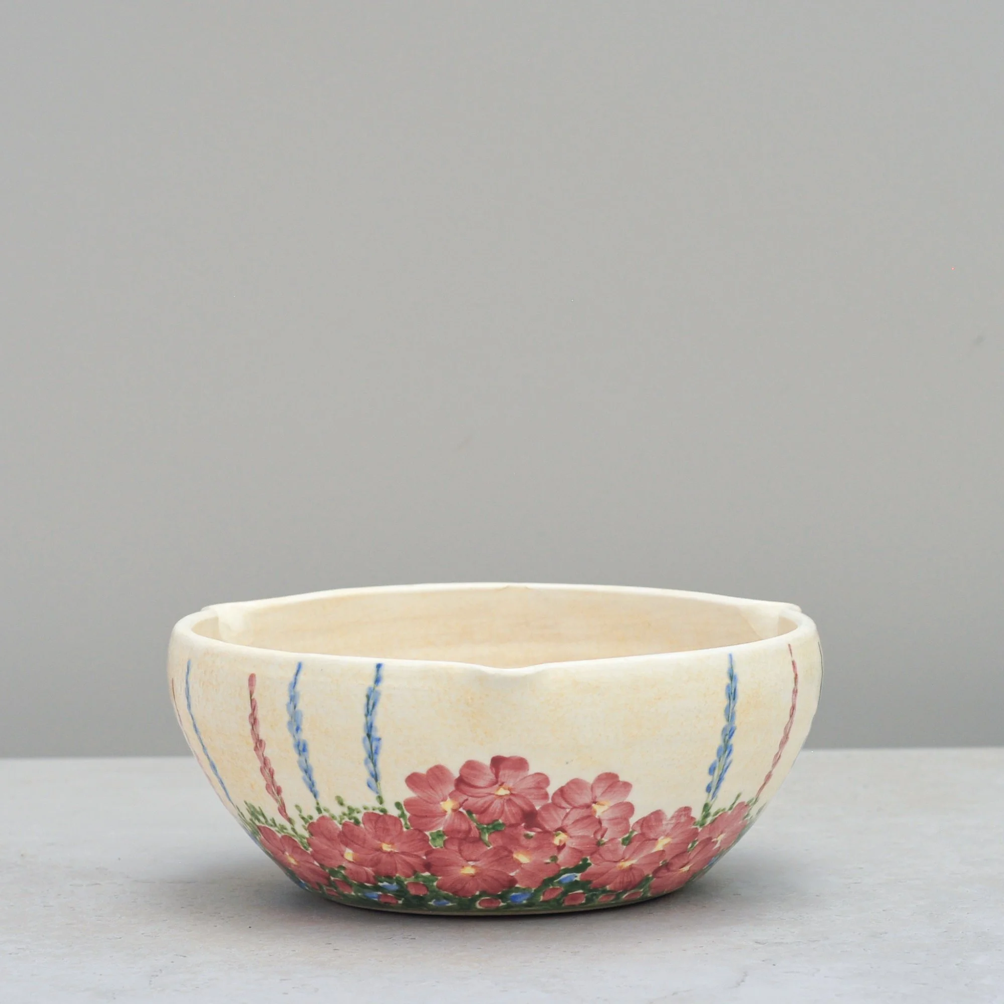
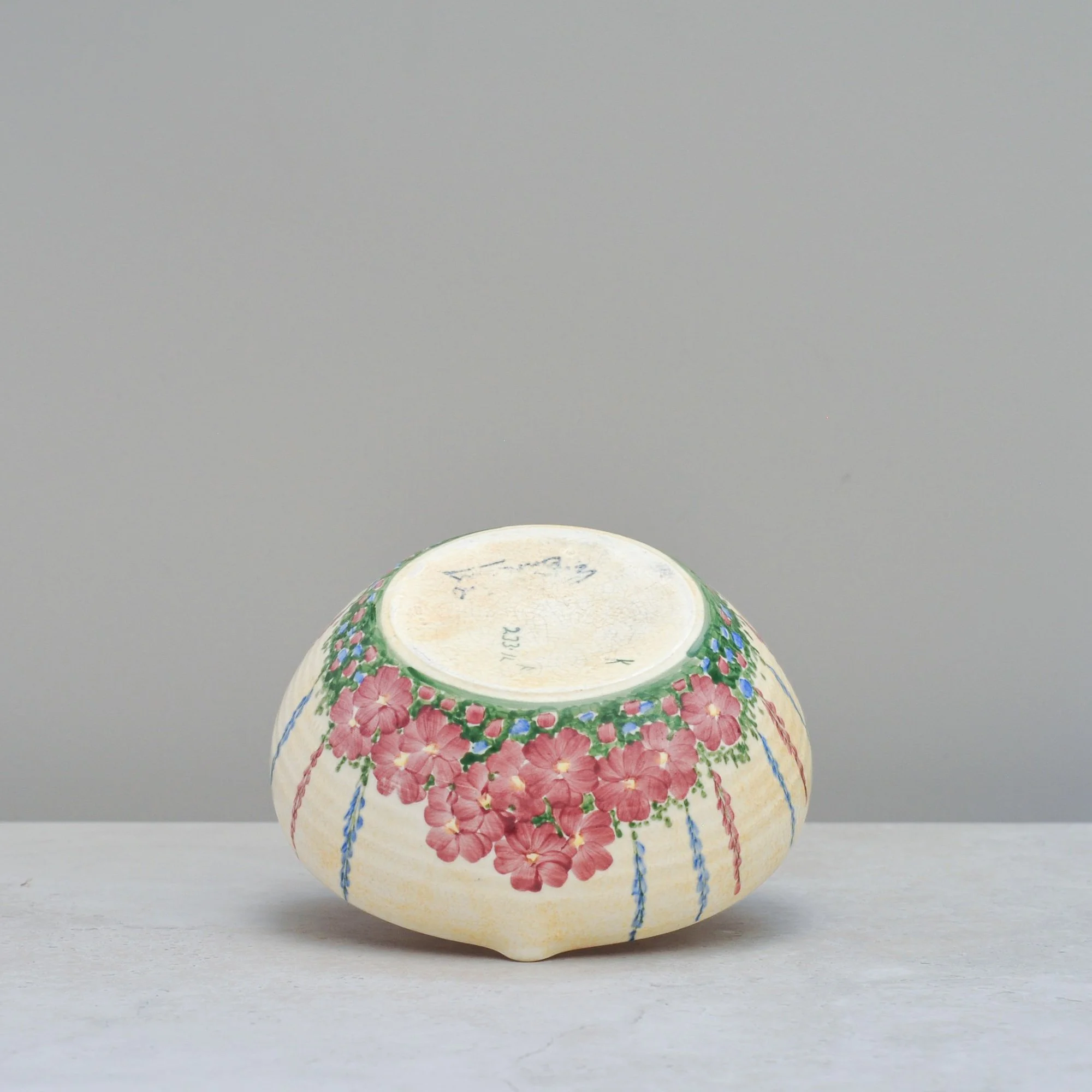
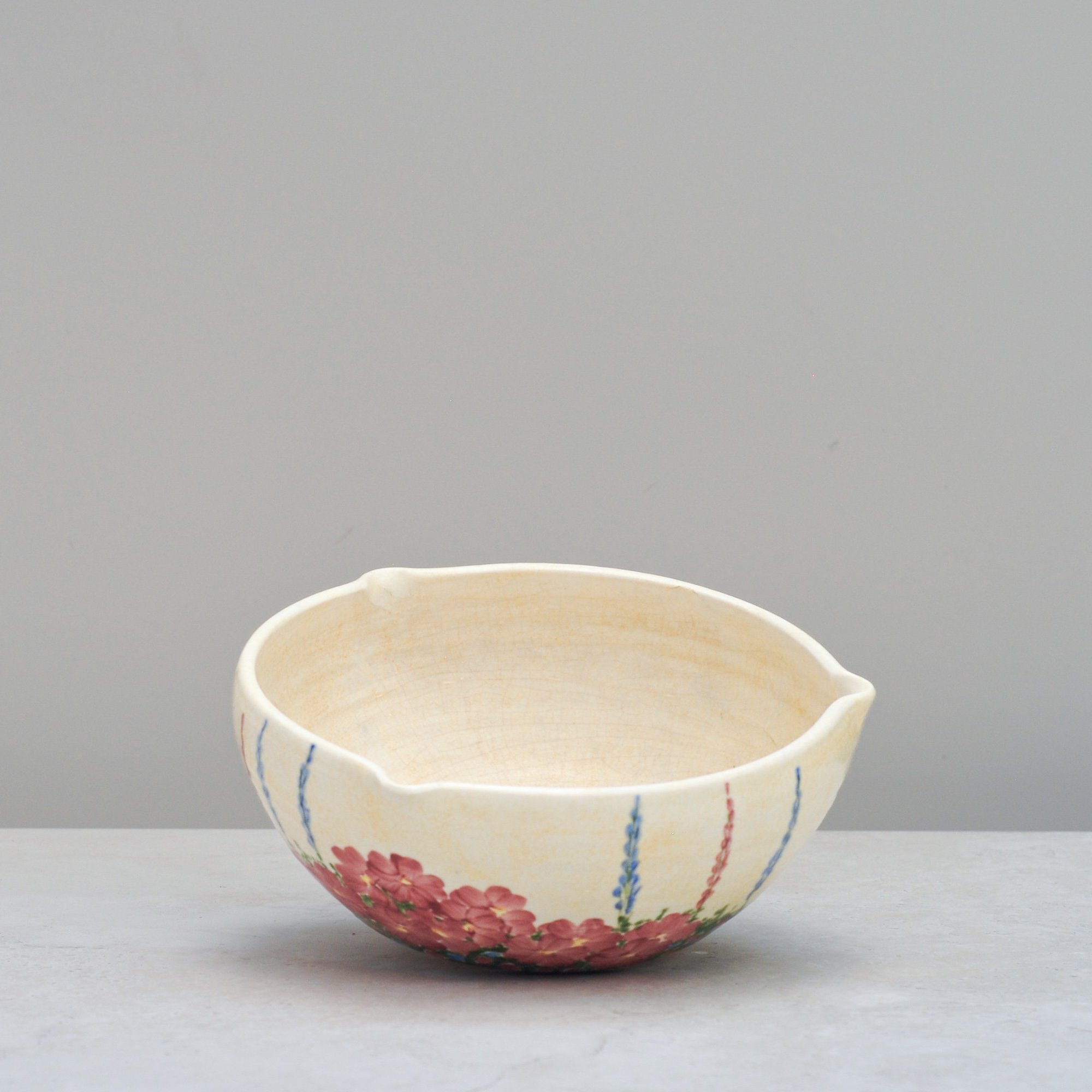
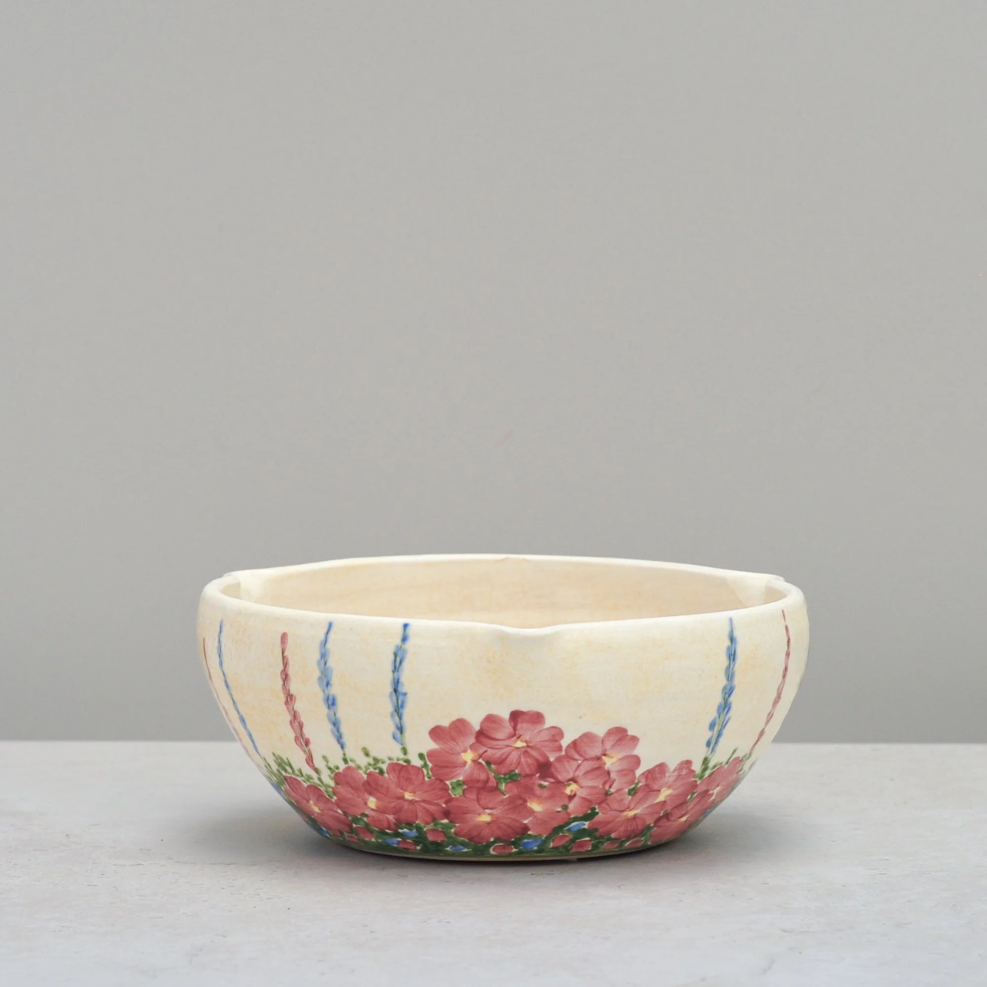
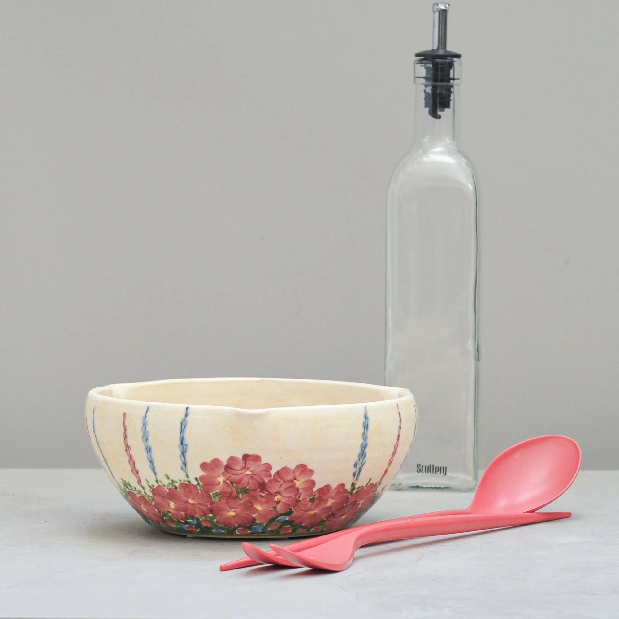
I’ll let you in on a secret - I have a real love of pottery from the Art Deco period. It all started with four little tired and chipped tea cups by Clarice Cliff that I found in a country antique store and it would explain why I was instantly drawn to this wonderful hand painted bowl signed E. Radford. It’s certainly of the same period, the colours and the pattern so typical of this era.
In researching this honest but delightful bowl, I discovered that Edward Radford established his pottery business in Burslem, England around 1930, and he’s best known for decorative hand-thrown earthenware - especially jugs, vases and bowls such as this one. This bowl is numbered 233, which tells me it is a ‘Bulb Bowl’ (what fun), but with its three spouts it seems today more akin to a mixing or serving bowl. Regardless, this piece is special. The colours, the pattern and the hand-painted uniqueness bring a certain type of respect to an art form that you can’t help but admire.
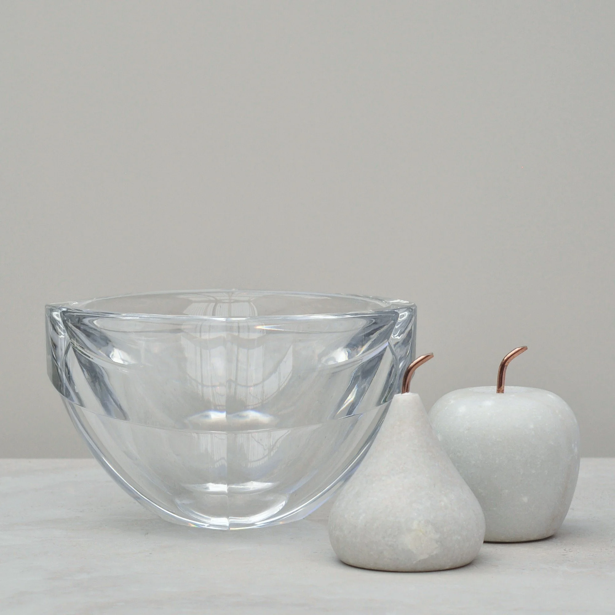
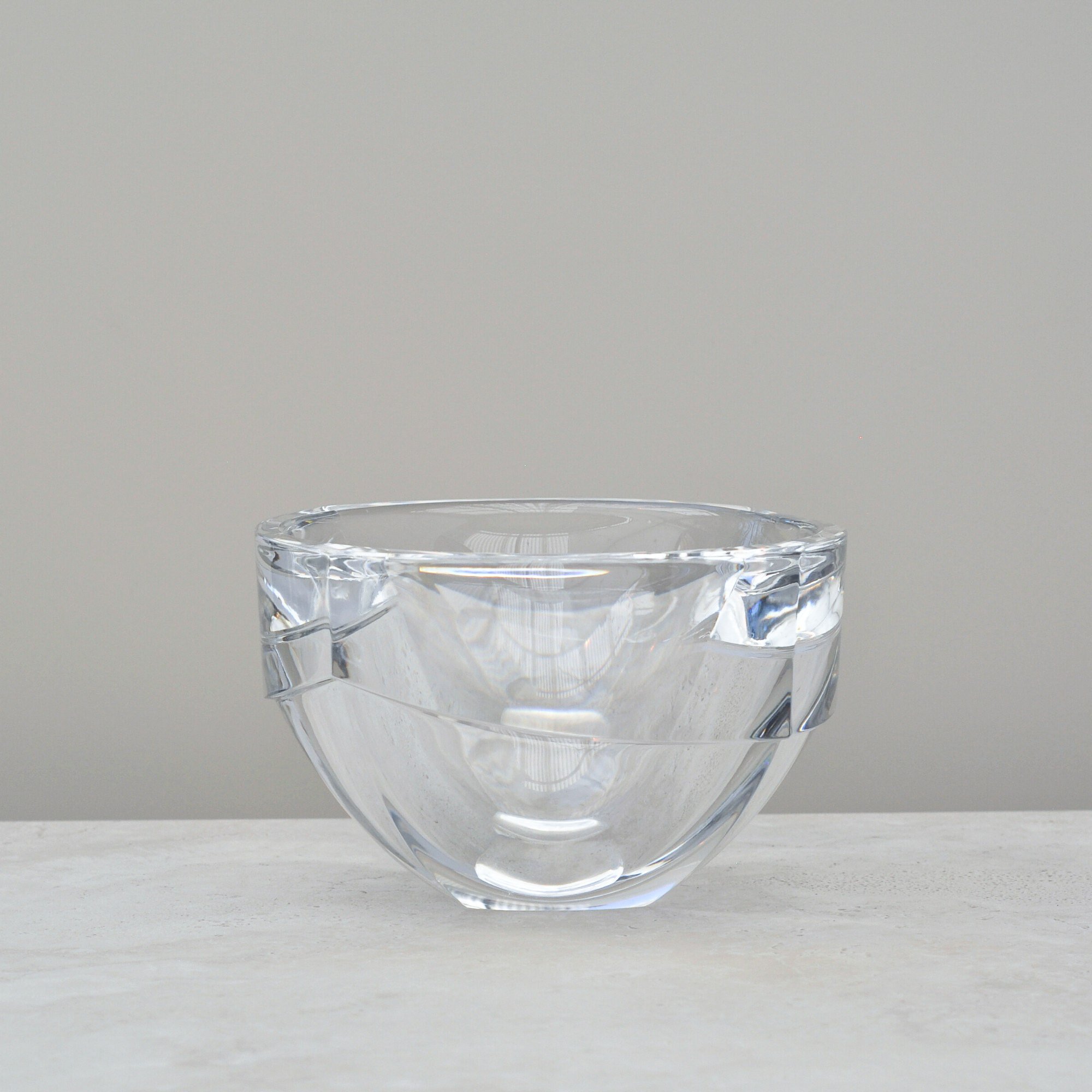
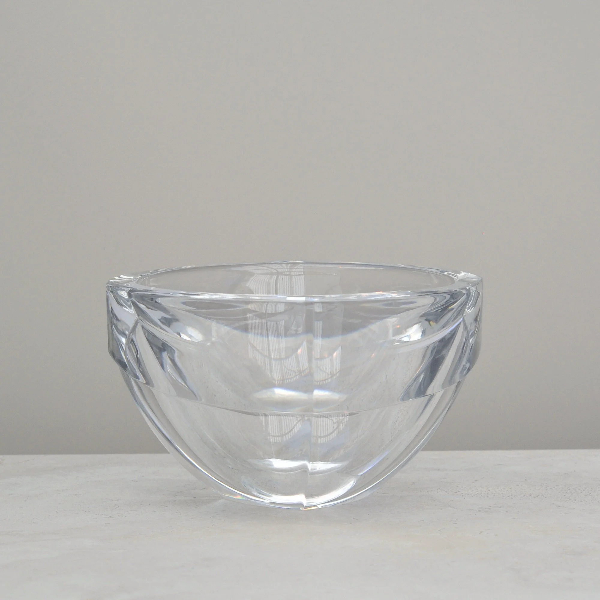
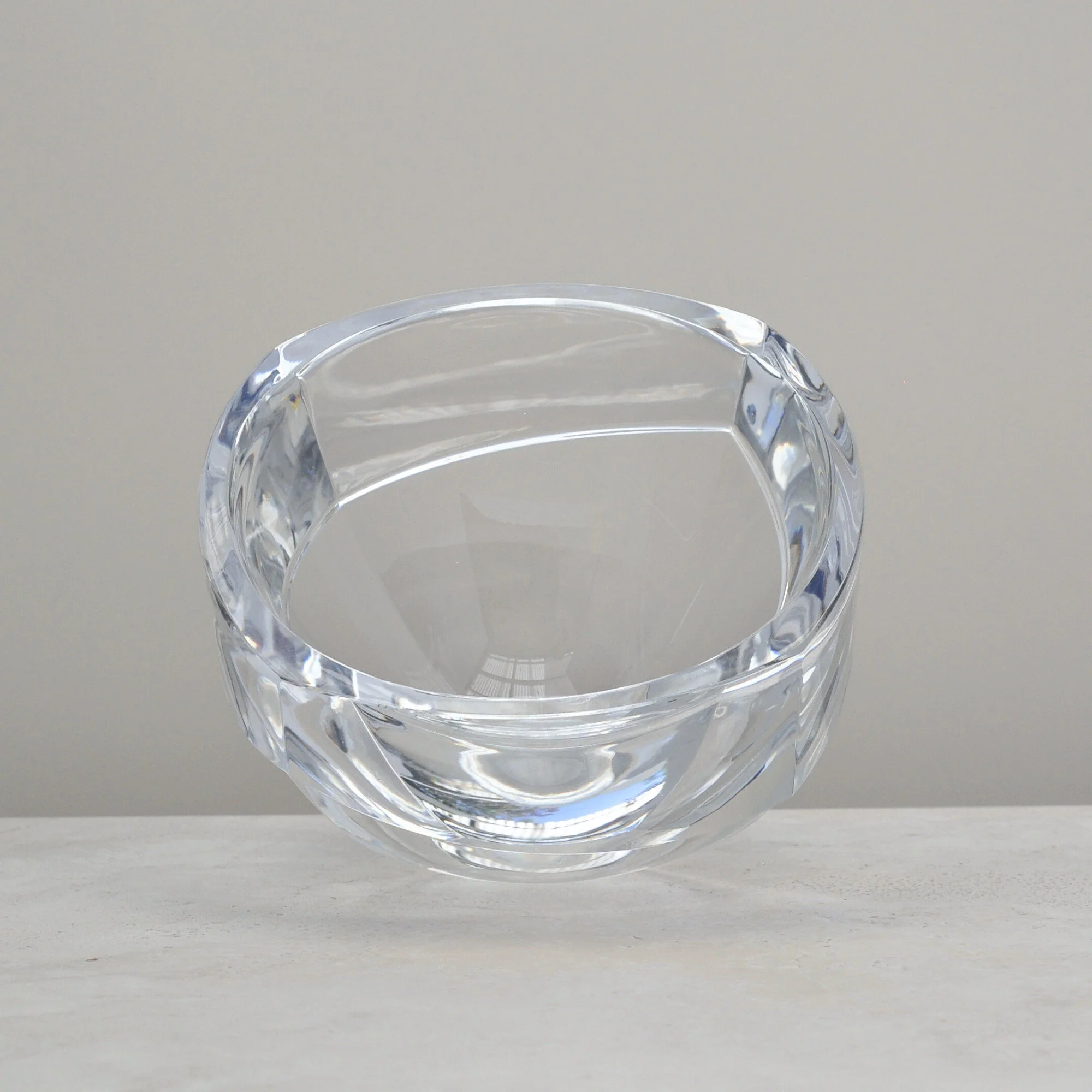
I’ll be frank, with so much glass available, a piece has to be very special to make it into Again by Clare. Lucky for you, this one ticked all the boxes. Its sculptural lines capture and reflect the light in the most delightful ways, whilst its heavy crystal composition gives it a strong, confident presence. It is good design personified.
I believe this bowl to be an Orrefors, the renowned Swedish glass manufacturer known for exceptional crystal and glassware, design as only the Swedes can do. The form relates closely to the work of designer Erika Lagerbielke, who collaborated with Orrefors between 1982–2009. While this particular piece is unsigned, its quality, style and clarity are unmistakably Orrefors. A true statement piece.
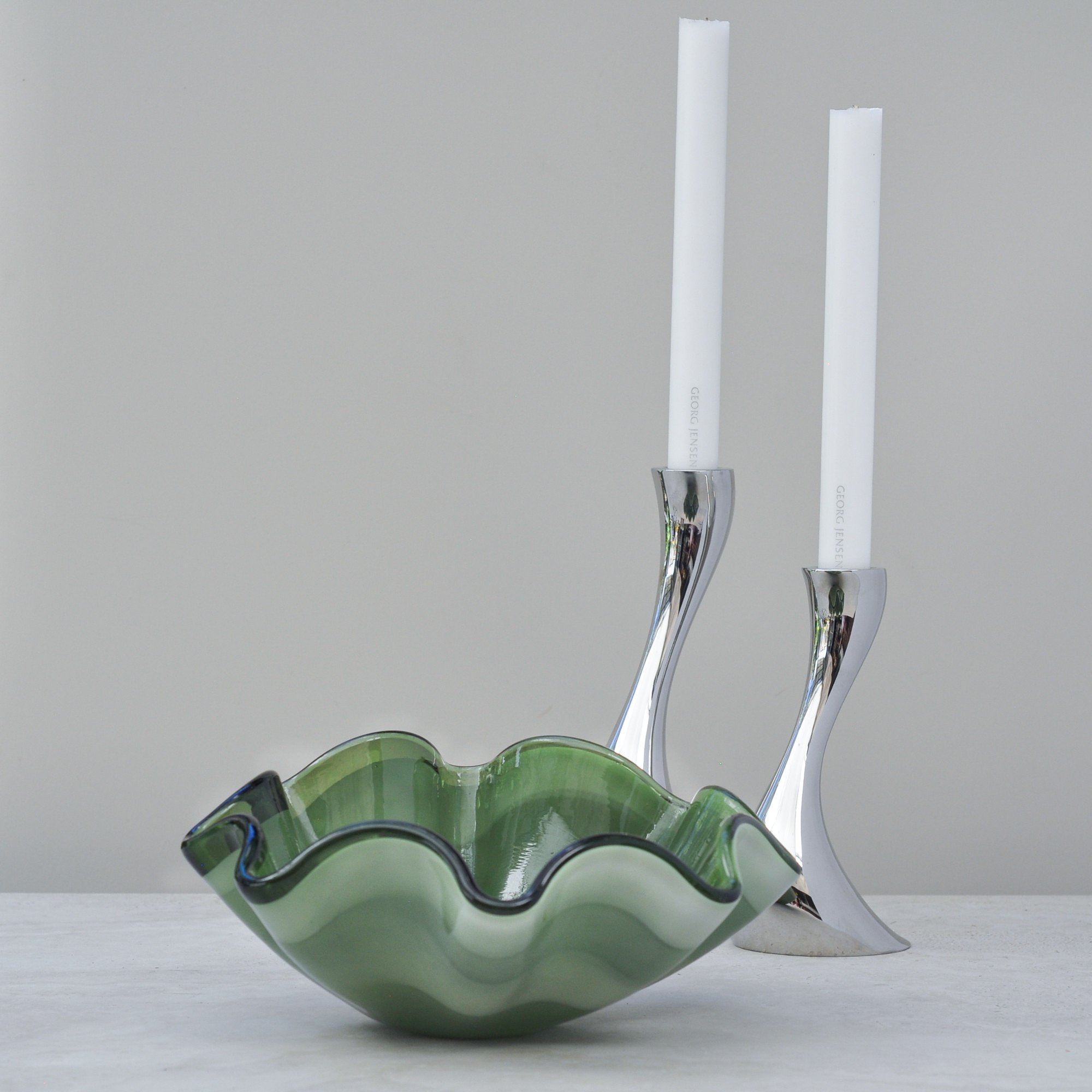
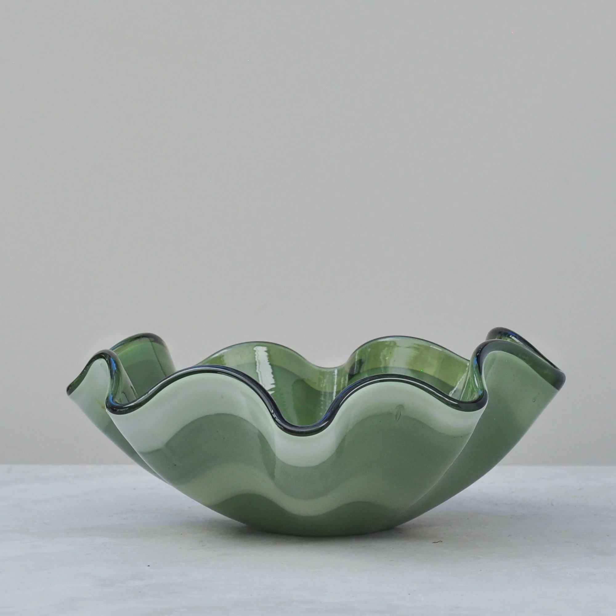
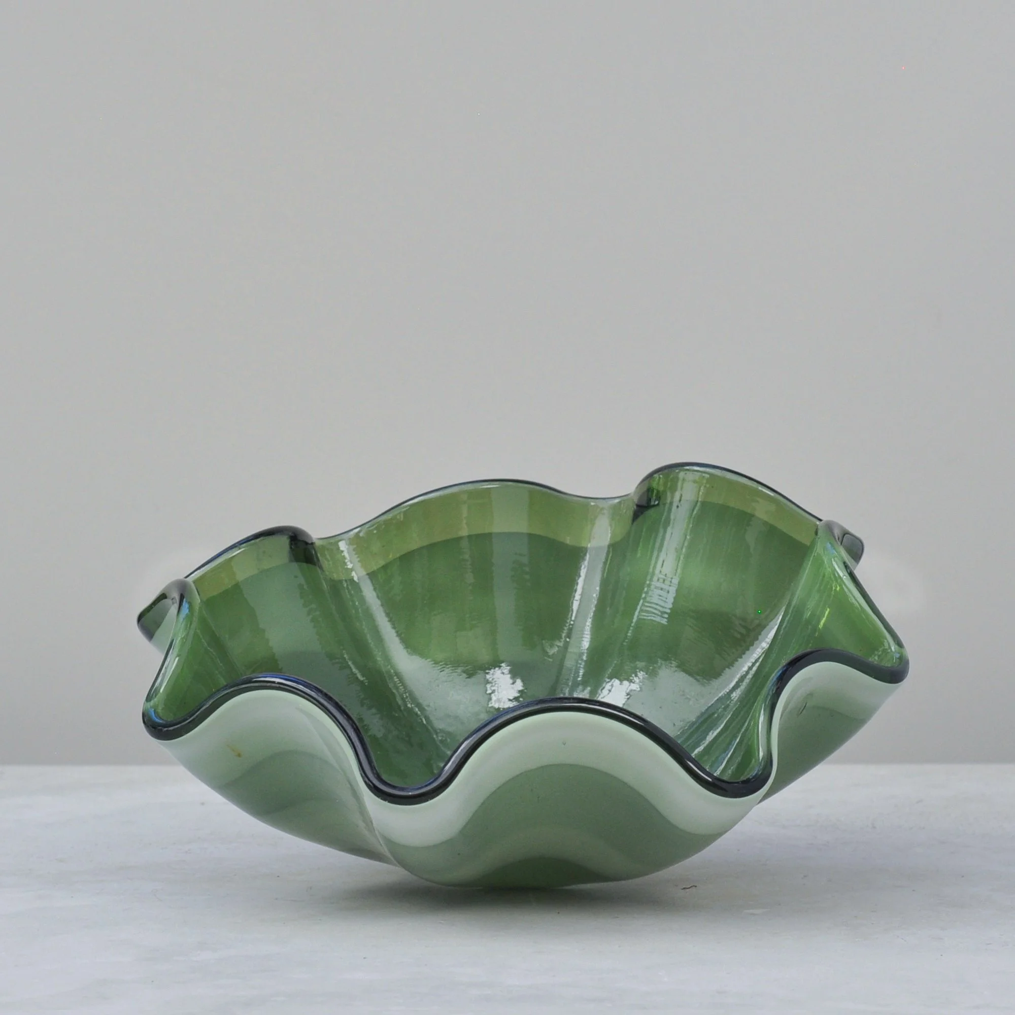
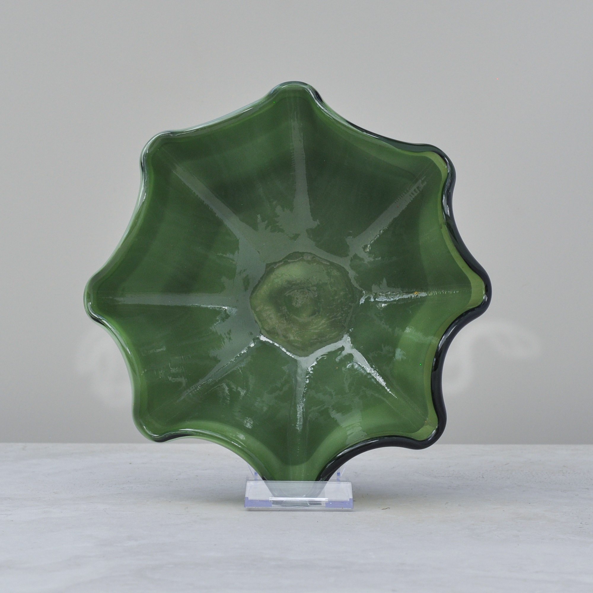
Stunning. There is no other word to describe this hand blown, olive green wave bowl. It’s curves, three fluid layers of colour - dark, light and clear olive green, and seemingly moving edge makes it magic. Wherever you look you see something different, a change in depth, a different shade of olive green. There is nothing straight about this wonderful bowl.
Another beautiful detail is the light lines you can see and feel inside the bowl - almost as if you can imagine the glass blower expanding the molten glass to create it. There’s something wonderfully honest about pieces that don’t shy away from the marks of their making. This bowl feels like a quiet, respectful nod to the talented person who created it.
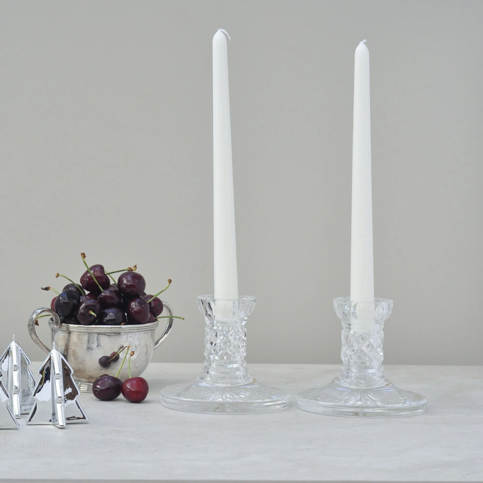
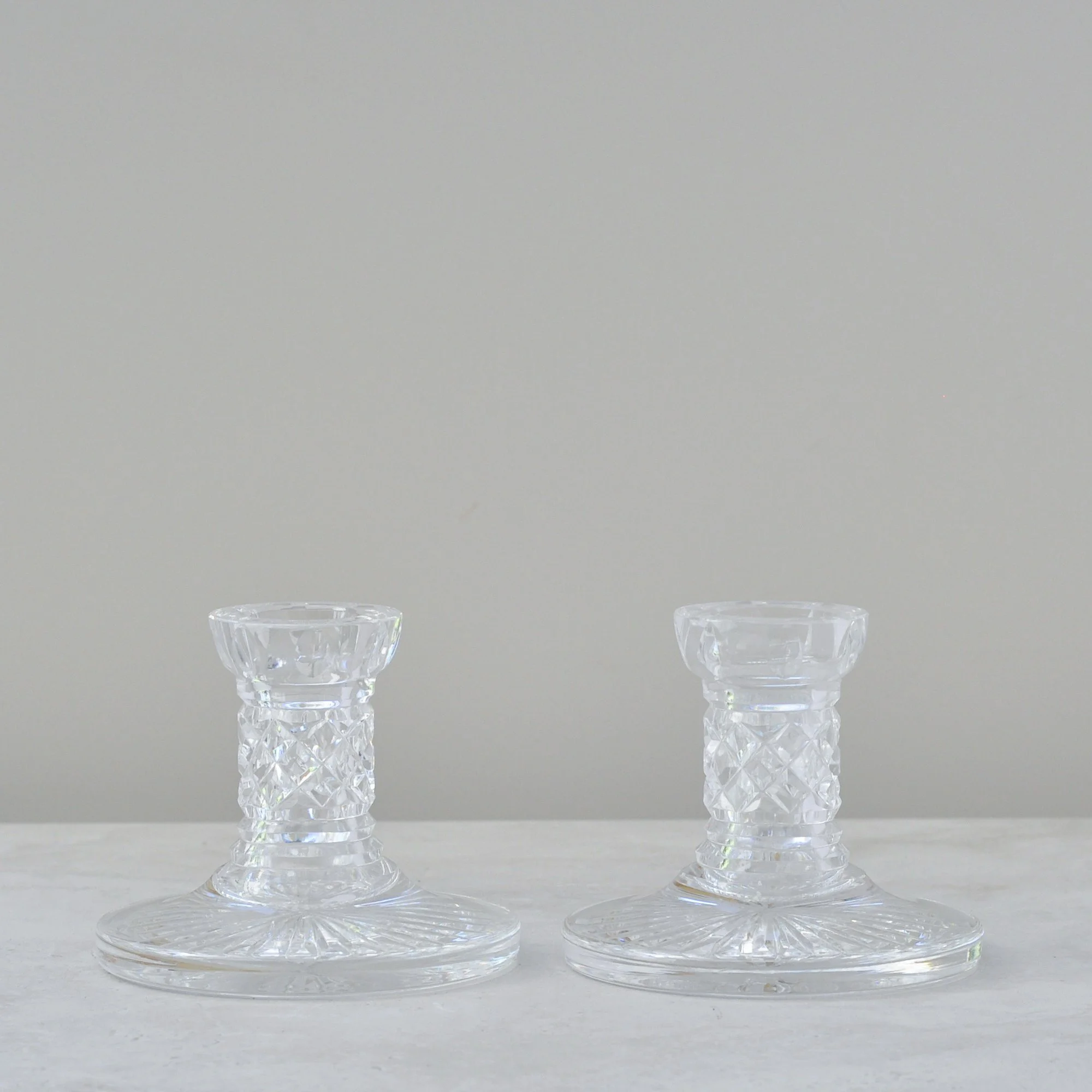
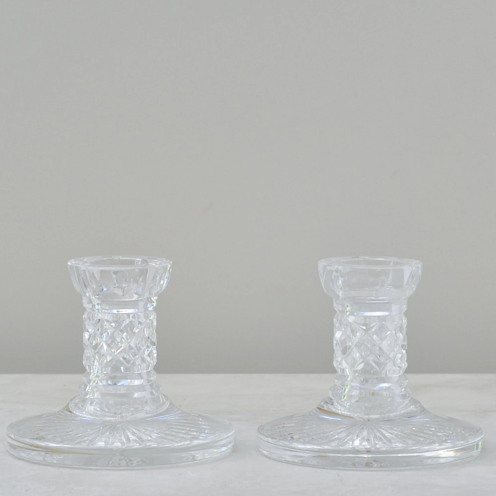
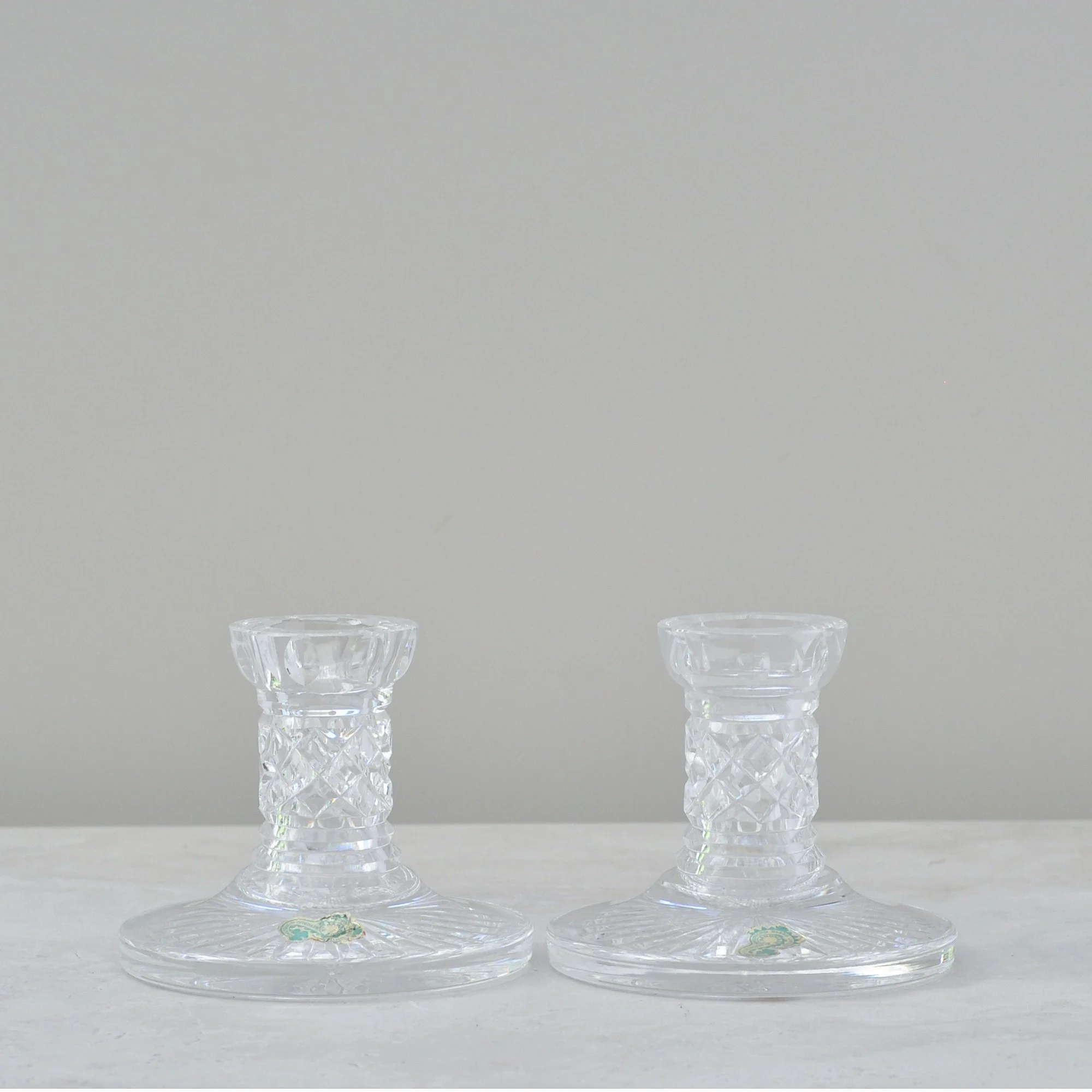
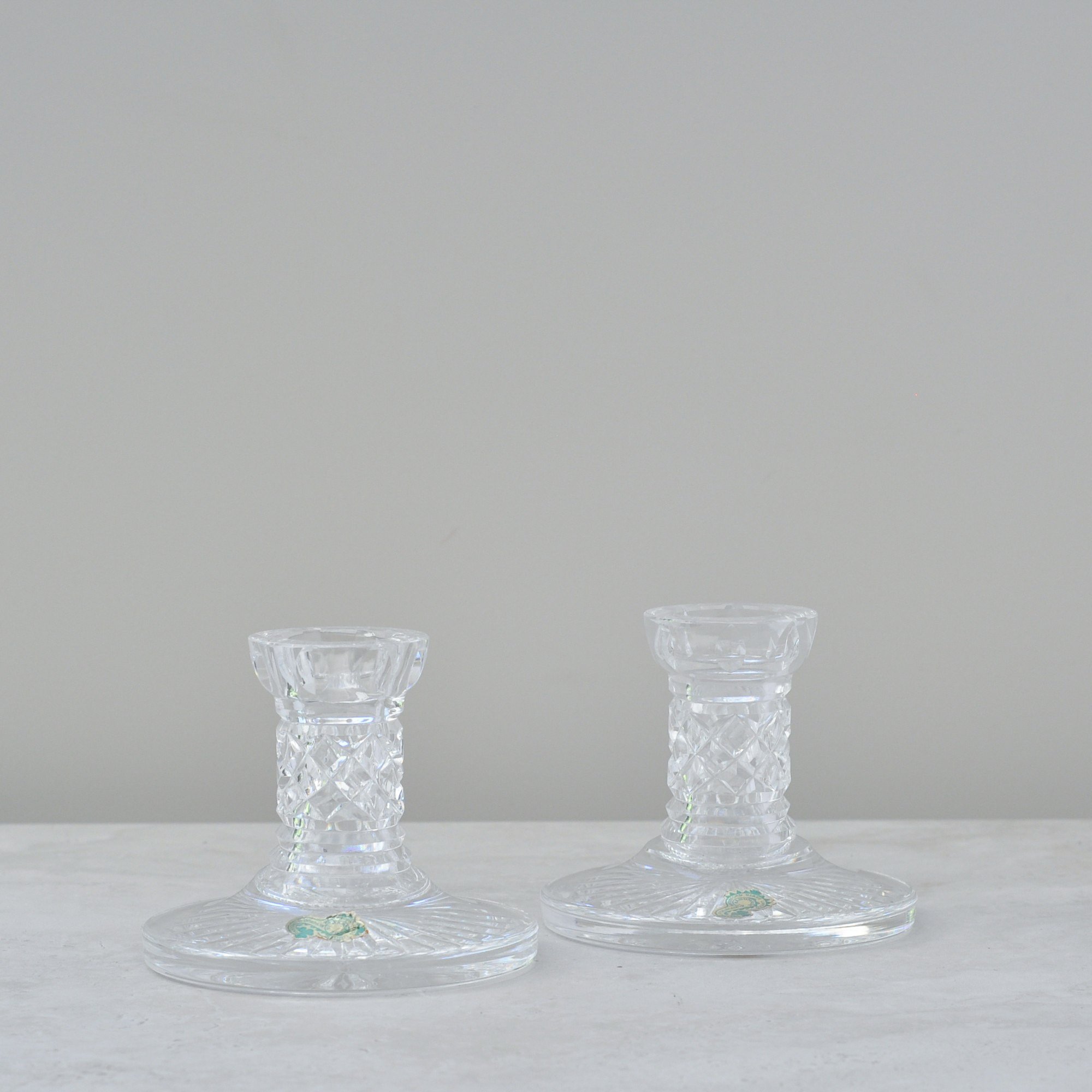
I really do try to stay away from pieces that you think you see everyday but these ones are classically timeless, full of weight and the epitome of style. They are a pair of Waterford crystal candle holders which would have been hand-cut in Ireland, designed solely to bring pure elegance to any table.
They feature Waterford’s signature cross-cut pattern that catches the light beautifully, giving that unmistakable, high-clarity glow excellent quality crystal is famous for.
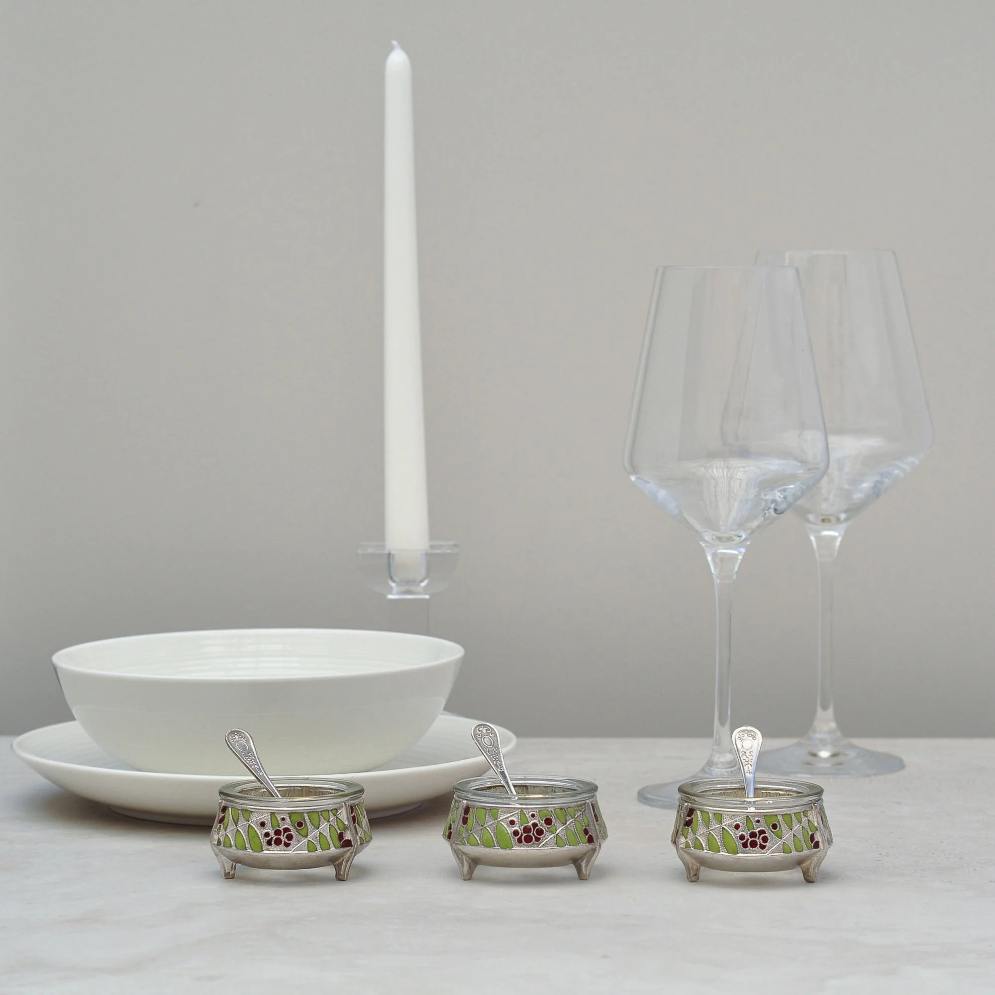
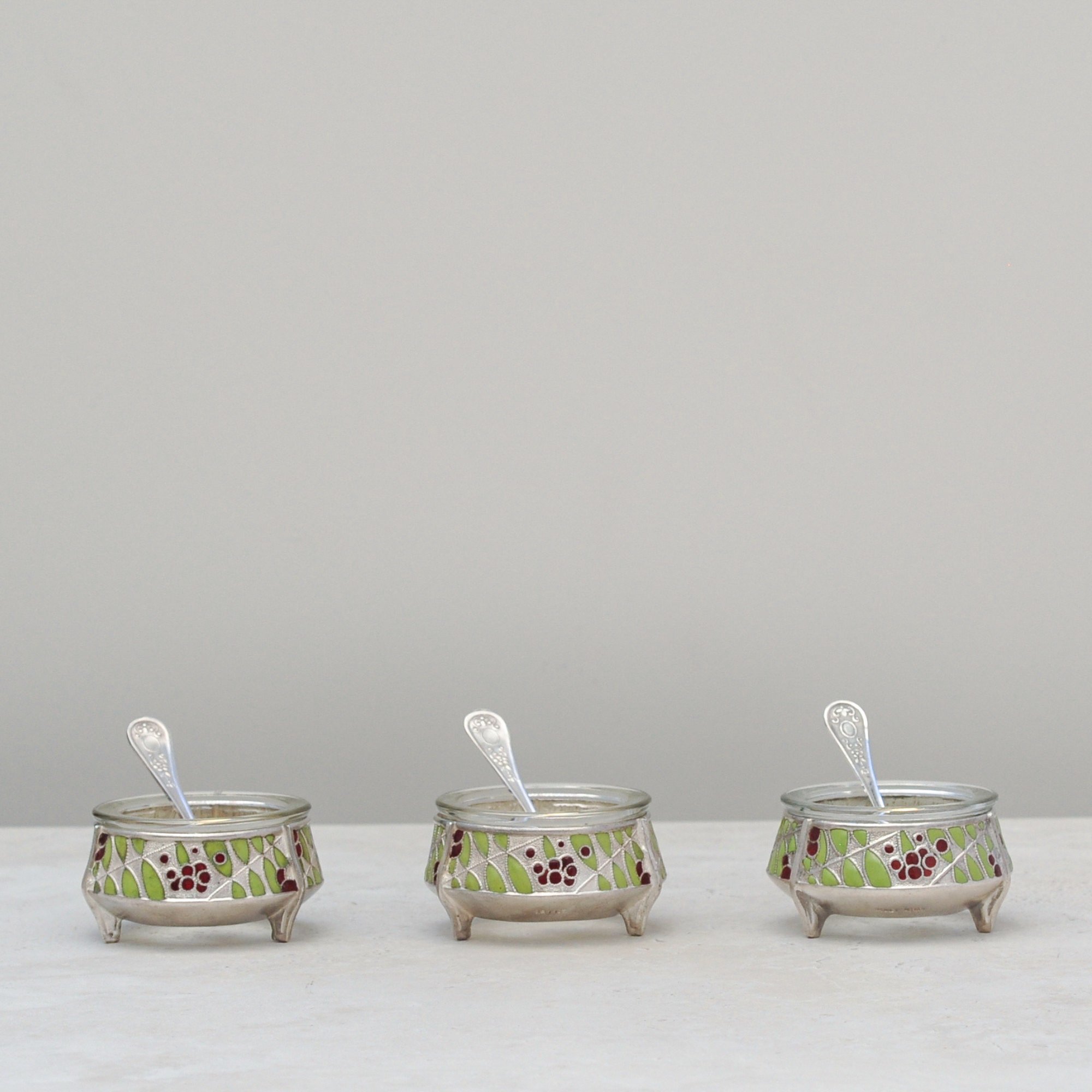
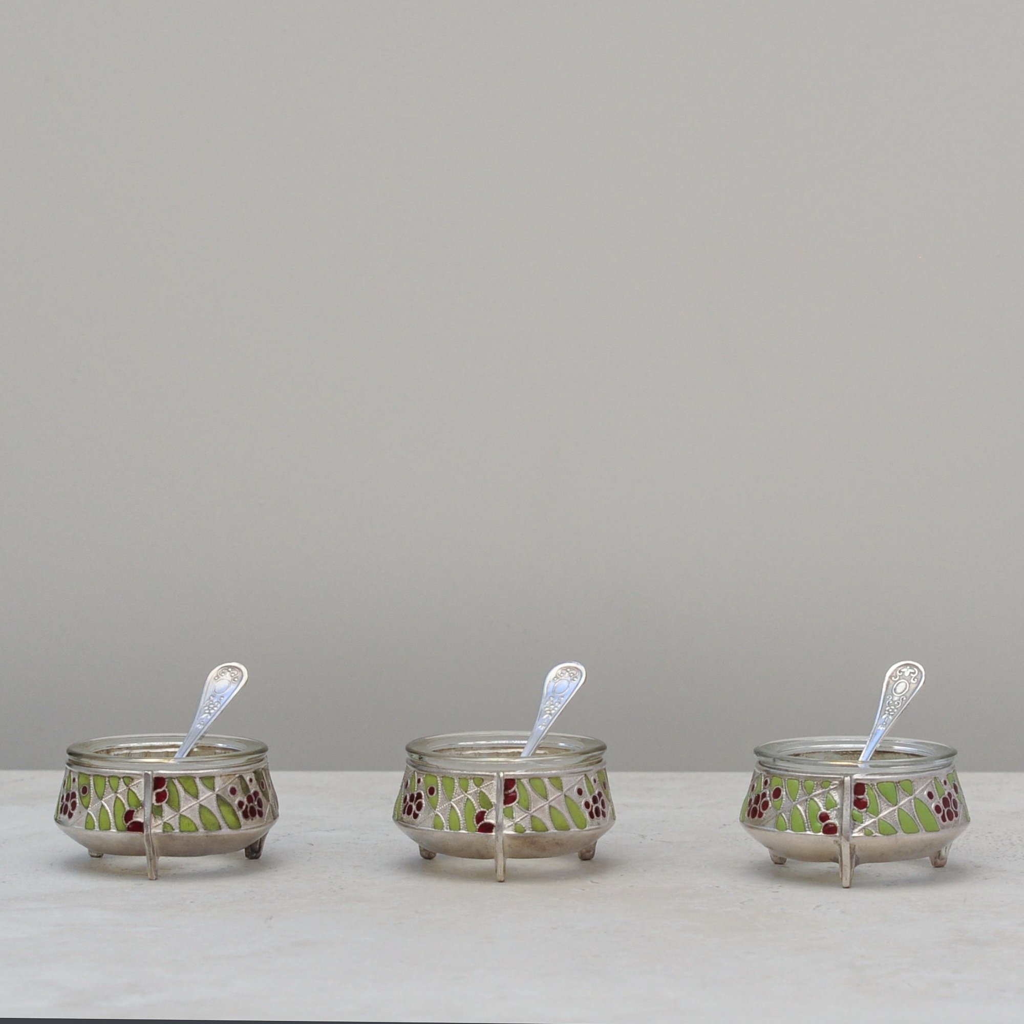
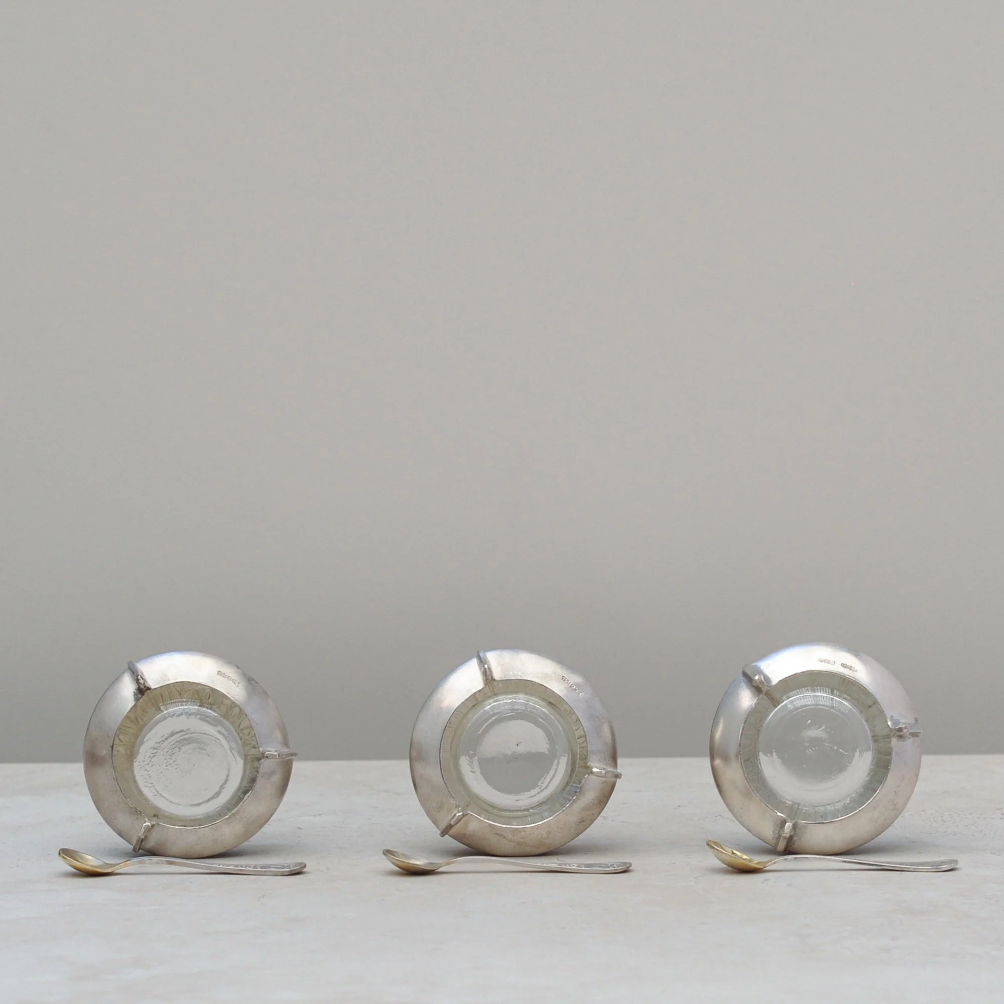
One of the joys of discovering pieces from the past is imagining how special a table once looked when set with little bowls as dainty and beautiful as these, simply to hold something we now think of as ordinary salt. It sings of a time when salt was precious, and the closer you were seated to the salt cellars (as they were then known), the more important you were seen to be.
You can now be your own royalty with these three absolutely delightful green and deep red cloisonné enamel salt bowls, made most likely in the 1970s by Russian maker IOMMET. Each comes with its original glass liner and matching spoon (as fingers are certainly not to be used), and despite their age would not look out of place on the tables of today.
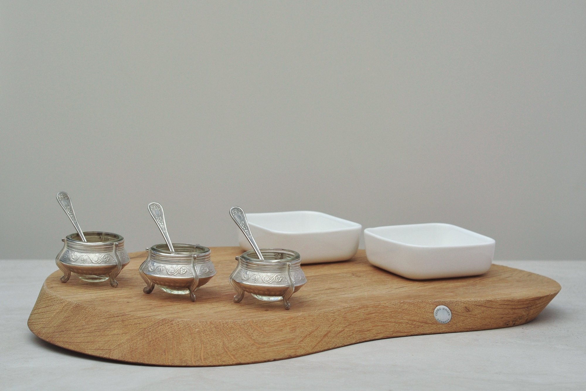
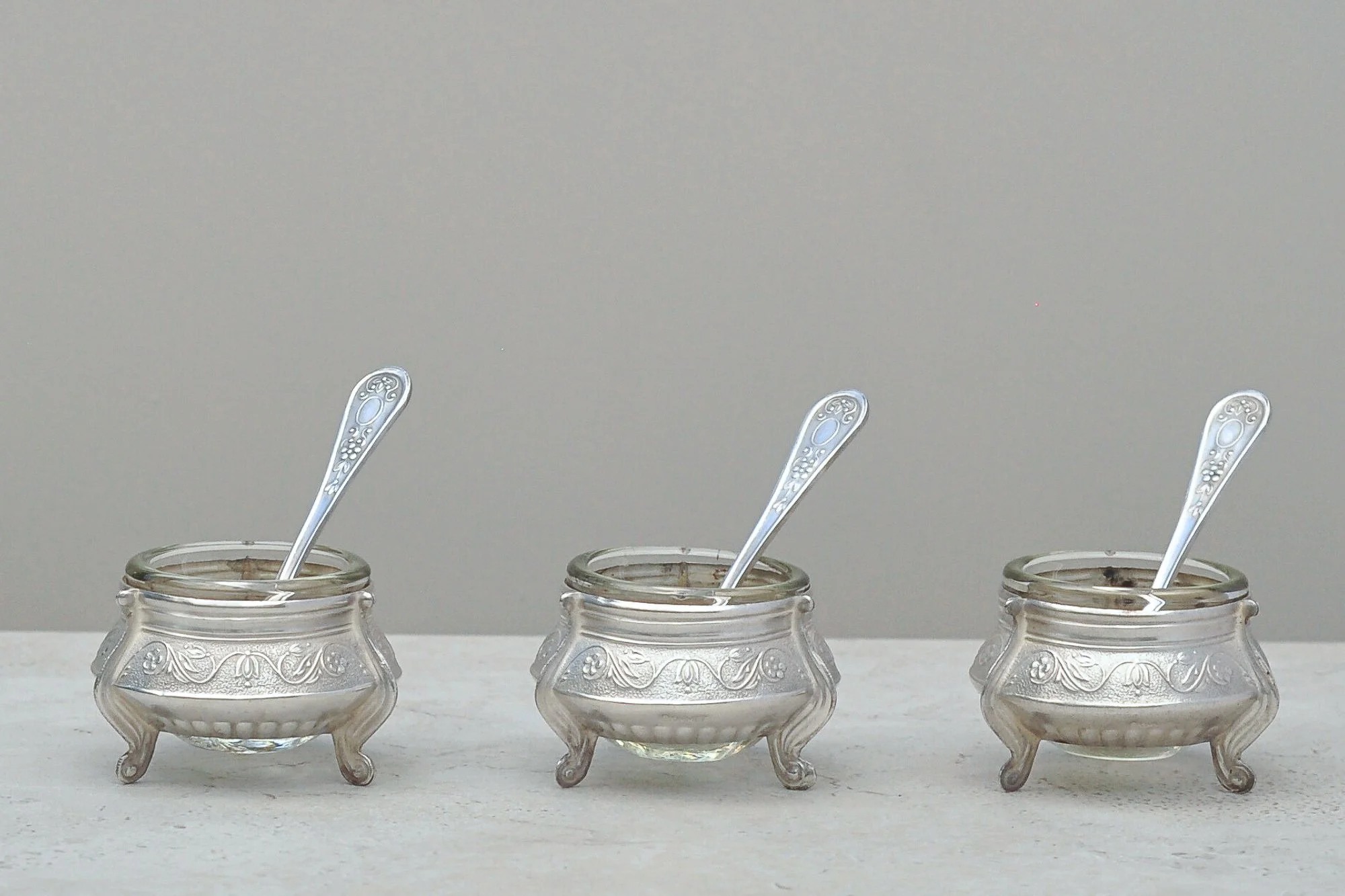
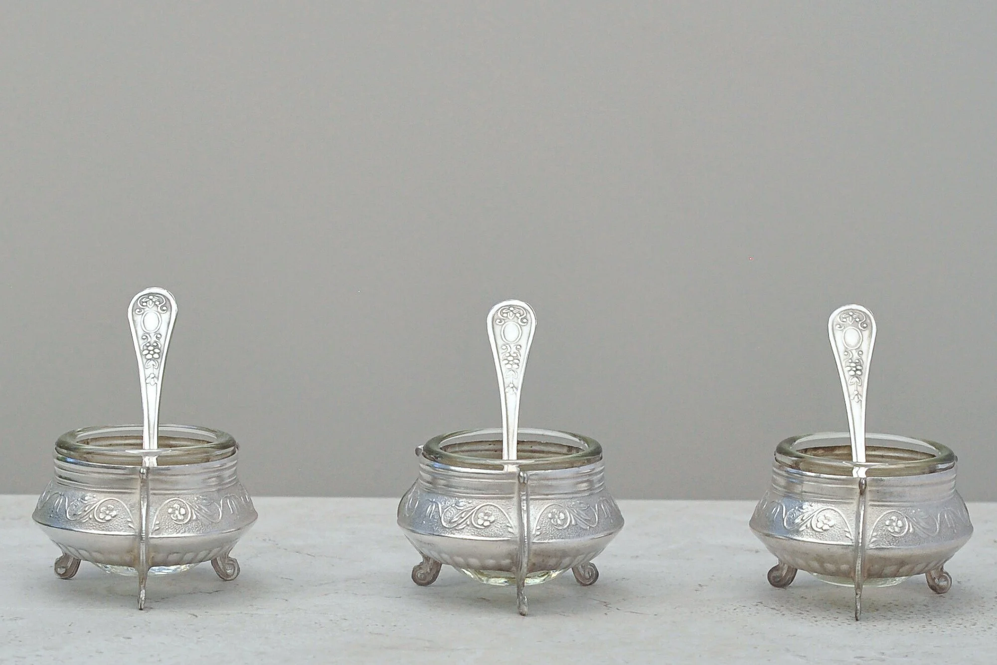
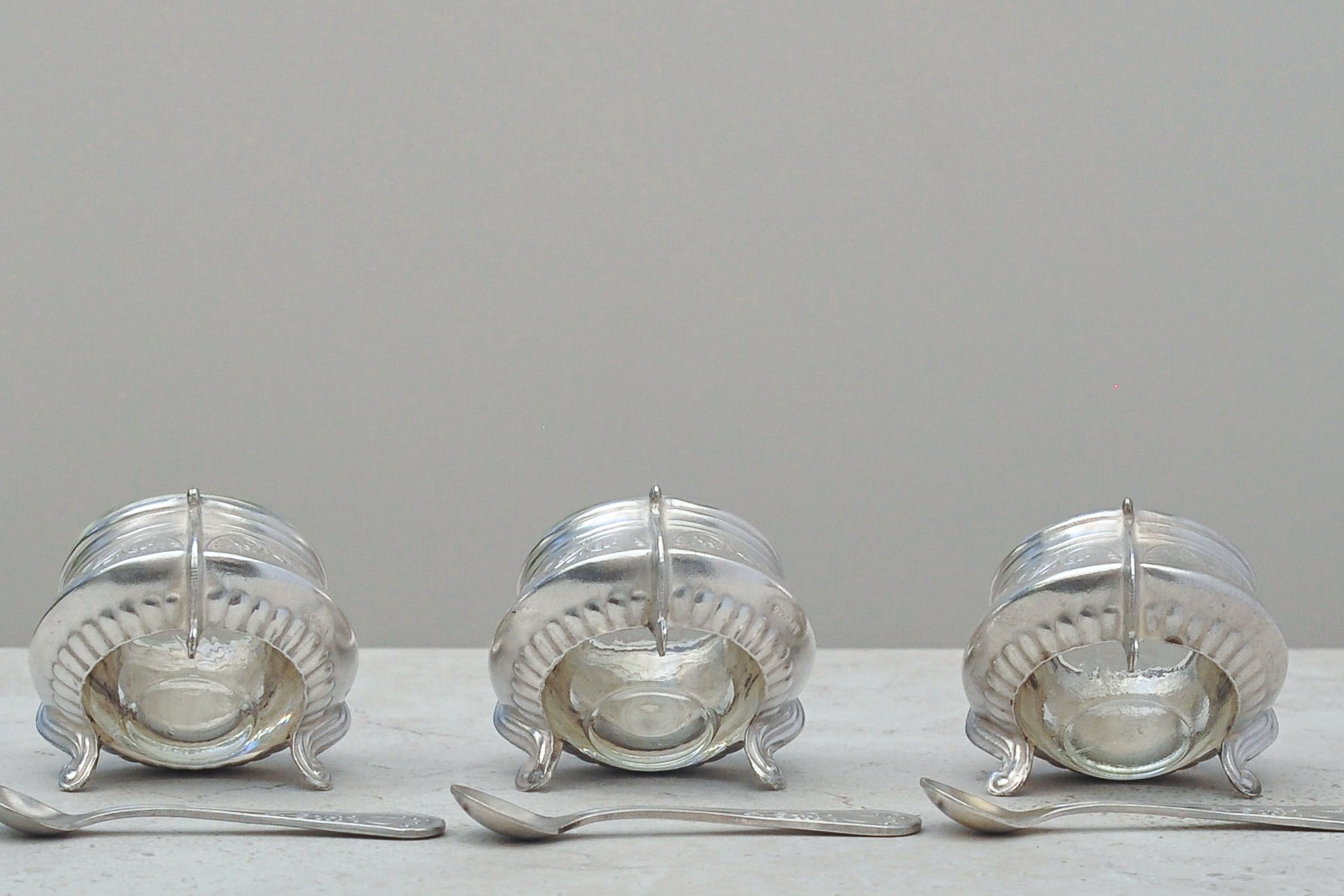
Salt cellars were once a small symbol of considered hosting (just a wee bit posh), and this mid-century silver-plated trio brings that tradition forward with quiet elegance. Understated, refined and wonderfully tactile, they feature delicate pierced metalwork, original glass liners and petite matching spoons - a whisper of a time when hosts thoughtfully placed one at each setting so no guest ever had to reach across the table.
What I love most about this set is its versatility. The clean, classic styling suits contemporary homes beautifully - on a dining table for seasoning, beside a charcuterie board for flakes of sea salt, or repurposed for spices, mustards or small condiments. Despite their age, they sit effortlessly in modern spaces. Truly timeless.
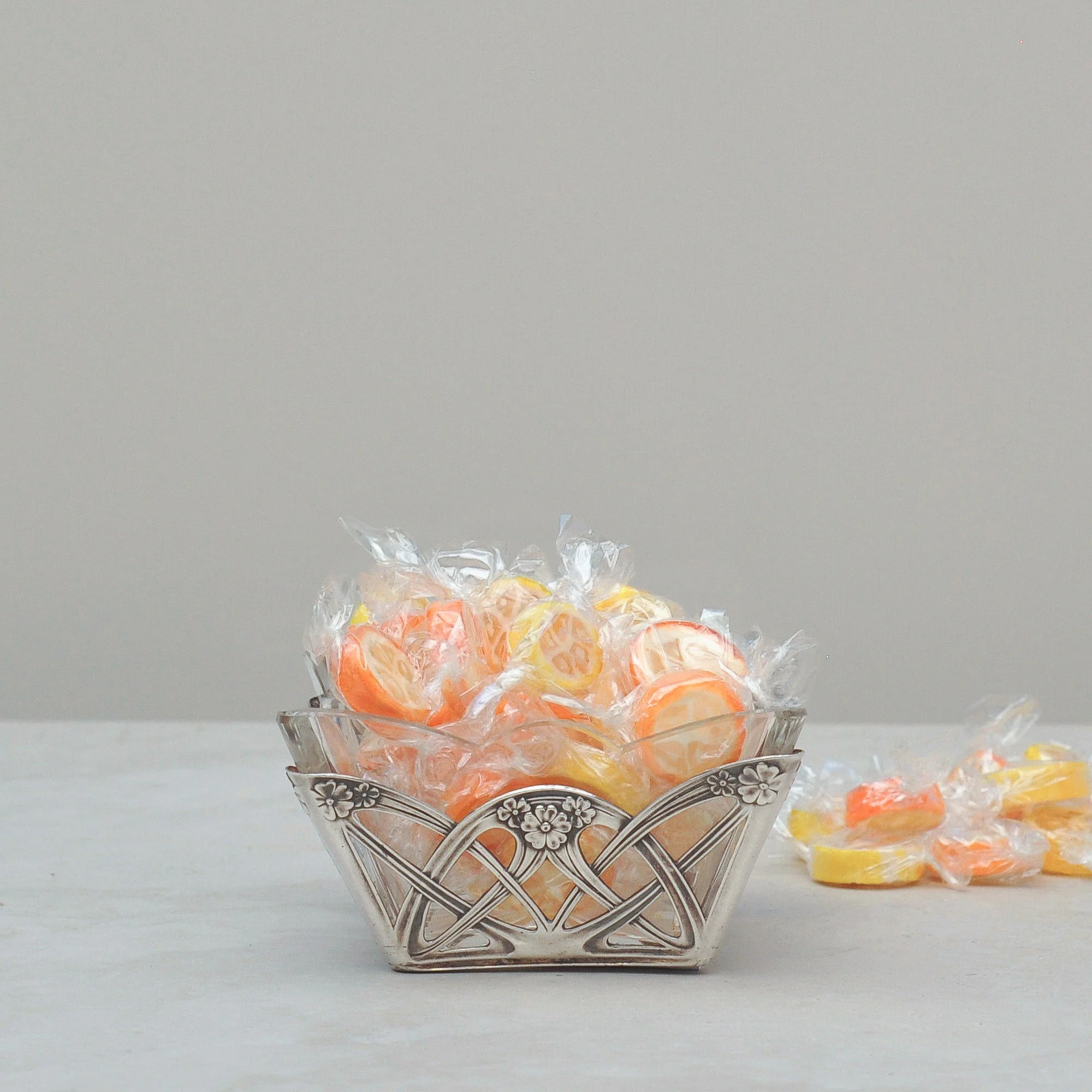
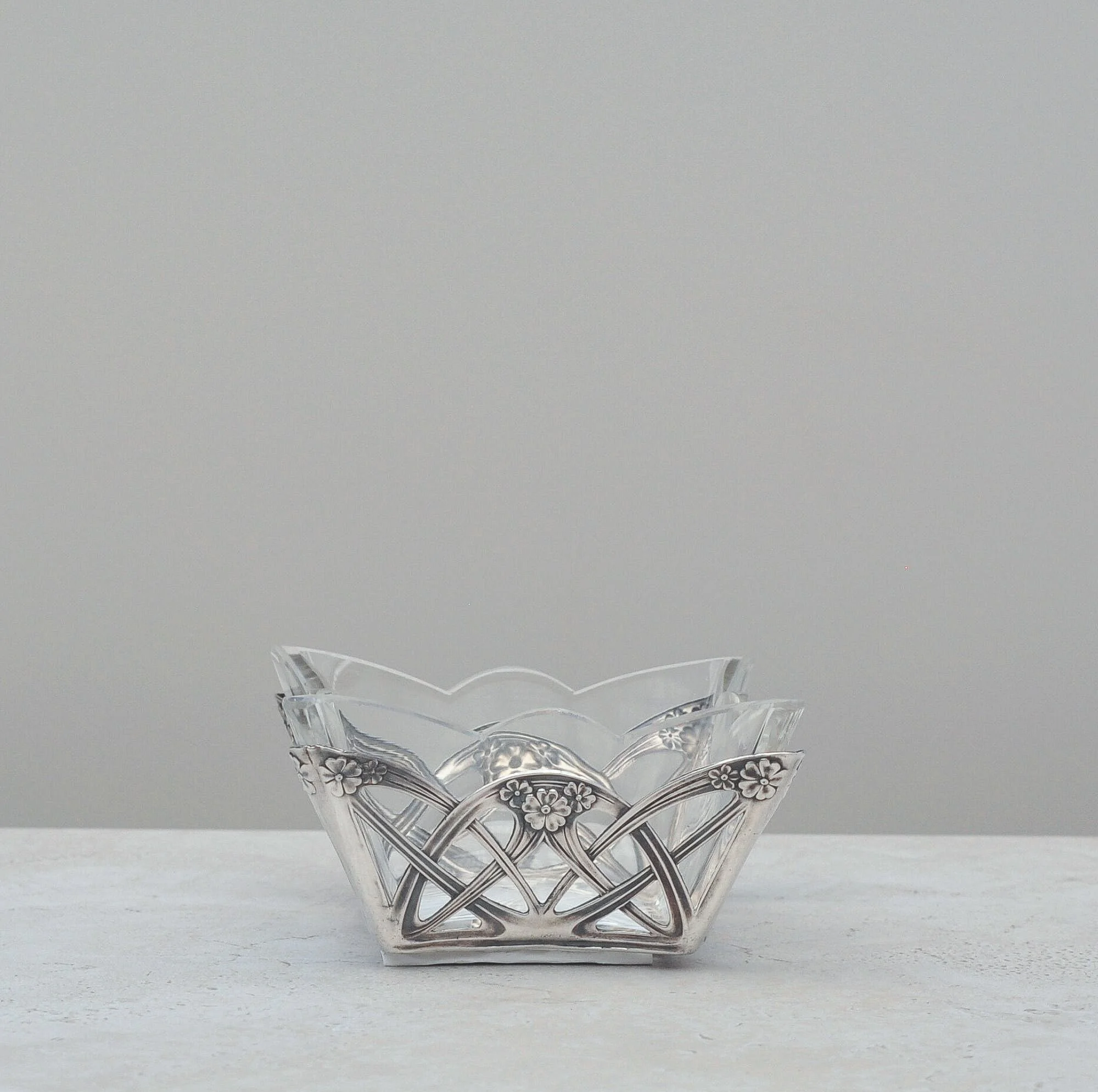
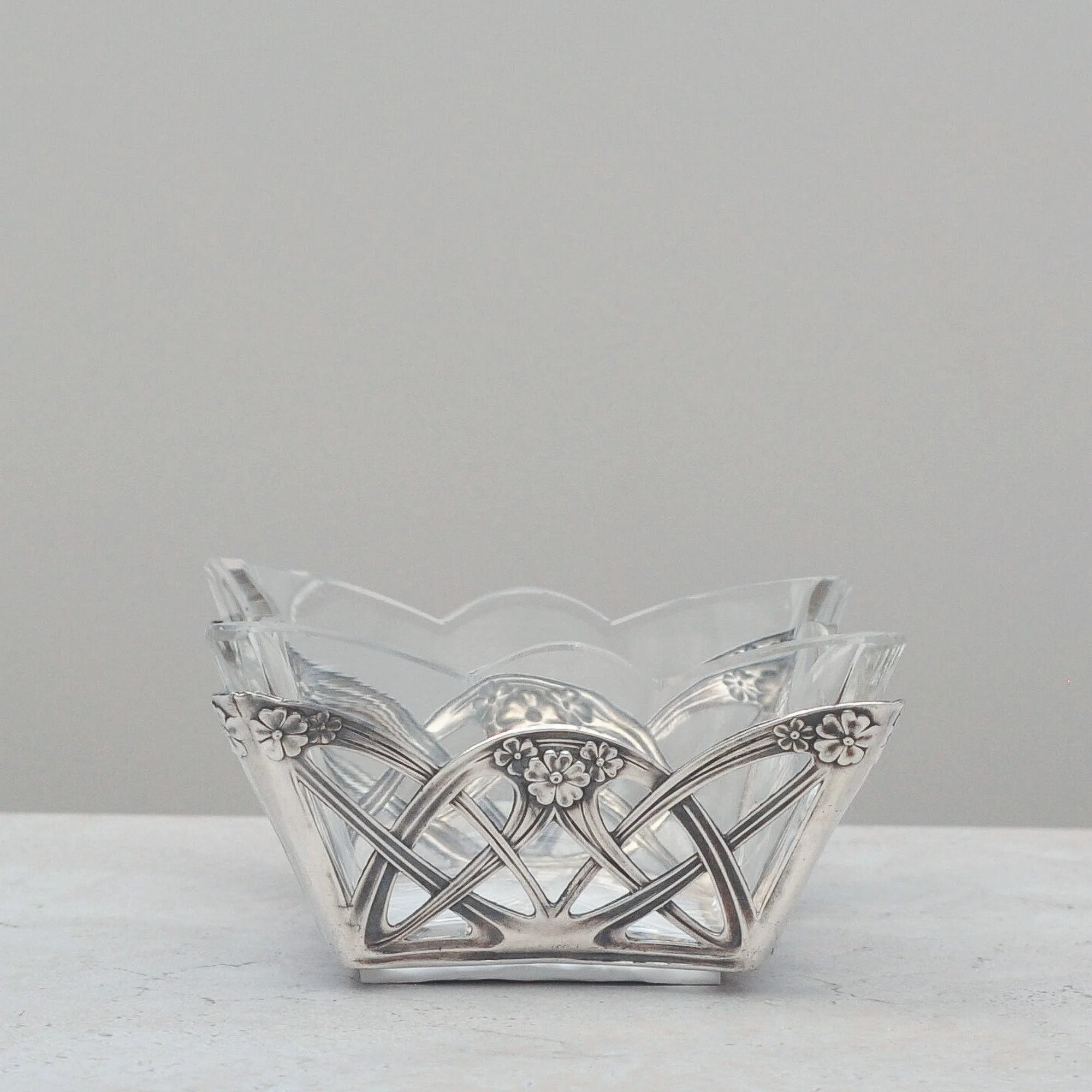
I have always loved the designs associated with the Art Nouveau period, and this sweet little sweet (or nut) dish is no exception. Its silver pattern has all the hallmarks of being from this period with the organic, flowing and intricate lace work, highlighted by delightful floral motifs. It must have been the most glamourous of periods, such style with so much innovation, almost futuristic in its look. Creativity at its best.
This little bowl is silver has its original glass insert and I’m led to believe it was designed this way as it made it easier to clean. Bless. It goes without saying of course, this bowl may be over 120 years old but sweets are timeless. Can’t you just wait to fill it with the little sweet things you love?


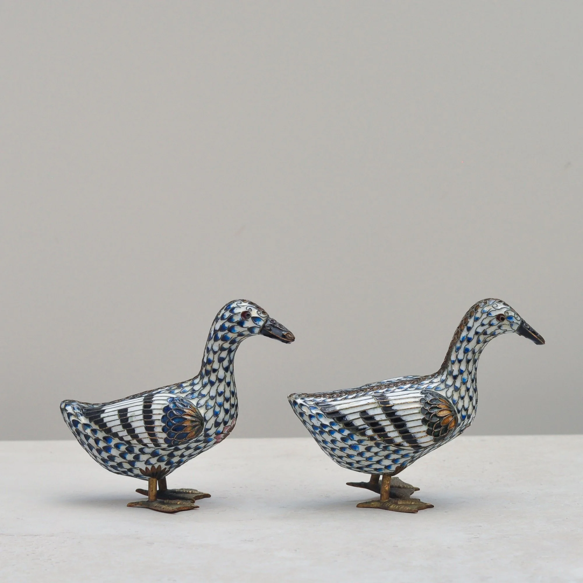
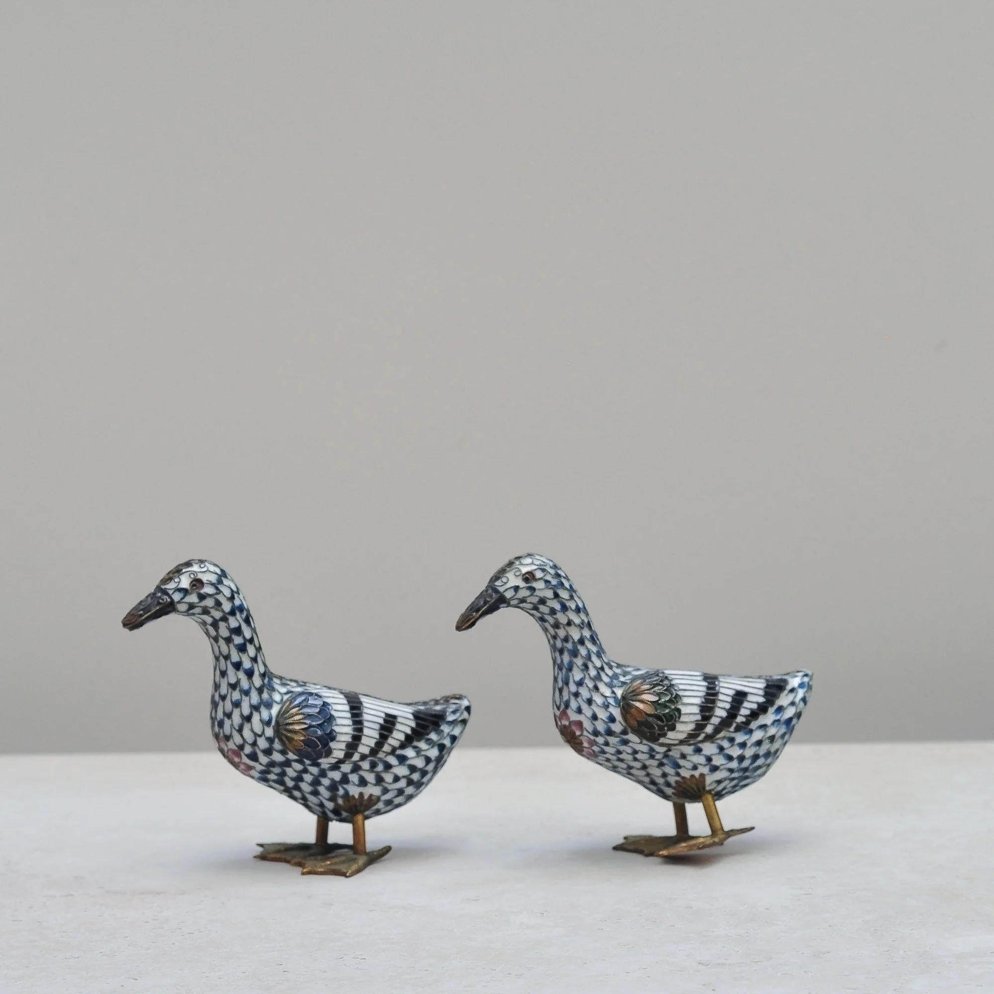
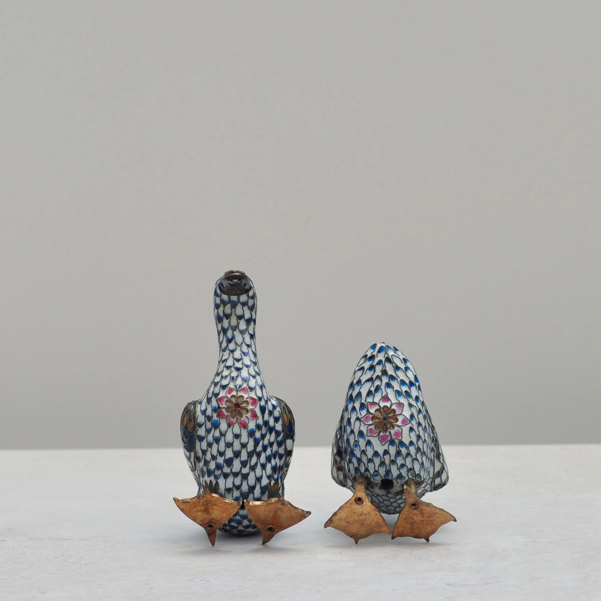
When I first saw this gorgeous pair of ducks it was instant love. Their colours, pattern, beauty and fragility really caught my eye. I am loathed to let them go.
Cloisonné is an ancient metalworking and enamelling technique which originated in the Middle East and but was perfected in China during the Ming dynasty. Thin metal wires are soldered onto a metal body to form raised cells called cloisons that are then filled with coloured enamel paste before being fired in a kiln. They’re jewel like without being a jewel.
This adorable pair is likely mid-century Chinese so deserve to be on display somewhere extra fabulous. Don’t be afraid to pair them with other, more modern decorative items as their charm will see them mix beautifully.


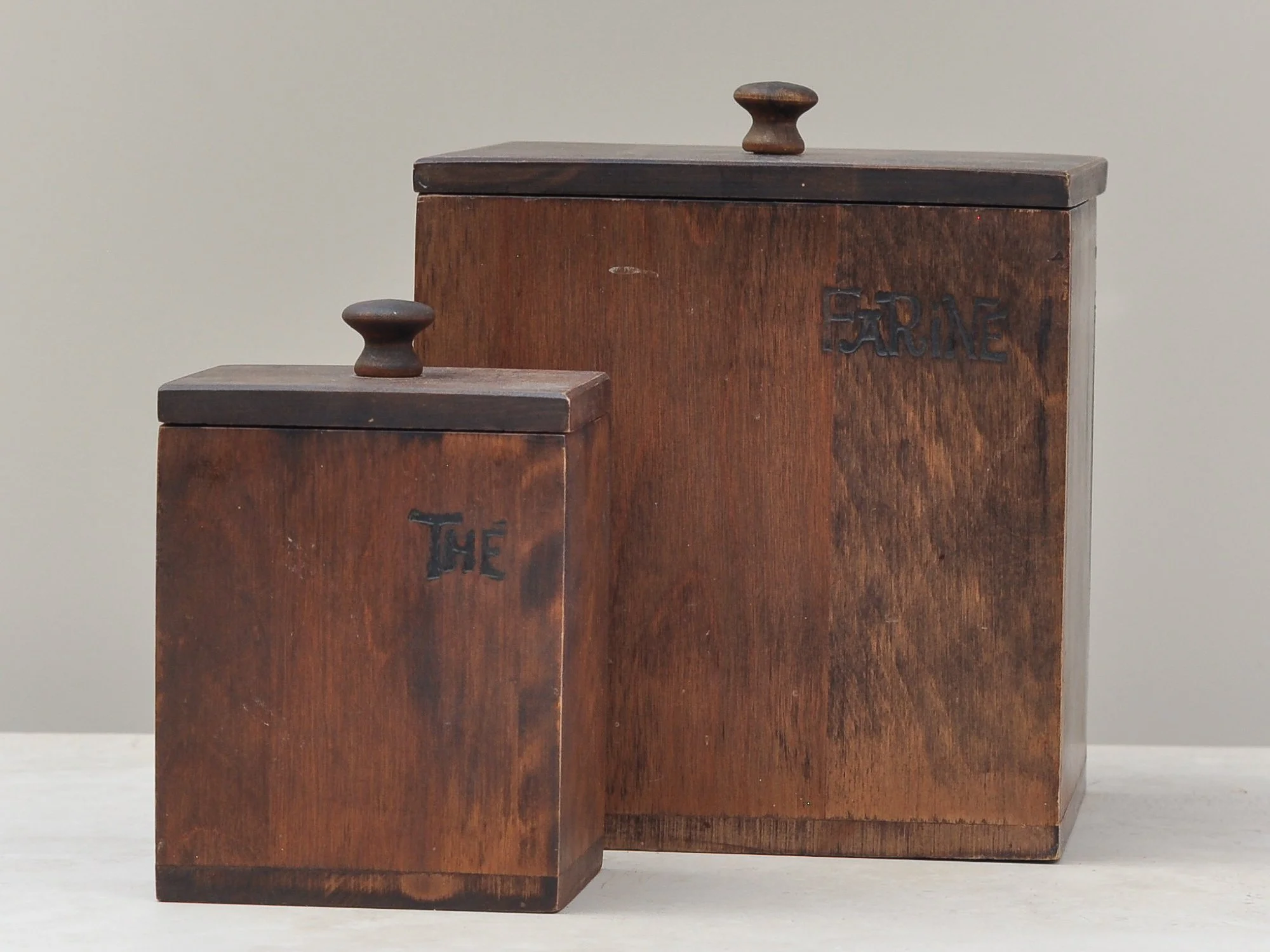
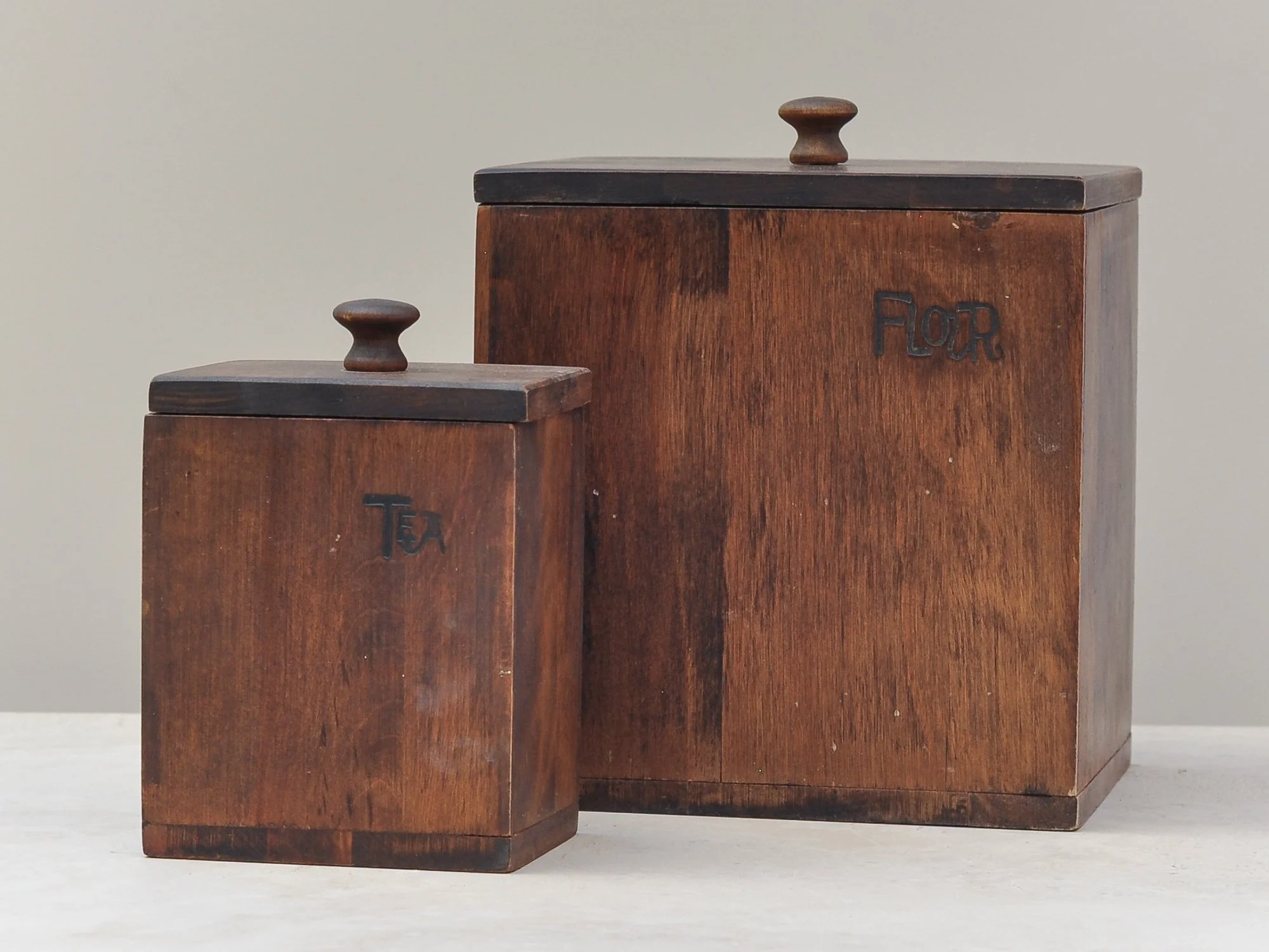
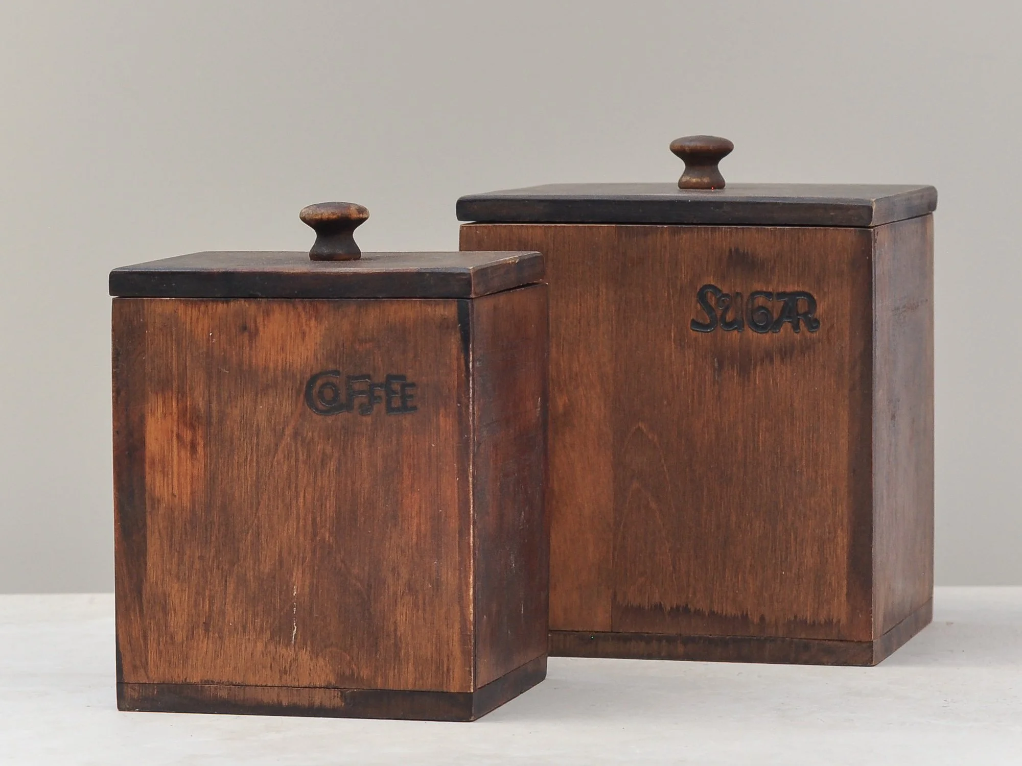
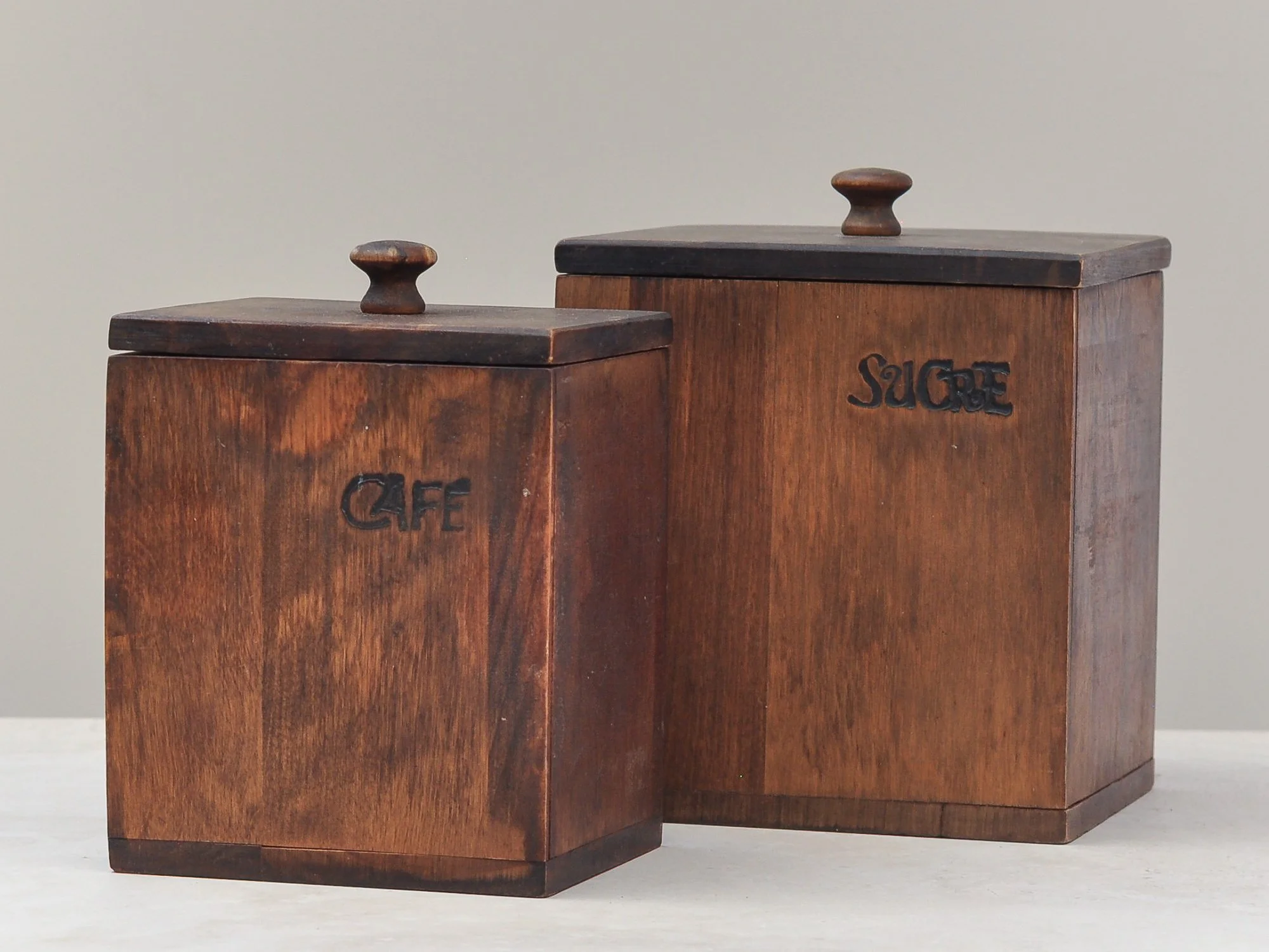
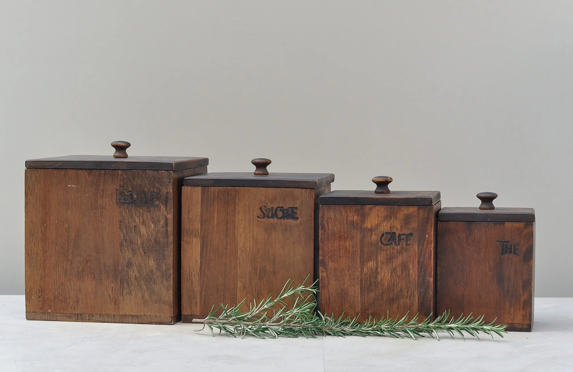
Where do you begin when describing these four incredible cannisters - you start by wishing today’s internet had the ability to share smells. Sounds crazy, I know, but with these cannisters you can still smell the tea, coffee and sugar they once held. It is amazing and I wish you could experience it - it is one my favourite things about these four wooden gems.
Baribocroft, the company that made these cannisters, was based in Quebec, Canada so you have another magical element. On one side stamped into the beautiful maple wood are the French labels - Farine, Sucre, Café and Thé; the other side, the English labels - Flour, Sugar, Coffee and Tea.
For a set of four cannisters, most likely from the 50s, they are they simply heart warming, igniting all your senses in the most wonderful of ways.
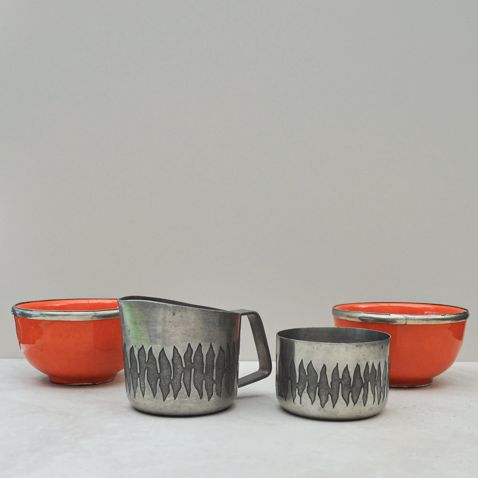
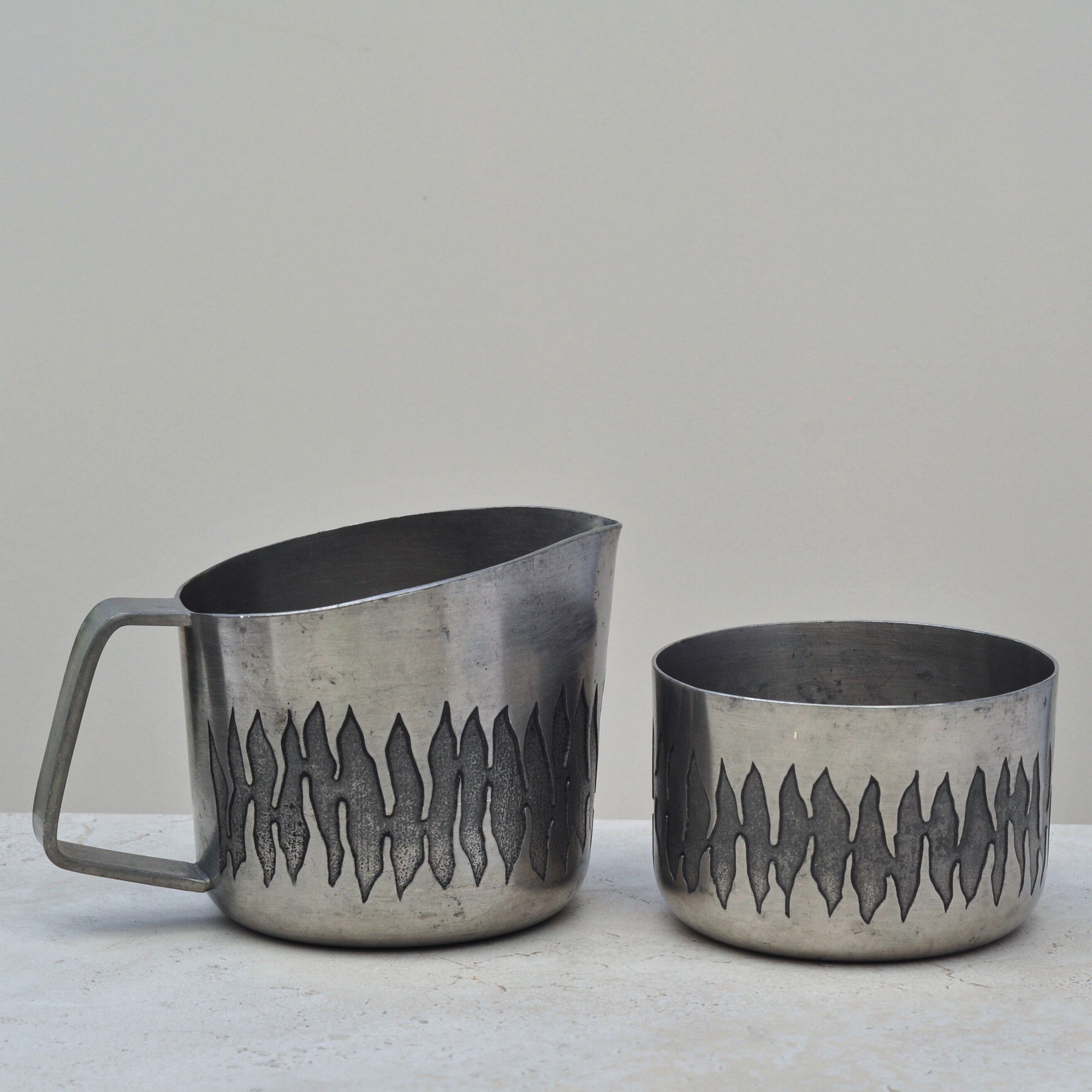
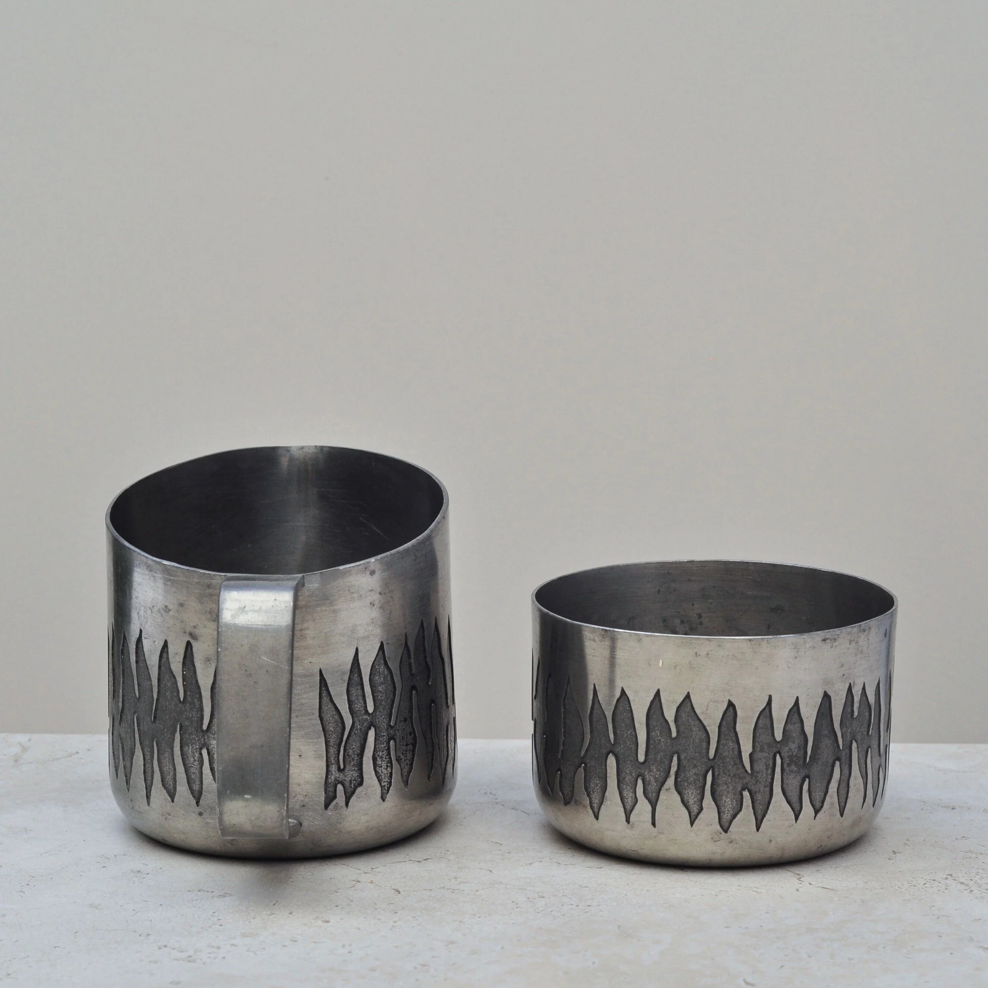
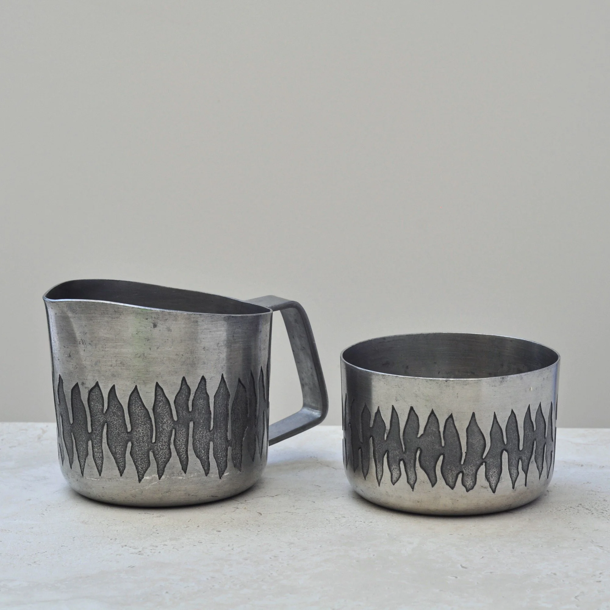
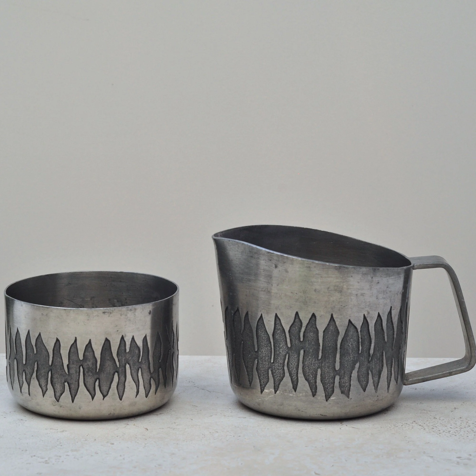
These are special, two pieces of Australian designed pewter which capture the essence of the 60s and 70s so perfectly. Just look at the engraved pattern, it brings to mind the colours of orange and brown matched with shag pile carpet. Love it! But there’s also something deeper here as pewter has a softness and warmth other metals don’t, giving these pieces a gentle but almost brutalist-influenced form. They are simply, stunning.
They’re designed by June Calcutt, and Australian pewter artist who worked from a small studio under her house in Mount Waverley, Victoria during the 1960s - 70s. I’ve read that she was self taught, taking up pewter work once her children had grown. Her work is one to collect, time to start now?

The Edit is a light touch and accessible personal search service for when you need to find ‘that’ one special piece.
It’s perfect for times when you’re sourcing a piece within a shorter timeframe, or when you need to find a thoughtful gift for a dated occasion. The Edit is also best suited to pieces that are a little more common - but not too common - as the search focuses on more typical and known channels.

The Hunt is a dedicated, bespoke personalised search for truly rare, highly specific or collector-level pieces - the sort that require patience, expertise and the right connections.
It’s designed for items that seldom appear on the open market, require deep provenance work, or need careful monitoring of auctions, dealers and private sellers.
With The Hunt the goal is to find those unforgettable pieces - the ones with story, soul and significance - so progresses at the pace the market allows. Time here is very much your friend.

Sometimes we have a special piece that deserves to move on with a little ceremony - something worthy of being photographed beautifully, priced thoughtfully and presented in a way that shows its true charm.
Rehoming a single piece with Your Hero begins with a simple fixed fee of $75, followed by 15% of the final sale price. It’s a gentle, considered way to help your piece move gracefully into its next chapter.
When you’re ready to move on from several pieces at once, Your Collection brings calm to the process. I’ll help you assess what’s worth selling, create a consistent look across every listing and manage the flow of enquiries so your treasured collection finds their right next home.
This service begins with a fixed $495 project fee, plus 15% of each final sale. The initial fee allows me to assess your collection, plan the approach and create a cohesive, high-quality presentation across every item.
The Collection is a streamlined, thoughtful way to move on multiple pieces with ease, clarity and consistency.
There may be times when you need to move many of your pieces on - think moving house, downsizing or support with an estate. With Your Next Story you’ll have access to a helpful extra hand, someone who really understands the potential of the pieces you’ve personally curated.
Because every story is different, we provide a custom project quote, followed by 15% of each final sale. This reflects the depth of care, organisation and coordination required when many pieces need thoughtful placement.
Together, we’ll place your pieces thoughtfully, allowing your next story to feel calm, supported and beautifully considered.
No results match your search. Try removing a few filters.